Does Pink Actually Work for Fall Decor?
You save a pink autumn room, buy a pink throw to match it, and drape it over the sofa next to your rust pillows. It looks like Easter. The pillows suddenly look muddy, the throw looks loud, and the whole corner stops working.
If that has happened to you, the shade you bought is not really the problem.
Looking for more ideas? Explore our full guide to Cozy Fall Aesthetic.
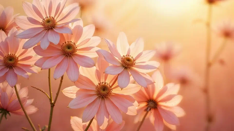
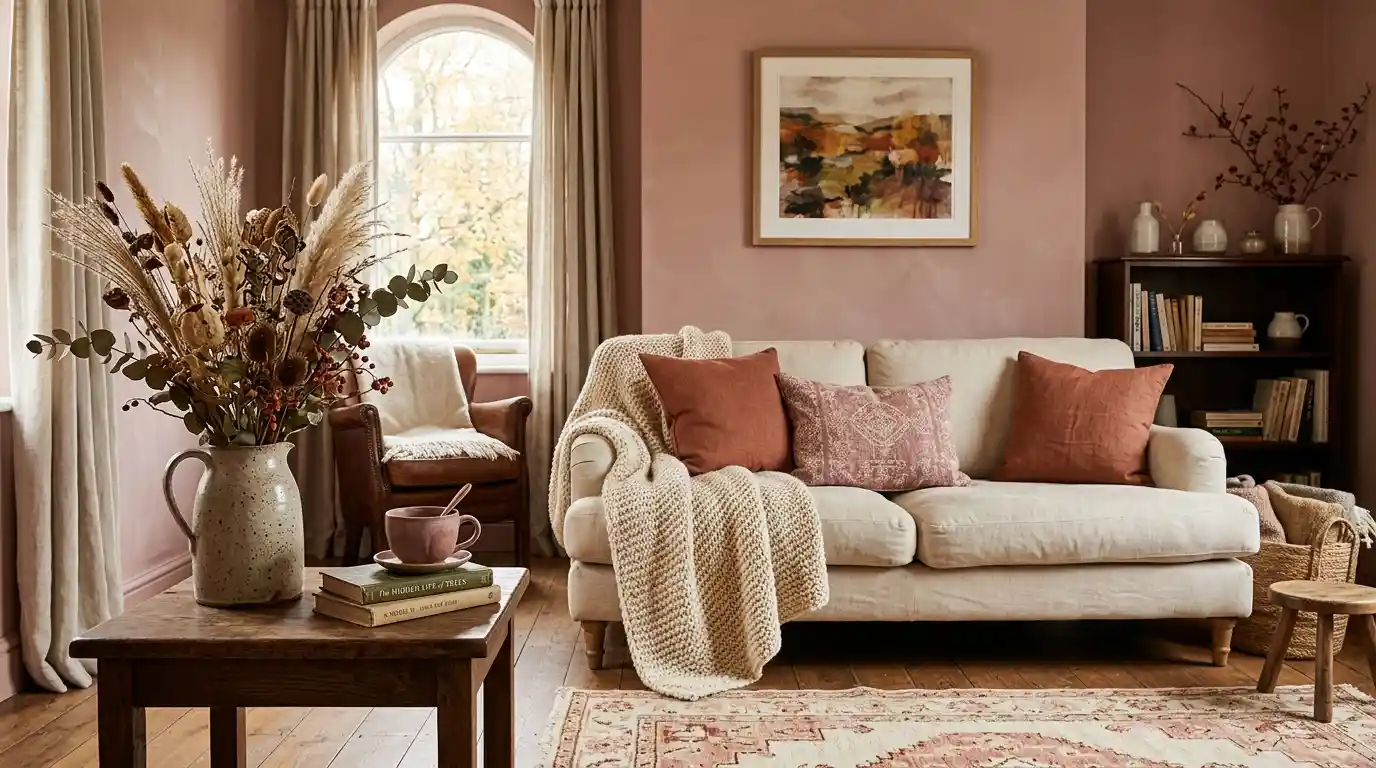
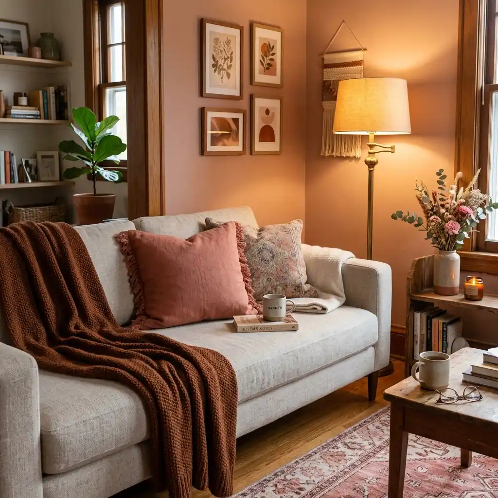
The pink fall aesthetic works when the pink is warm — built on yellow or brown pigment rather than blue. Dusty rose, clay pink, mauve and antique rose sit comfortably beside rust, ochre and espresso brown because they share the same underlying warmth. Cool blush and bubblegum fight those colors. Undertone decides whether pink looks like autumn or like leftover spring.
Editorial field note: A room styled in cool blush and grey in April usually looks thin once the light drops in October, because both colors lean blue and the low sun has no warmth left to lend them. Swapping the same two pieces for clay pink and warm brown fixes it in an afternoon, with no other change to the room.
Below you get the shades that pass, a two-minute undertone test for anything already in your house, and the three colors warm pink belongs next to. If you are refreshing the whole house rather than one corner, our home decor inspiration covers the wider picture first.
Five Checks Before You Buy Any Pink
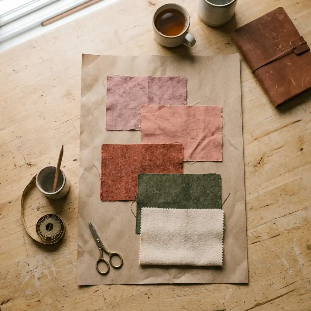
Run this before you buy anything. It takes five minutes and saves a return trip.
- Hold every pink candidate against brown kraft paper, not against a white wall.
- Name one warm anchor first — rust, burnt umber or deep olive — then pick the pink to suit it.
- Spread pink across three separate spots at three heights, never one large piece.
- Pick pink in velvet, wool, boucle, stoneware or dried stems; skip satin and glossy plastic.
- Check the pink under your evening lamp, not under the shop’s overhead light.
KEY TAKEAWAY: Warm pink is a supporting mid-tone in a fall room, not the headline color.
If you want the wider seasonal plan around this palette, start with our creative fall and autumn decor ideas and treat pink as one layer inside it.
Signs Warm Pink Is Moving Into Fall Decor
Warm pink is not appearing out of nowhere. The evidence sits in the same places the rest of the 2026 palette came from.
Signs This Is Catching On:
- Glidden named Warm Mahogany (PPG1060-7) its 2026 Color of the Year — a warm red carrying brown undertones, which is exactly the family dusty rose belongs to.
- Pantone chose Cloud Dancer, a soft white, for 2026, and a pale neutral base is what lets a muted pink hold a room without shouting.
- Heritage plaster pinks that were treated as period colors five years ago now sit in mainstream fall room photos alongside umber and olive.
- Pinterest searches for pink fall decor and pink pumpkin decor now run through the autumn season rather than fading after spring.
None of that makes pink the dominant fall color. It does mean the warm end of the family stopped being a seasonal mismatch. The same drift runs through our cozy decor ideas, where muted rose keeps turning up next to wool and oak.
Which Pinks Count as Autumn Pinks?
Five pinks carry enough warmth to hold their own in October light. Dusty rose is a soft pink greyed down with brown. Clay pink is terracotta with more white folded in. Mauve is pink with grey and a trace of purple. Antique rose is deeper and slightly dusty, close to a faded velvet curtain. Plaster pink is the palest of the group, warmed with yellow rather than cooled with white.
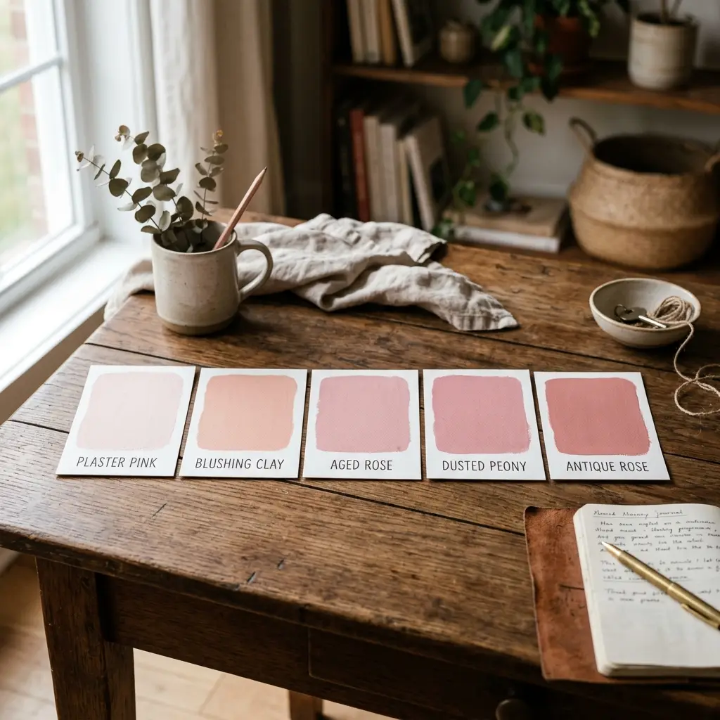
The failures are easier to name. Bubblegum, cool blush, cotton-candy pink and anything sold as “baby pink” carry blue, and blue is what makes them look like spring in a room full of brown. A blush pink bedroom works year-round — but the versions that survive autumn are warmed with cream and wood rather than paired with grey. Our full fall color palette guide covers how to build the three-color scheme these pinks sit inside.
DESIGNER TIP: If a pink looks slightly dirty next to a white page, that is usually the brown in it. Keep that one.
How Do You Check a Pink’s Undertone at Home?
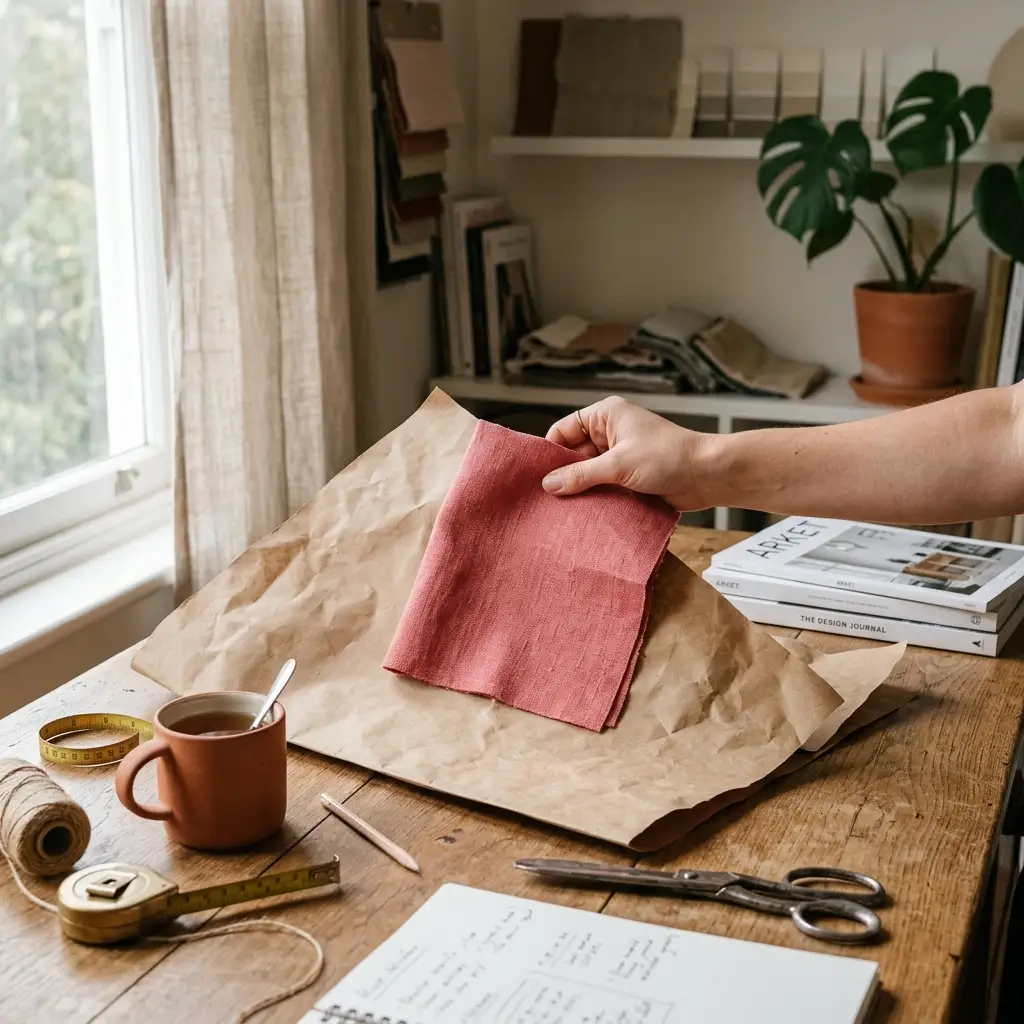
Put the pink against brown kraft paper or a plain cardboard box. Warm pink settles into the brown and looks related to it. Cool pink jumps forward and turns slightly violet at the edges. White paper hides this completely, which is why paint chips mislead people in the store.
Source Note: Farrow & Ball describes Setting Plaster as “definitely a pink in historic terms, but has a certain softness to it due to the inclusion of yellow pigment” — yellow pigment is the mechanism behind every warm pink.
Run the test on the pink you already own. A throw, a cushion cover, a vase — each one tells you in ten seconds whether it belongs in your autumn room or in a drawer until March.
What Should Warm Pink Sit Next To?
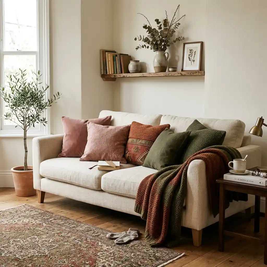
Warm pink needs one strong partner and one quiet base. Three partners work reliably.
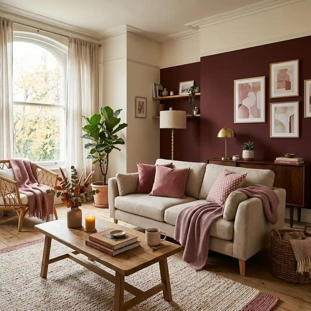
Rust and burnt umber are the closest relatives — same warmth, more depth — and they make dusty rose look chosen rather than accidental. Deep olive is the contrast option, since green sits opposite pink and stops the room turning sweet. Espresso brown grounds everything, and it works hardest in a room that already has oak or walnut. A terracotta room palette shows the first pairing at full strength.
The base underneath should be warm cream, oat or soft greige — never cool white, which drains the pink and puts back the blue you just spent an afternoon avoiding.
Designer Rule of Thumb: Warm pink belongs in the middle of the stack — lighter than your anchor, deeper than your base — and it should never be the first color a visitor names. If someone walks in and says “pink room,” you have gone too far for autumn. Deep brown and tan schemes make the easiest anchor to build against.
One pairing to avoid outright: pink and orange. Both are warm, both are bright, and neither wins. Rust is orange’s grown-up version and does the job without the fight.
Why the Fabric Decides It More Than the Shade
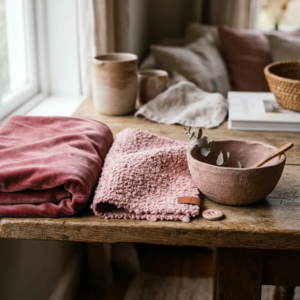
The same dusty rose looks autumnal in velvet and looks like a party supply in satin. Texture does most of the work in a pink fall aesthetic, not color.
Velvet absorbs light and deepens a pale pink by a shade or two, which is why a rose velvet cushion looks richer than its swatch. Wool and boucle break up the surface so the color arrives softened. The same texture stack drives these cozy cabin interiors. Unglazed stoneware holds pink at a chalky, clay-like level, and dried stems carry pink that has already faded on its own.
Glossy plastic, satin ribbon, acrylic and anything metallic push pink back toward party decor. Matte belongs to autumn; shine belongs to spring and holidays. The same logic runs through these pink bathroom designs, where matte tile and warm brass keep the room from tipping into candy.
What Do Warm Bulbs Do to Pink?
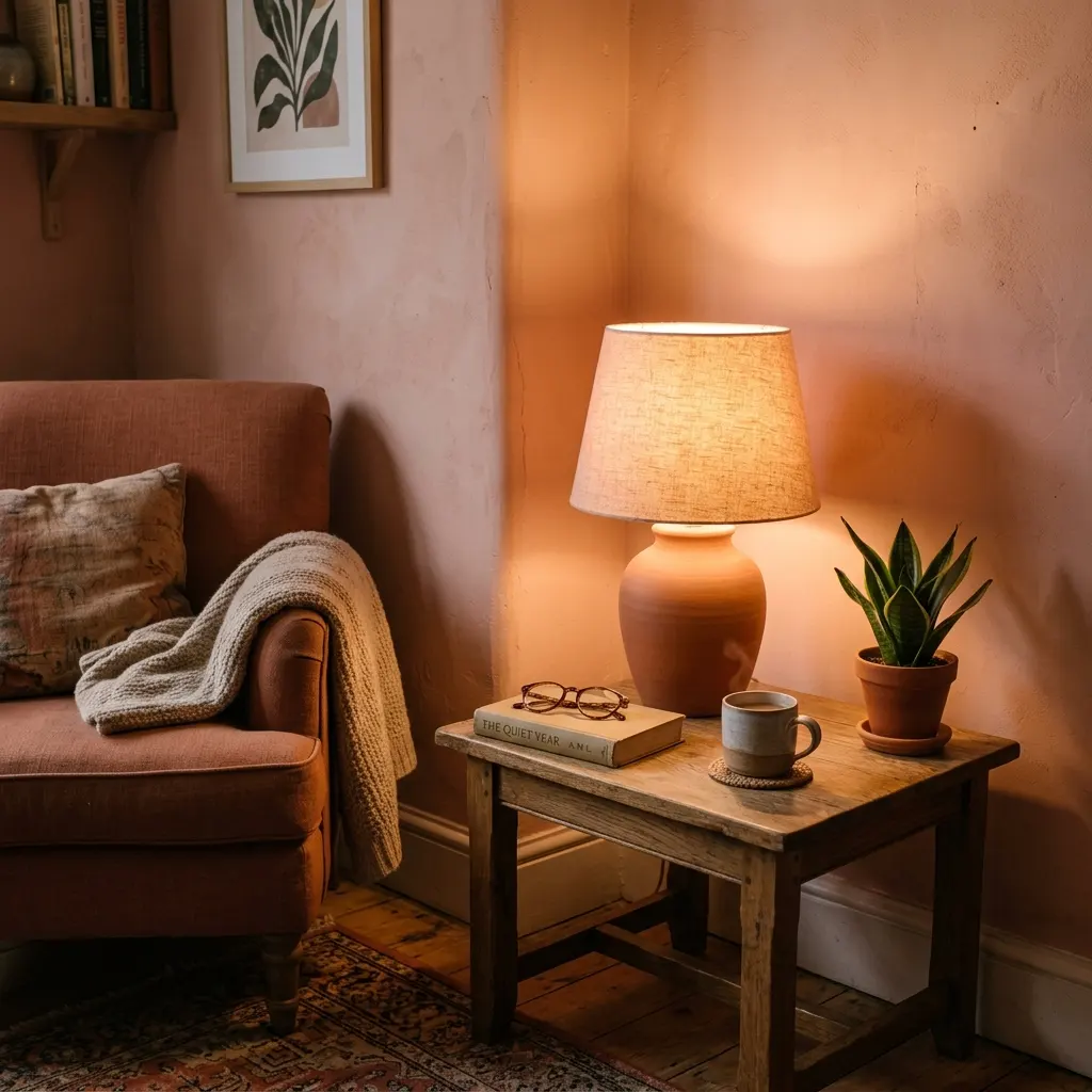
A 2700K bulb pushes warm pink toward peach and pushes cool blush toward grey. That single fact explains why a pink corner can look right at 2pm and look tired at 8pm.
Test any pink under the lamp you use in the evening before committing. Clay pink and antique rose gain depth under warm light. Cool blush loses its color and turns a flat grey-lilac that fights everything near it. That is a pink-specific quirk, not a general lighting rule — our cozy bedroom lighting ideas cover the wider layered setup.
Autumn Grows Its Own Pinks

The strongest argument for pink in fall is that autumn produces it without being asked.
Source Note: North Carolina State Extension notes that panicle hydrangea blooms “fade over time to a pinkish rose and tannish brown” as the season turns — the exact dusty rose people buy in a shop, growing on a shrub in September.
Sedum ‘Autumn Joy’ runs a shorter clock, opening soft pink and deepening through rose and copper into rust by late October. Dried strawflower, sumac and ornamental grasses land in the same muted family. Cut any of them, hang them upside down in a dark room for two weeks, and you have free pink nobody will mistake for spring.
Pink pumpkins are the other route. Johnny’s Selected Seeds lists the Porcelain Doll F1 as a blocky, deeply ribbed pumpkin averaging 16 to 24 pounds, harvested once the skin turns fully pink. Two of those beside a cream heirloom give you the palette without a trip to the seasonal aisle.
Material Note: Air-dried hydrangea keeps its rose tone for one season indoors and drifts toward tan after that, so treat it as a yearly cut rather than a permanent piece.
Four Ways to Bring Warm Pink Into a Fall Room
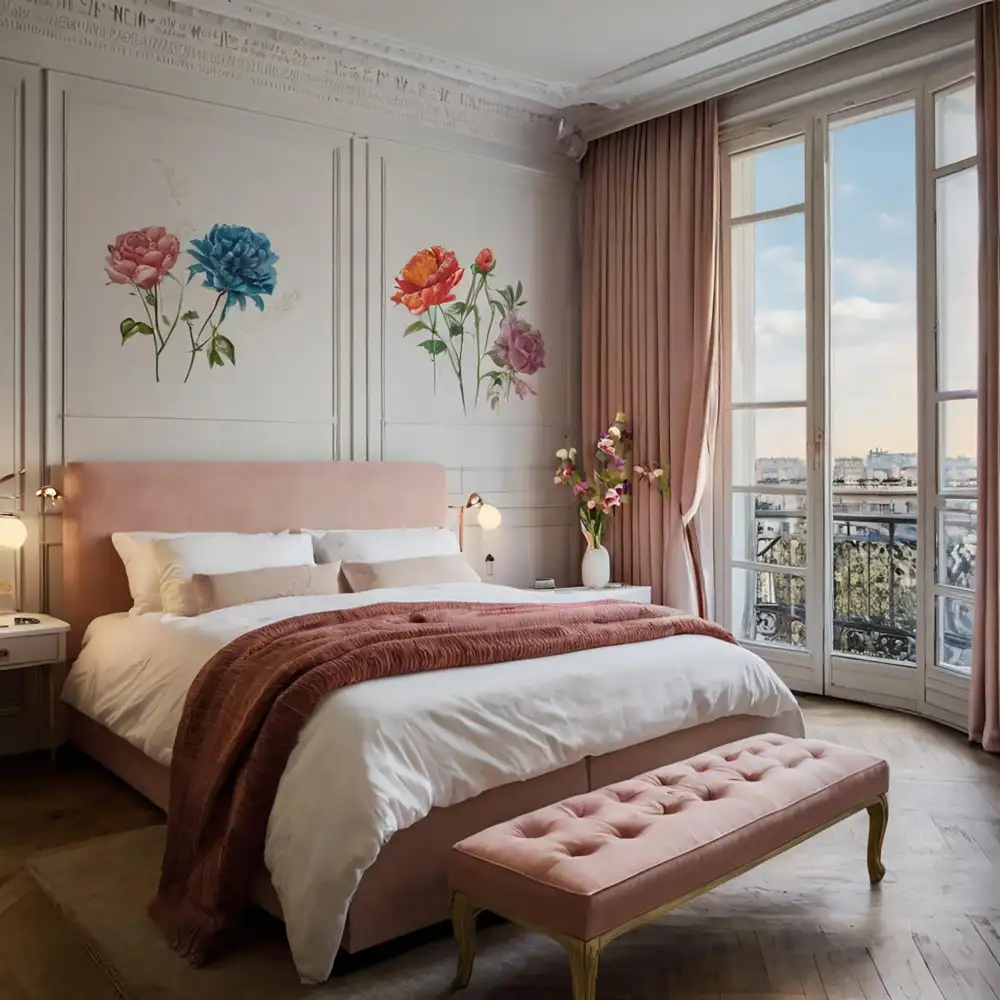
Four moves cover most rooms, in this order.
Start with textiles. Two dusty rose cushion covers and one wool throw give you three separate pink points without committing to anything. This is the cheapest test of whether the color suits your light, and it sits comfortably alongside the rest of our autumn decorating ideas.
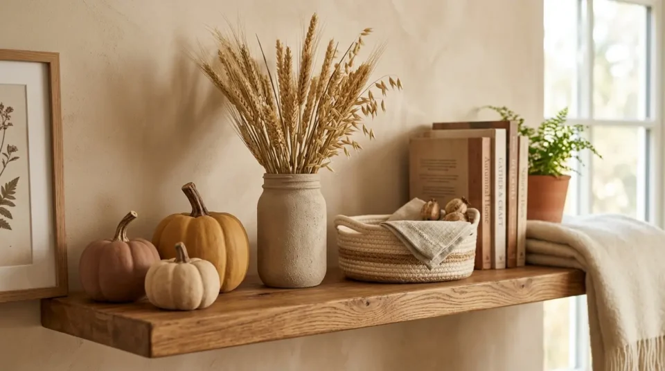
Add a dried botanical. A jug of dried hydrangea, sedum heads or rose-toned grasses puts pink at a different height and in a different texture from the fabric.
Bring in one ceramic piece. A clay-pink stoneware vase or bowl holds the color in a hard material, which stops the palette looking entirely soft.
Only then consider a surface. Plaster pink on a single wall, inside a bookcase, or on a small piece of furniture is the last step, not the first. A seasonal fall bedroom refresh shows how far the first three moves get you before paint enters the conversation.
The Small-Dose Version for Renters and Doubters
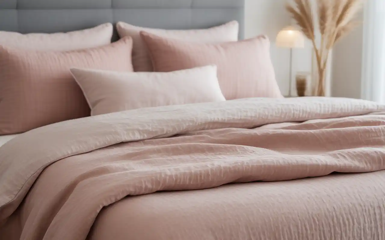
You do not need a pink room to get this look, and a full pink small bedroom is a different project entirely. You need pink in three places at three heights.
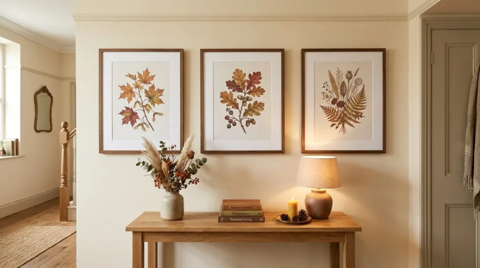
One cushion at seat level, one dried arrangement at table level, one small ceramic or framed print higher up. Three touches of clay pink across a brown-and-cream room look planned. One large pink object on its own looks like a mistake. Concentrating those three touches inside one warm corner rather than spreading them around the room is what makes a small dose read as deliberate.
Rental Note: Keep every pink element removable — textiles, stems and objects — and leave the walls alone; nothing here needs a drill or a paint tin.
If the color still feels risky, buy the cheapest version first and live with it for two weeks. Pink is the one autumn color people second-guess, and a $20 test beats a $400 regret. More seasonal palettes across the year sit in our seasonal decorating ideas.
Three Ways Pink Fall Decor Goes Flat
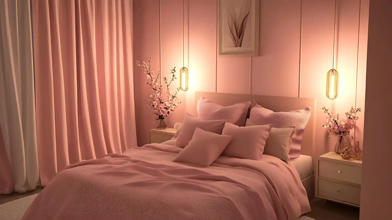
- Most people buy the pink first and hunt for a partner afterward. Pick the warm anchor first — rust, umber or olive — then choose a pink to sit beside it. That reversed order is why so many pink corners never settle.
- Spreading one pale pink thinly across a whole room gives you a washed-out result, not a soft one. Pink needs a dark partner in the same sightline to hold its shape. Without one, the room looks faded rather than warm.
- Pairing pink with black turns the palette into Halloween. Hot pink and black is a real seasonal look, but it belongs to October 31st, not to a harvest palette — swap black for espresso brown here and keep the two projects separate.
What Does a Pink Fall Refresh Cost?

Warm pink is one of the cheapest seasonal palettes to test, because the entry point is textiles rather than furniture.
| Project | Estimated Cost | Impact Level |
|---|---|---|
| Two dusty rose cushion covers plus one wool throw | $45-$120 | High |
| Dried hydrangea or sedum bunch plus two pink-skinned pumpkins | $60-$180 | Medium |
| Anchor piece: rose-toned wool rug, velvet chair, or one plaster-pink wall | $320-$900 | Very High |
Best First Upgrade: The cushion-and-throw swap, because it tests the undertone against your own evening light for under $120.
Skip for Now: A pink-painted wall in the first season — paint locks the shade in before you know how it behaves in December.
Will Warm Pink Still Look Right Next Fall?
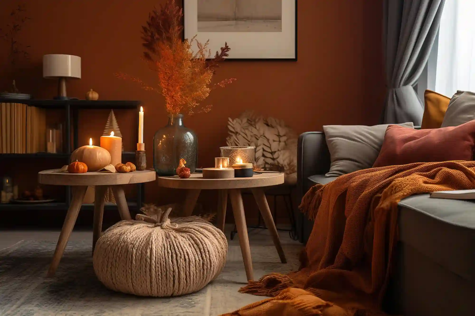
The Bottom Line: Dusty rose and clay pink will outlast this cycle, because they are muted earth tones wearing a pink name — the same family as terracotta and rust, which have held for a decade. Bright pink paired with orange is the version that will date, and it will date fast. Buy the muted end in textiles you would keep anyway, commit to one named look rather than sampling several, and the palette carries into winter beside cream and wool without a second purchase. Winter’s own warm scheme in these cozy winter decor ideas picks up almost exactly where this one leaves off.
Frequently Asked Questions
Conclusion
Warm pink was always an autumn color; the blue-based versions on the shelf in spring are what gave the pink fall aesthetic its bad name. Check the undertone against brown paper, give it rust or olive to lean on, and buy it in velvet, wool or dried stems rather than anything shiny. More seasonal palettes and room-by-room plans sit across our home decorating ideas.
Next Steps
- Gather every pink item already in your home and test each one against brown kraft paper.
- Pick your warm anchor — rust, burnt umber or deep olive — before buying a single new pink piece.
- Cut or buy one dried hydrangea, sedum or grass bunch and place it at table height in the room you use most.