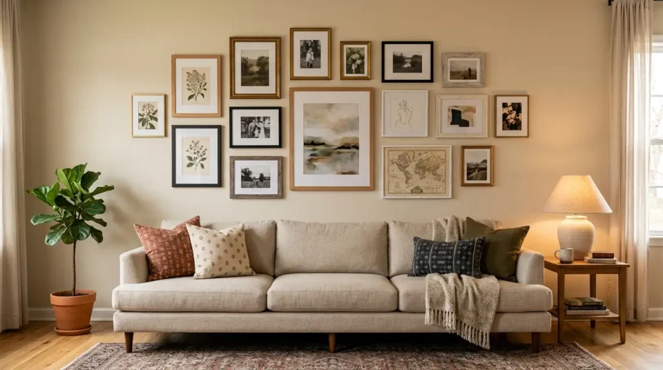
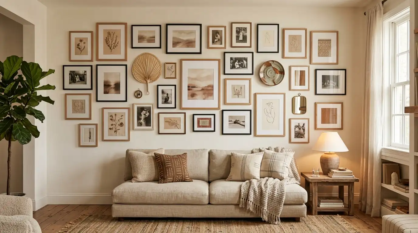
TL;DR
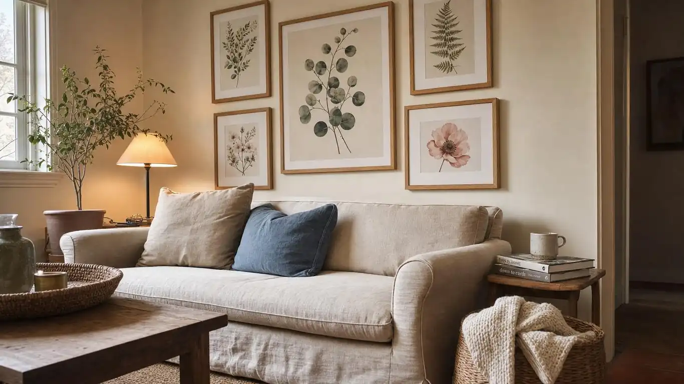
- The real problem: Cluttered gallery walls are almost never badly spaced. The frames have nothing in common with each other.
- The fix: Pick one thread — a shared subject, one tonal range, or one repeated material — and let everything else vary.
- Frames: Two finishes maximum. Matching all of them is the dated version; mixing five is the chaotic one.
- Photos: Frame a print, never the original. Light damage to a photograph cannot be undone.
- The test: Stand ten feet back and squint. If it breaks into separate objects instead of one shape, the thread is missing.
Why Do Most Gallery Walls Look Cluttered?
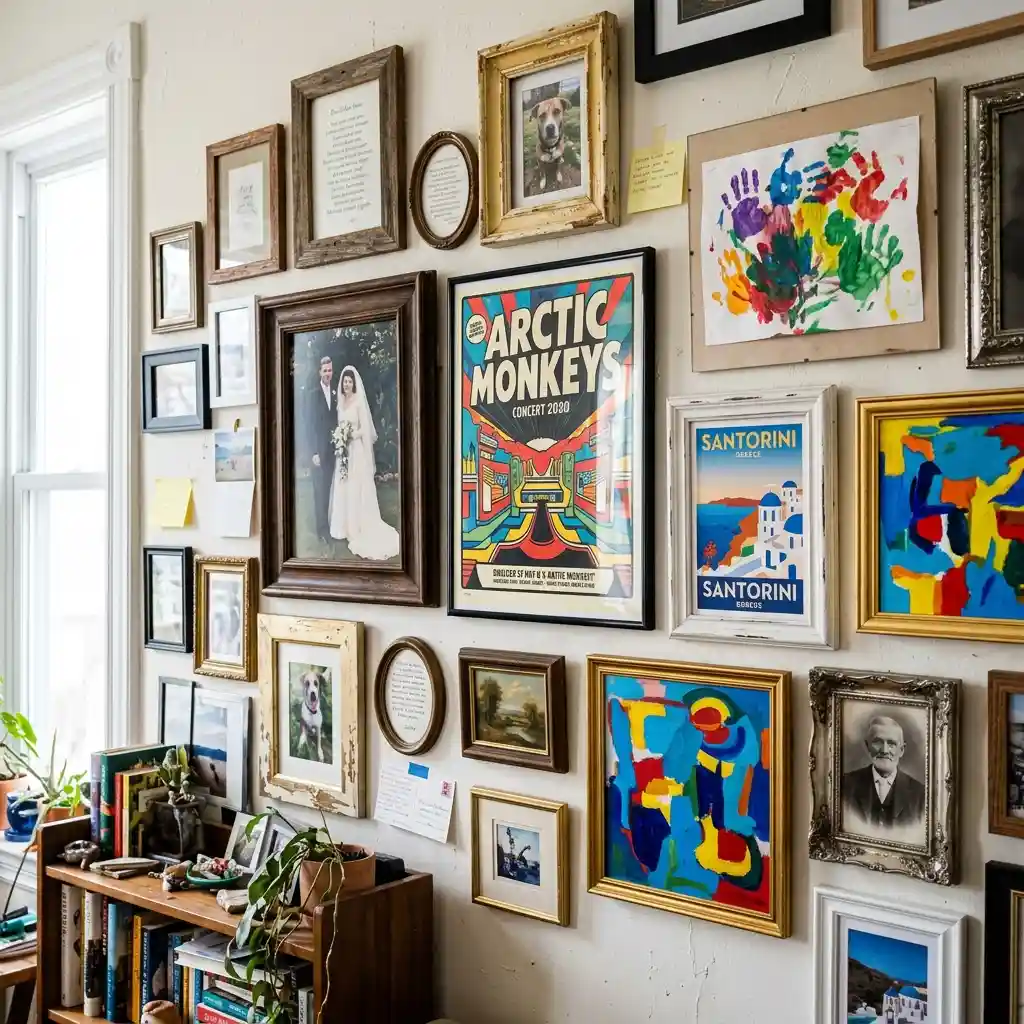
Almost every guide to gallery walls opens with a layout template — the grid, the salon, the staircase diagonal. Then it gives you spacing in inches and a hanging height. Follow all of it exactly and the wall can still look like a noticeboard.
Part of our guide to wall decor, this post covers the half that templates skip.
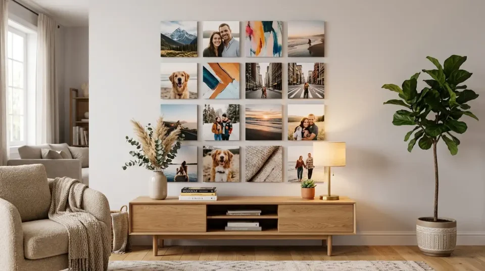
Here is the direct answer. A gallery wall looks cluttered when the pictures have nothing in common, not when the spacing is wrong. Nine frames in a perfect grid will still read as clutter if one holds a wedding photo, one a concert poster, one a child’s painting and one a travel print. The eye is looking for a reason these things are together and cannot find one.
Good gallery wall ideas therefore start with a question most people skip: what do these pictures share? Answer that and the layout gets easy, because a collection with a thread survives uneven spacing. Answer it badly and no template rescues you.
Editorial field note: A hallway wall holding twelve mismatched frames usually improves the moment nine of them come down. The three that stay — same tonal range, same frame finish — do more work than the twelve did, and the wall stops competing with the rooms on either side of it.
The Squint Test — Look at Yours From Ten Feet Back
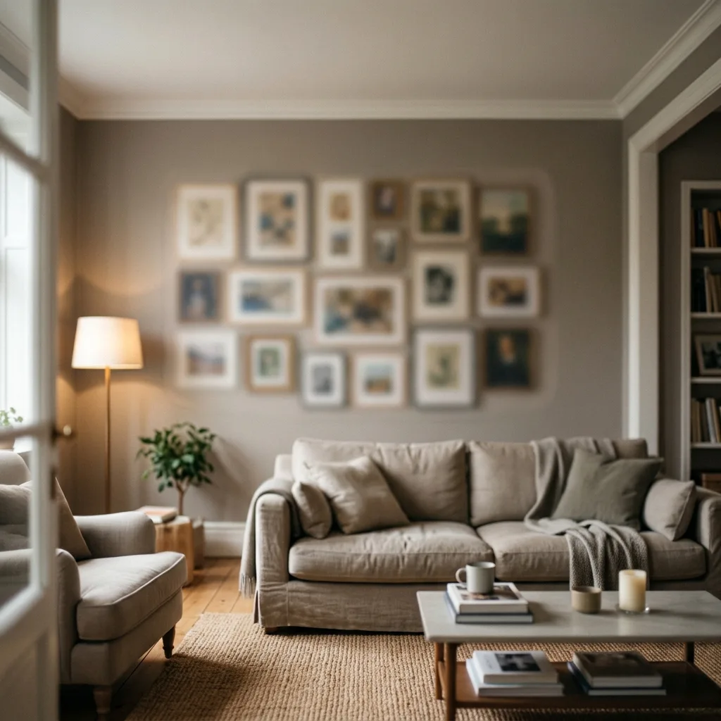
Stand about ten feet from the wall and half-close your eyes until the detail disappears. You are left with shapes and values — light and dark blocks, nothing else. This is the fastest diagnosis there is, and it takes five seconds.
A gallery wall that is working collapses into one shape at that distance. The individual frames stop registering and you see a single rectangle of tone sitting on the wall. That is the effect you are actually buying when you hang a group of pictures rather than one large piece.
A gallery wall that is not working stays broken up. You still see separate bright and dark patches fighting each other, usually because one or two pieces are far lighter or far darker than the rest. Those pieces are the problem, and they are almost always the ones added last.
The squint test also tells you which piece to remove. Whatever still shouts at ten feet is the outlier. Take it down and hang it on its own somewhere else, where being loud is an advantage rather than a fault — our living room wall decor ideas cover where a single strong piece works better than a group.
What Has Actually Changed About Gallery Walls?
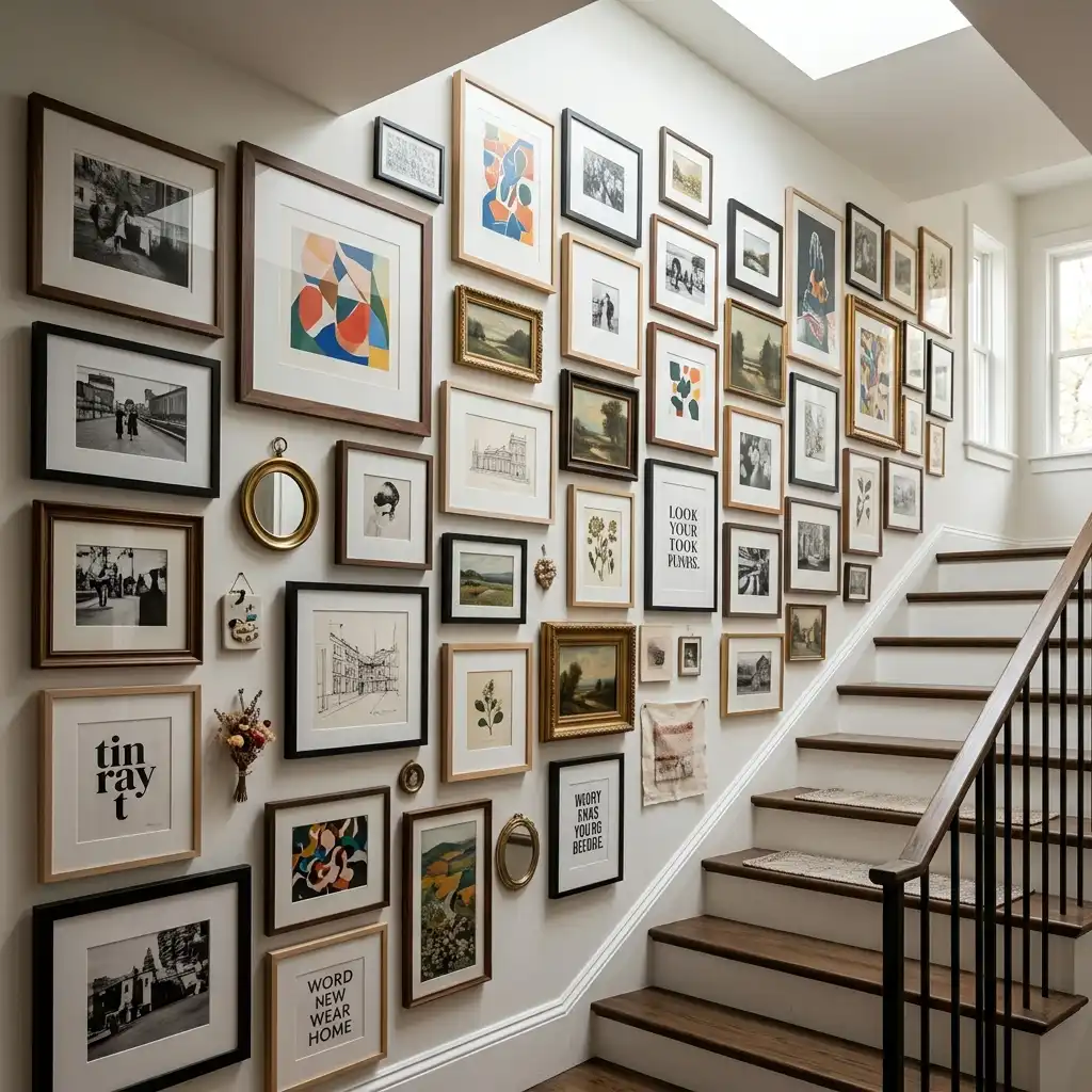
The matching-black-frames grid is the version that dated. It arrived with flat-pack frame multipacks, it was easy to execute, and it turned up in so many homes that it stopped reading as a choice. What replaced it is looser and much more about content.
Signs This Is Catching On:
- Salon-style hanging — dense, floor-to-ceiling, deliberately uneven — has moved from period houses and galleries into ordinary living rooms and stairwells.
- Picture rails and ledges are being used as a lower-commitment alternative, letting pieces lean and change without new holes.
- Mixed media is normal again. Plates, mirrors, textiles and small objects hang alongside framed prints rather than in a separate display.
- Two-finish frame mixes, typically a dark frame with a natural oak, have replaced the all-matching set as the default advice.
None of that removes the need for a thread — it increases it. A tight grid of identical frames supplies its own visual logic even when the contents clash, because the repetition does the work. The moment you loosen the frames, the pictures have to carry the connection themselves.
It is worth knowing the alternative before you commit. A painted feature wall solves the same blank-wall problem with colour instead of objects, and our living room accent wall ideas make the case for that route. The two rarely belong on the same wall.
What Gives a Gallery Wall Its Thread?
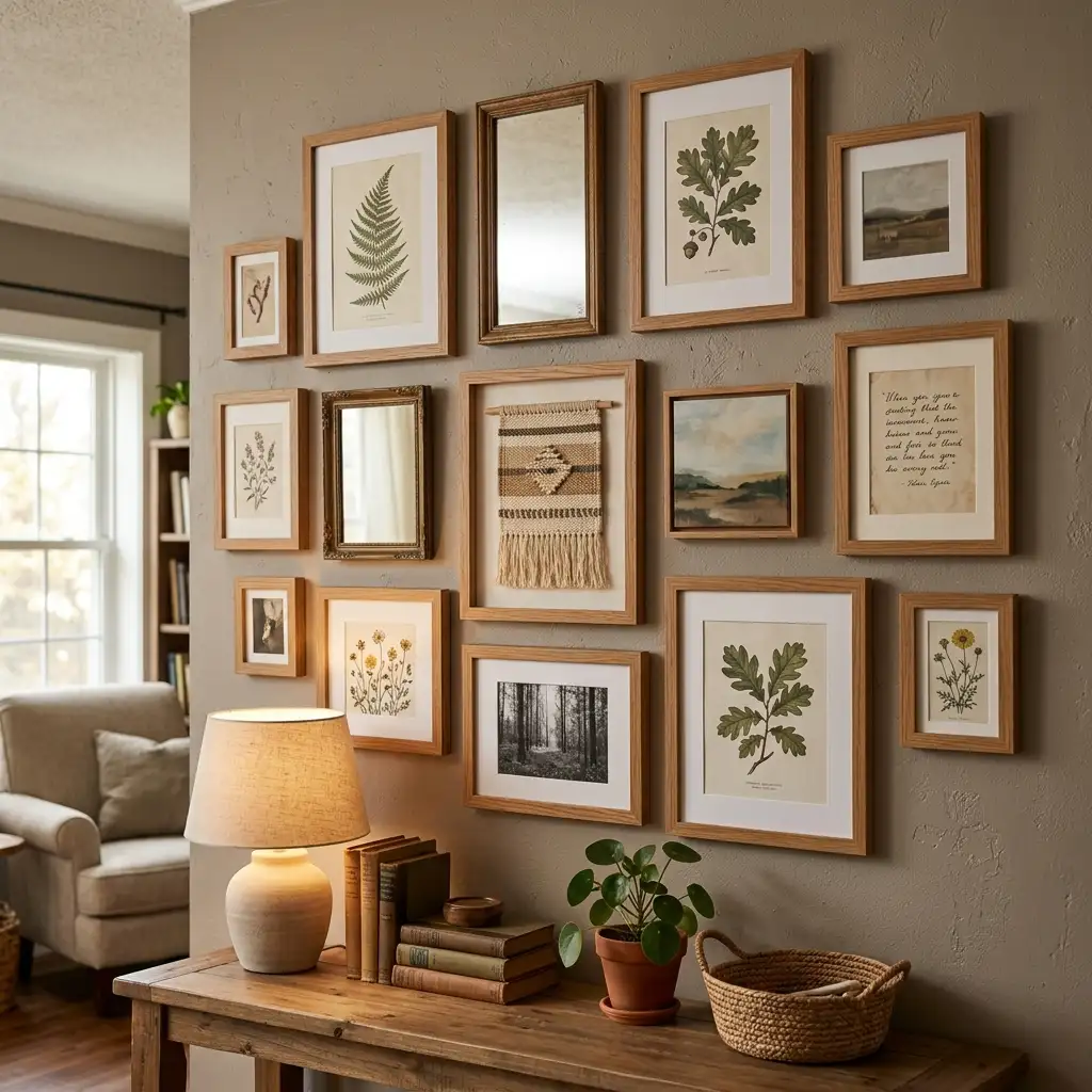
A thread is the one thing every piece on the wall has in common. You need exactly one. Two feels planned, three feels like a showroom, and none is where the cluttered look comes from. Every set of gallery wall ideas worth following comes back to this, whatever layout it recommends on top.
The three below are the workable options. Pick whichever matches the pictures you already own, because the thread should be discovered in your collection rather than imposed on it.
Thread 1 — One Subject Running Through
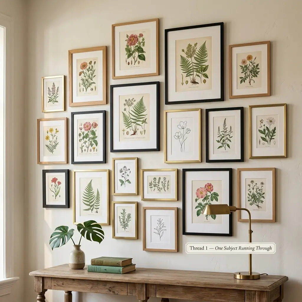
Subject is the easiest thread to see and the easiest to build. Every piece shows the same category of thing: all landscapes, all botanical studies, all architecture, all portraits, all black-and-white street photography.
The frames can then vary freely. A walnut frame, a thin brass one and a wide white mat can sit side by side without tension, because the eye has already grouped the pictures by what they show. Subject threading is why a wall of nine different botanical prints looks collected while nine random prints looks accidental.
This is also the thread that survives additions. You can keep buying into a subject for years, which is what makes a wall look gathered over time rather than bought in one afternoon. Botanical and seasonal prints are the easiest subject to build on, and our spring wall art ideas are a good place to start a collection of them.
Thread 2 — One Tonal Range
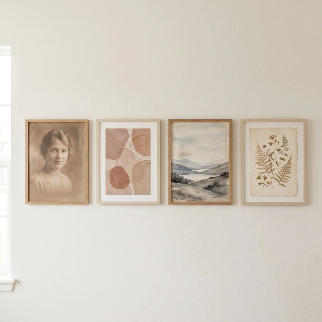
Tonal threading means every piece sits in the same light-to-dark band, regardless of what it shows. A wall of soft, faded, mid-tone images works even when the subjects are unrelated — a portrait, a coastline, an abstract, a page of handwriting — because none of them jumps forward.
Warm sepia, muted clay, soft greige and washed indigo all live comfortably together at similar values. What breaks a tonal wall is a single high-contrast piece: pure black on bright white in a group of soft neutrals will pull the eye every time and undo the grouping.
DESIGNER TIP: Photograph your candidate pieces on the floor with your phone, then view that photo in black and white. Colour hides value mismatches; greyscale exposes them in about two seconds.
Thread 3 — One Repeated Material
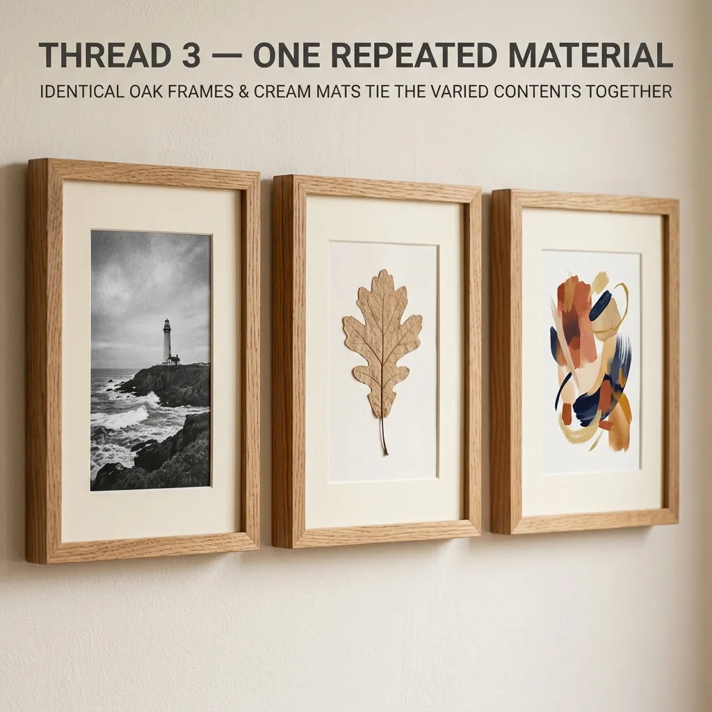
Material threading runs the common element through the objects rather than the images. Every frame in natural oak. Every mat in the same warm cream. Every piece under the same brass. The contents can then be wildly mixed — a poster, a pressed leaf, a child’s drawing, an old map.
Two finishes is the working limit, and each one needs to appear at least twice so it reads as a decision rather than a leftover. One oak frame among six black ones looks like a frame you ran out of; three and three looks deliberate.
Material threading is the most forgiving option for a collection you did not plan, which is most people’s actual situation. It also costs the least to correct, since reframing is cheaper than rebuying art.
Where Do the Pictures Actually Come From?
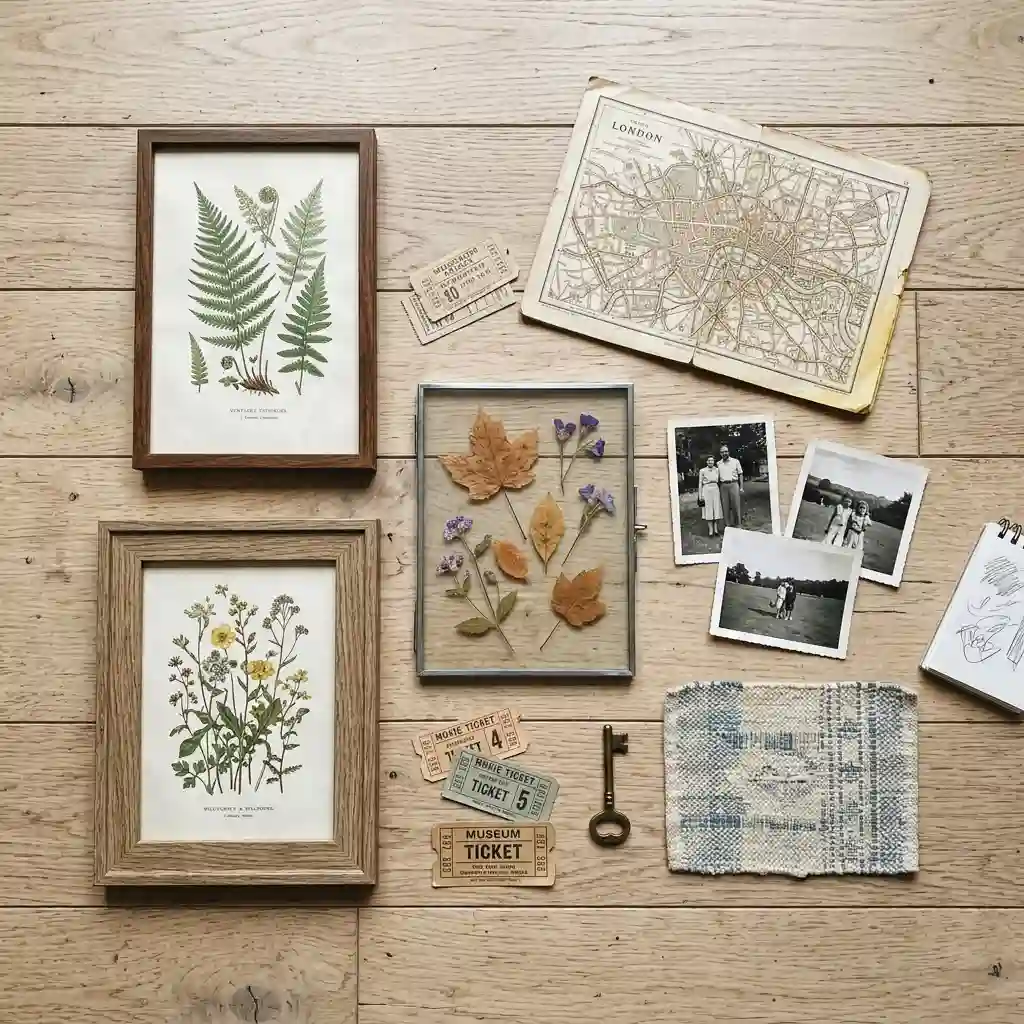
Most gallery walls stall here rather than at the layout stage. You have four frames, two things worth hanging, and no idea what fills the rest. Sourcing is a content problem with content solutions.
Look first at what you already own and never framed — ticket stubs, a good map, pages from a damaged book, fabric offcuts, your own photographs. A framed personal object with a real story beats a bought print almost every time, and it costs the price of the frame. When nothing in the house qualifies, our home decor inspiration is a reasonable place to decide what to buy into.
Your Own Photographs, and Why to Frame a Copy
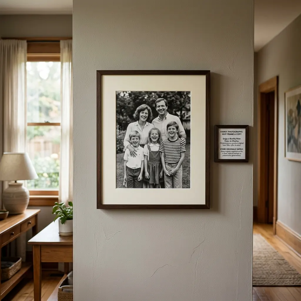
Personal photographs are the strongest content a gallery wall can carry, and they come with one rule that almost nobody follows. Frame a print. Keep the original somewhere dark.
The Library of Congress is direct about this in its guidance on limiting light damage: all photographs exposed to light will undergo irreversible damage, even behind UV-filtering glass, and for any photograph of personal, monetary or historic value it recommends framing a facsimile and storing the original properly. Fading does not reverse when you take a picture down. Whatever is lost is lost.
For a print that holds up on a wall, size the file to roughly 300 pixels per inch at final print size. A 16 by 20-inch print at that density needs about 4,800 by 6,000 pixels, which is around 29 megapixels — more than a phone photo usually holds, so 8 by 10 or 11 by 14 is the safer enlargement from a phone camera.
Designer Rule of Thumb: If a scan or phone photo looks soft on screen at full zoom, it will look worse framed. Print smaller rather than sharpening it.
Humidity is the other enemy, and it rules out one room entirely. Framed paper and photographs warp and foxing sets in where steam is regular, so a bathroom needs pieces chosen for the conditions — our bathroom wall decor ideas cover what survives there instead.
Mixing In Things That Are Not Pictures
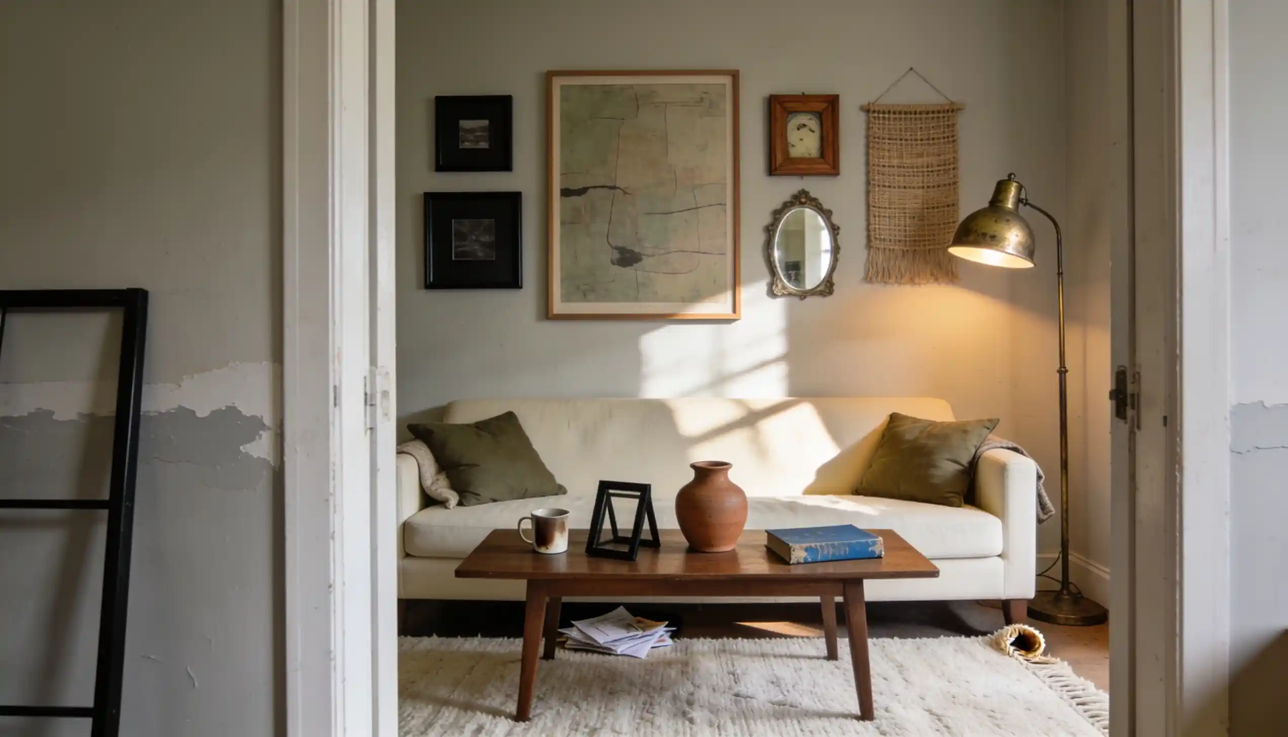
Objects break up a wall of rectangles and stop it reading as a filing system. Ceramic plates, a small round mirror, a woven fan, a shallow basket, a hat, a framed textile — each one changes the silhouette of the group without changing its thread. A woven or fabric piece is the easiest to add, and our guide to wall hanging craft ideas covers making one rather than buying it.
Keep objects to roughly a quarter of the pieces and space them apart rather than clustering them in one corner. Two or three across a nine-piece wall is plenty. This is a mixed gallery wall, not a wall built entirely from objects — that is a different look with different rules.
Depth is the thing objects contribute that a print cannot. A plate sits half an inch off the wall and catches light across its curve, which is what stops a large gallery wall from looking flat under a single ceiling fixture. Any wall of mixed depths improves under side light rather than a downlight, and our guide to layered bedroom lighting explains how to build that.
Where Gallery Walls Go Wrong
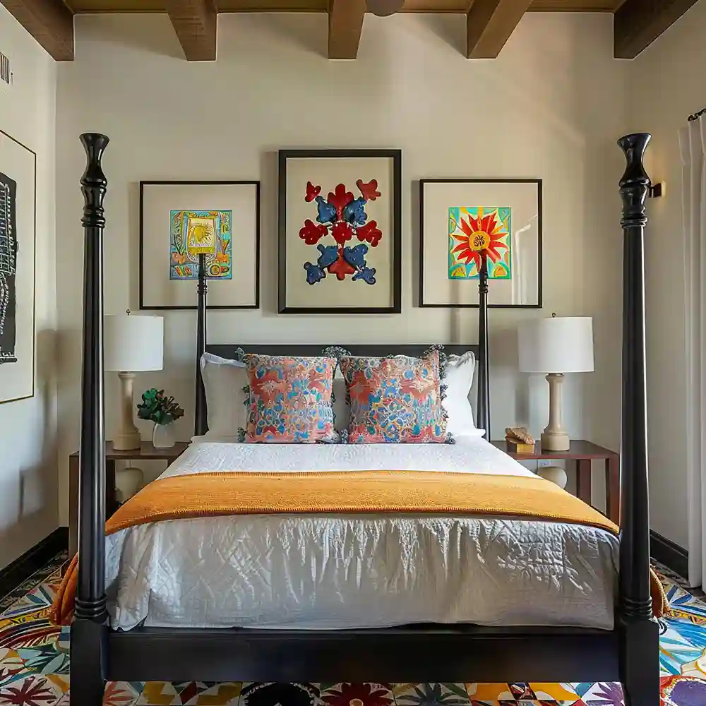
Three failures account for most disappointing walls, and none of them is about spacing.
The first is treating the wall as storage for everything you like. A gallery wall is an edit, not an archive. The instinct to include one more piece because it deserves a place is exactly the instinct that produces a noticeboard, and the cure is to hang the extras elsewhere rather than squeezing them in.
The second is buying a matched frame multipack and then filling it with unrelated images. The frames supply repetition, so the wall looks organised from across the room and falls apart as you approach. This is the most common version of a wall that is technically correct and still unsatisfying — the layout is fine, the collection was never assembled.
The third is scaling everything the same. A wall of nine identical 8 by 10 frames has no entry point, so the eye wanders without landing. One clearly larger anchor piece fixes it, and the anchor does not need to be centred — it works just as well set low and to one side, with the smaller pieces stepping away from it. Above a bed the anchor logic changes again, and our guide to wall decor above the bed handles that wall specifically.
What a Gallery Wall Costs
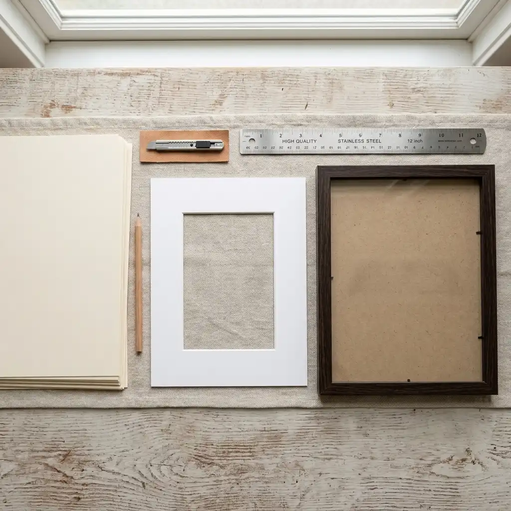
Cost lands almost entirely on framing rather than on art, which surprises most people pricing their first wall.
| Project | Estimated Cost | Impact Level |
|---|---|---|
| Ready-made frames plus your own prints and photos, 7–9 pieces | $90–$250 | Very High |
| Mixed set with two frame finishes and a few larger sizes, 7–9 pieces | $250–$600 | High |
| Custom framing with cut mats, per piece | $120–$400 each | Medium |
At the budget end, a set of ready-made oak or black frames with prints you already have will fill a wall for well under $250. In the middle, spending on two or three larger frames and keeping the rest inexpensive buys most of the finished look. At the premium end, custom framing is worth it for one or two anchor pieces and almost never worth it across a whole wall.
Best First Upgrade: Reframe the three pieces you already like most into one finish. It changes the wall more than adding new art does.
Skip for Now: Custom mats on small pieces. The cost per piece is high and the effect is invisible in a group.
If You Rent, or the Wall Is Small
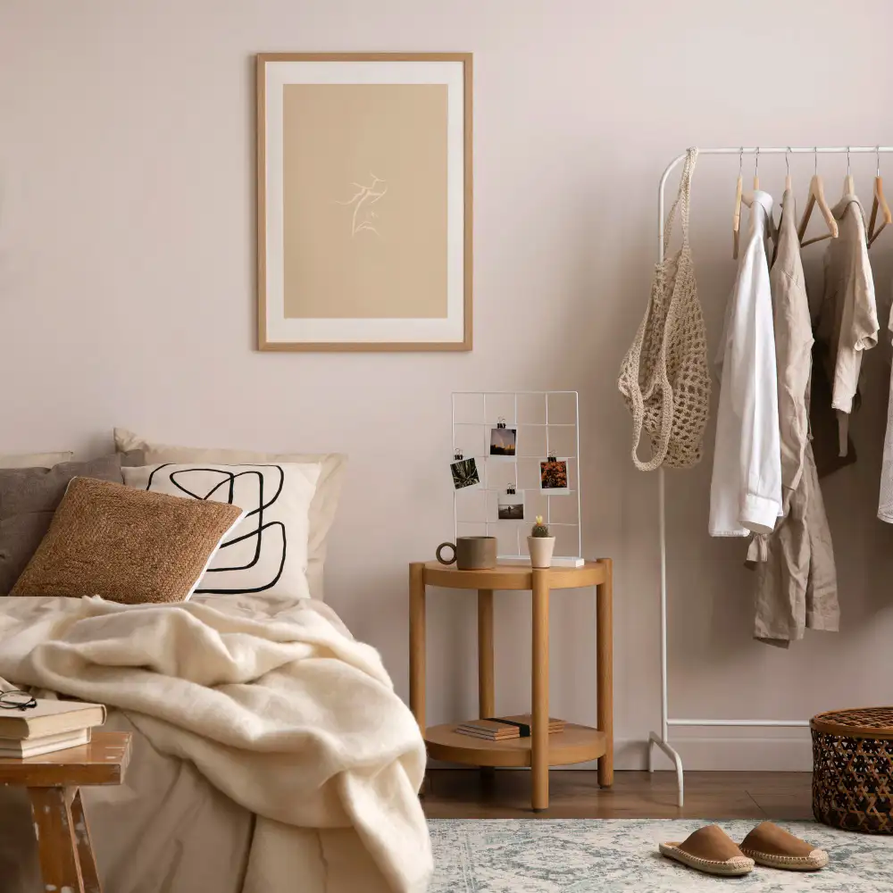
A gallery wall is one of the few large-scale looks that adapts down without losing the point, because the thread does the work rather than the scale.
On a small wall, cut the count rather than the sizes. Three well-matched pieces at generous scale beat seven small ones crammed together, and a narrow wall between two doors often takes a single vertical column of three better than any cluster. If the room is already busy, a tighter grouping with more wall showing around it looks calmer than an edge-to-edge arrangement.
Renting changes the hardware, not the plan. A picture ledge fixed with two anchors holds a whole row of leaning frames, so one install replaces nine holes and the arrangement can change whenever you like. Adhesive strips rated well above the frame’s weight handle lighter pieces, and leaning a large framed piece on a dresser or a run of built-in style shelving removes the question entirely.
Rental Note: Check the weight rating on adhesive hanging strips against the framed weight, not the art alone — glass and a wood frame often triple it.
Gallery Wall Checklist
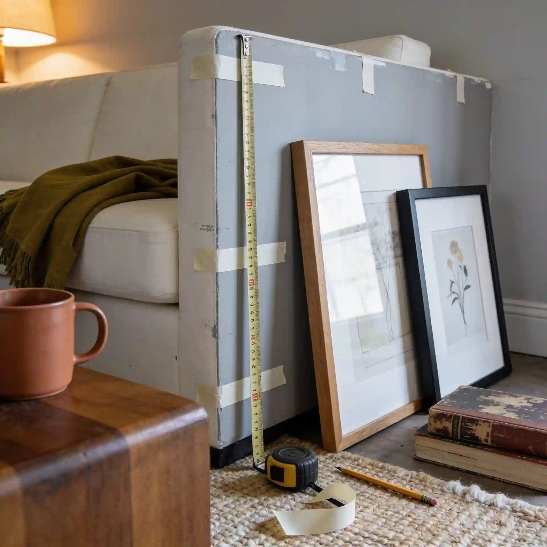
Before you put a single hole in the wall:
- Lay every candidate piece on the floor and photograph it, then view that photo in black and white to check the tonal range.
- Name your thread out loud — subject, tone or material. If you cannot name it, the collection is not ready.
- Count your frame finishes. More than two, and remove the odd ones out.
- Pick one anchor piece that is clearly larger than the rest.
- Set aside anything that fails the squint test and plan a separate home for it.
- Replace any original photograph with a print and store the original away from light.
- Check what the wall gets in direct sun through the day, and keep irreplaceable pieces off the brightest section.
The Bottom Line
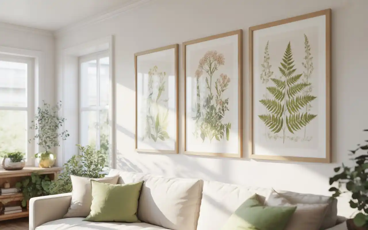
Designer’s Verdict: Gallery walls are not going anywhere, but the version worth copying now is the loose, mixed, content-led one rather than the matched grid. That shift has staying power because it rewards what you actually own instead of what you can buy in a set — and a wall assembled from things with a real connection to you keeps working long after a trend in frame finishes has moved on.
The version to be sceptical of is the full salon wall in a small room. Floor-to-ceiling density is genuinely striking in a stairwell or a tall hallway, and it is overwhelming across from a sofa in a standard living room. Take the looseness and the mixed media. Leave the sheer quantity to the rooms with the height for it.
More ways to work a blank wall sit across our decor and styling ideas, from surface treatments to single statement pieces.
KEY TAKEAWAY: Name the thread before you buy a frame — a collection that shares a subject, a tonal range or a material will look right at almost any spacing, and one that shares nothing will look wrong at every spacing.
Frequently Asked Questions
Conclusion
The layout template was never the thing standing between you and a good wall. Gallery wall ideas succeed or fail on whether the pictures share something — a subject, a tonal range, or a material — and once that thread exists, spacing becomes a detail rather than a rescue operation. Start by laying everything on the floor and naming what connects it, and browse more home decor inspiration when you are ready to plan the rest of the room.