Why Does a Fall Color Palette Look Wrong Once It’s in the Room?
Both of the largest American paint brands named a warm brown-neutral as their 2026 color of the year. Neither picked orange. That gap explains most of the trouble people have with a fall color palette indoors: the palette saved on a phone is built from photographs of leaves, and the room it lands in already has a floor, a sofa, and four walls that were all there in June.
A fall color palette for the home is three colors, not eight. One warm neutral covers the biggest surfaces, one mid-tone earth color carries the textiles, and one saturated accent appears in small doses. Muted wins indoors because wall and upholstery area multiplies whatever saturation you choose. Name the warm neutral your room already owns, then build the other two around it.
Looking for more ideas? Explore our full guide to Cozy Fall Aesthetic.
Editorial field note: A grey-toned living room with a charcoal sofa usually looks worse after a burnt-orange pillow set arrives, not better, because orange fights cool grey instead of warming it. Swapping that same accent to ochre and adding a camel throw settles the room without touching the sofa.
This guide gives you six buildable palettes for interiors, the split that decides how much of each color to use, and a version that needs no paint at all. For color ideas that carry past October, our home decor inspiration covers the rest of the house.
The Three-Color Rule in Practice
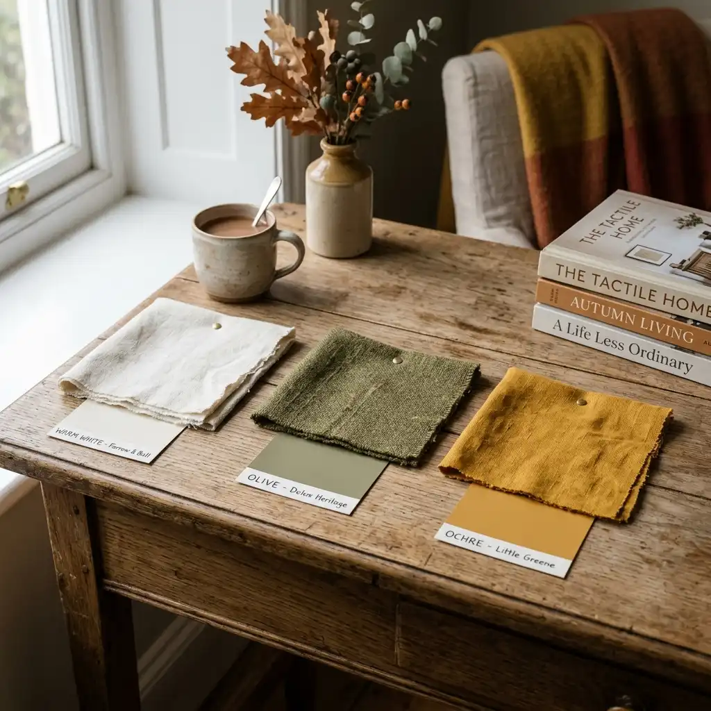
- Name the warm neutral already in the room — floor, sofa, or wall — before choosing anything new.
- Pick one mid-tone earth color for textiles: olive, terracotta, camel, or mushroom.
- Pick one accent and use it in three places only, never four.
- Test paint on the wall you actually plan to change, not on a chip held up to a window.
- Keep every metal in the room to one finish family so the palette stays the loudest thing.
Browse more fall decorating ideas before you commit to a color.
KEY TAKEAWAY: A palette fails from too many colors far more often than from the wrong color.
Why Did Fall Color Move Away From Orange?
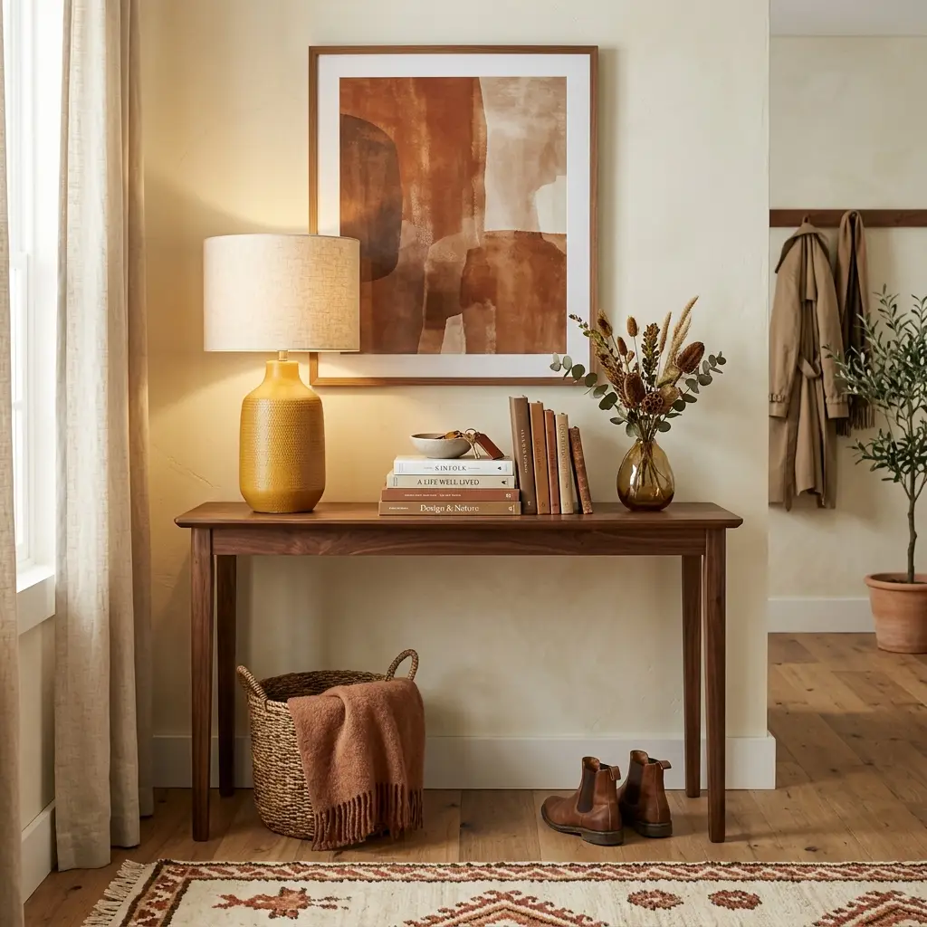
The shift shows up clearest in what the paint companies chose for 2026. Source Note: Benjamin Moore named Silhouette AF-655 its Color of the Year 2026, describing it as “an alluring mix of rich espresso hues with subtle notes of charcoal,” and surrounded it with Swiss Coffee OC-45, Sherwood Tan 1054, Southwest Pottery 048 and Narragansett Green HC-157.
Source Note: Sherwin-Williams picked Universal Khaki SW 6150 for 2026, calling it “an essential neutral selected by our color experts for its beautiful balance of livability and longevity,” backed by Cream and Sugar SW 9507, Limestone SW 9599, Henna Shade SW 6326 and Dark Auburn SW 6034.
Signs This Is Catching On:
- Two competing brands landed on the same family — warm brown and khaki — for the same year.
- Both supporting palettes lean cream, tan, clay and green. Neither includes a bright orange.
- Brown moved from a color people painted over to a color people paint on purpose.
- Store shelves in August now carry cream and blue-grey pumpkins beside the orange ones.
None of this means fall stopped being warm. It means the warmth now comes from brown, clay and ochre instead of from saturated orange. For the year-round version of this same thinking, our bedroom color ideas work through palettes and schemes in one place.
What Separates a Home Palette From a Wedding Palette?
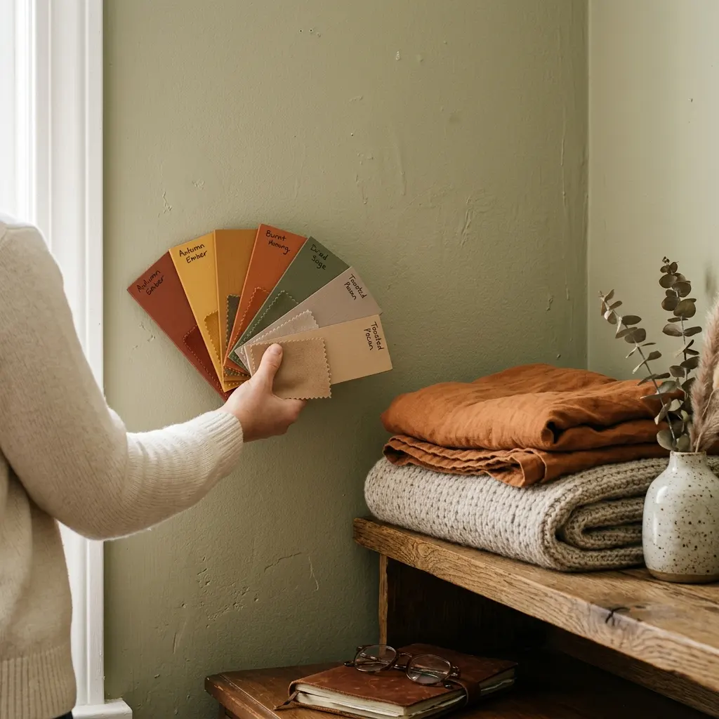
Search almost any fall color combination and half the results are wedding boards. Those palettes are built for a single afternoon, seen mostly against green grass or white linen, and carried by flowers and bridesmaid dresses. A home palette has to survive Tuesday morning under a ceiling light in November.
The practical difference is surface area. A wedding palette can hold five colors because no single one covers much. In a room, the wall alone can be 400 square feet, so a color that looked lively on a small board turns into the loudest thing you own. That is why home palettes cap at three and lean muted.
Exterior color follows different rules again, since a porch palette has to agree with brick, siding and roof color that you cannot change this month. This guide stays indoors. For the broader seasonal picture across the whole house, start with our fall and autumn decor ideas.
Six Fall Color Palettes That Work Inside a Home
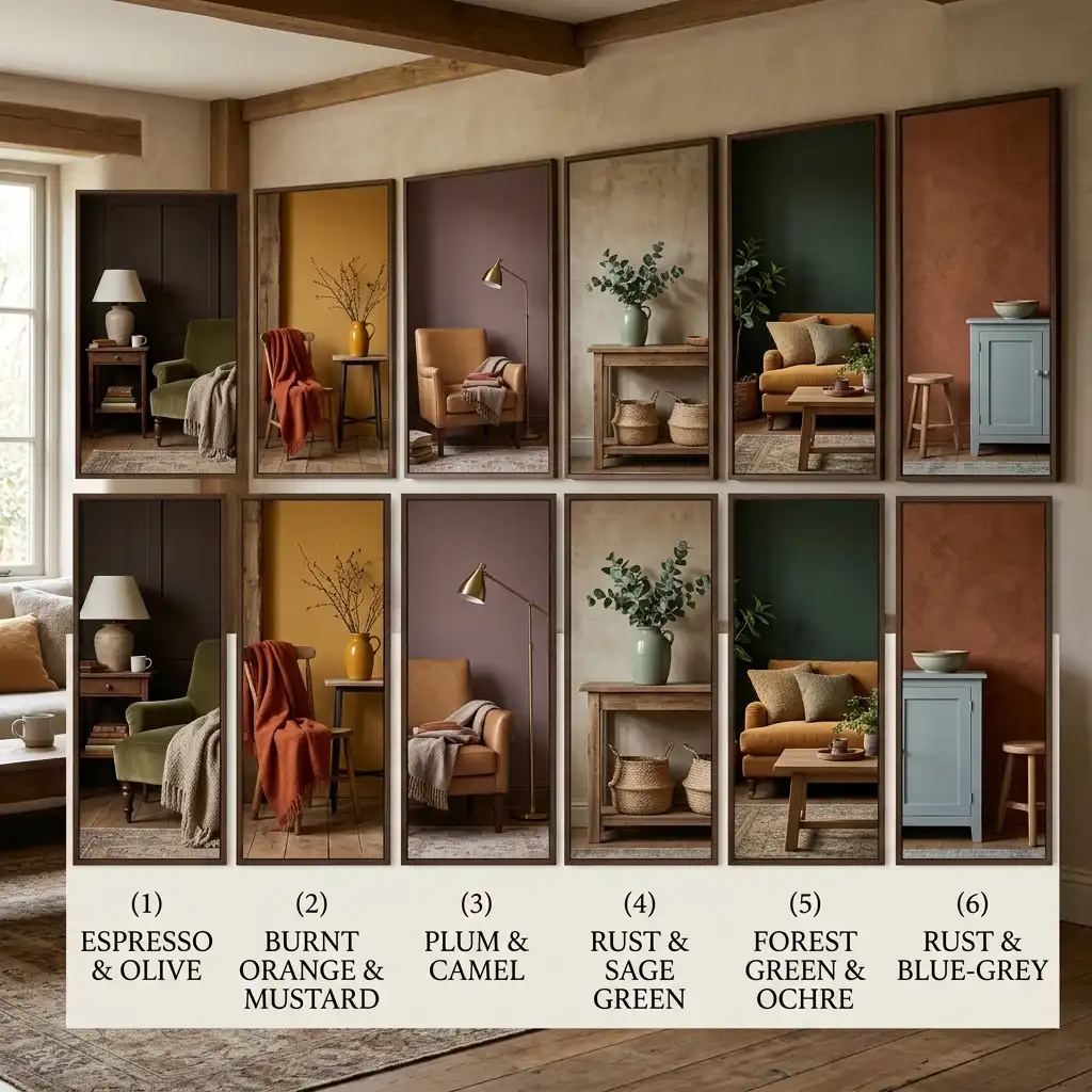
Each palette below lists a dominant neutral, a mid-tone, and an accent. Use them in that order of quantity. Paint codes are starting points, not requirements — the relationship between the three colors matters more than the exact chip.
Espresso, Swiss Coffee and Ochre
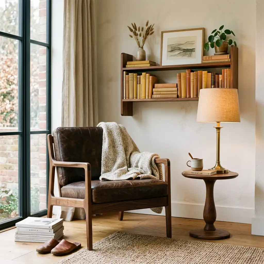
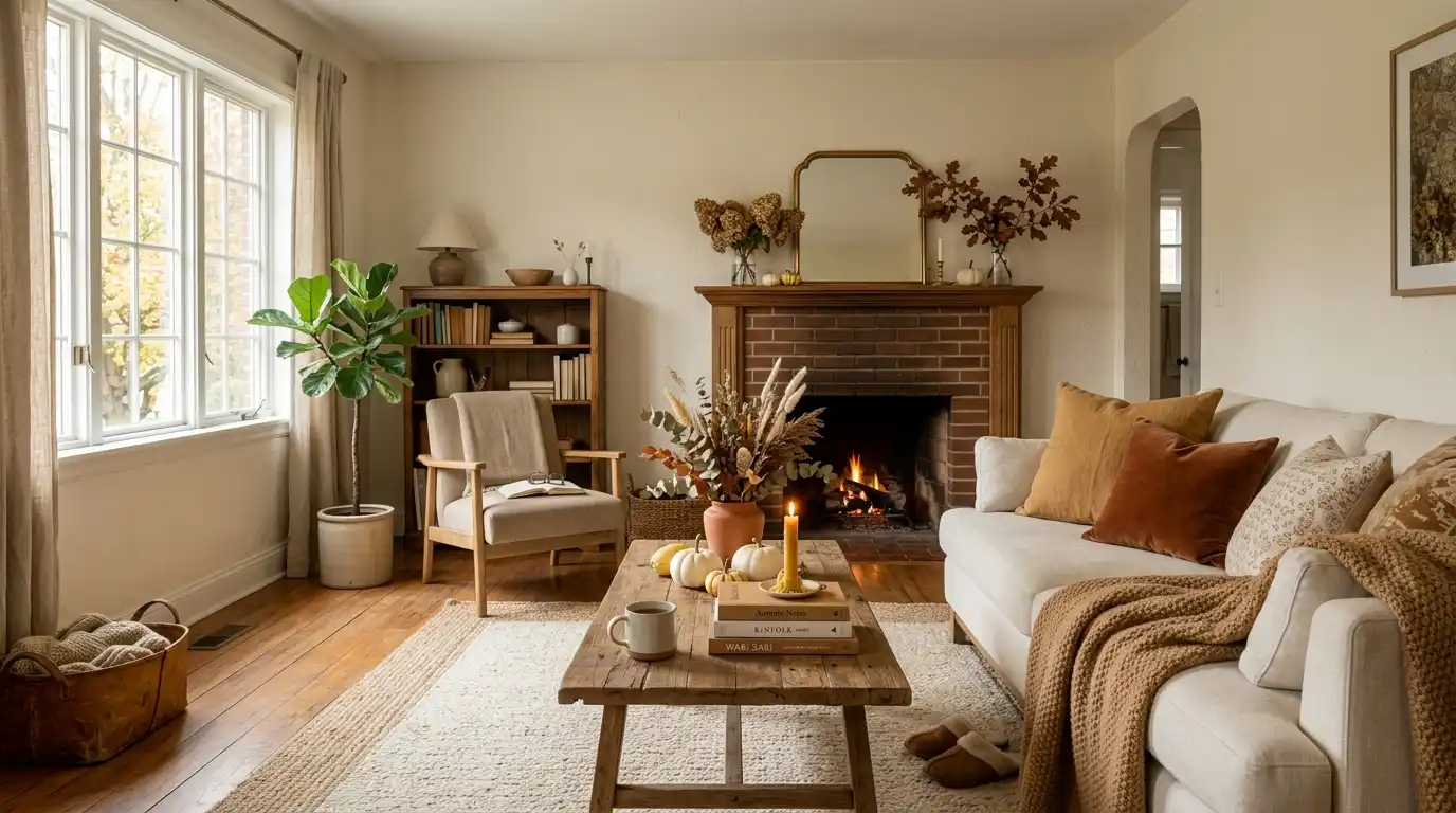
This is the 2026 palette in its purest form. Swiss Coffee OC-45 or any soft warm white takes the walls, espresso brown takes the heavy furniture and one large textile, and ochre appears in a lamp base, a stack of books, and one cushion. Brown works here because it behaves like a neutral at full saturation, so a leather chair or a walnut console can carry 30 percent of the room without shouting. It suits rooms with oak or walnut flooring and plenty of natural light. Our brown and tan bedroom ideas show the same three-part structure in a sleeping space.
Olive, Warm White and Brass
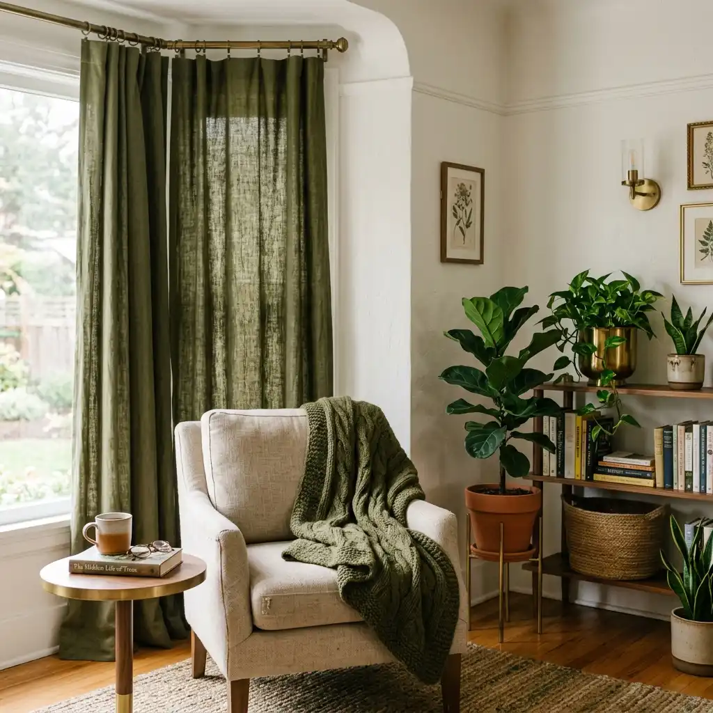
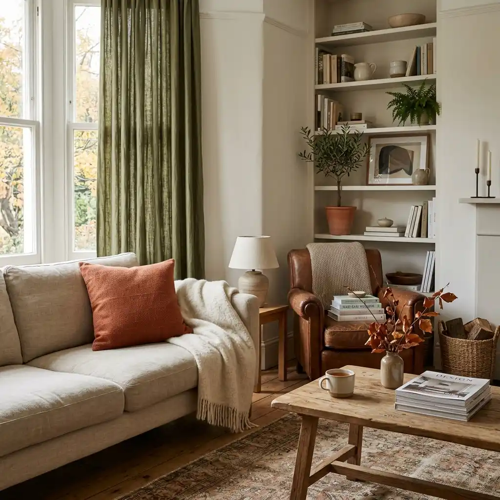
Olive is the fall green that never looks like Christmas. Warm white walls, olive across the largest textile — curtains, a slipcover, or a wool throw over the sofa back — and brass in the hardware, the lamp, and one frame. The palette skews quieter than the brown family and holds through winter without swapping anything. It works especially well in rooms with a lot of greenery already, since live plants read as part of the scheme rather than as clutter. These olive green bedroom ideas use the same warm-white pairing.
Terracotta, Oatmeal and Charcoal
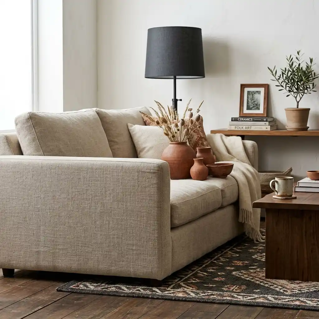
Terracotta is a red-orange clay tone that sits between rust and blush, and it is the closest a muted palette gets to classic autumn. Oatmeal takes the walls and the sofa, terracotta lands on a rug or a pair of ceramic vessels, and charcoal grounds the scheme through a lamp shade, a frame, or a single chair. The charcoal matters — without it, terracotta and oatmeal drift into beige. Try our terracotta decorating ideas for the full range of clay tones.
Khaki, Bone and Dried Wheat
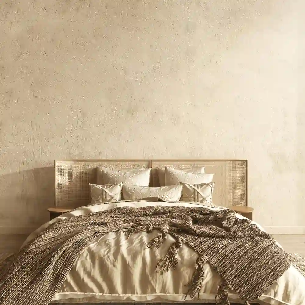
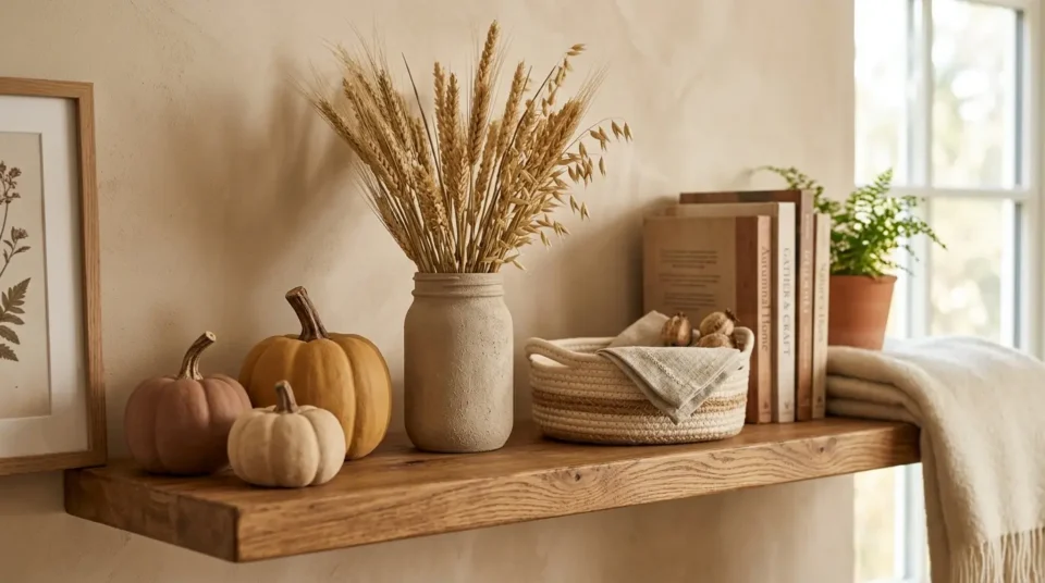
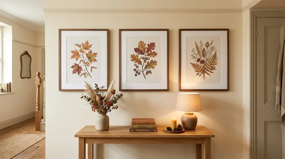
The true neutral fall palette, and the easiest to live with past November. Universal Khaki SW 6150 or a similar midtone khaki on the walls, bone and cream on upholstery and bedding, and dried wheat, pampas or bleached branches as the only decorative color. Nothing here needs replacing in December. This is the palette to choose if you repaint rarely and want the room to look seasonal only through what sits on the surfaces. Our beige and cream ideas cover how to keep this range from going flat.
Burgundy, Camel and Soft Black
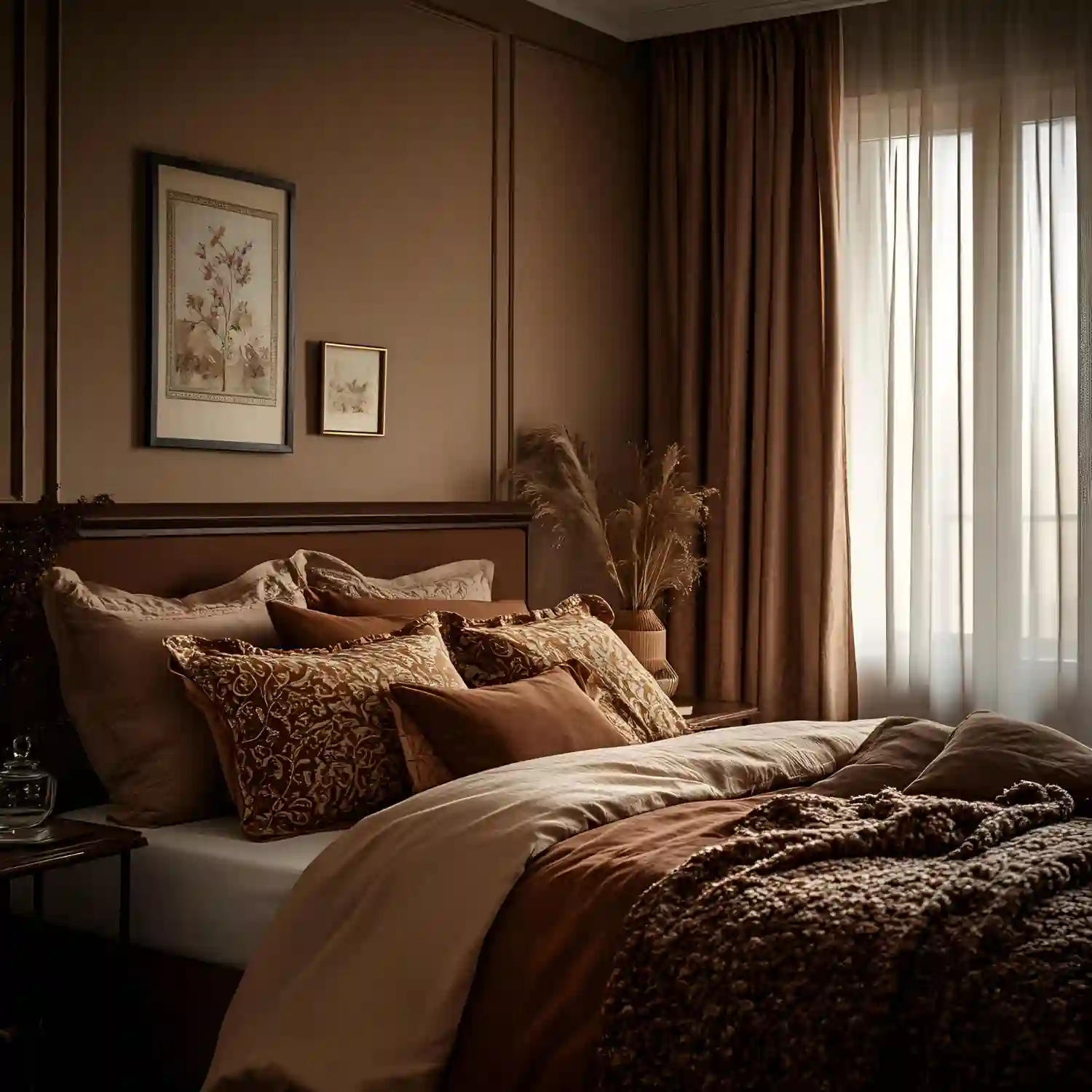
The darkest of the six, and the one people mistake for a Halloween scheme. It is not — the black here is a soft charcoal-black used on a frame or a lamp base, never paired with bright orange. Camel takes the largest soft surface, burgundy appears in a velvet cushion, a throw, or one upholstered chair, and soft black outlines the room in small doses. It suits north-facing rooms that already feel dim, because leaning into the darkness works better than fighting it with pale paint. Our two-color combinations guide explains why pairs like this hold together.
Rust, Blue-Grey and Cream
The unexpected one, and the fix for rooms that already lean cool. Cream on the walls, blue-grey across a sofa or a rug, and rust in three small places. Blue-grey and rust sit opposite each other on the color wheel, so a small amount of rust makes the blue look richer instead of colder. If your floors are grey or your existing sofa is slate, this is the palette that stops you from repainting the whole room. Heirloom pumpkins in that same blue-grey tone tie the scheme together without adding a fourth color.
How Do You Split Three Colors Across One Room?
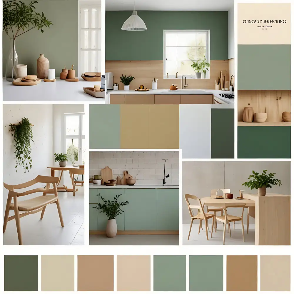
Use roughly 60 percent dominant neutral, 30 percent mid-tone, and 10 percent accent, measured by how much of the room you can see at once — not by object count. Walls, large rugs and the sofa make up the 60. Curtains, bedding, a second chair and a large throw make up the 30. Everything in the accent color together should fit inside that final 10 percent.
Designer Rule of Thumb: If the accent color appears in more than three separate places in one room, it has stopped being an accent and become a second mid-tone. Remove one.
Light reflectance value, or LRV, is a 0-to-100 scale of how much light a paint color bounces back, printed on the back of most fan-deck chips. It is worth checking before you buy, because two colors with different names can share an LRV and behave the same way on a wall. Keep the dominant neutral above about 55 in a room with one window, and let the mid-tone sit anywhere below it. Our fall bedroom refresh ideas apply the same ratio to a smaller room.
Can You Get the Palette Without Painting?
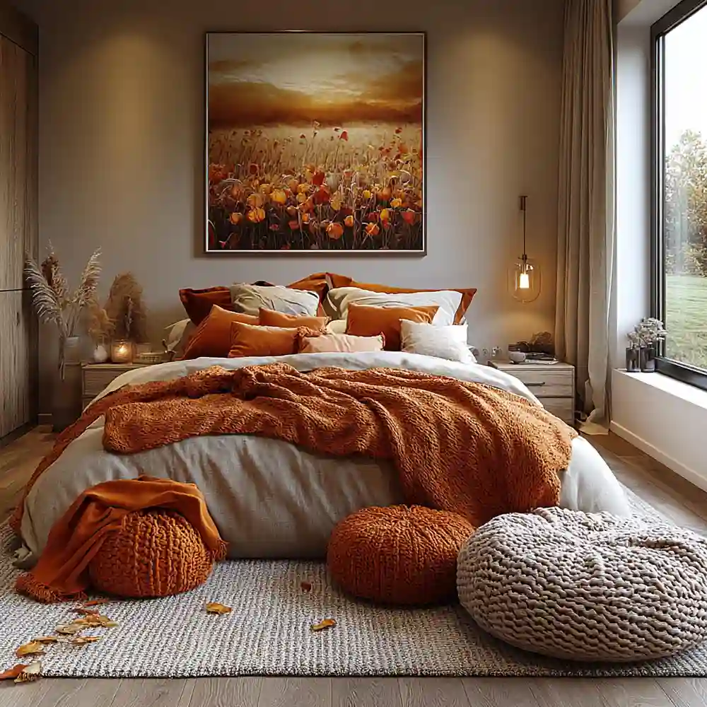
Yes. A fall color palette can run entirely on textiles, and in a rental that is usually the smarter version. Treat the existing wall color as your 60 percent, whatever it is, then buy the 30 and the 10.
Three purchases cover it: one large soft surface in the mid-tone, two cushion covers in the same tone, and one small group of objects in the accent. A washable wool-blend throw over the sofa back, two linen cushion covers, and a stoneware vase with dried stems will shift a beige rental room into the khaki palette in an afternoon.
Rental Note: Cushion covers, throws and curtain panels change a room’s color without a single hole in the wall, and they pack flat when the lease ends. Material Note: Undyed and low-dye natural fibres like linen and jute hold warm tones well but fade faster in direct sun than solution-dyed acrylic, so keep the accent color off a south-facing window seat. For more ways to layer texture into the same palette, browse our cozy decor ideas.
Which Palette Fits the Room You Already Own?
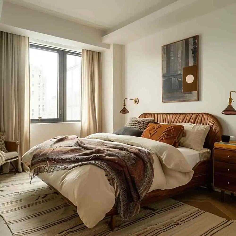
Start from the two things you are not replacing this year: the floor and the largest piece of upholstery. Warm oak or walnut floors pair naturally with the espresso, olive and terracotta palettes. Grey or cool-toned floors do better with rust and blue-grey, or with khaki and bone. A charcoal or navy sofa points toward burgundy and camel, since both warm a dark base without asking it to change.
White-box rentals are the easy case. Any of the six will work, so choose by how much light the room gets: the pale palettes for north-facing rooms with one window, the darker two for rooms you mostly use after dark. Rooms built around natural materials handle the earth tones best, which our organic modern living room ideas show in detail.
Five Palette Habits Worth Dropping This Fall
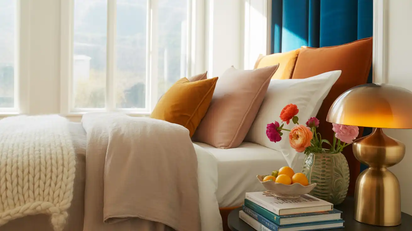
Instead of pulling eight colors off a leaf photograph, Try picking the two warmest tones in that photo and ignoring the rest.
Instead of buying the accent color first because it is the fun one, Try locking the dominant neutral first — it covers the most surface and the other two have to live with it.
Instead of matching orange decor to an orange-toned wood floor, Try letting the floor be the warm tone and choosing a cooler mid-tone like olive or blue-grey above it.
Instead of testing paint on a chip by the window, Try painting a two-foot square on the wall you plan to change and looking at it after dark, when most of the season is spent.
Instead of swapping the whole scheme again in December, Try choosing a palette whose neutral and mid-tone stay put and changing only the 10 percent accent.
Price by How Far You Take It

Most of a fall palette can be done for under $100, and the parts that cost more are the parts you keep for years. Peel-and-stick samples are the cheapest insurance against a repaint you regret.
| Project | Estimated Cost | Impact Level |
|---|---|---|
| Three peel-and-stick paint samples | $12-$25 | Medium |
| Dried stems, one stoneware vessel and two candles in the accent | $35-$80 | Medium |
| Two cushion covers plus one wool-blend throw in the mid-tone | $45-$110 | High |
| One gallon of the dominant neutral plus roller, tray and tape | $60-$120 | Very High |
| Full palette change including an area rug in the mid-tone | $280-$700 | Very High |
Best First Upgrade: The cushion-and-throw pair in the mid-tone. It shows you whether the palette works in your light before you open a paint can.
Skip for Now: The area rug. It is the single most expensive way to test a color you may not keep.
Seasonal palettes overlap more than people expect, so browse all our seasonal decor inspiration before treating fall as a standalone purchase.
The Pick
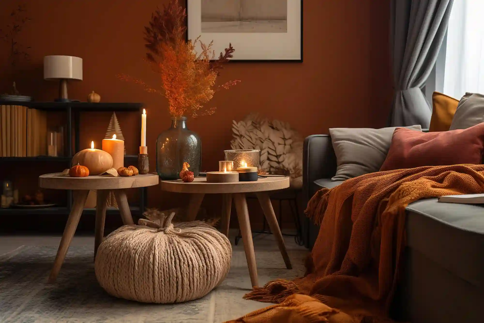
Designer’s Verdict: Khaki, bone and dried wheat is the palette worth choosing if you only build one. It costs the least to maintain, needs no repaint in December, and shifts into winter by swapping the wheat for evergreen. The espresso palette is the more striking room, but it asks for furniture you already own in brown. When the season turns, our cozy winter decor ideas pick up where the harvest tones leave off.
Frequently Asked Questions
Conclusion
A fall color palette works indoors when it stops trying to copy a photograph of leaves and starts from the neutral your room already owns. Editorial field note: A beige rental living room with no repaint allowed still looks seasonal once a khaki-and-bone scheme takes over the textiles and dried wheat carries the only accent, because the change happens on the surfaces you can see at once. For more ways to bring the season into the rest of the house, visit our home decor inspiration.