TL;DR
- Size first. A sign shorter than 24 inches disappears from the sidewalk, no matter how pretty the lettering is.
- Letter height decides readability. One inch of capital letter height stays readable at roughly 10 feet.
- Fewer words win. One or two words hold up all season; a full sentence starts to grate by week three.
- Six styles are worth your money, and the bare-wood leaner is the one most porches should start with.
The Real Reason a Porch Sign Looks Cheap
One inch of capital letter height stays readable from roughly 10 feet away. Sign makers have worked from that ratio for decades. Almost nobody checks it before buying a porch sign, and it is the quiet reason so many of them fail.
Most people blame the slogan or the swirly font when a sign does not land. If you have moved one to the garage after a single week, the font was probably not the culprit.
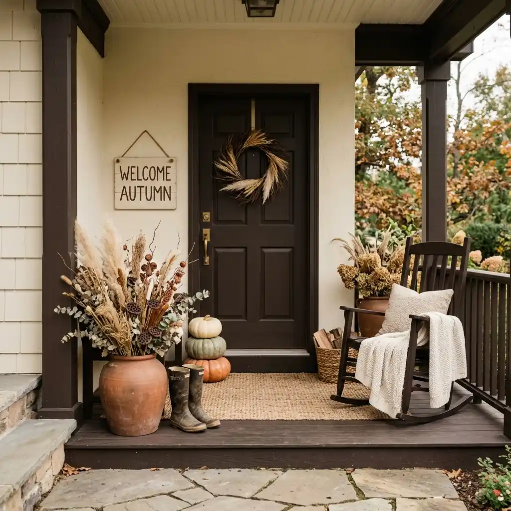
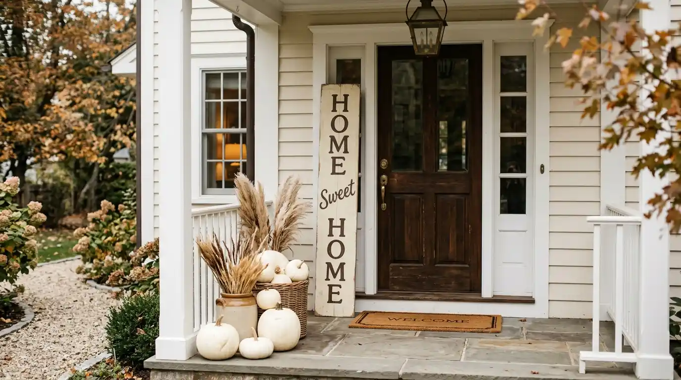
Fall porch signs sold in stores are built to fit a retail shelf, which means they cluster around 12 by 24 inches with lettering near 2 inches tall. That size works on a mantel. On a porch, viewed from a driveway 30 feet away, it shrinks into the doormat. Get both measurements right and even a plain painted board looks like it belongs there.
Looking for more ideas? Explore our full guide to Fall Porch Decor.
Editorial field note: A porch with a good rug, two planters and one small store-bought sign usually looks unfinished at the curb. Swap that sign for a 36-inch board in warm cream and the same porch suddenly has a focal point. Nothing else on the porch changed.
The rest of this guide covers the four things worth checking before you buy or build one: size, lettering, wording and material. Each is a measurement or a material call, not a taste call. If you are starting the porch from scratch, our home decor inspiration shows how seasonal layers stack up across a home. The sign is the last layer to add, never the first. For the wider fall picture on every other surface, this round-up of creative fall and autumn decor ideas is the better starting point.
Fall Porch Sign Checklist
- Measure the wall space beside your door before shopping, not after the sign arrives.
- Choose a sign at least 24 inches tall for a standard 36-by-80-inch entry door.
- Keep capital letters 3 inches or taller so the sign reads from the front walk.
- Cap the wording at two words, or skip words entirely.
- Pick warm cream, muted clay, olive or espresso over bright pumpkin orange.
- Seal any bare wood on all six sides, including the back and the cut edges.

KEY TAKEAWAY: Size and letter height decide whether a fall porch sign works; the wording and the styling are secondary.
Why Are Fall Porch Signs Getting Quieter This Year?
Fall porch signs have shifted away from bright orange and curly script toward muted, low-word designs in warm neutrals. The look now borrows from the palette the paint brands are pushing: deep browns, warm creams and soft clay instead of the harvest orange that dominated a decade of porch decor.
Benjamin Moore named Silhouette AF-655 its Color of the Year 2026, describing it as “an alluring mix of rich espresso hues with subtle notes of charcoal” and pointing to “the growing interest in the brown color family.” A sign painted in that range sits comfortably next to real dried stems and unpainted pumpkins. A sign in bright orange fights with them.
Signs This Is Catching On:
- Independent makers now sell more single-word boards than full-sentence pallet signs.
- Big-box seasonal ranges have added cream, clay and black colorways beside the orange ones.
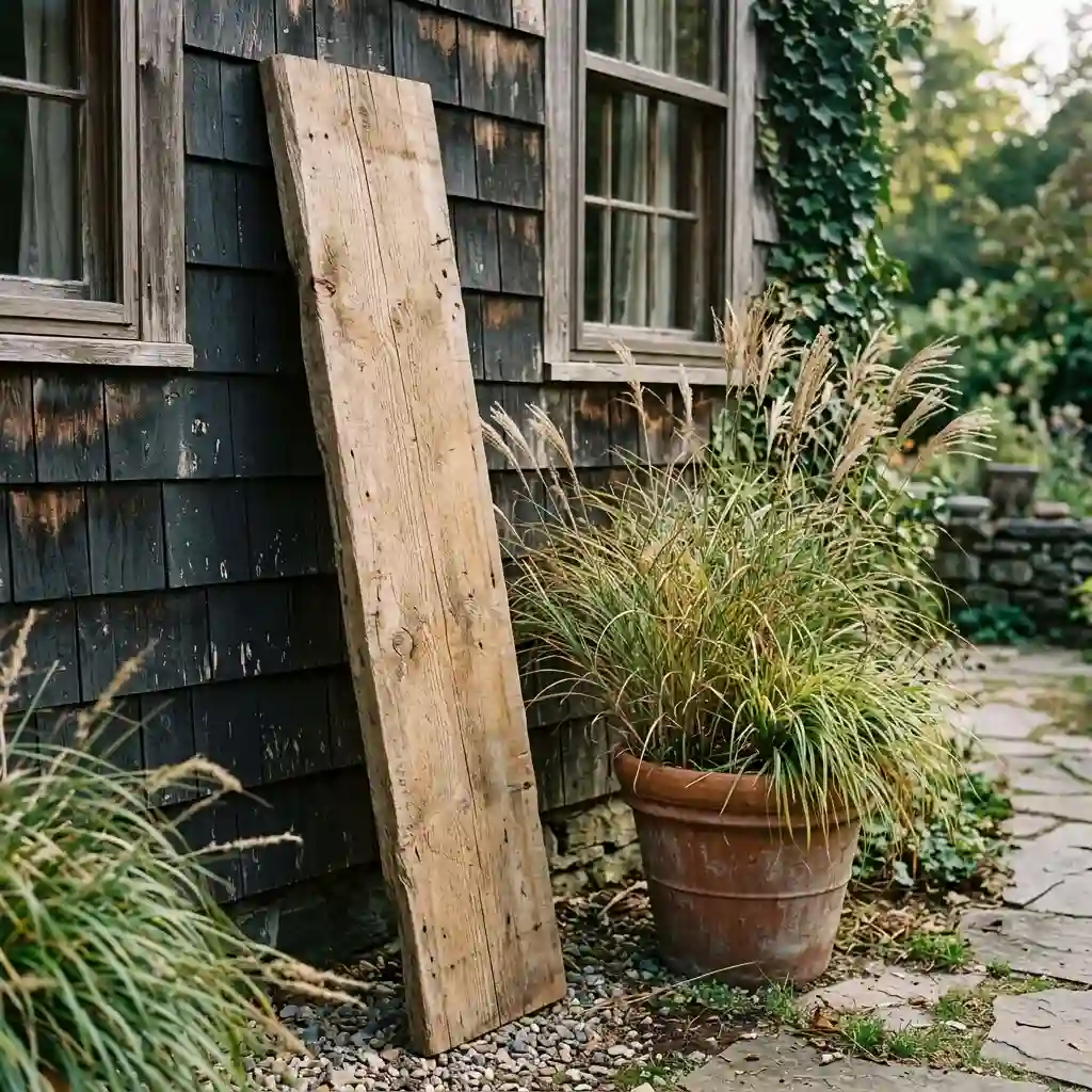
- Porch photos trending each September lean on bare wood, dried grasses and one small word.
- Script fonts are giving ground to plain serif and stencil lettering, which stays legible at distance.
There is a second reason for the shift, and it is practical. Muted signs stay up longer. A cream board with one word works from late August through Thanksgiving, while an orange sign covered in pumpkins has a short window. For more on how the wider porch layers stack up across the season, browse all our fall decorating ideas.
Which Fall Porch Sign Styles Actually Hold Up?
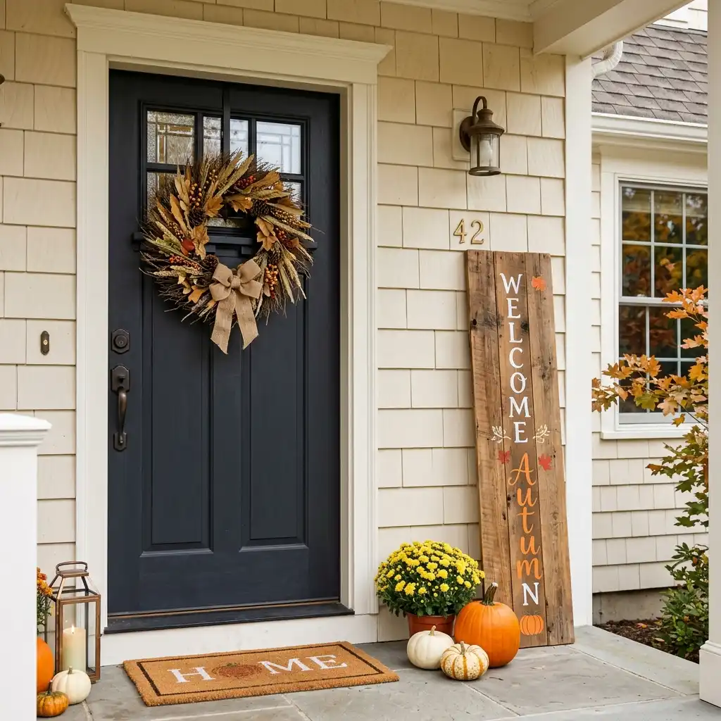
Six styles cover almost every porch. They differ in cost, weather tolerance and how much attention they pull.
The Bare-Wood Leaner
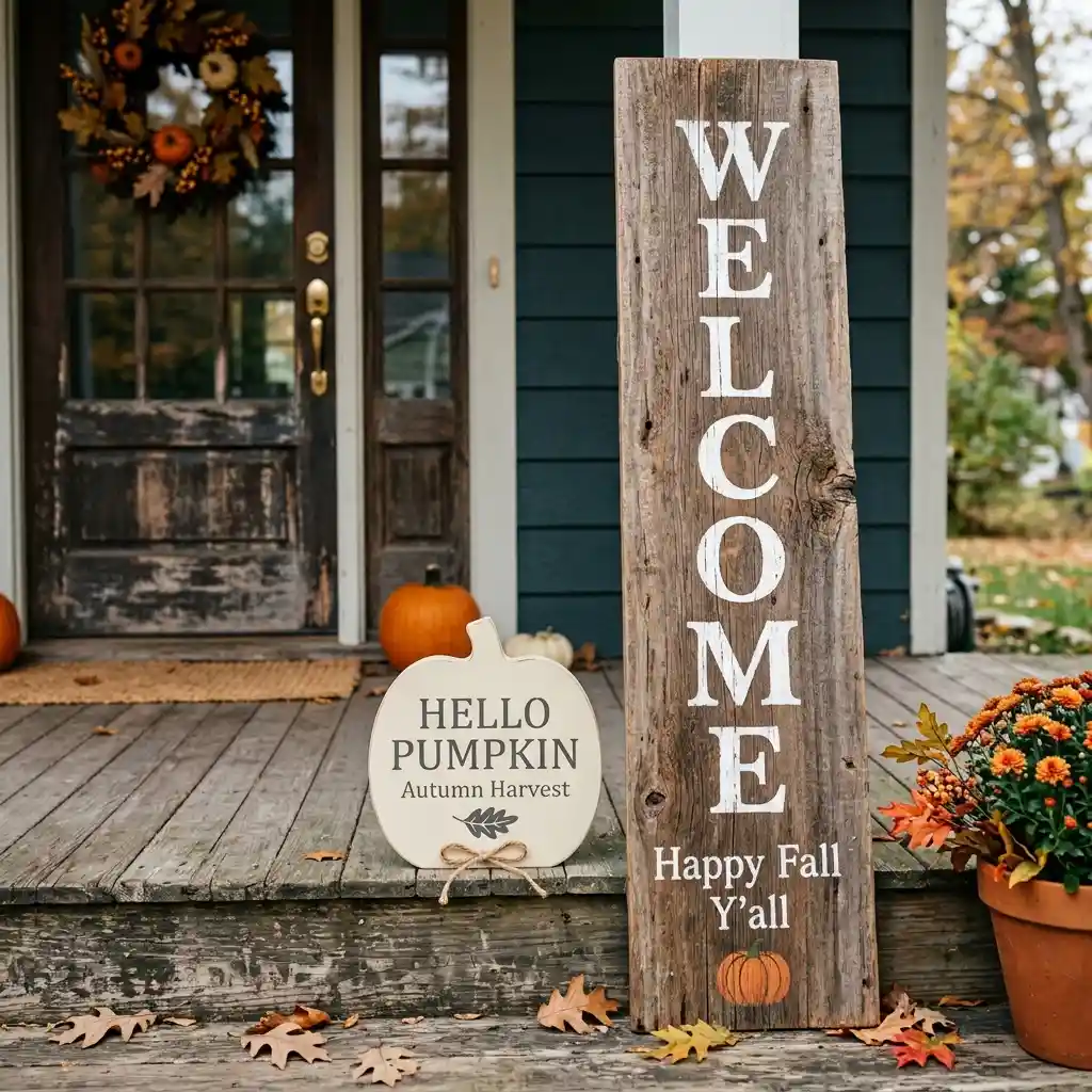
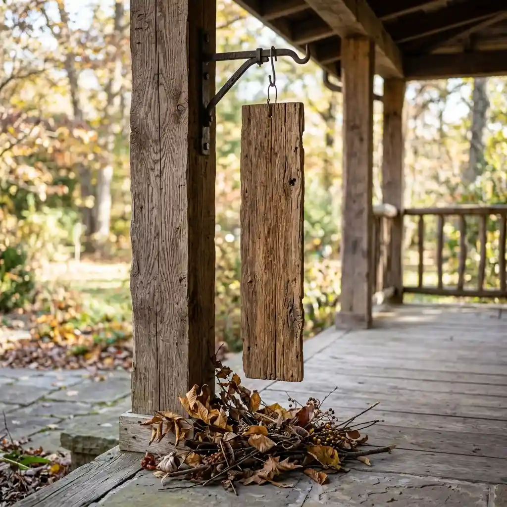
A bare-wood leaner is a plank of pine, oak or poplar, 24 to 40 inches tall, propped against the house wall beside the door. Lettering is optional. The wood grain does most of the work, and the height is what makes it read from the street. This is the style most porches should start with, because it costs the least and dates the slowest.
Lean it at a shallow angle so the top edge touches the siding. A steeper lean catches wind and topples. If your porch is exposed, run a short screw through a discreet corner into the trim, or set a planter against the base.
The One-Word Painted Board
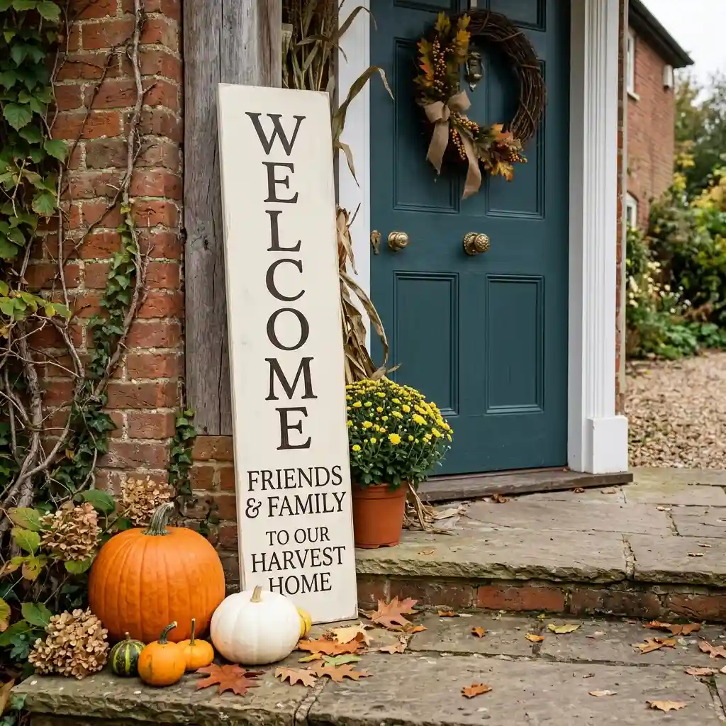
A one-word painted board carries a single word in tall block or serif letters: Gather, Harvest, Welcome, or your house number. The word matters far less than the letter height. At 4 inches tall, capital letters stay readable at roughly 40 feet, which covers most front walks.
Paint the board in warm cream or muted clay and the letters in espresso or matte black. Avoid the reverse. Dark boards with cream lettering look sharp in a product photo but swallow light on a north-facing porch.
The Vertical Hanging Plank
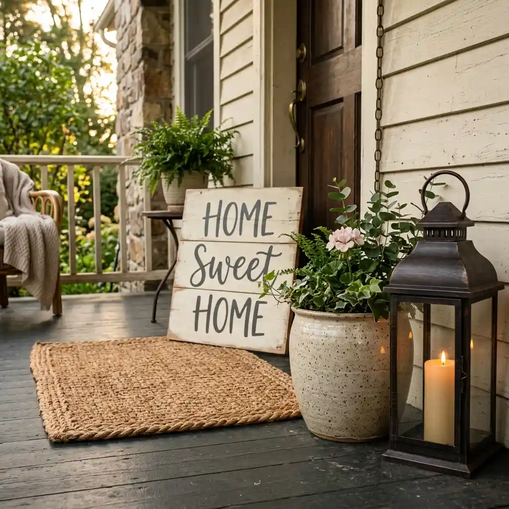
A vertical hanging plank runs 8 to 12 inches wide and 30 to 48 inches tall, hung from a bracket or an existing shutter. It suits narrow porches where floor space is already taken by planters and a bench. The vertical shape also flatters columns, which read as vertical lines themselves.
Hang it with outdoor-rated hardware and check it after the first storm. A plank swinging free will mark the siding within a week.
The Slate or Chalkboard Panel
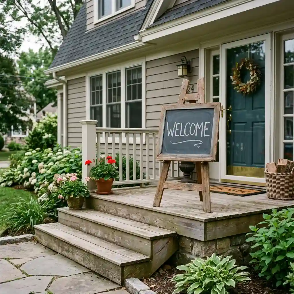
A slate or chalkboard panel gives you a sign you can rewrite. Change the word from Hello in September to Thankful in November without buying anything new. Framed slate panels usually run 18 by 24 inches to 24 by 36 inches, and they sit well on a simple easel beside the steps.
Material Note: Chalk marker holds up far better than stick chalk outdoors, but rain will still soften the edges of the lettering over a few weeks.
The Framed Print Under Glass
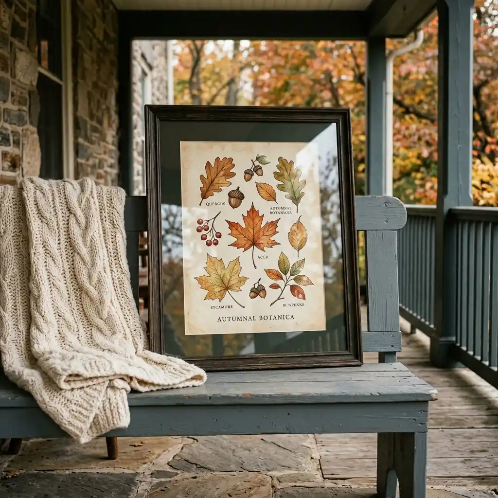
A framed print under glass is the cheapest way to get a polished sign, since the artwork can be a downloaded print in a thrifted frame. It belongs on covered porches only. Glass and moisture do not get along, and condensation will fog the print within one wet week. If you have a covered or screened entry, these enclosed porch ideas show what else that shelter makes possible.
The Wordless Sign
A wordless sign carries a shape rather than a slogan: an oversized house number, a painted leaf silhouette, a plain arched board in muted clay. It is the most forgiving option, because nothing about it can feel corny in year three. Pair it with a wreath and the door looks complete. Our guide to a spring wreath for front door ideas covers the same sizing logic in the opposite season.
DESIGNER TIP: Buy or build the sign in the same wood tone as one other porch item – the bench, the planter box or the doormat binding. Two matching tones make a porch look planned; five competing tones make it look collected by accident.
How Big Should a Fall Porch Sign Be?
A fall porch sign should stand at least 24 inches tall for a standard entry door, and 30 to 40 inches tall if the sign sits alone with no bench or planter beside it. Standard exterior doors in US homes typically run 36 inches wide by 80 inches tall, with 30-inch and 32-inch widths also common, so a 24-inch sign covers roughly a third of the door height. Anything shorter loses the fight against the door.
Letter height is the second measurement, and it does the real work. Sign makers price and cut from a simple ratio: one inch of capital letter height gives roughly 10 feet of readable distance in good light. Three-inch letters read at about 30 feet. Two-inch letters, which is what most store-bought signs carry, stop working past 20 feet.
So measure the distance from your front walk to the door. A 25-foot walk needs letters of about 3 inches. A long driveway approach needs 5 or 6. That single measurement rules out most of the seasonal aisle.
Porch architecture changes the answer too. A deep covered porch with columns carries a much taller board than a shallow concrete stoop does. These modern front porch ideas show how the structure itself sets the ceiling on scale.
Designer Rule of Thumb: Make the sign roughly two-thirds the width of whatever it leans against – the wall panel, the column base or the bench back. Signs that span the full width look wedged in.
Where Should a Porch Sign Sit?
A porch sign belongs beside the door, not on it. The door already has a job, and that job is the wreath. Two decorated surfaces facing the street cancel each other out, and the visitor’s eye has nowhere to rest.
Four placements work reliably. Lean the sign flat against the house wall on the hinge side of the door. Set it on the top step against the riser, where it catches light from below. Prop it against a large planter so the two pieces read as one group. Or hang it on a shutter or column bracket if floor space is short.
Keep the base of the sign clear of the walking path. A 36-inch board sticking into a 42-inch porch walkway becomes a trip hazard in the dark, and October evenings get dark early. The beside-the-door position works indoors as well, which our spring entryway decor ideas apply to a hallway console.
If the sign is going onto a porch you have not styled yet, work the floor and door layers first. A rug, a doormat and two planters give the sign something to belong to. These 21 front porch decor ideas cover that year-round base.
Seasonal porches follow the same placement map. Only the plants and the palette change between September and April. Our spring front porch decor ideas put the same sign position to work in the opposite season.
How to Make a Fall Porch Sign in One Afternoon
A DIY fall porch sign costs $20 to $40 in materials and takes an afternoon plus drying time. It also fixes the size problem, because you choose the board instead of accepting a shelf-sized one. No saw is needed if you buy a pre-cut panel. It is one of the easier projects in our roundup of DIY fall decor worth making.
- Buy a pre-cut pine or poplar panel, roughly 16 by 30 inches or 20 by 36 inches. Most home centers cut to size at the counter if you prefer a custom shape.
- Sand the face and all four edges with 120-grit, then 220-grit. Wipe the dust off with a slightly damp cloth and let it dry fully.
- Paint the face in warm cream, muted clay or olive. Two thin coats beat one thick one. Leave the back bare only if the sign will live under cover.
- Add lettering with a large adhesive stencil, not freehand. Keep capitals at 3 inches or taller, and stop at one or two words.
- Seal every surface, including the back and the cut edges, which is where water gets in first.
Material Note: Minwax states that its Helmsman Spar Urethane “contains UV blockers to reduce the sun’s graying and fading effects” and recommends three coats for exterior or previously unfinished wood. The same page warns that “no clear exterior finish will permanently protect wood against direct sun, snow, ice and rain,” so plan to check the finish each year and recoat when it dulls.
Safety Note: Secure any sign over 30 inches tall against wind with a screw into trim or a weighted planter at the base, and leave power-tool cutting to someone experienced with the tool.
Rental Note: Skip screws entirely if you rent. A leaned board behind a heavy planter holds fine in normal weather and leaves no marks.
If you enjoy this kind of build, our wall hanging craft ideas use the same board-and-sealer approach for indoor pieces. Reclaimed timber works for both, and an old fence picket makes a better leaner than a fresh panel. For more of that salvage-first thinking, these spring upcycling crafts are worth a look.
Sign Mistakes That Cheapen a Porch
Buying the shelf size is the first and costliest error. A 12-by-24-inch board is priced to sell, not sized to a porch, and it will read as clutter next to a full-height door. Start at 24 inches tall and go up from there.
Fitting a whole sentence onto one board forces the lettering small. Every extra word steals height from the letters, and height is the only thing that carries the message to the sidewalk. Cut the wording to one or two words and let the letters grow.
Curly script blurs past about 15 feet, which is roughly halfway down most front walks. The loops that look charming at arm’s length turn into a grey smudge from the car. Plain serif or stencil capitals at 3 inches or taller stay legible the whole way in.
Putting the sign on the door beside the wreath splits the focus. Two decorated surfaces on the same plane cancel each other out and the entry reads as busy rather than welcoming. Lean the sign on the wall and let the door keep one job.
Leaving the back and cut edges unsealed is the failure that shows up in November, not October. Water enters through end grain first, so an unsealed bottom edge swells and splits long before the painted face ever fades. Seal all six sides.
Cost by Sign Type
Porch signs span a wide price range, and the cheapest option is rarely the best value once size is factored in.
| Project | Estimated Cost | Impact Level |
|---|---|---|
| Store-bought printed board, 12 by 24 inches | $15-$30 | Low |
| DIY painted panel, 20 by 36 inches, sealed | $20-$40 | High |
| Framed slate or chalkboard panel with easel | $35-$70 | Medium |
| Made-to-order wood sign from an independent maker | $90-$220 | Very High |
At the budget end, a $20 pre-cut pine panel with a stencil and sealer outperforms a $28 store-bought sign purely on size. In the middle, a $60 slate panel earns its keep because you rewrite it for Thanksgiving instead of buying a second sign. At the premium end, a $180 made-to-order oak board in a custom size is the only route to a piece scaled exactly to your door, and it will still look right in five years.
Whichever tier you pick, the sign is one line in a wider seasonal budget. The same warm-neutral palette costs almost nothing to carry indoors, and these fall bedroom refresh ideas put it on bedding and lamps instead of boards.
Best First Upgrade: A larger board in a warm neutral – size is the single change that moves a porch furthest.
Skip for Now: Sets of small coordinating signs. They scatter attention and none of them read from the street.
The Pick
Designer’s Verdict: The bare-wood leaner wins on staying power. It costs the least, works from late August through Thanksgiving, and carries no slogan to get tired of – which means it survives the trend cycle that eats every painted phrase within about three seasons.
The muted palette behind this shift looks durable too, because it is tied to the wider move toward brown and warm neutrals rather than to fall itself. A cream or espresso sign still looks right on a winter porch. Compare that with our cozy winter front porch decor ideas and the same board carries straight through December, while an orange one comes down the day after Thanksgiving.
That carry-over is the real argument for spending on one good board. It earns four months of use instead of six weeks. Our full seasonal decorating archive covers what replaces it once the year turns.
Frequently Asked Questions
Conclusion
Fall porch signs are decided by two measurements almost nobody takes: the height of the board and the height of the letters. If your entry is a shallow stoop with no wall to lean against, hang a narrow 30-inch plank from a column bracket instead and keep the capitals at 3 inches. Once the porch is settled, the rest of our home decor inspiration covers the layers behind the door.
Next Steps
- Measure the distance from your front walk to your door, then divide by 10 to get the minimum capital letter height in inches.
- Measure the clear wall space beside the door and choose a board at least 24 inches tall that fits it.
- Pick one word, one warm neutral, and seal all six sides before the first wet week.