The One You Keep All Season Is Already a Mood Board
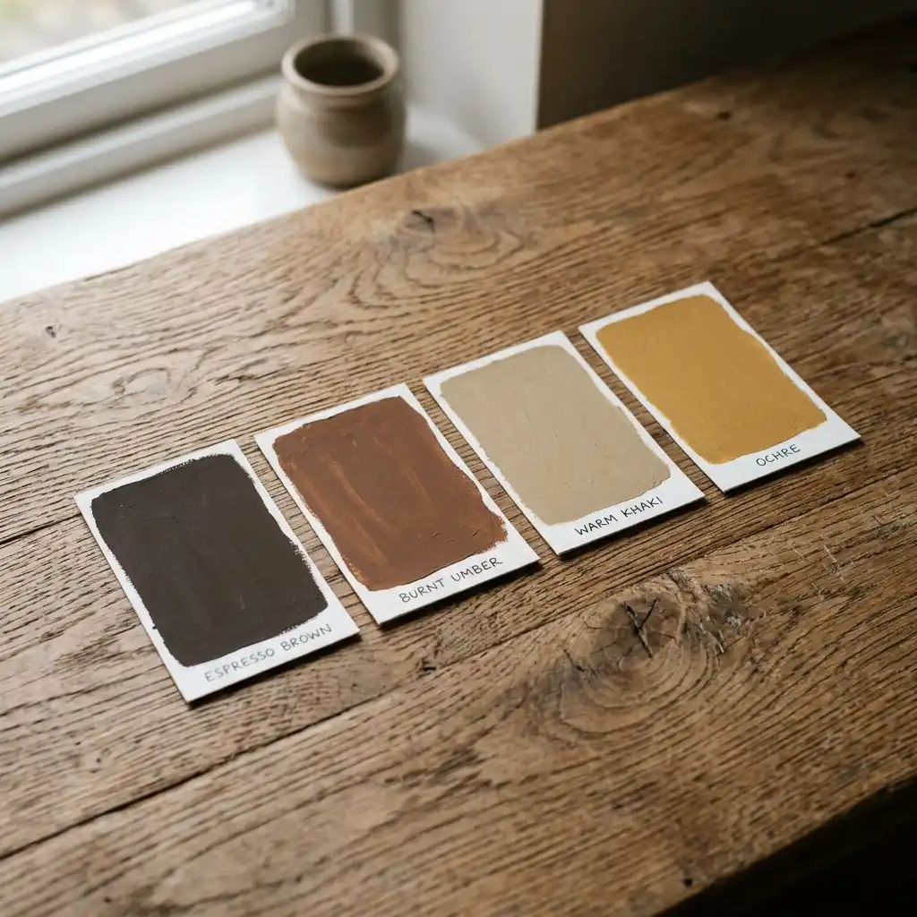
A phone screen in early September tells you what kind of autumn someone wants long before a single pumpkin gets bought. Scroll a fall aesthetic feed this year and the orange is mostly gone. Coffee brown, mushroom, dried ochre and a lot of shadow have taken its place.
Looking for more ideas? Explore our full guide to Fall Ideas.
Fall wallpaper turned brown because the wider color world turned brown first. Benjamin Moore named Silhouette AF-655, a burnt umber with charcoal in it, as its 2026 Color of the Year. Sherwin-Williams named Universal Khaki SW 6150, a mid-tone neutral with a slight yellow undertone. Screens followed paint, not the other way around.
That matters here because a saved background is the cheapest mood board you will ever build. Most people gather one without meaning to. If you are planning a wider seasonal refresh, our creative fall and autumn decor ideas cover the physical side of the same palette. This guide covers the screen side and the bridge between them, and the rest of our home decor inspiration picks up from there. Bookmark this guide for quick reference.
Why Did Fall Wallpaper Turn Brown?
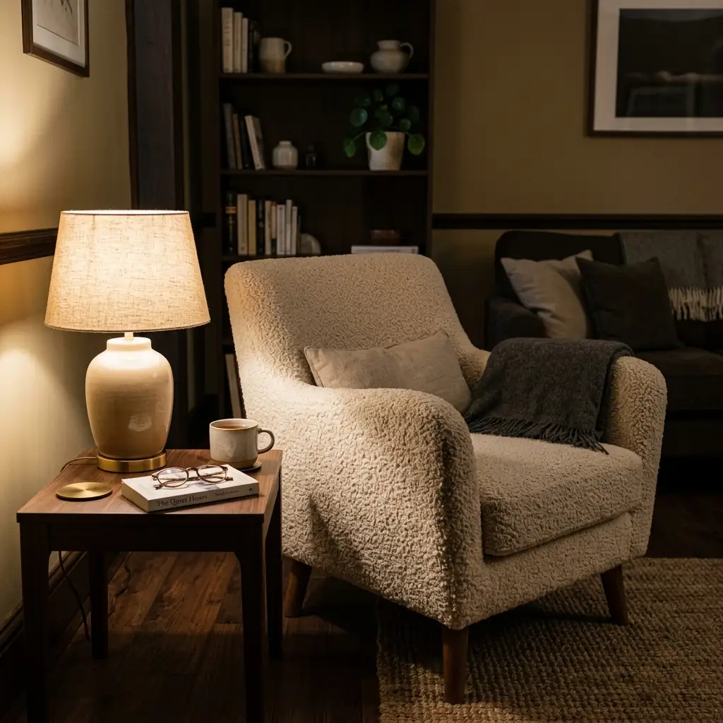
Brown won because the whole idea of autumn shifted from harvest to hibernation. Orange belongs to the harvest version of fall: pumpkins, corn stalks, a bright afternoon. Brown belongs to the indoor version: coffee, wool, a lamp on at four in the afternoon. Searchers have been asking for the second one for three seasons running, and image makers noticed.
Signs This Is Catching On:
- Both major US paint brands landed on warm earth tones for 2026 rather than grey or blue.
- Pantone went the opposite direction with Cloud Dancer 11-4201, a soft white, which leaves midtone brown as the natural partner rather than the competition.
- “Cozy fall aesthetic” and “dark fall aesthetic” now pull more saves than plain pumpkin imagery across seasonal boards.
- Vintage film grain and 1970s ochre keep resurfacing in autumn image sets, and neither reads orange.
Source Note: Benjamin Moore describes Silhouette AF-655 as burnt umber woven with charcoal, which is a browner, moodier pick than any of its recent autumn-adjacent choices.
What Does the New Fall Aesthetic Actually Look Like?
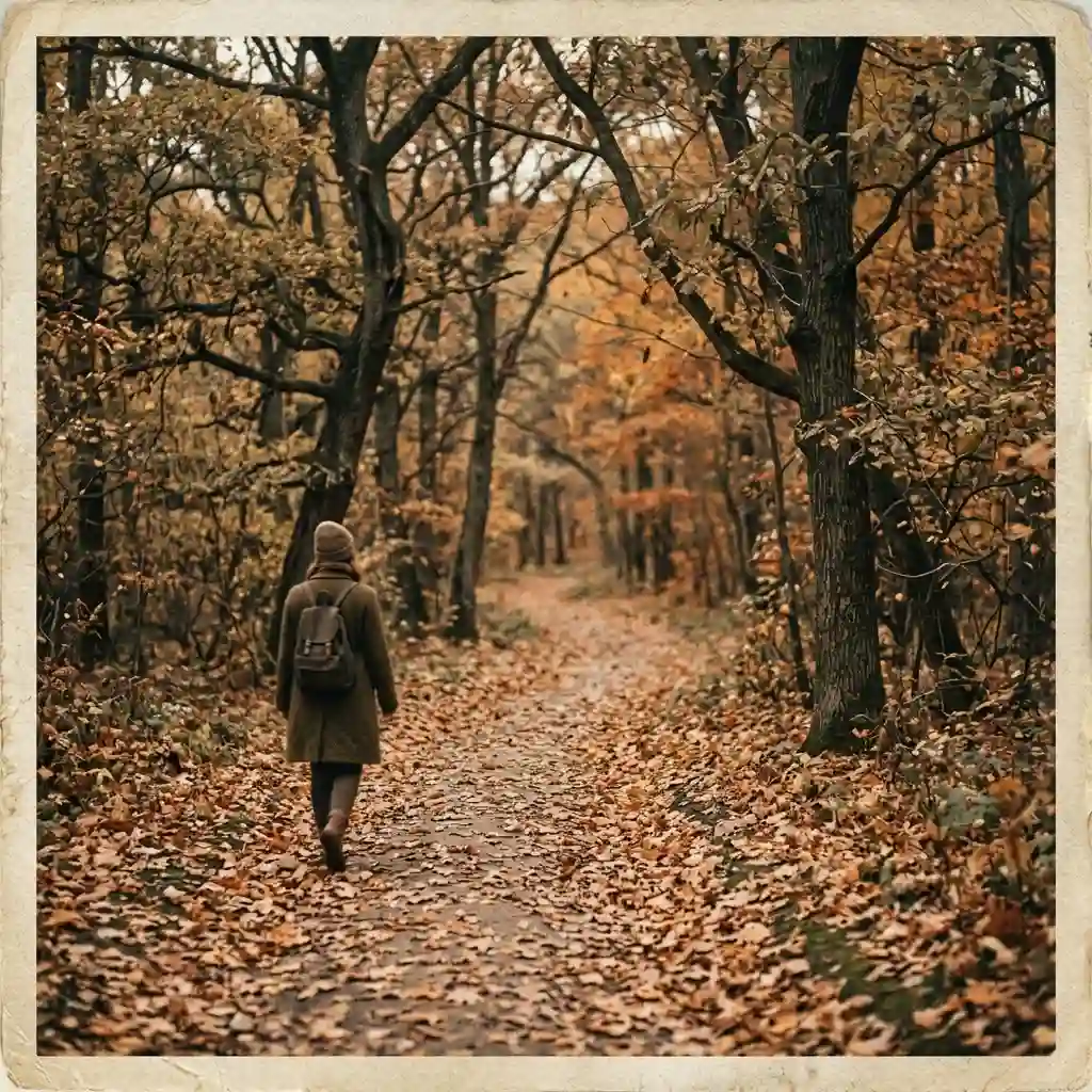
The new autumn look is quieter, darker and warmer than the version most people picture. It runs on three changes at once: the color, the surface texture, and the light in the frame. Miss any one of them and an image still looks like 2019. Get all three and it looks like this season without trying.
Which Colors Replaced Orange?
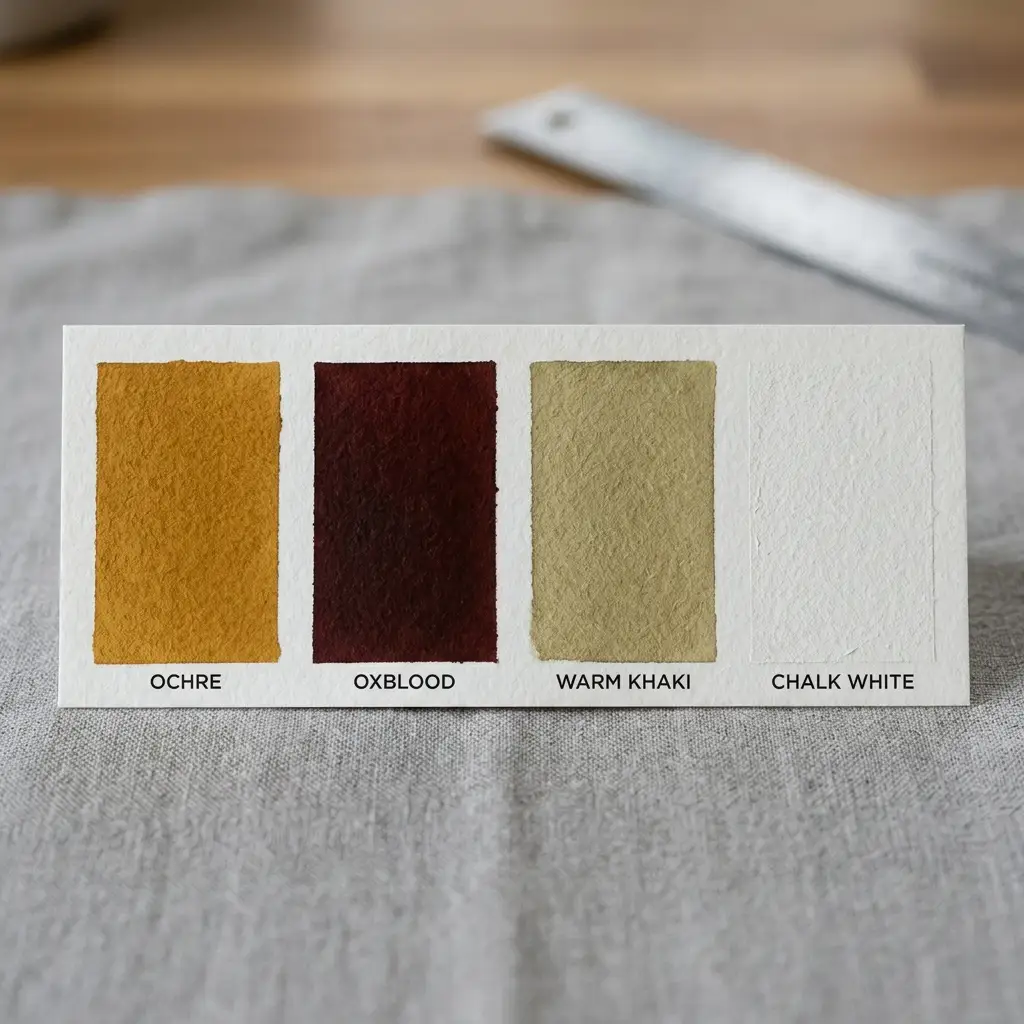
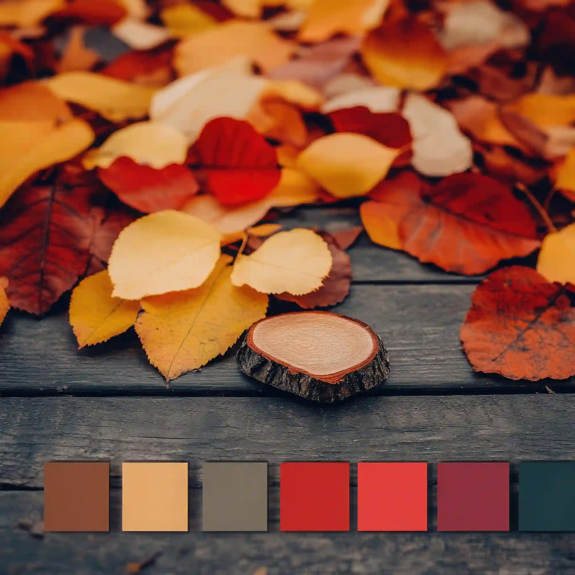
Espresso brown, warm khaki, ochre and oxblood replaced pumpkin orange. Ochre is a yellow-brown earth pigment, so it carries the warmth orange used to carry without the plastic brightness. Oxblood does the same job for red. Warm khaki sits underneath both as the base tone, and a soft chalk white keeps the whole set from going heavy. Cool grey is the one shade that no longer fits.
Designer Rule of Thumb: Build the set at roughly 60% warm neutral, 30% deep brown, and 10% ochre or oxblood. That split holds up on a screen and in a room.
Grain Instead of Gloss
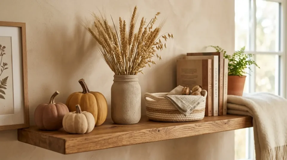
Texture carries more of the new look than color does. This season’s images lean on visible film grain, matte paper, unglazed ceramic, boucle, knit wool and raw linen. Glossy, heavily sharpened edits look dated next to them. The practical version of this for a room is simple: matte or eggshell paint, unlacquered brass instead of chrome, and a wool or jute rug instead of a flat synthetic weave. The same material mix runs through our cozy winter cabin interior aesthetic ideas, which is the colder cousin of this look.
Low Light Instead of Golden Hour
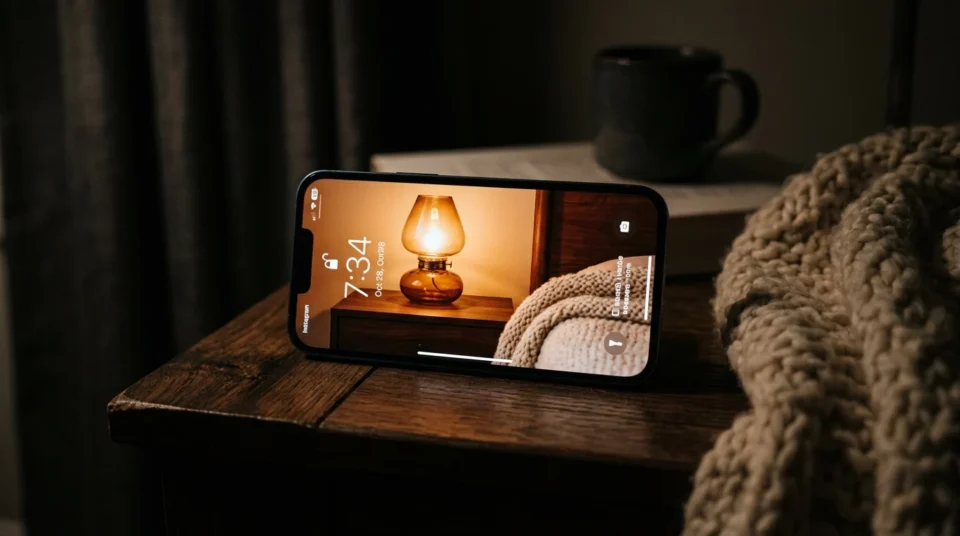
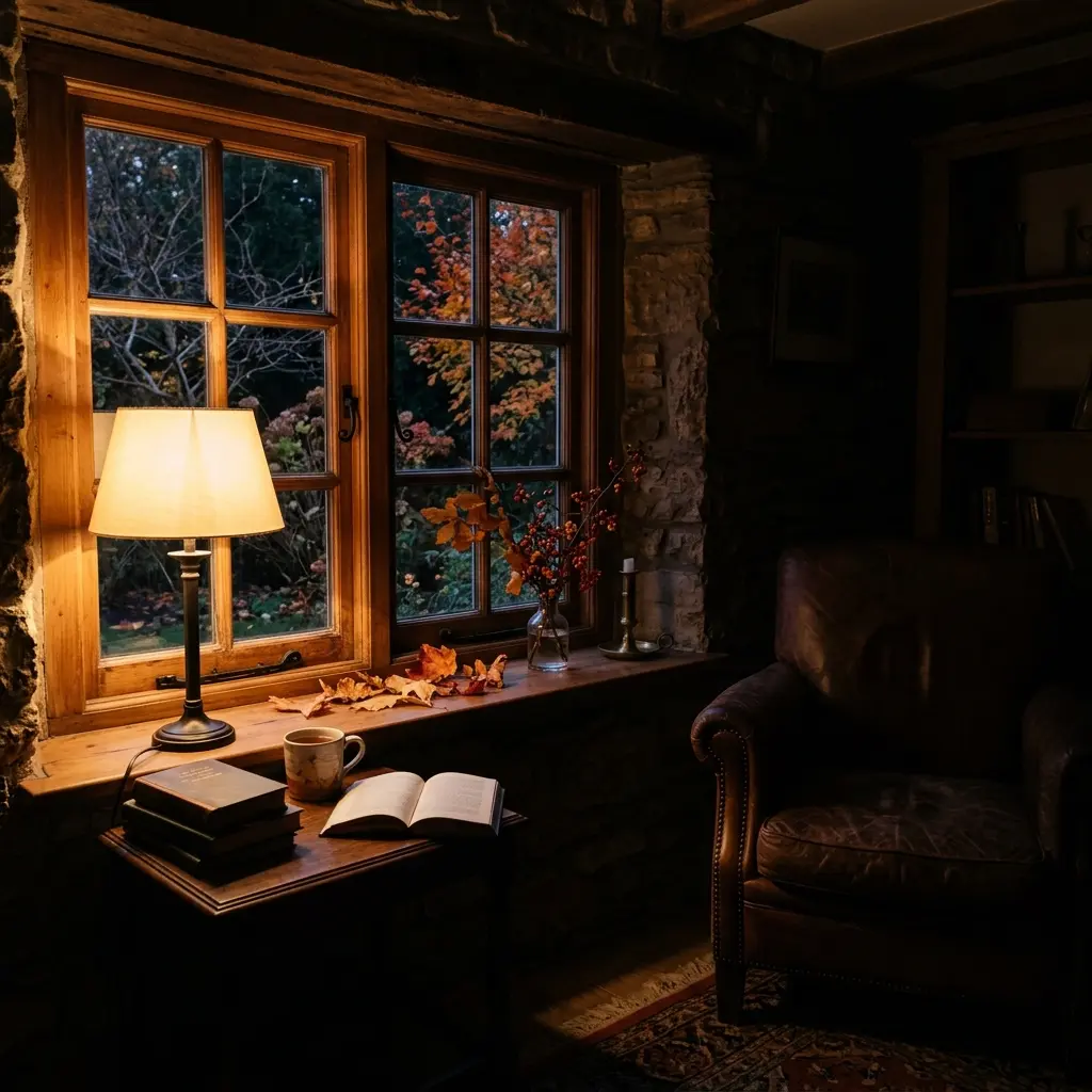
Golden hour has been replaced by lamp light. The strongest autumn images this year are shot late, indoors, with one warm light source and a lot of shadow left alone. Warm white bulbs sit around 2700K, and that is the color temperature almost every one of these frames is lit at. If your own room never looks like the images you save, the bulbs are usually the reason, not the furniture. Our winter hygge bedroom ideas build a whole room around that single warm-light rule.
Which Fall Wallpaper Style Fits Your Screen?

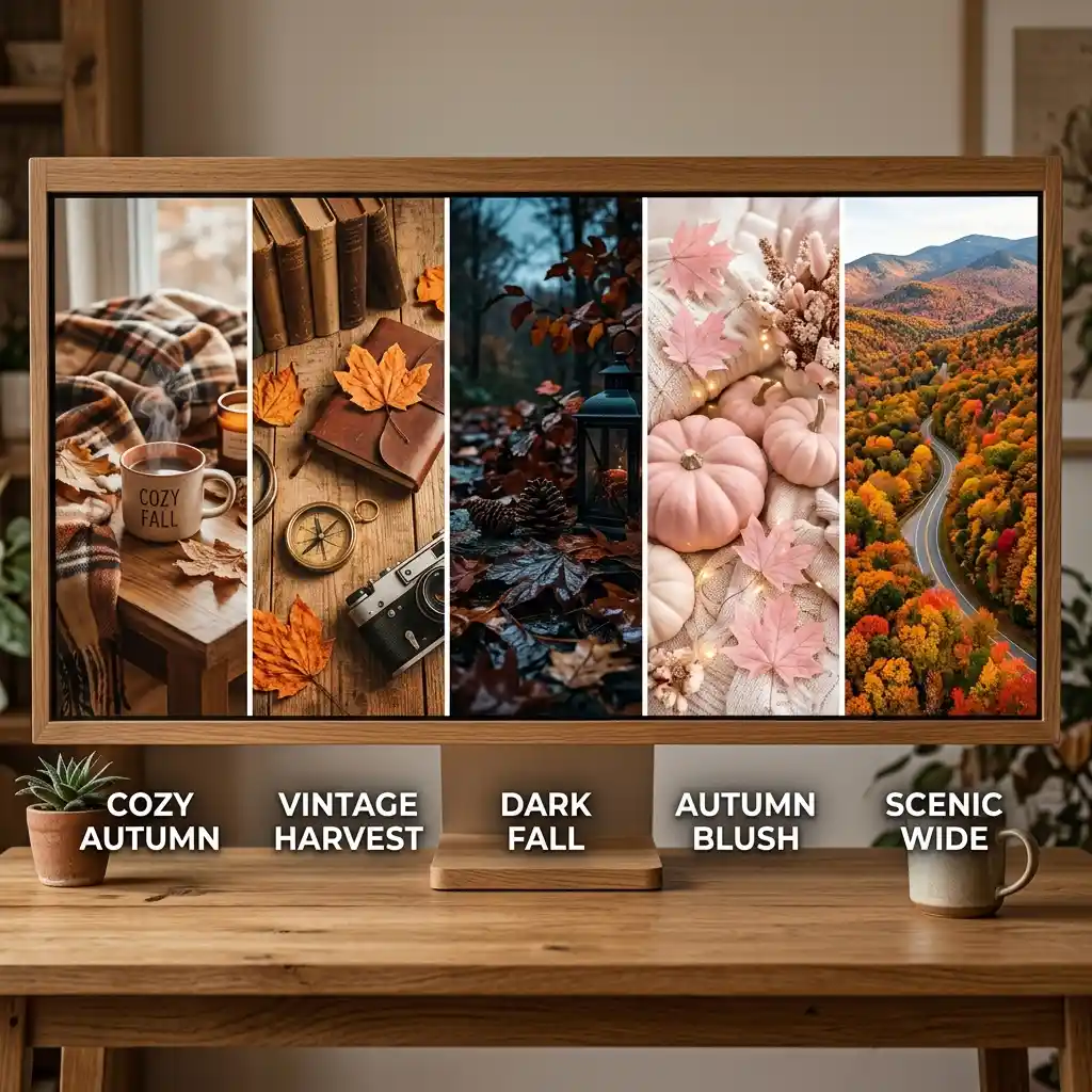
Five styles cover almost everything people save in autumn. They are not interchangeable. A busy vintage collage that looks rich on a laptop can make a lock screen clock unreadable, and a near-black background that looks moody on a phone can look like a dead screen on a monitor. Pick by device first, then by mood. Our fall iPhone wallpaper guide covers the phone side in detail.
Cozy Fall Wallpaper for a Lock Screen
Cozy fall wallpaper is the largest category and the safest lock screen choice. The frame is usually one warm light source, a knit throw, a mug, and an out-of-focus background. Because the detail sits low in the frame, the top third stays dark and empty, which is exactly where the clock lands. If you like this look in a room as well, our cozy aesthetic small bedroom ideas build the same feeling with real textiles.
Vintage Fall Wallpaper
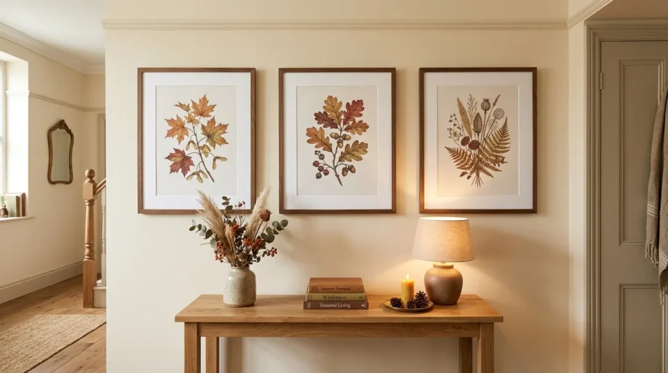
The vintage version leans on faded film, 1970s ochre and avocado, and old botanical plate illustrations. The color is duller than a modern edit on purpose, and the grain is the point. This style prints better than any of the others because the softness hides low resolution. It also pairs well with real wall art, which is why our spring wall art ideas use the same botanical logic in a different season.
Dark Fall Aesthetic Wallpaper
Dark fall aesthetic wallpaper sits on a near-black ground with one lit element: a window, a candle, a single branch. It pairs cleanly with system dark mode, and white clock text stays legible over it without any editing. The trap is scale. A near-black image that feels moody at 6 inches can feel oppressive across a 27-inch monitor, so keep this one on the phone. The test that separates the good ones is darkness — our guide to cozy fall wallpaper works through why a screen only reads as cosy if it is dark enough.
Pink Fall Wallpaper
The pink version is the anti-orange take on the season, built on dusty rose, terracotta and cream. It works because dusty rose and terracotta are both muted earth tones, so they sit beside espresso brown without fighting it. This is the easiest of the five to translate into a bedroom, since the palette needs no dark paint at all to feel seasonal.
Fall Desktop and Laptop Wallpaper
Desktop autumn backgrounds need a wide crop and real empty space. Icons stack down the left side on most machines, so the subject belongs right of center with a quiet area behind the icon column. Wide landscape scenes, single-subject still lifes and simple color-block gradients all survive that constraint. Busy collages do not.
How Do You Turn a Saved Fall Wallpaper Into a Real Room?
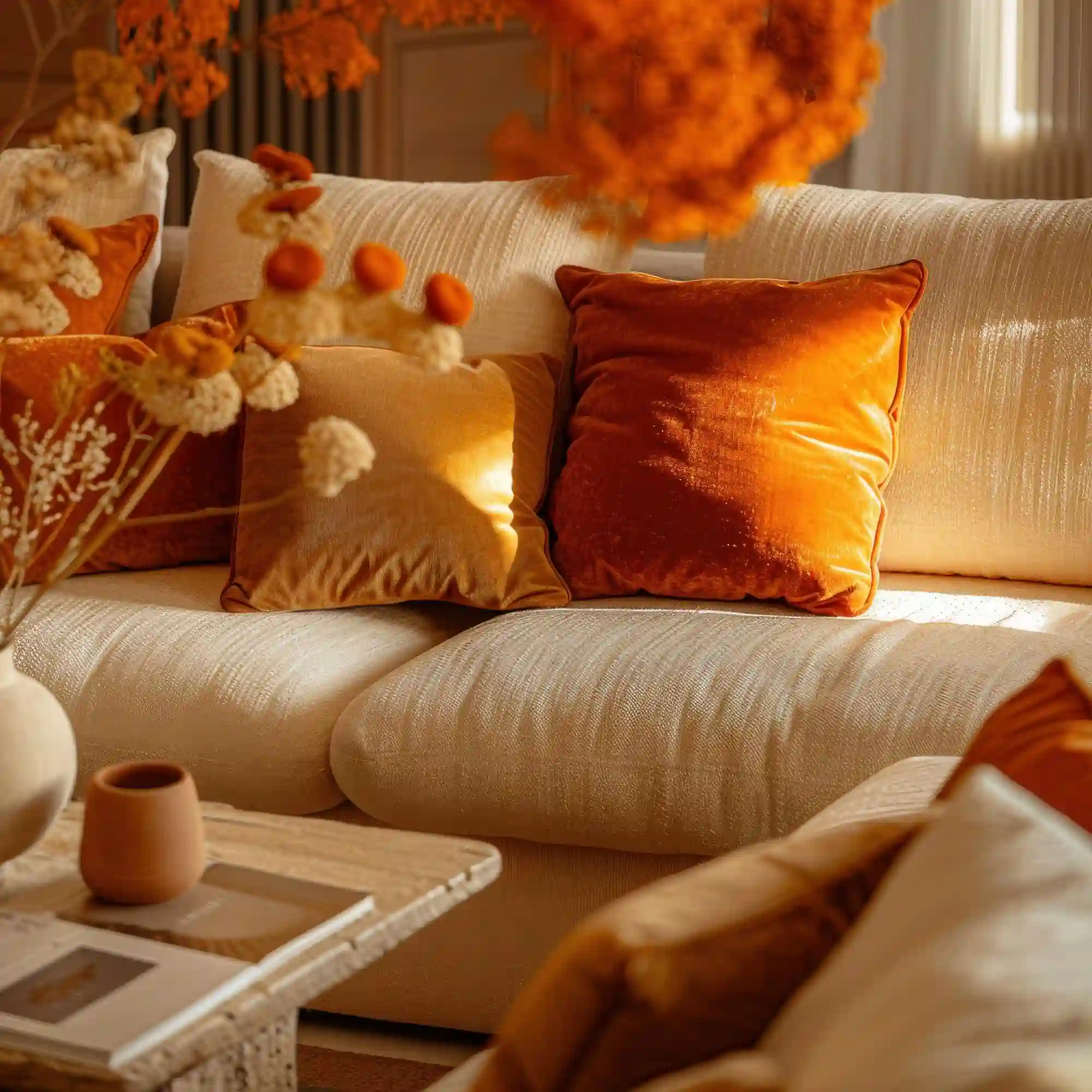
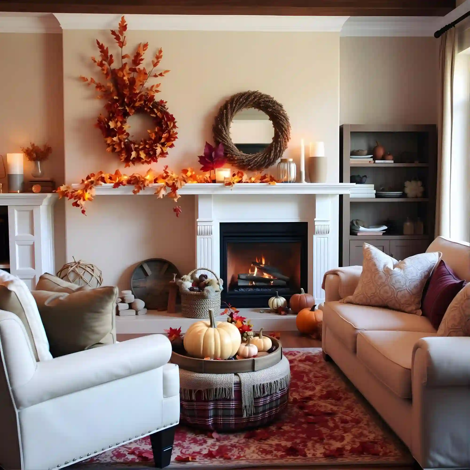
Pull three colors out of the fall wallpaper you have kept longest, assign them a 60/30/10 split, and start with textiles and bulbs rather than paint. A throw, two pillow covers and a set of 2700K bulbs will move a room further in one evening than a feature wall will in a weekend, and none of it is permanent.
Four moves, in order:
- Screenshot your three favorite backgrounds and look at them in one album. The color they share is your palette, and it is rarely the one you would have named.
- Change the light first. Swap cool bulbs for warm 2700K dimmable ones and turn the overhead off. Our cozy winter decor ideas use the same lighting order for the colder half of the year.
- Add the palette in fabric. Two ochre or espresso pillow covers and one wool throw carry the 30% and 10% without touching a wall. The layering approach in our fall bedroom refresh ideas shows how far textiles alone go.
- Add one brown anchor object rather than a brown wall. A leather ottoman, a walnut tray or a dark ceramic lamp base does the work at a fraction of the risk. If a framed print is where you want to land instead, our living room wall decor ideas cover hanging height and grouping.
DESIGNER TIP: Hold your phone up against the actual wall in the room, in evening light, before you commit to any paint. The gap between the two is the whole problem, and you can see it in five seconds.
Source Note: Apple’s iPhone 17 specifications list a 2622-by-1206-pixel display at 460 ppi with up to 3000 nits of peak outdoor brightness — no wall returns light like that.
Take the same palette outdoors and the logic holds. Warm porch lighting and one deep-toned door mat do for an entry what a throw does for a sofa, which is the approach behind our cozy winter front porch decor ideas once the season turns.
Fall Wallpaper Checklist
- Check that the top third of the image is dark or empty so the lock screen clock stays readable.
- Match the crop to the device: tall and centered for phones, wide with left-side space for desktops.
- Limit yourself to three colors in the frame; a fourth is what makes an image look busy.
- Choose grain and matte texture over sharpened, high-contrast edits.
- Keep one background for the whole season instead of switching weekly, so the palette actually sinks in.
- Save the three you like most into one album before deciding anything about a room.
- Check the license before printing anything; many free downloads cover personal screen use only.
KEY TAKEAWAY: The background you keep longest is a better guide to your real taste than any single image you save on impulse.
What Makes a Fall Wallpaper Look Cheap?
Instead of painting a whole wall the exact espresso from your lock screen, Try a sample board propped in the room for two evenings — screen color is backlit and paint is not.
Instead of a background with detail across the entire frame, Try one with a quiet top third, so the clock and notifications sit on empty space rather than on a pumpkin. The same clear zone is what keeps fall widgets readable instead of cluttered.
Instead of changing wallpapers every few days, Try one for the season — the whole point of a seasonal palette is repetition, and constant swapping kills it.
Instead of pairing the new brown palette with cool grey furniture, Try warming the greys with oak, jute or unbleached linen so the brown does not look like a stain.
What Will This Actually Cost?
Turning a screen palette into a room costs less than most seasonal decorating, because textiles and light do most of the work. The budget end is bulbs and pillow covers, the middle is a framed print and a throw, and the premium end is a single anchor piece in leather or walnut.
| Project | Estimated Cost | Impact Level |
|---|---|---|
| Four-pack of 2700K dimmable warm bulbs | $12-$28 | Very High |
| Two ochre or espresso linen pillow covers | $30-$70 | High |
| Licensed 8×10 autumn print plus a simple frame | $18-$45 | Medium |
| One brown anchor piece: leather ottoman or walnut tray | $85-$320 | High |
Best First Upgrade: Swap every cool-white bulb in the room for a 2700K dimmable one — it changes how all your existing colors look for under $30.
Skip for Now: Hold off on dark paint until you have lived with the palette in fabric for a few weeks, since espresso walls are the hardest thing on this list to undo.
Rental Note: Bulbs, textiles and a leaning framed print are all fully reversible, so nothing here needs landlord approval.
The Bottom Line
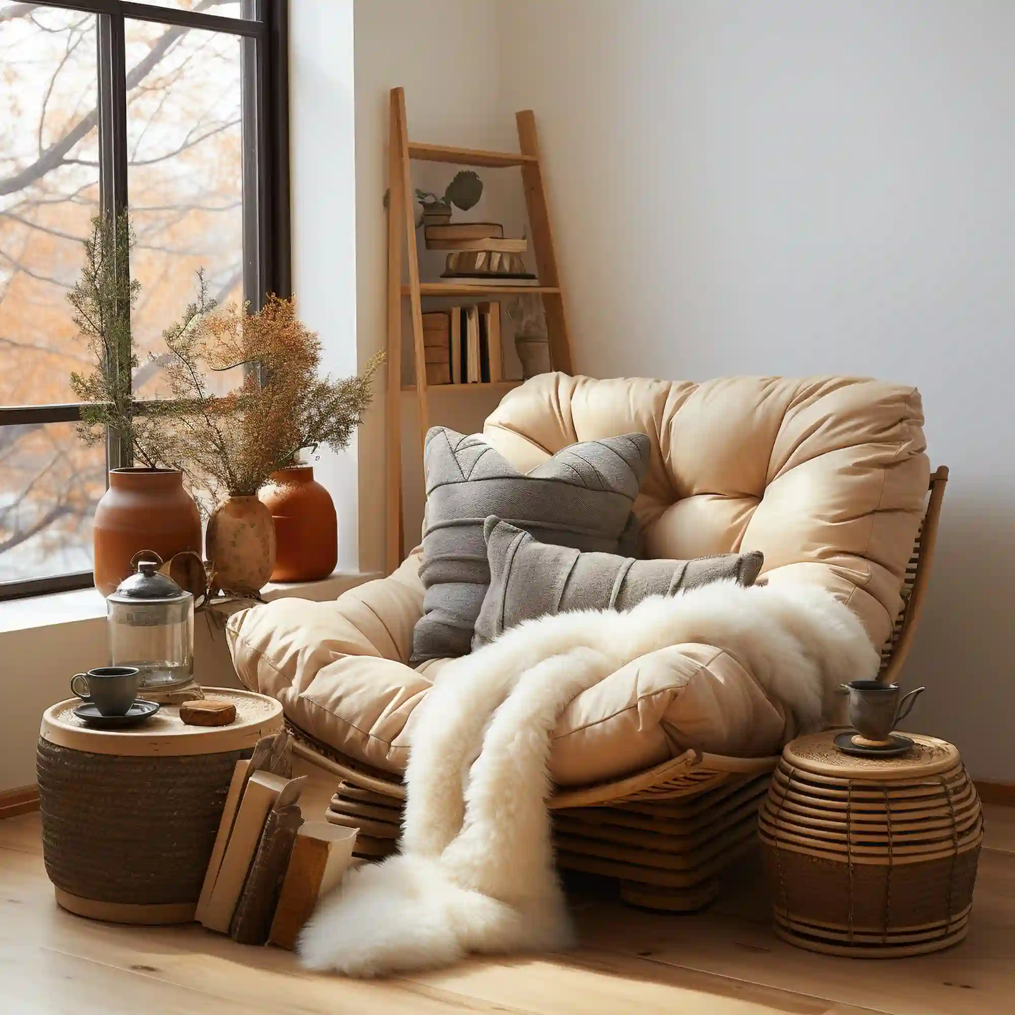
The Pick: Cozy fall wallpaper on a warm khaki base is the one worth keeping all season. It survives the lock screen clock, it prints without falling apart, and its palette translates into a room more easily than the dark or pink versions do. Save the dark aesthetic for the phone and the vintage look for the wall.
Editorial field note: A living room lit only by a cool overhead fixture usually flattens warm browns into grey-beige. Swapping to two warm 2700K table lamps and leaving the ceiling light off brings the espresso and ochre back before a single item of decor changes. The room looks settled at that point, not redecorated.
Once the palette is settled, the physical side is the easy part.
Frequently Asked Questions
Conclusion
Fall wallpaper stopped being orange because autumn stopped being about the harvest and started being about the hours after dark. Take the three colors out of the one you keep, put them into bulbs and fabric first, and the room catches up to the screen — see more of our home decor ideas for what to change next.
Next Steps
- Save your three favorite autumn backgrounds into one album and note the color all three share.
- Replace the cool-white bulbs in your main room with 2700K dimmable ones this week.
- Buy two pillow covers in ochre or espresso and one wool throw before touching any paint.
- Prop a paint sample board against the wall for two evenings before committing to a dark color.