The Wallpaper Was Never the Hard Part
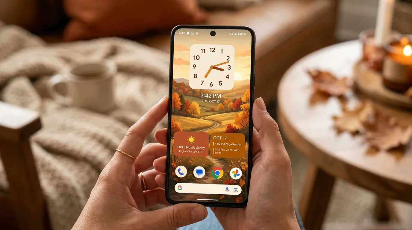
Why does a fall home screen look busy when the wallpaper looked perfect on its own? Count what is sitting on top of it. Most crowded screens carry four or five panels, each added on a different day, each chosen the way people choose apps — by what it does, never by how it looks next to the thing beside it.
Three is the answer for almost every screen. Fall widgets are a styling problem, not a download problem — a widget is an object placed on a surface, so the rules that govern a console table apply here too: one large piece, mixed sizes, a capped palette. One large panel carries the layout, one small panel supports it, and a third goes on only if it earns the space.
Looking for more ideas? Explore our full guide to Fall Wallpaper.
That swap in thinking matters, because the wallpaper is the part people spend the most time on and the part that needs the least help. Choosing the photo is its own job with its own rules. This is about the layer that goes on top of it — the half you actually design, and the half that decides whether a screen looks put together or thrown together. Our home decor and styling ideas work the same way inside a real room.
A screen carrying a blue weather panel, a white calendar, a battery ring and two quote cards has five things competing at once. Take three away, move the remaining two into one column, and the same wallpaper comes back. Nothing was replaced. Only the count and the placement changed.
Your Home Screen Is the Smallest Surface You Decorate
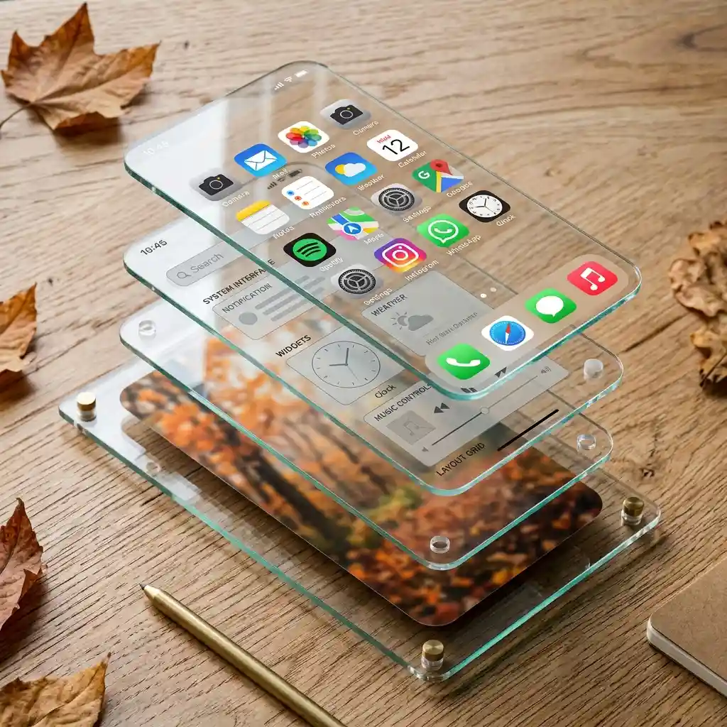
A home screen has the same three layers as a room. The wallpaper is the wall. The widgets are the furniture. The app icons are the small objects that fill in around the furniture. Trouble starts when the middle layer gets treated like the bottom one, and a widget lands in whatever slot happened to be free.
Widget slots are measured in app icons, which makes the arithmetic simple. A small widget takes the space of four icons. A medium widget takes eight. A large widget takes sixteen — close to a third of everything visible. A large widget is the sofa of the screen. You get one, and everything else arranges itself around it.
Groupings on a screen behave like groupings on a wall. Odd numbers look settled, even numbers look like a matched set, and two objects of the same size cancel each other out. Those same rules decide whether living room wall decor looks planned or accidental. Three widgets in one block will nearly always beat four spread evenly down the page.
Designer Rule of Thumb: Keep the widget block inside one continuous zone of the screen, and leave at least one full row of bare wallpaper below it.
Why Did Fall Home Screens Get Emptier This Year?
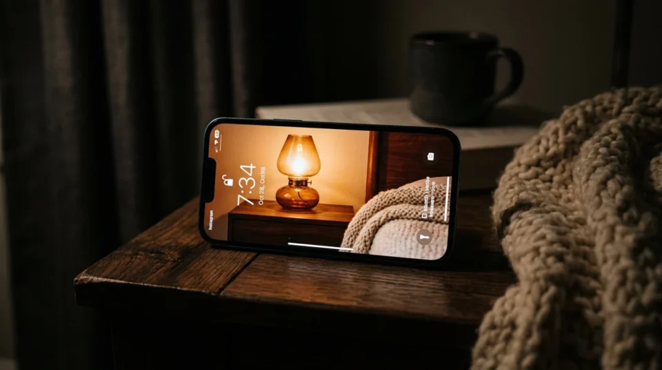
Phone software started rewarding empty space. Recent iPhone releases added clear and tinted icon styles along with glass layers behind widgets, so the wallpaper shows through the interface instead of hiding behind a grid of colored squares. Once the system itself is built to let the picture through, covering the picture starts to look dated.
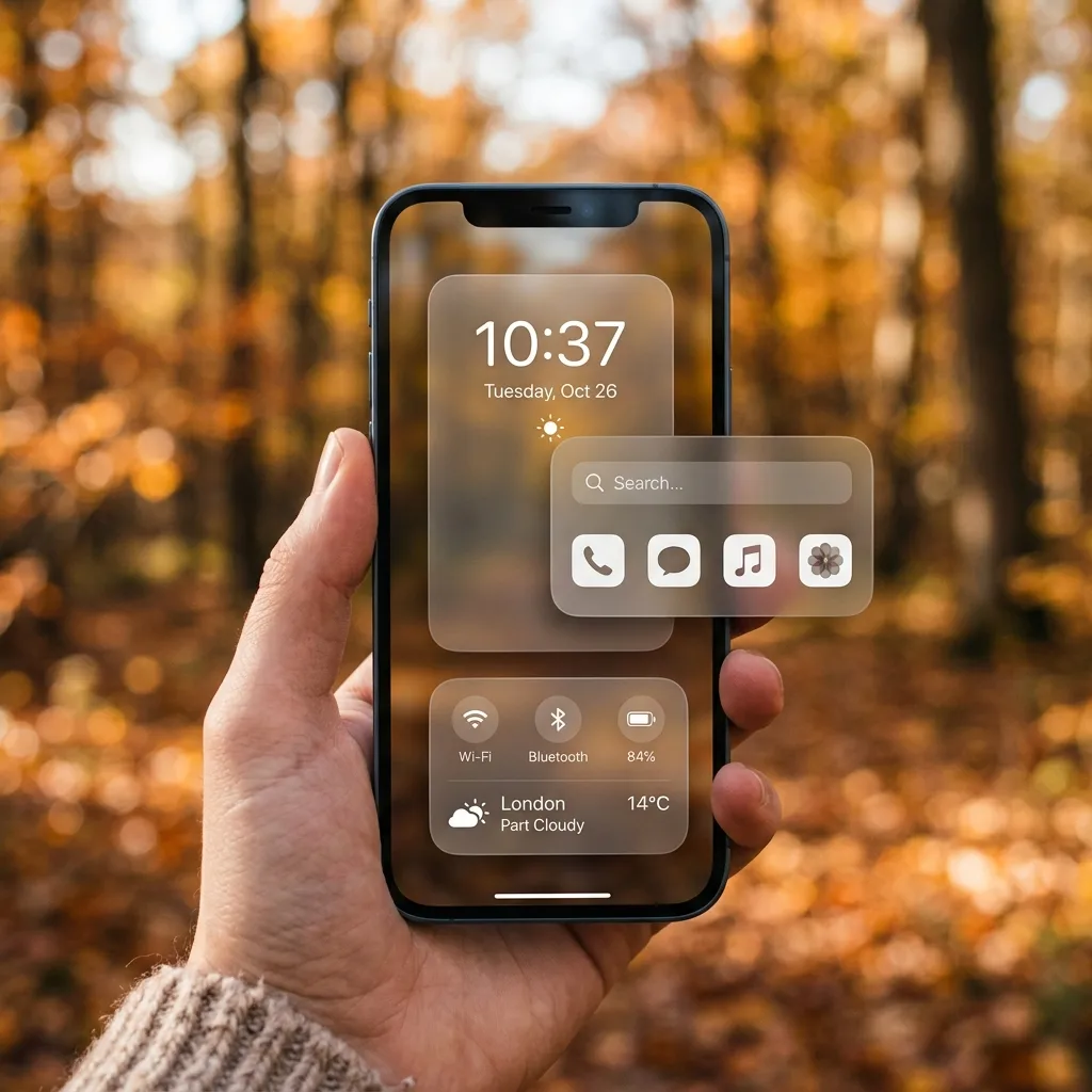
The autumn version is easy to spot. Screens that used to carry a full page of solid cream cards now carry one photo panel, one clock, and a lot of visible wallpaper. For the wider seasonal picture, browse all our fall decorating ideas first.
Signs This Is Catching On:
Apple’s newest home screen settings include clear and tinted icons plus translucent widget layers, options that only make sense when the wallpaper underneath is meant to be seen.
The big widget apps now advertise clear and frosted widget finishes as headline features instead of solid colored cards.
Widget stacks moved the useful-but-plain panels out of sight, so whatever stays on the surface is now chosen for how it looks.
Source Note: Apple’s iPhone guide confirms you can stack up to 10 widgets in a single slot, which is why the tidiest fall screens show two or three panels and park the rest behind them.
What Do Good Fall Widgets Actually Look Like?
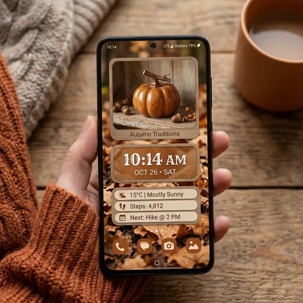
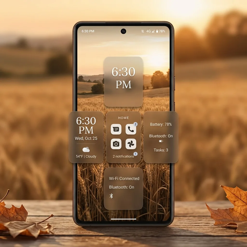
The look is warm, quiet, and mostly picture. One panel carries information you check daily, one carries a photo, and the wallpaper does the rest of the work. The same warm-and-quiet balance shows up in cozy winter cabin interior aesthetic ideas — few objects, low light, deep color, nothing shouting. Four decisions get you there.
How Many Widgets Should One Screen Hold?
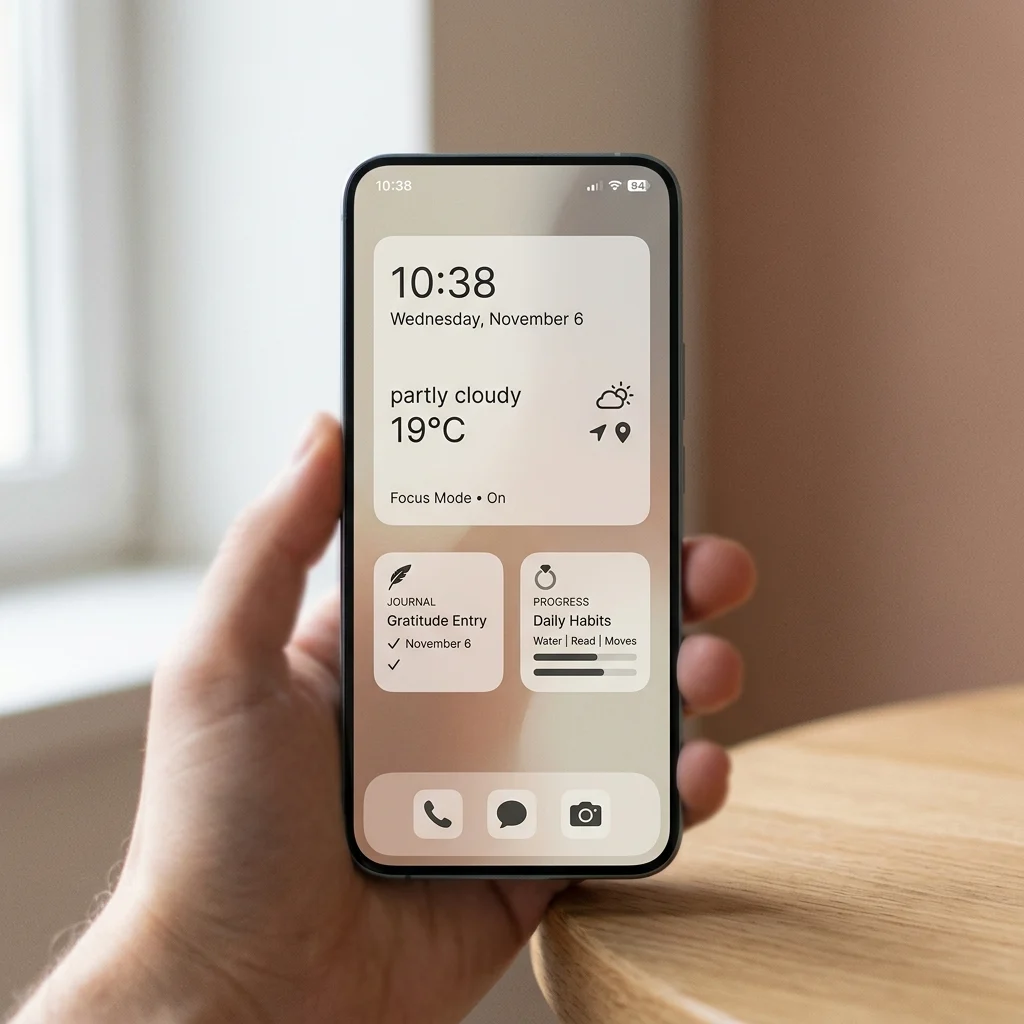
Three is the working maximum for one screen. One large or medium panel carries the layout, one small panel supports it, and a third earns its place only if it does something the first two cannot. A fourth almost always pushes the wallpaper’s subject — the tree line, the window light, the pumpkin on the step — behind a block of text.
Count before you style. Most crowded screens are not badly designed; they are simply over-filled, one useful addition at a time, across several weeks. The fix takes about a minute: remove every widget, then add back only the ones you looked at yesterday. Small rooms follow the same logic, which is why cozy aesthetic small bedroom ideas start with subtraction rather than shopping.
Why Do Two Same-Size Widgets Look Wrong Together?
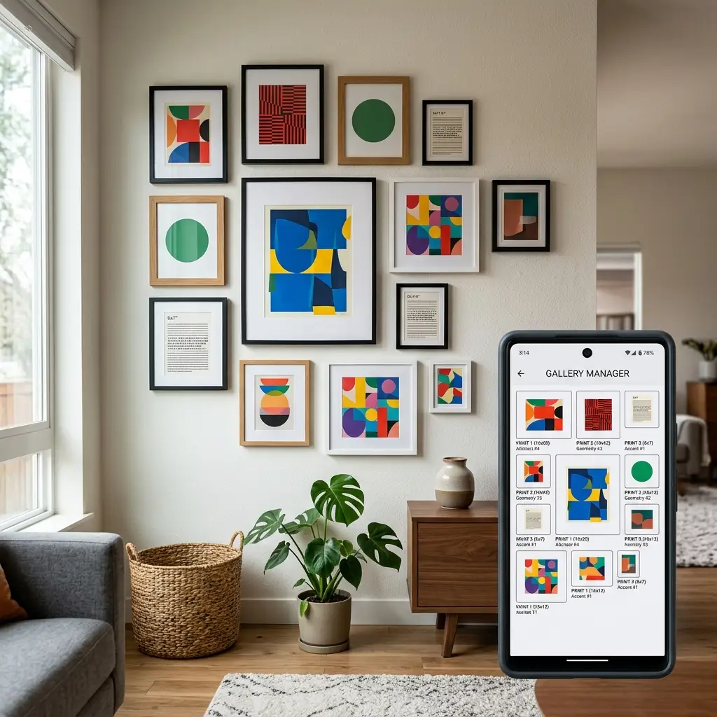
Two matching widgets remove the focal point. When a screen holds two mediums stacked one above the other, the eye has no reason to land on either, so it bounces and the layout feels flat. Mixed sizes fix it instantly — one medium above two smalls gives the screen a clear first stop and a supporting second.
Frames on a wall and lamps on a console follow the same rule. Matching heights look like a showroom set; mixed heights look like a home, which is why bedroom wall decor above the bed lives or dies on this one decision.
DESIGNER TIP: If you want two panels of the same information, stack them instead of placing them side by side — the stack keeps one visible and hides the twin.
Which Colors Should the Widgets Borrow?
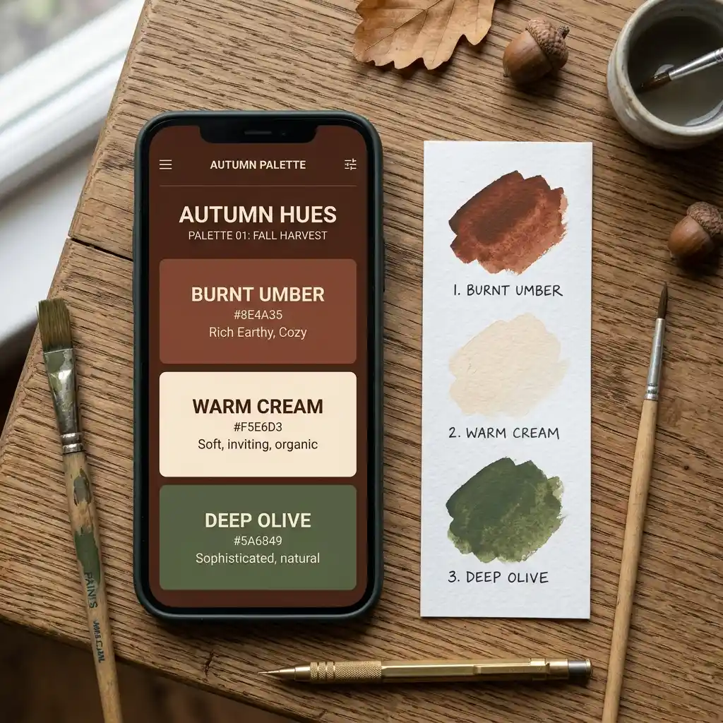
Cap the screen at three colors, and take all three out of the wallpaper. Autumn photos hand them over easily: burnt umber and warm cream from a dried-leaf shot, muted clay and deep olive from a farm-stand scene, dusty gold and espresso from low evening light. Set the widget background to the darkest of the three and the widget text to the lightest.
The color that wrecks most fall widgets is one nobody chose. Stock weather panels ship in a bright system blue, and a single blue card in a room of warm browns is the screen version of one chrome handle in a kitchen of brass. It is the loudest thing on the page and it was never a decision. Either restyle it in a widget app or move it into a stack.
Two colors plus one metallic accent works even better than three flat colors, and the logic carries straight over from two-color bedroom combinations to a phone screen.
None of this is about choosing the picture. The wallpaper arrives with its palette already set, and your job is only to copy it into the panels sitting on top. Our color ideas for the home cover how to pull a scheme off a single photograph at room scale.
Can You Still Read It?

Decor that stops working is not decor. Cream text over a pale wheat-field wallpaper looks beautiful on a desk at night and becomes unreadable on a sunny sidewalk, which means the widget has failed at the only job it had. The clock and date are handled by the phone itself; this is about the small type inside the widgets, which is where legibility actually breaks down.
Source Note: The W3C accessibility guidelines set a minimum contrast ratio of 4.5:1 between normal text and its background, easing to 3:1 for large text at 18 point or 14 point bold. Widget clock faces are usually large text; widget calendar entries usually are not.
The practical version needs no tools. Set the widget up, walk outside at midday, and glance at the phone the way you would in a car park. If you have to stop and squint, give the widget its own solid or frosted background instead of letting the photo show through behind small type.
How Do You Set It Up in Five Moves?
Work top down, the same order you would use on an empty console table — surface first, then the big object, then the small ones, then the color, then the check. It is the sequence behind all our seasonal decorating ideas, scaled down to a five-inch surface.
- Start with the block, not the panels. Decide which two rows of the screen the widget block will occupy before you choose a single widget. Picking the photo is a separate job with its own rules; this step is only about which part of the grid you are willing to give up.
- Choose the one large object. Decide which single panel earns a medium or large slot: a photo, a clock, or a calendar. That choice sets the screen’s character, because it is what you see first every time the phone wakes.
- Move everything else into a stack. Battery levels, step counts, reminders and shortcuts are useful and rarely attractive. Drag them onto one another so a single slot holds the lot.
- Pull the palette from the picture. Set backgrounds and fonts to the two or three colors already in the wallpaper. Warm neutrals do most of the work here, which is why terracotta bedroom ideas and autumn screens end up in the same color family.
- Test it in daylight, then leave it alone for a week. A screen you keep tweaking is not finished. Seven days is long enough to know whether the layout works.
What If You’re on Android, or It’s a Work Phone?
Android gives you more control and slightly harder arithmetic. Widgets sit on a cell grid rather than fixed sizes, and they stretch to fit. Google’s developer documentation lists the usable dimensions for a typical five-by-four handset grid: a one-by-one cell measures 57 by 102dp in portrait, while a five-by-two block measures 349 by 220dp. The practical takeaway is that most cells are wider than they are tall, so a vertical autumn photo will crop hard and lose its subject.
A work phone needs a lighter version. Skip custom icon packs, and let one photo widget carry the only seasonal touch. A single warm panel over a muted background looks fine in a meeting; a full autumn theme with hand-lettered quote cards does not.
Older phones and older software cap what you can do, and that is not a problem worth solving with money. If your phone only offers built-in widgets, use two of them and spend your attention on the wallpaper instead. The whole-house version of this seasonal reset lives in our creative fall and autumn decor ideas.
Eight Small Calls That Finish the Screen
Run through these once, in order, before you decide the screen is done.
- Cap the screen at three visible widgets, and stack anything that does not make the cut.
- Give exactly one widget the largest slot; nothing else may match its size.
- Keep every widget inside one continuous block rather than spread down the page.
- Pull two or three colors from the wallpaper and apply them to every widget font and background.
- Restyle or hide any stock panel that arrives in system blue.
- Check that the wallpaper’s main subject is still fully visible with the widgets in place.
- Crop photo widgets to landscape, since most widget slots are wider than they are tall.
- Look at the finished screen outdoors at midday and confirm every line of text is readable.
KEY TAKEAWAY: The screen is finished when you can name the one thing you look at first and still see the whole wallpaper behind it.
The Widget Choices That Undo the Whole Screen
Five habits account for nearly every fall home screen that looks busy despite a good wallpaper. Each one is undone in under a minute.
❌ Filling every empty slot with a useful widget → ✅ Leave one full row bare and treat that row as untouchable.
❌ Running two large widgets on the same page → ✅ Give one panel the biggest slot and let the rest support it.
❌ Leaving the stock weather card in system blue → ✅ Restyle it in a widget app or drop it into a stack.
❌ Picking widget font colors by how they look at night → ✅ Choose the color under the harshest light the phone will meet.
❌ Forcing a vertical photo into a landscape widget slot → ✅ Keep a separate landscape-only album for photo widgets.
The first one causes the most damage and is the hardest to resist, because every widget added that way was genuinely useful on the day it went on. The same slow crowding happens on a physical wall, which is why wall decor ideas nearly always start by taking things down.
How Much Should You Pay for a Widget App?
Almost nothing. Costs here are small enough that the real question is whether a paid layer buys anything the built-in tools cannot.
| Project | Estimated Cost | Impact Level |
|---|---|---|
| Built-in widgets plus a saved autumn wallpaper | $0 | Very High |
| One-off preset pack or a single custom widget style | $3-$12 | Medium |
| Widget app premium tier, billed yearly | $20-$40 | Medium |
Best First Upgrade: Spend nothing and rebuild the screen with built-in widgets first — most crowded layouts are fixed by removal, not by purchase.
Skip for Now: Full custom icon sets, which take an hour to install, break whenever an app updates, and change the layer that matters least.
If seasonal decorating on a tight budget is the wider question, our budget decorating ideas apply the same order of operations to physical rooms.
The Three-Widget Screen Is Worth Keeping
Designer’s Verdict: The stripped-back screen wins, because it is the only version that still looks good in December. A three-widget layout built on one warm photograph survives the season change with a single swap, while a fully themed screen with matching icons, quote cards and a custom grid has to be rebuilt from scratch.
Editorial field note: A screen holding a large photo widget, a small clock and a stacked utility slot looks close to empty next to a fully themed one. Give both a month. The themed screen gets rebuilt twice; the quiet one gets a new wallpaper in November and carries straight through winter.
The same reasoning drives fall bedroom refresh ideas, where two changed textiles beat a full seasonal overhaul every time.
Frequently Asked Questions
Conclusion
A year from now you will still be glad you kept the screen simple, because a three-panel layout takes one wallpaper swap to move from October to January while a fully themed screen has to be rebuilt every season. Fall widgets are furniture, not decoration — place one large piece, keep the palette to what the photo already contains, and let the picture do the rest. Our full library of decorating ideas applies the same order to every surface in the house.