Why Fall Front Porch Decor Looks Wrong on Some Houses
You buy the mums, the pumpkins and the wreath from a photo you saved in August. You set it all out. It looked warm and expensive in the photo, and on your house it looks slightly off — muddy, or cheap, or just loud.
If that has happened to you, nothing you bought was wrong. Good fall front porch decor is chosen against the house it sits on, and the photo you saved was shot against someone else’s brick, siding and door. Your facade already runs a color scheme you did not pick and cannot change in a weekend. The autumn layer has to answer to it.
Looking for more ideas? Explore our full guide to Fall Porch Decor.
This post is the palette half of a porch plan — our creative fall and autumn decor ideas cover which objects to put out, and this one covers what color those objects should be. The split matters more than it sounds. The object list barely changes from house to house: two planters, a wreath, a mat, some pumpkins. The palette changes completely, and that is the part nobody photographs a rule for. If you want the same read-the-space-first habit applied indoors, it runs through our whole home decor inspiration library.
What Changed About Fall Porch Palettes?
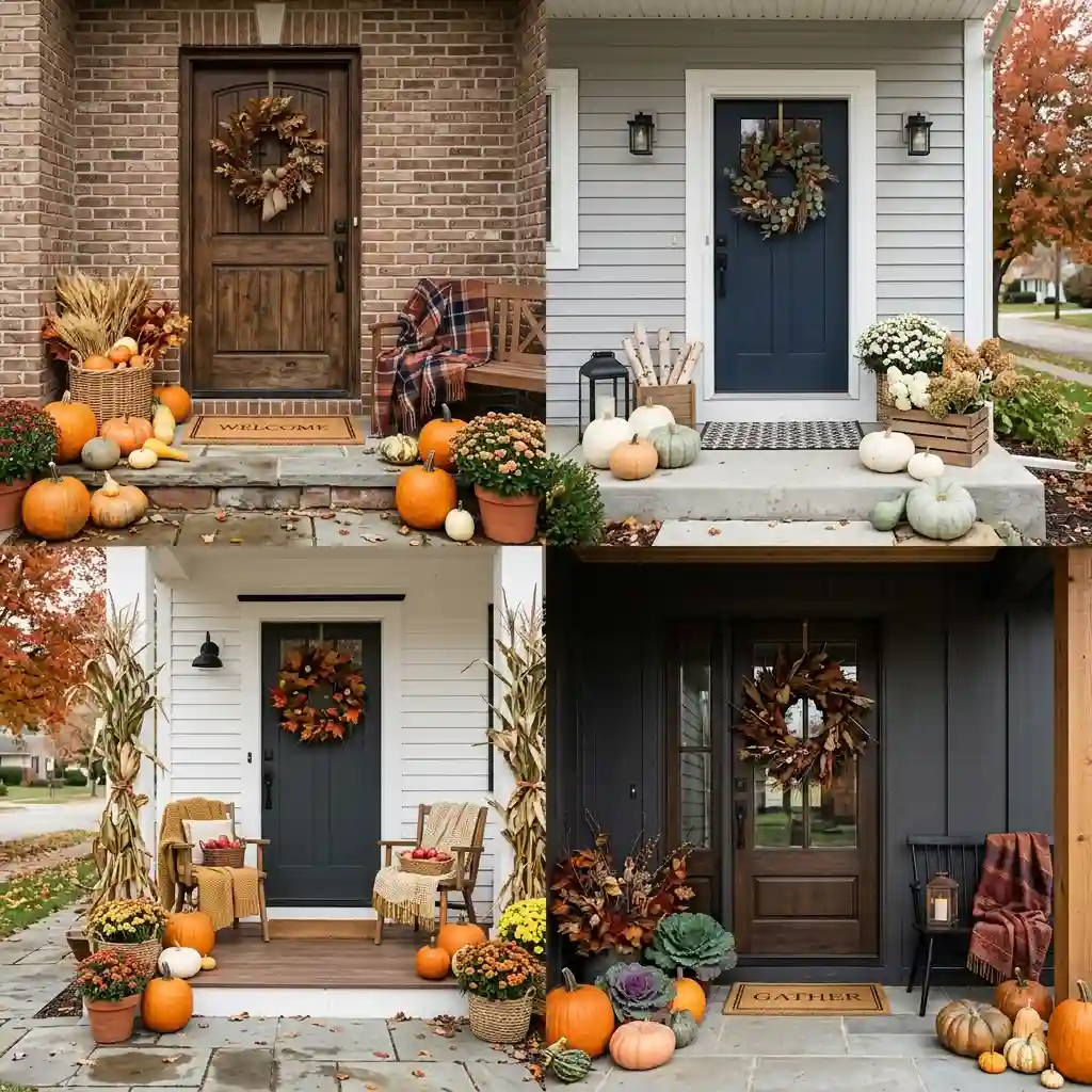
Autumn palettes have moved off bright pumpkin orange toward muted, warm mid-tones that sit against real building materials rather than against a white studio wall. That shift matters more than it sounds. A saturated orange only works next to a small number of exteriors. A warm mid-tone works next to most of them.
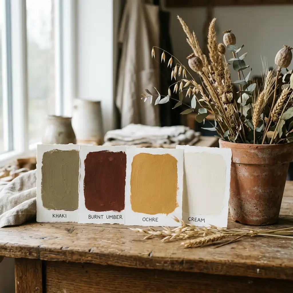
The paint industry made the same call for 2026. Sherwin-Williams named Universal Khaki SW 6150 its Color of the Year and describes it as a mid-tone neutral with a slight yellow undertone. Benjamin Moore chose Silhouette AF-655, a burnt umber cut with charcoal. Both are exterior-friendly in a way bright orange never was.
Muted colors ask more of you, though. A bright color announces itself against anything. A muted one either harmonizes with the wall behind it or disappears into it, so the wall behind it is now the deciding factor. The same thinking drives these modern front porch ideas, where finish choices follow the architecture rather than the season.
How Do You Read Your Own Facade?
Stand at the end of the driveway and name four things you cannot change this month: the wall material, the trim, the roof, and the door. Those four are your fixed palette. Everything you add for autumn is the fifth color, and it should not repeat any of the first four. Deciding which single look those additions commit to is what our fall porch decor ideas guide works through.
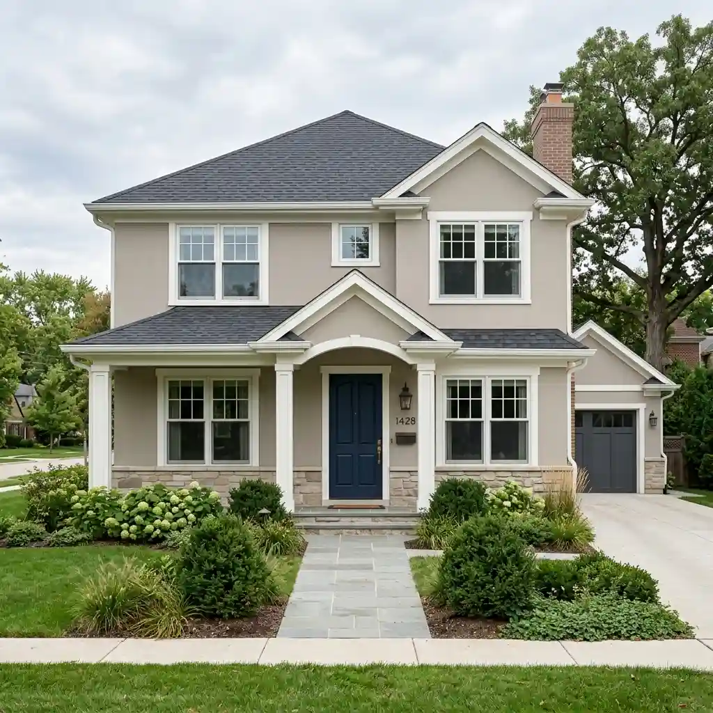
That single rule explains most porch failures. Orange mums against orange brick repeat a color already covering 400 square feet of wall. Cream pumpkins against white trim vanish. Charcoal planters against a charcoal roofline blend into the shadow. The fifth color has to be one the house does not already own.
Designer Rule of Thumb: pull your autumn accent from something permanent but small — the mortar between the bricks, a stone step, the undertone in the roof shingle. An accent borrowed from the house always looks like it belongs there.
Those four fixed colors do not change with the season, which is why the year-round base underneath a seasonal display matters as much as the display. Our front porch decor ideas cover that permanent layer. Look at the porch in daylight and again after dark before you commit, because exterior color shifts hard between the two. Carrying the same accent through the door helps as well — our fall bedroom refresh ideas use a matching three-tone approach on textiles.
Which Fall Palette Suits Your House?
Five exterior types cover most homes, and each one asks fall front porch decor for a different accent. Find yours, take the color listed, and skip the two named as fights. None of this requires buying different objects — only different versions of the same objects.
Red or Orange Brick
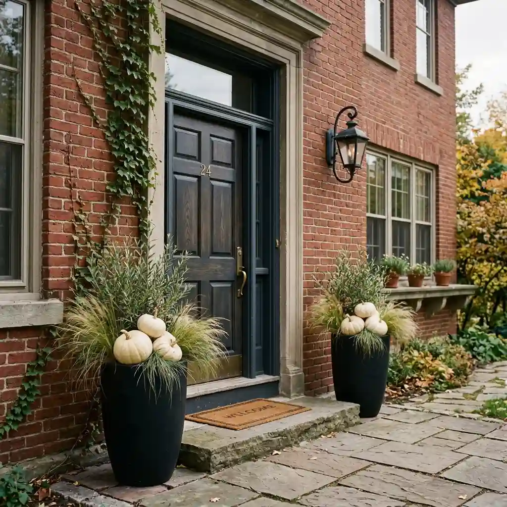
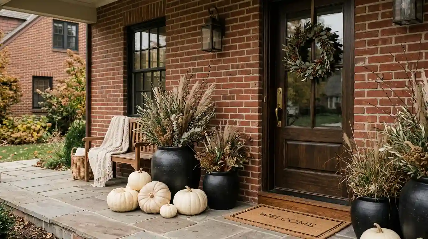
Red brick is the most common porch problem, because the wall is already a warm orange-red at full strength. Adding orange pumpkins and rust mums gives the eye nothing to separate. The house and the display merge into one hazy block from the street.
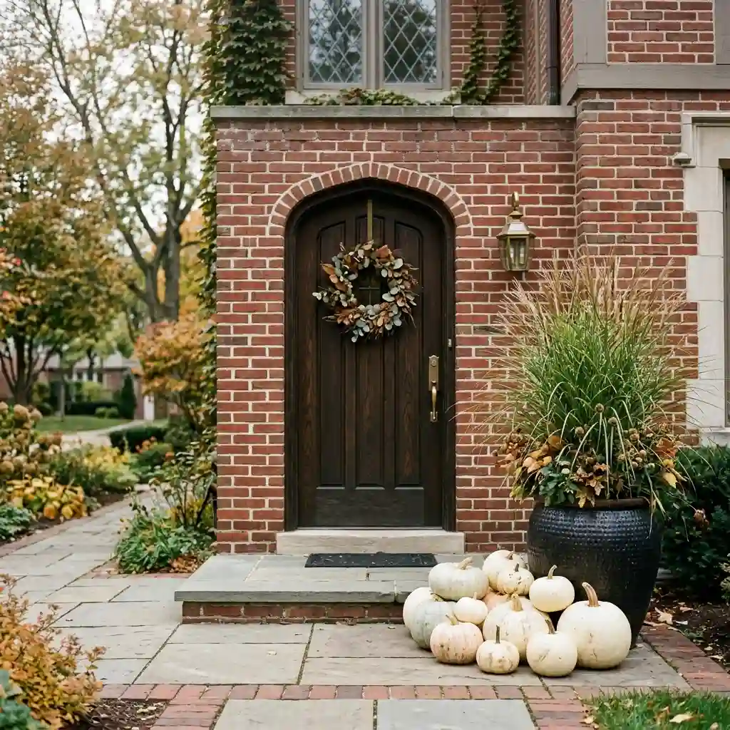
Answer brick with cream and green. White or cream pumpkins, deep olive or sage ornamental grasses, a dried-neutral or greenery wreath, and matte black planters for a hard edge. Cream is the one value brick cannot supply on its own, so it does the most work. Skip burgundy, which muddies against brick red, and skip true orange entirely.
Grey or Blue-Grey Siding
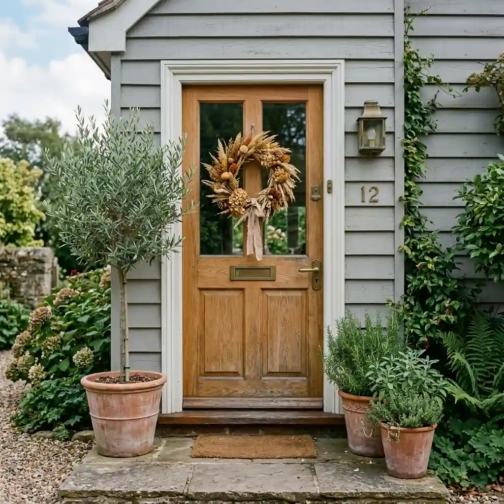
Grey siding is the opposite problem. The facade is cool and low-contrast, so it makes almost any autumn display look colder than it did in the shop. This is the one exterior where full-strength warm tones really pay off.
Go burnt umber, ochre and rust. Raw terracotta planters, an ochre-toned dried wreath, and brass or aged-bronze hardware. A warm bulb matters more here than on any other facade — VOLT Lighting names 2700K the most preferred color temperature for residential outdoor lighting, and on grey siding it is the difference between warm and washed out. Skip more grey, and skip an all-white display, which goes flat against cool siding.
White or Cream Clapboard
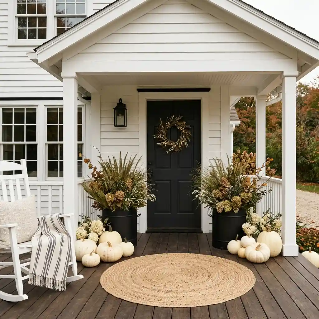
White clapboard takes any color, which is exactly why these porches end up overloaded. With no constraint from the wall, people add a fifth and sixth color and the display turns busy. The house is not fighting you here — you are.
Hold it to two colors plus green. One example that works: black planters, cream pumpkins, olive grasses, natural jute mat. The black gives the crisp outline white siding cannot, and the green keeps it from looking stark. Skip pastels, which read washed out against white, and skip a third accent color.
Tan, Beige or Stucco
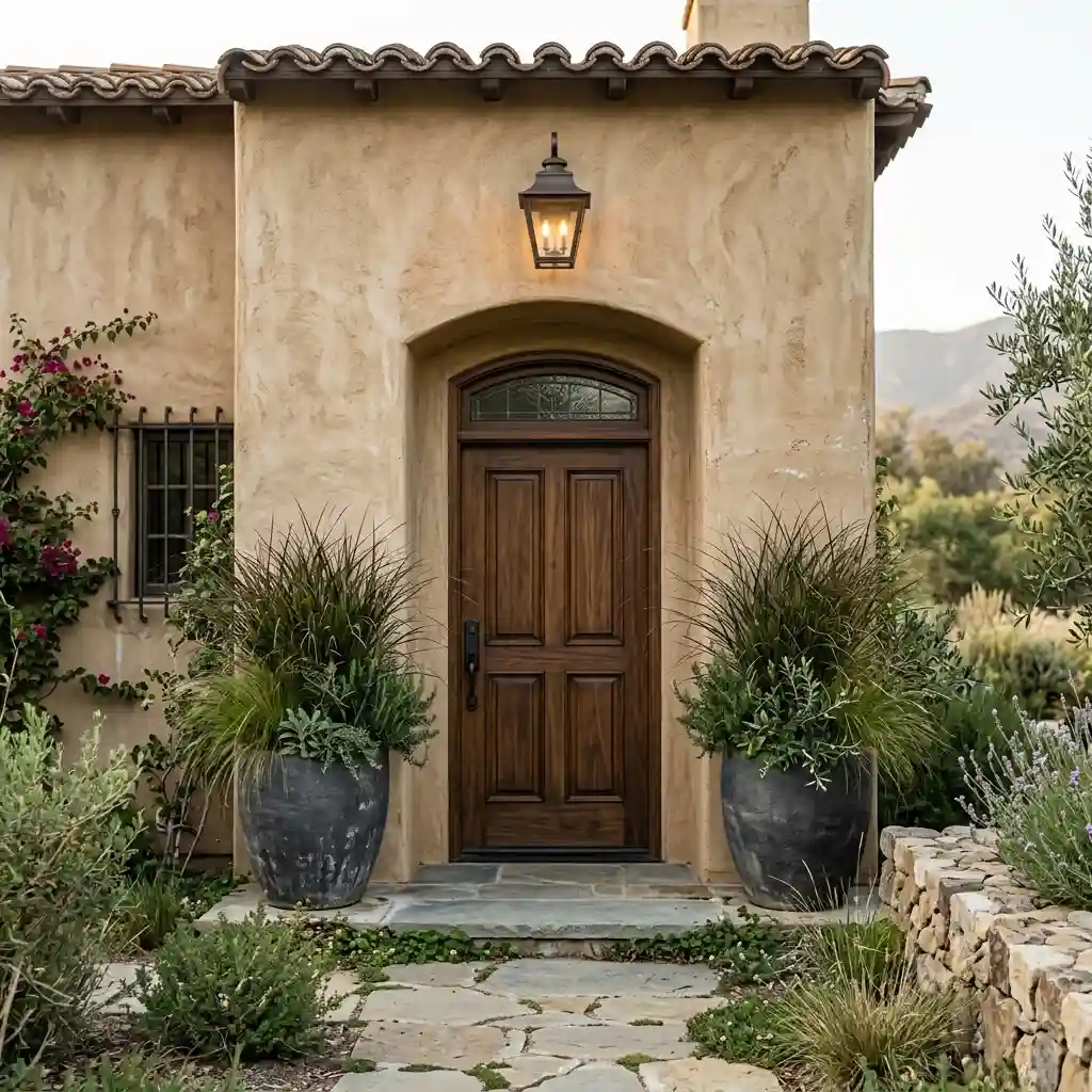
Tan siding and stucco defeat warm neutrals. A cream pumpkin on a beige wall has almost no separation, and umber against tan looks like a smudge. The problem is not the hue — it is that both are the same lightness.
Fix it with darkness, not warmth. Charcoal or black planters, deep olive grasses, dark bronze lanterns, and one deep umber note. Benjamin Moore’s Silhouette AF-655 is a useful reference tone for that depth. This is the same contrast logic behind the curb-appeal work in our ranch style home updates, where low-contrast exteriors get lifted by darker trim rather than warmer trim.
Dark Green, Navy or Black Exterior
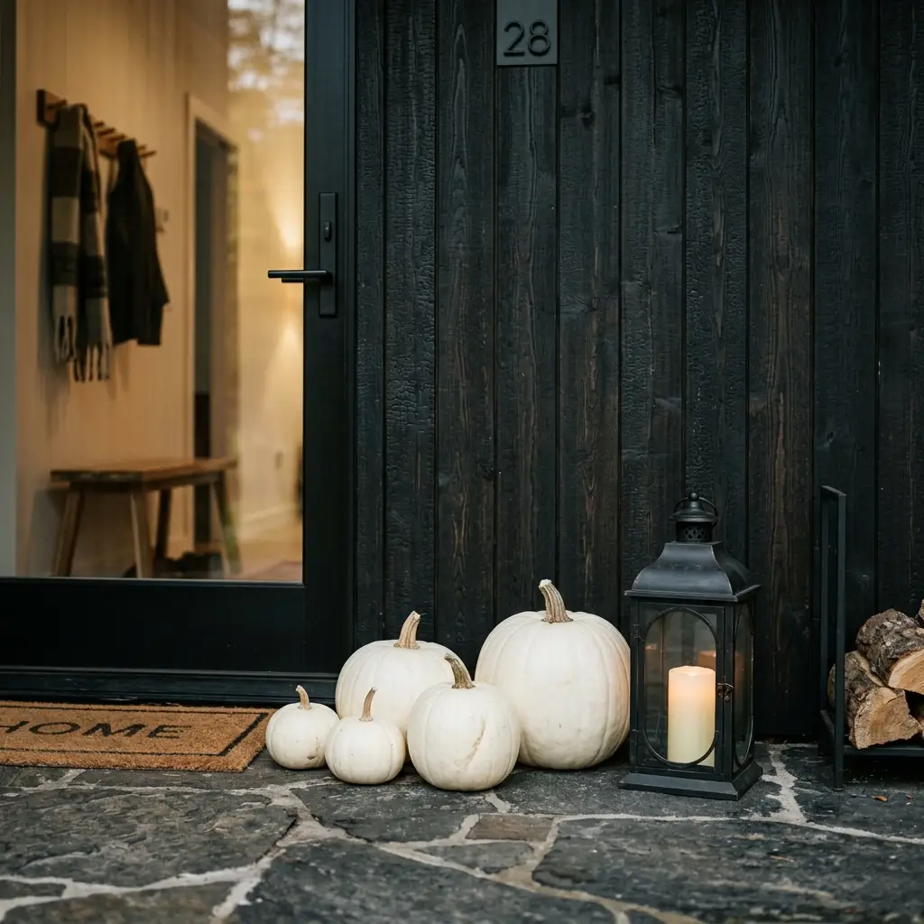
A dark facade is already the strongest thing on the property, so the porch should be the light against it. Dark planters vanish. Deep jewel tones vanish faster. The instinct to go moody on a moody house is the mistake.
Keep it pale and natural. White and cream pumpkins, blonde dried grasses, pale wheat, raw wood crates, natural jute, and brass rather than black hardware. One deep note is fine as a full stop, but the display should sit lighter than the wall. Warm exterior lighting does a lot of lifting on a dark house, and the same approach carries into our cozy winter house exterior once autumn ends.
What About a Door Color You Cannot Change?
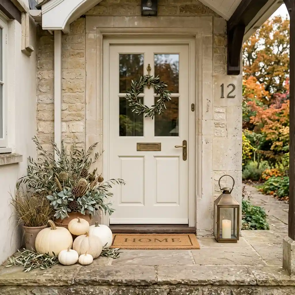
The door is the smallest of your four fixed colors and the loudest, because it sits behind the wreath. A red door and a burgundy wreath is the single most common clash on a fall porch — two reds at slightly different temperatures, four inches apart.
Four common doors and what they will accept. A red door wants cream, white, natural dried stems or deep green, and nothing in the burgundy-to-orange range. A teal or blue door wants warm neutrals and no orange at all. A black door is the most forgiving of the four, and brass and cream both pop against it. A stained oak or natural wood door already carries a wood tone, so add greenery and cream rather than a second, competing wood. Wreath color is doing most of this work, and the sizing and palette rules in our spring wreath for front door ideas apply in autumn with dried stems swapped in for blooms.
How Do the Metals and Hardware Fit In?
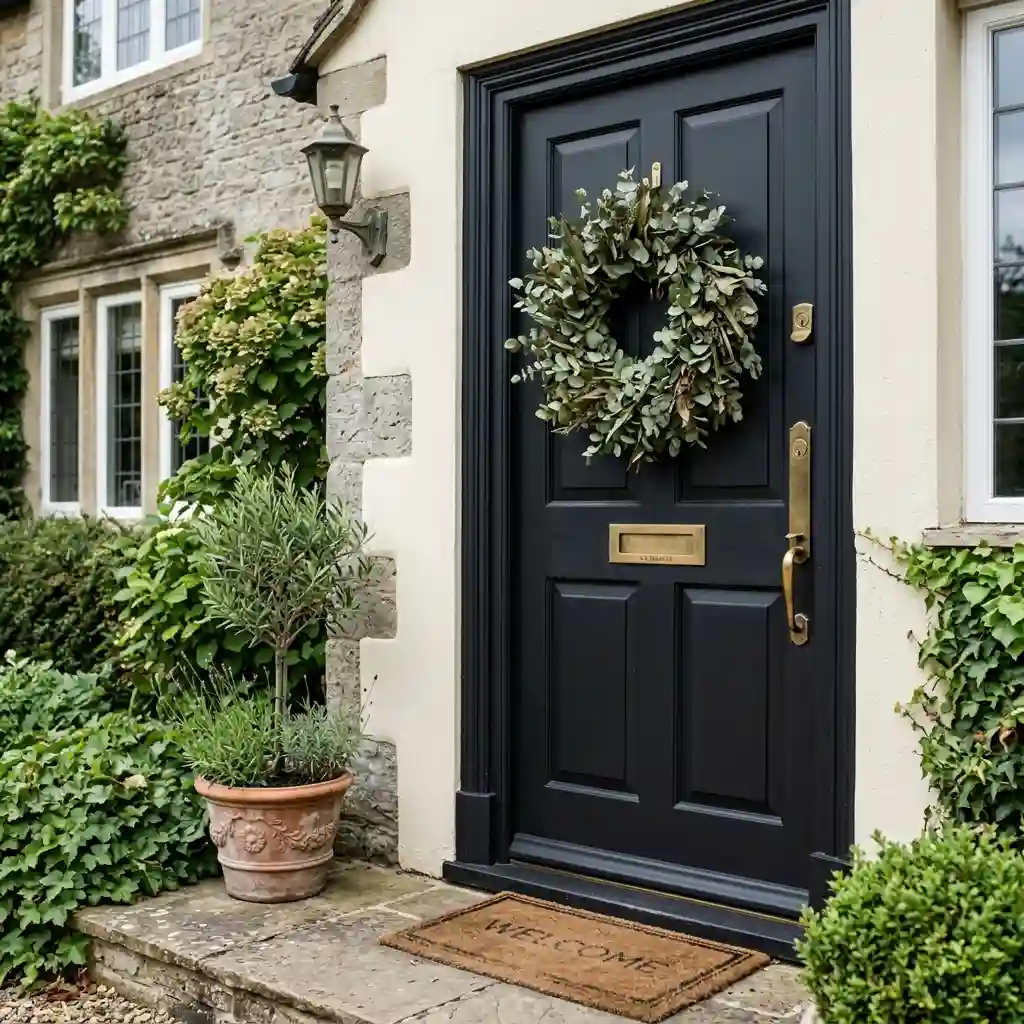
Match your planter and lantern finishes to the porch light fixture, not to the door hardware. The light fixture is larger, higher and visible from further away, so it is the piece that sets the metal for the whole entry. Door handles are small and usually a different finish already.
Pick one metal and repeat it two or three times. Matte black suits white, grey and light brick. Oil-rubbed bronze suits tan, stucco and red brick. Brass suits dark green, navy and black exteriors. Three metals on one small porch is where a display starts to look accidental. Safety Note: any outdoor fixture change needs a wet-rated or damp-rated unit, and hardwiring belongs to a licensed electrician. More facade-level projects sit in our exterior decorating archive.
Your Facade-First Checklist
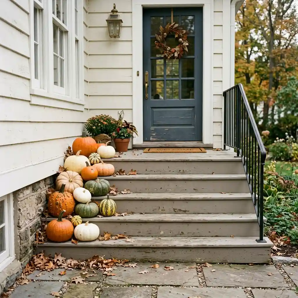
Work through this before you buy anything, because every line below costs nothing and changes what you put in the cart. More fall decorating ideas are worth a look once the palette is settled.
- Name your four fixed colors: wall, trim, roof, door.
- Pick one autumn accent that repeats none of those four.
- Borrow that accent from something permanent — mortar, stone, or a roof undertone.
- Check lightness, not just hue: pale objects need a dark wall, dark objects need a pale one.
- Choose one metal from the porch light fixture and repeat it two or three times.
- Hold the whole display to two colors plus green.
- Look at it once in daylight and once after dark before buying a second round.
KEY TAKEAWAY: The house picks the palette. Your only real decision is which single accent it is missing.
Palette Mistakes That Fight the House
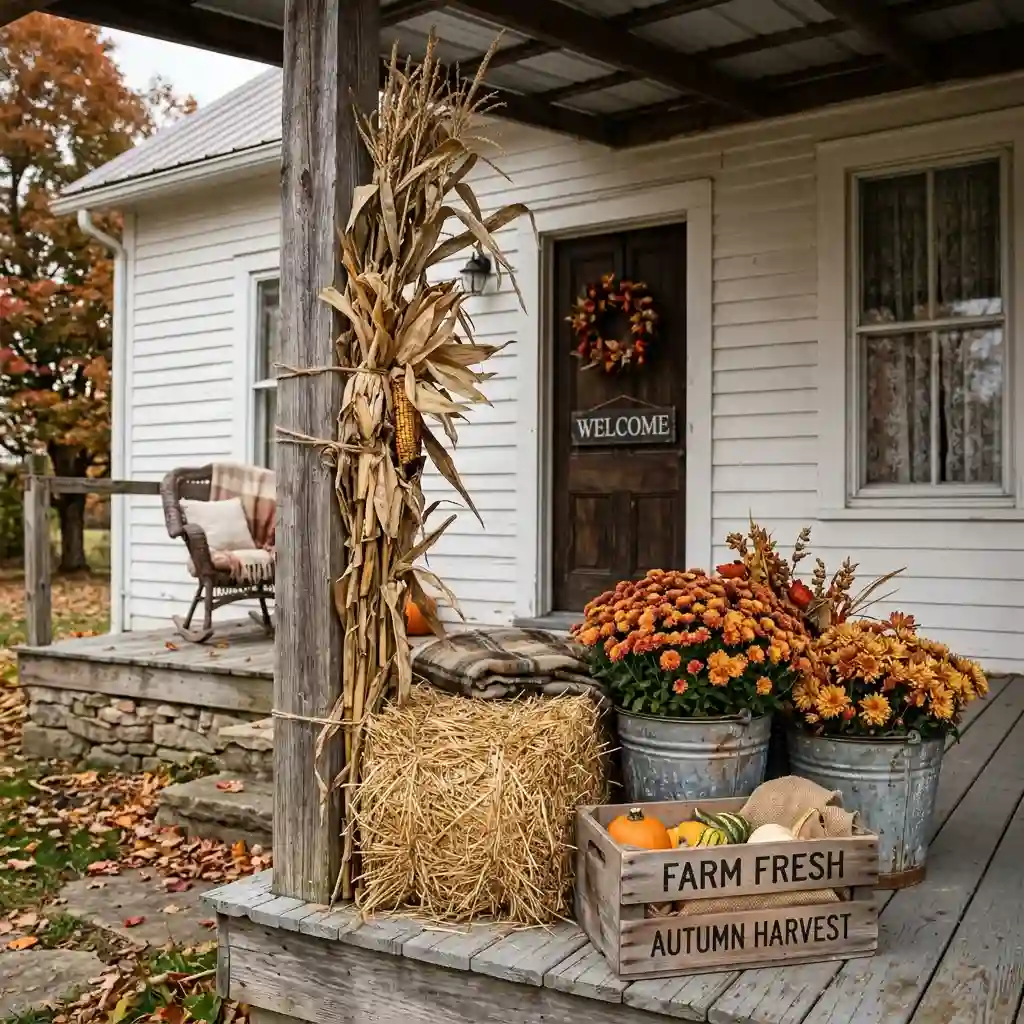
- Copying the palette from a saved photo. The photo was styled against a different wall color, a different door and a different roof. Take the arrangement from the photo if you like it, but re-pick every color against your own facade.
- Running orange on orange brick. Orange mums, orange pumpkins and a rust wreath against red brick give the eye no edge to find, and the whole front of the house turns to one flat smear. Cream and olive are what brick is missing.
- Using warm neutrals on a tan or stucco wall. Cream, oat and umber all sit at roughly the same lightness as beige stucco, so the display disappears. Contrast has to come from dark, not from warm.
- Going dark on an already-dark house. Charcoal planters against navy siding read as one silhouette after 4 p.m. On a dark facade the porch has to be the light thing in the picture.
- Judging the palette indoors. Shop lighting and daylight are different colors, and exterior surfaces shift again at dusk. Hold anything you are unsure about against the actual wall, outside, before you commit to a set.
What a Palette Swap Costs
Most of this is a choosing problem rather than a spending problem, and the cheapest line on the table changes the most. The budget tier is a bulb. The mid range is planters and a wreath in the right finish. The premium tier is repainting the door, which resets one of your four fixed colors permanently.
| Project | Estimated Cost | Impact Level |
|---|---|---|
| Warm 2700K bulb for the porch fixture | $12-$30 | High |
| Choosing cream or white pumpkins over orange | $0-$35 | Medium |
| Dried wreath in a facade-matched palette | $50-$160 | High |
| Two planters in a matched metal or matte finish | $60-$180 | Very High |
| Repainting the front door (quart plus primer) | $45-$95 | Very High |
Best First Upgrade: The warm bulb, because it changes every other color on the porch for the price of one coffee.
Skip for Now: A second wreath, a second doormat, and anything in a third accent color.
Renters, Shared Entries and Facades You Cannot Touch
Renting removes the door and the siding from your control, which actually simplifies the choice. You now have three fixed colors instead of four to work around, and your accent still has to avoid all of them. A beige corridor with a brown door leaves you dark green, charcoal and cream, and very little else that will show.
Buy the bases in neutral so they survive a move. Black or charcoal planters, a natural jute or coir mat and a bare grapevine wreath base work against almost any facade, which means the only thing you replace at the next address is the filler. Rental Note: use over-door hooks and freestanding planters rather than anything screwed into siding or a shared wall.
Shared landings carry one more limit – most buildings require a clear exit path, so keep everything inside your door frame width. Covered entries do give you a material advantage, since dried wheat, pampas and untreated wood all survive under a roof; the same logic makes enclosed porch ideas unusually easy to style seasonally.
What I’d Change Last
Designer’s Verdict: Change the bulb first and the door color last. A 2700K bulb costs almost nothing and re-tints every other color on the porch, while repainting the door resets a fixed value you will live with through three more seasons — worth doing, but not in October.
The palette question also settles the Halloween line without any argument. Warm harvest neutrals matched to your facade hold from late August through Thanksgiving, while black, purple and acid orange belong to a three-week window and to our Halloween decorating ideas. Keeping them separate means nothing has to come down early. The facade does not change in December either, so the same four fixed colors pick your evergreens for cozy winter front porch decor. Only the filler moves with the calendar; the planters, the metal and the mat stay exactly where they are all twelve months. By March those same containers are holding tulips and forced branches, which is how our spring front porch decor ideas handle the warm-season swap.
Frequently Asked Questions
Conclusion
The real variable in fall front porch decor is not the object list or the budget — it is whether the palette answers the four colors your house already runs. Name the wall, trim, roof and door, pick the one accent none of them own, and the same mums and pumpkins that looked wrong last year will look chosen. The rest of the calendar lives in our seasonal decorating archive, and every season rewards reading the house first.
Next Steps
- Photograph your house from the driveway and write down the wall, trim, roof and door colors.
- Pick one autumn accent that appears in none of those four, and borrow it from mortar, stone or the roof if you can.
- Fit a 2700K bulb, then check the palette again after dark before buying a second round.