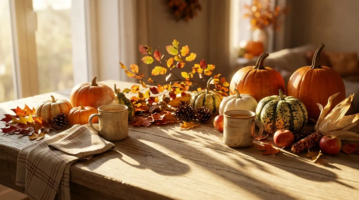
Why Do Two Autumn Photos of the Same Mug Look Nothing Alike?
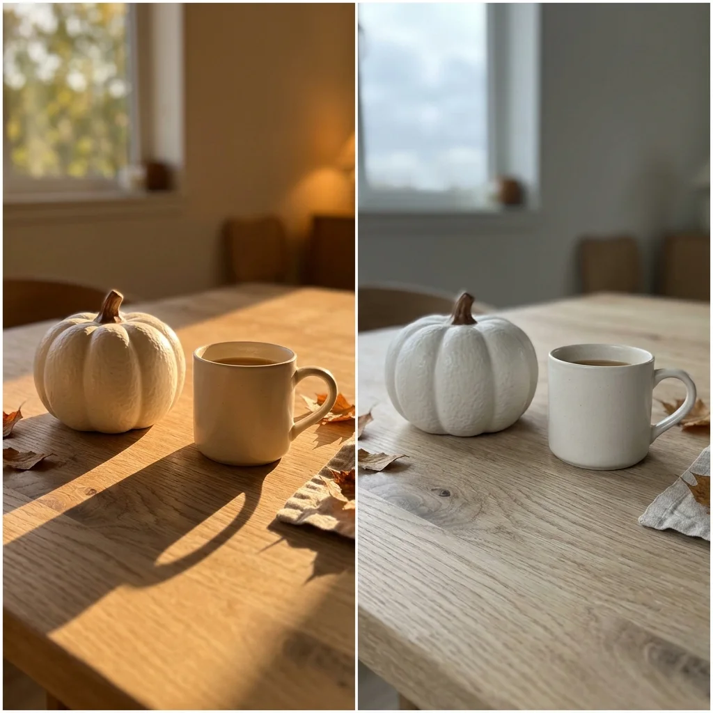
Why do two autumn photos holding the same mug, the same throw and the same small pumpkin land as completely different looks? Not the objects. The light. A fall aesthetic wallpaper takes its identity from the light it was shot in and from what was done to the contrast afterwards, which is why copying somebody’s props never gets you their picture. Name the light first and the search collapses from thousands of images to five.
Editorial field note: Photograph one white pumpkin on an oak table at four in the afternoon and the shot comes out amber, long-shadowed and soft. Photograph the identical setup on a grey Tuesday morning and it turns cool, shadowless and flat. Same table, same pumpkin, two aesthetics that do not belong on the same saved board.
Looking for more ideas? Explore our full guide to Fall Wallpaper.
This post sorts autumn backgrounds by the five kinds of light behind them, shows how to tell which one you keep reaching for, and explains why the rooms you live in can only ever produce two or three of them. If the physical side of the season is next on your list, our creative fall and autumn decor ideas cover that half.
What Do All Fall Aesthetic Photos Have in Common?

Almost the entire genre runs on six objects. A mug. An uncarved pumpkin. A knit wool throw. Dried stems in a jug. A stack of hardbacks. A handful of fallen leaves. Scroll a hundred saved autumn images and you will meet the same six in rotation, which is exactly why props are useless as a sorting tool. Everybody already has them.
What separates one board from another is how the light behaved when the shutter opened, plus one editing decision made afterwards. Two variables. That is the whole taxonomy. Once you can name both, you stop saving images that will never sit together and you stop buying objects hoping they will fix it. The same swap in thinking helps in a room, and there is more home decor inspiration if that is where you are heading next.
What Changed in Autumn Photography This Year
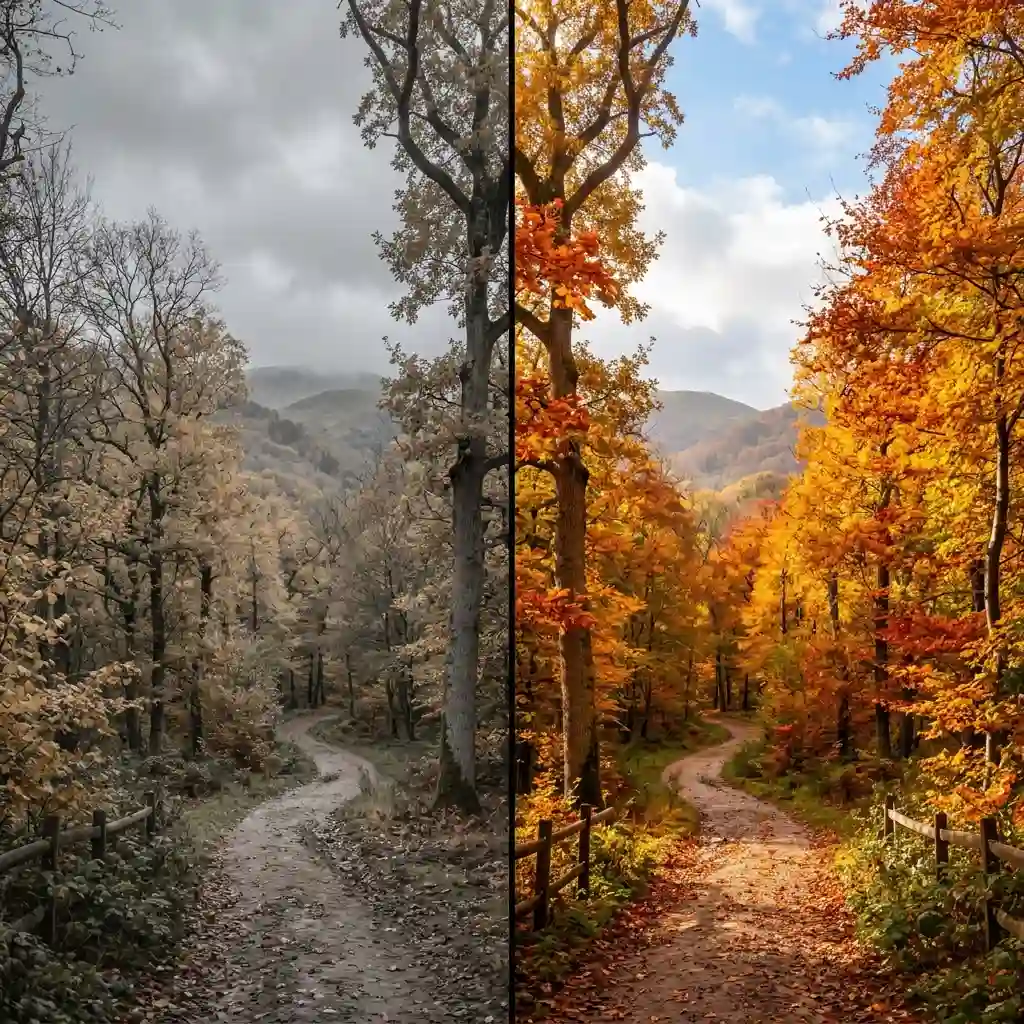
Autumn imagery used to be one thing: orange leaves, full frame, shot in strong midday sun. The genre has split, and the shift is easy to check for yourself.
Signs This Is Catching On:
- The weather in the photos changed. Grey, wet and shadowless shots now sit beside the sunlit ones instead of being treated as failed attempts at them.
- Editing moved in the opposite direction to a decade ago. Contrast and saturation are pulled down rather than pushed up, so the images look closer to faded paper than to a poster.
- Illustrated versions flattened out. Layered drawn scenes gave way to three flat colours and a great deal of plain field.
There is also a real reason autumn carries the colours it does, and it explains why some of these images look honest and others look pushed. Source Note: According to UW-Madison Horticulture Extension, carotenoids — the yellow and orange pigments — sit in leaves throughout the growing season and become visible only once chlorophyll levels drop away, while the red anthocyanins are made partway through the autumn breakdown, and leaves in direct sun turn the brightest red while shaded leaves show little or none.
So amber and yellow images look consistent year after year, while reds swing hard by species and by how much sun a branch happened to get. When a saved photo looks unnaturally red, the photographer usually found the one sunlit branch. You can see the same colours on real walls and textiles across our fall decorating archive.
The Five Kinds of Light in a Fall Background
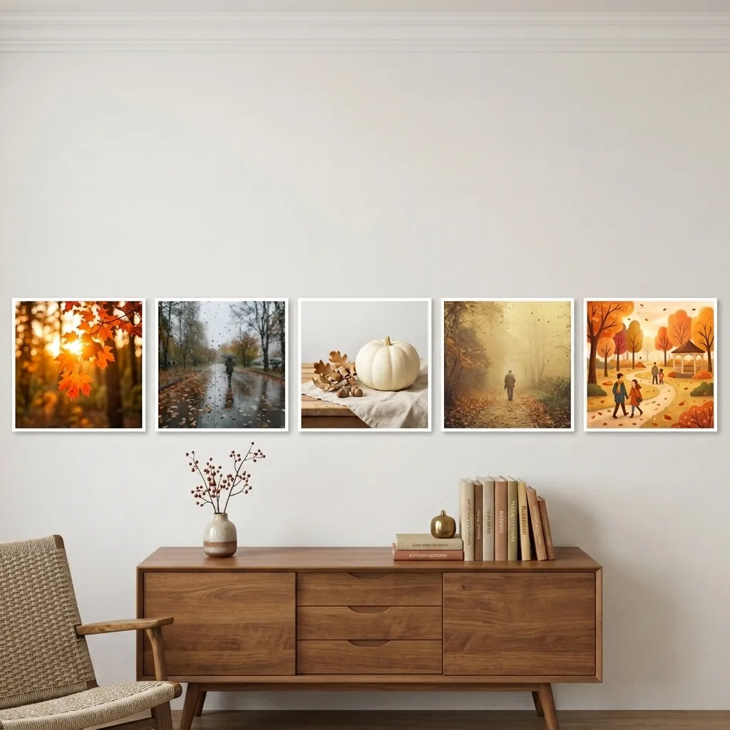
Every fall aesthetic wallpaper sits in one of five lighting situations. Each one produces its own colour cast, its own shadow behaviour and its own mood, and each one belongs to a different set of rooms. Read the five, then look at what you have already saved — one group will be far bigger than the rest. Each has a room equivalent too, and our bedroom aesthetic ideas guide shows what those look like at full scale.
Low Backlit Sun
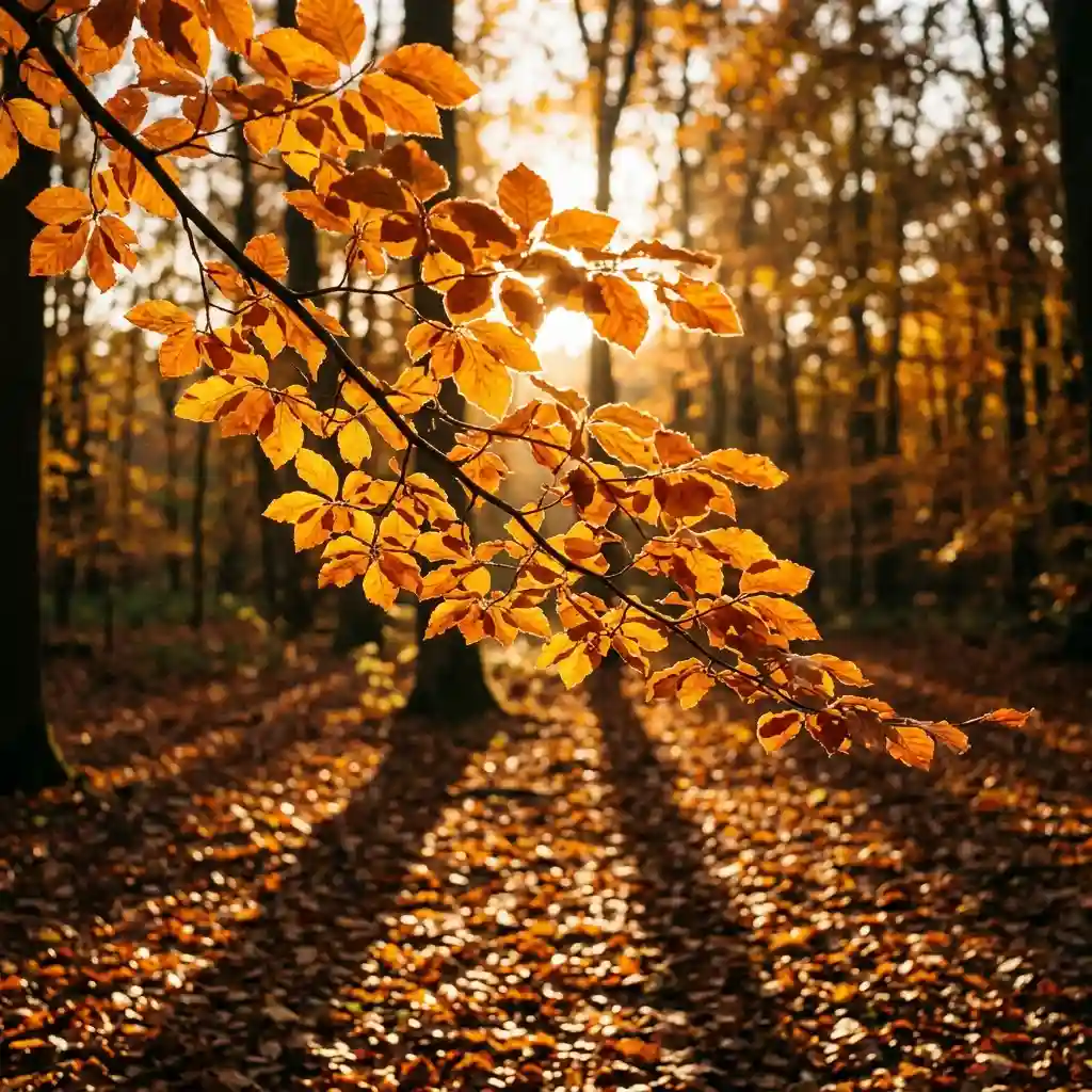
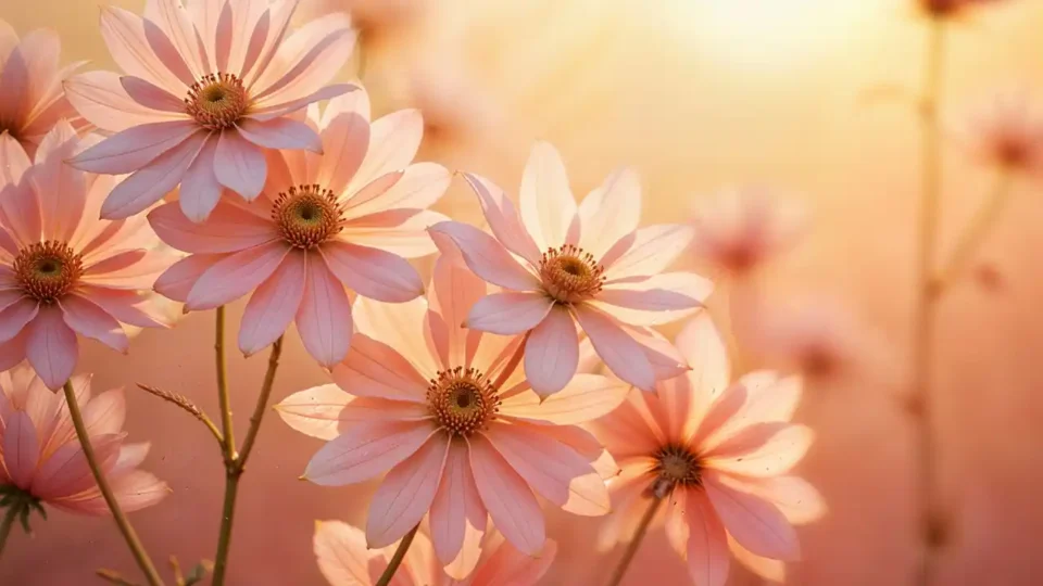
Low backlit sun is the classic autumn photograph: the sun sitting near the horizon behind the subject, leaf edges rimmed with light, shadows stretched long across the ground. The warmth comes from the sun’s angle rather than from the leaves themselves. Source Note: The UCAR Center for Science Education explains that when the sun is low, light travels through a much greater thickness of atmosphere, so more wavelengths scatter away and mainly red light reaches your eye. Colours run amber and ochre, whites turn cream, and everything gains a glow that no filter reproduces convincingly. Its room cousin is a warm cream and putty palette, the kind behind these beige and cream bedroom ideas.
Flat Overcast Grey
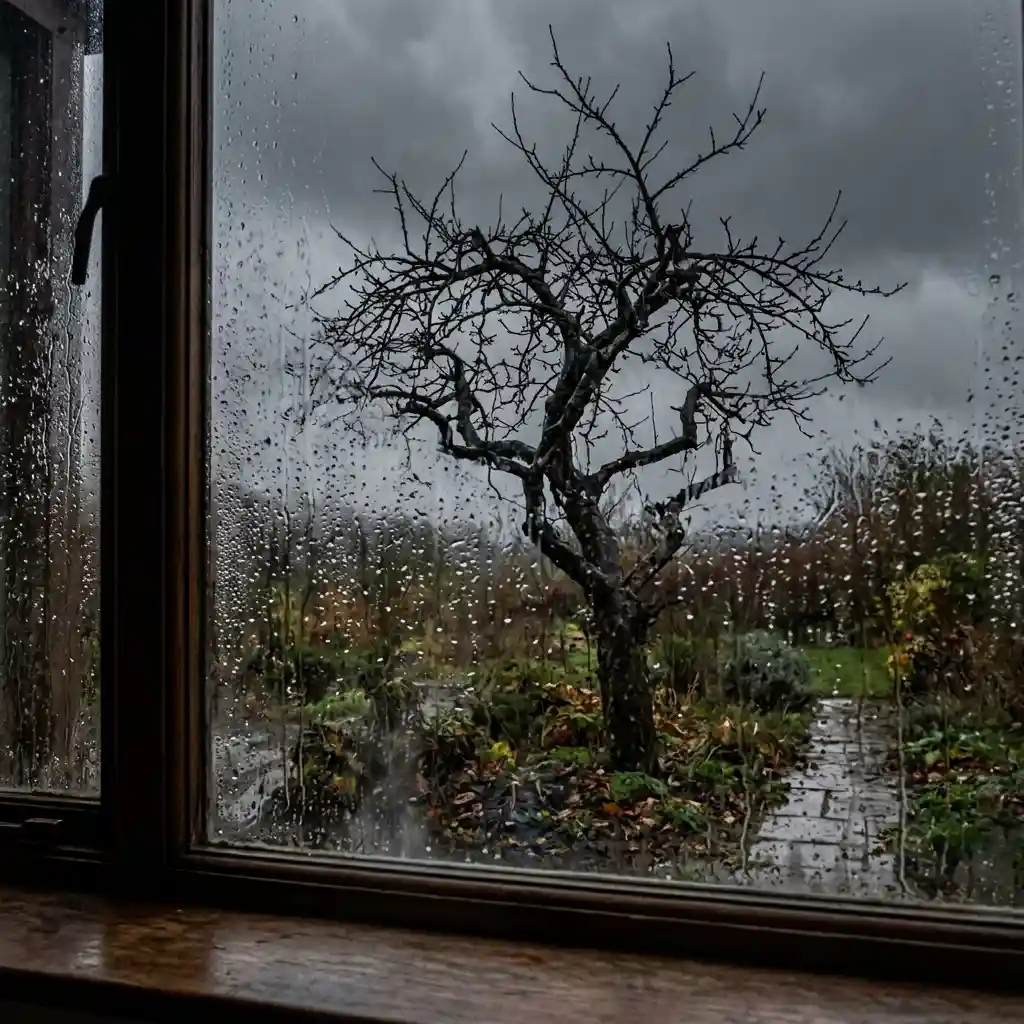
Flat overcast grey is the light most of autumn actually happens in. Cloud turns the whole sky into one enormous soft source, so shadows disappear, colours drop in saturation, and the image lands inside a narrow band of charcoal, wet bark and moss. Rain on glass belongs here. So does every walk photographed at eleven in the morning in November. This light is the least dramatic and the most honest, and it holds up longer than the sunlit version because nothing in it is showing off. Cool, quiet rooms sit in the same register, which is the ground these grey bedroom design ideas work in.
Bright Indoor Daylight
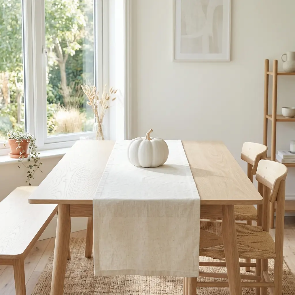
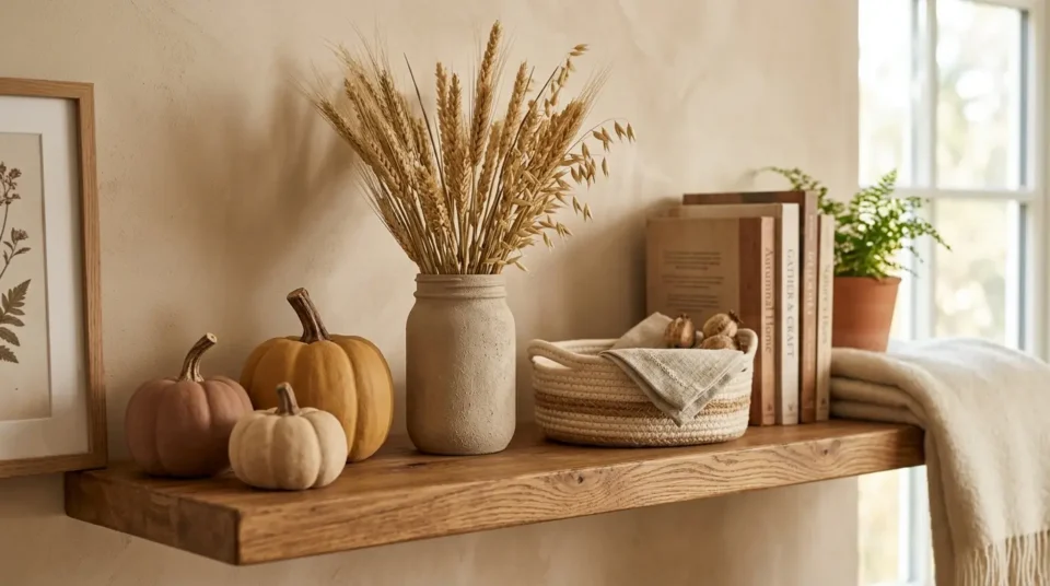
Bright indoor daylight is autumn without the gloom, and it is badly underused. A large window at midday, pale oak, cream linen, one pumpkin that happens to be white rather than orange. Nothing is dim and nothing is amber. This is the version people scroll past because it does not look seasonal at first glance, then keep coming back to because it never feels heavy. Whites stay white, so the palette reads clean instead of cosy, and the same clarity runs through these Scandinavian bedroom ideas.
Pulled-Down Film Contrast
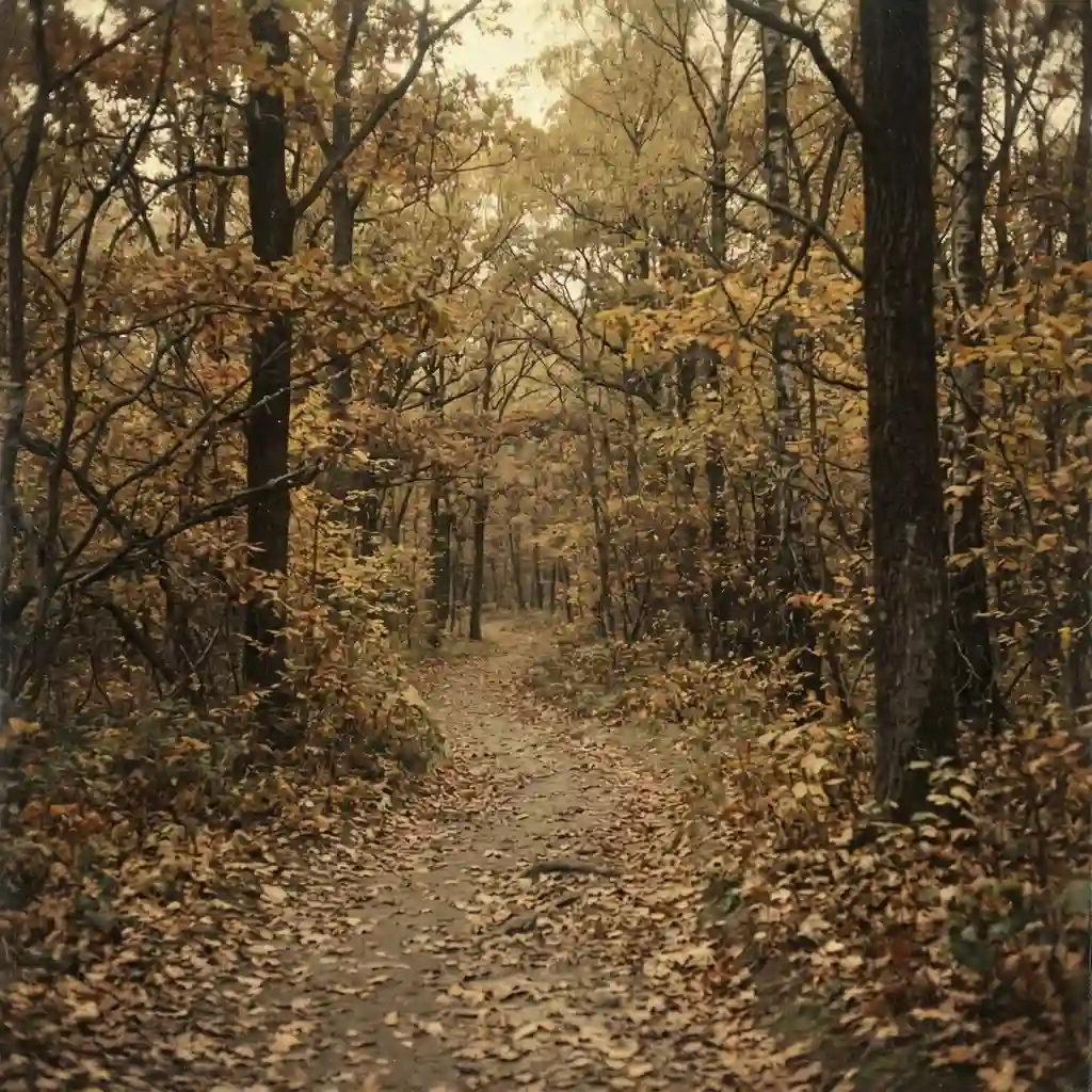
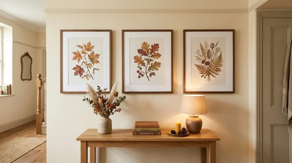
Pulled-down film contrast is an edit rather than a weather condition. Blacks are lifted, highlights are held back, fine grain is laid over the top, and the whole image compresses into a narrow band of dust yellow and faded brown. It can start from any of the three lighting situations above and still end up here. The tell is the darkest corner: if nothing in the frame is truly black, the contrast was pulled down after the shutter closed. Vintage botanical plates carry exactly this treatment, which is why these botanical art ideas sit beside it so easily.
No Light at All
The fifth kind has no light source in it, because nothing was photographed. Flat illustration builds an autumn scene out of three or four solid colours on a plain field: small pumpkins, a mug, a scatter of leaves, no shadow anywhere. The upside is control — an illustrator decides every colour and leaves the plain field where it suits. The downside is shelf life, since a drawn style carries the year it was made in its line weight and palette. Three flat colours and a lot of empty field is the same edit behind these minimalist bedroom ideas.
Which Light Are You Actually Drawn To?
Naming the five is the easy half. Working out which one is yours takes five minutes and settles the question for the season.
Sort what you have already saved. Open the folder and put each image into one of the five. One pile will be noticeably larger, and that pile is the answer — not the image you think is the prettiest.
Check the pile against the weather you live in. If your autumn is genuinely grey from October onward, a folder full of low backlit sun is a holiday you are not taking. The overcast pile will serve you better and stop looking borrowed.
Pick the edit separately from the light. Pulled-down contrast can be applied to any photograph. Decide whether you want the faded version or the straight one, then apply that decision to every image you keep.
Let one kind own the whole season. Mixing backlit sun with flat grey across a set of saved images never resolves. Each one makes the other look wrong, the same way two different wood tones argue in a room.
DESIGNER TIP: Turn a photo upside down before you judge it. Flipping it removes the subject from your attention and leaves only the light and the tone behind, which is the quickest way to see whether two saved images actually belong together.
Keep five images, not fifty. A large folder is a symptom of not having chosen. Five in one kind of light gives you variety without the daily decision, and you can browse more seasonal decorating ideas once you want the rooms to follow.
Can You Get the Same Light in a Real Room?
Partly, and the deciding factor costs nothing: which way your windows face. A room cannot produce a kind of light its orientation never delivers, which is why some saved boards stay out of reach no matter what gets bought.
Designer Rule of Thumb: north-facing rooms give you flat overcast light almost all day, with soft shadows and steady colour. West-facing rooms are the only ones that hand you low backlit sun indoors, and only for the last hour or two of the afternoon. South-facing rooms are where bright indoor daylight lives, and east-facing rooms get one sharp bright window in the morning and then behave like a north room for the rest of the day.
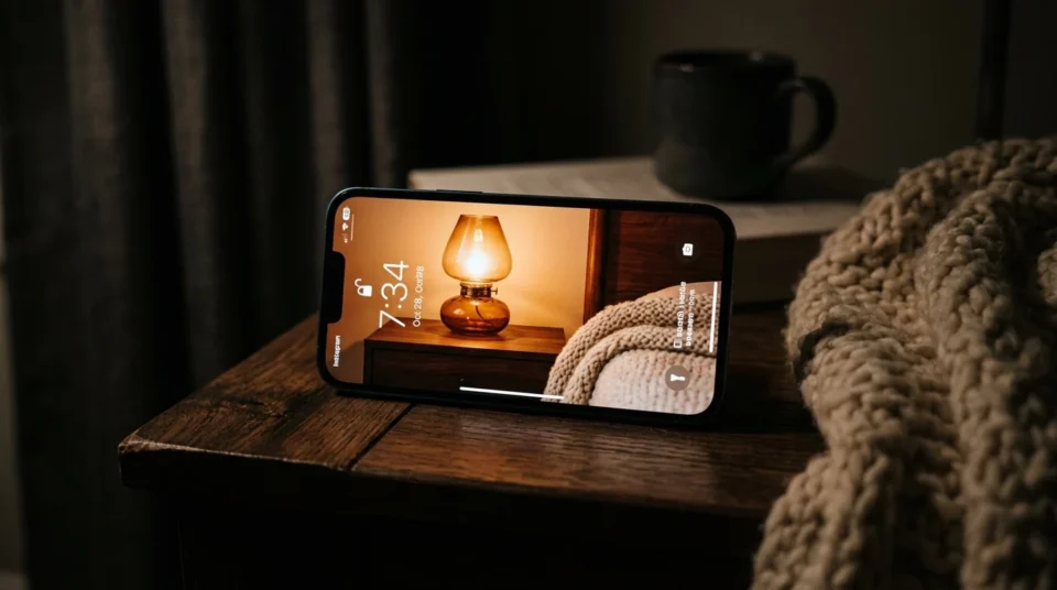
That single fact reorders the whole project. If you love low backlit sun and live in a north-facing flat, chasing it with objects will not work — the amber in those photos is sunlight, not decor. The honest move is to take the overcast look, which your rooms already produce beautifully, and let the amber live on the screen. Where a room has only one window to work with, the arrangement matters more than usual, and these ideas for a bedroom with one window show how to place things around it.
The reverse is also worth knowing. A very bright south-facing room fights a moody autumn scheme all day and wins, so it is better decorated toward the daylight version of autumn than the dim one. Sunlit rooms handle warm neutrals and pale wood far better than deep browns, which is the thinking behind these sunroom decorating ideas.
Which Kind Wears Best Across the Season?
Autumn is three months long and its light changes twice inside that span. A fall aesthetic wallpaper chosen in early September is looking at a different world by late November, and some of the five handle that shift far better than others. The same “will I still want this in eight weeks” test decides most seasonal choices, which is the thread running through our bedroom trends guide.
| Kind of light | What it does to colour | When it stops working |
|---|---|---|
| Low backlit sun | Pushes everything amber; whites turn cream | Early November, once the leaves are down |
| Flat overcast grey | Drops saturation; charcoal and wet bark lead | Rarely — it carries into winter unchanged |
| Bright indoor daylight | Keeps whites white; palette stays clean | Mid-December, when it starts reading spring |
| Pulled-down film contrast | Compresses to dust yellow and faded brown | Not tied to a date; it has no season in it |
| No light at all | Whatever three colours were chosen | Next autumn, when the drawing style dates |
Five Ways to Tell Which Light a Photo Was Shot In
- Look at the shadows: long and hard means low sun, and none at all means cloud.
- Check the leaf edges for a bright rim, which only happens when the sun sits behind them.
- Find something cream in the frame; cream gone amber means late afternoon sun.
- Look at the darkest corner — if nothing is truly black, the contrast was pulled down afterwards.
- Try to name a light source; if you cannot find one anywhere, you are looking at an illustration.
KEY TAKEAWAY: Name the light in a photo and you have named its aesthetic — the objects in it were never the point.
Six Autumn Photos That Never Work as Backgrounds
❌ Woodland shots taken at midday → ✅ Wait for the last hour of sun; the same trees carry the whole look at 4pm.
❌ Two kinds of light in one saved set → ✅ Sort into the five kinds and keep only the largest pile.
❌ Direct flash on an autumn still life → ✅ Use window light, since flash removes the shadow that makes a season readable.
❌ Heavy orange filters over a grey-day photo → ✅ Find a photo with real low sun; added warmth always looks added.
❌ Bright pumpkin orange beside black → ✅ Keep rust, amber and ochre, and hand that pairing to Halloween decorating.
❌ Committing to light your home never gets → ✅ Pick the kind your windows already deliver, then decorate toward it.
The One Light Worth Keeping All Season
Low backlit sun is the most beautiful of the five and the most tied to a date, because the trees in those photos are bare by early November while the picture is still on your screen. Flat illustration is the easiest to live with and the quickest to age. Bright indoor daylight is the sleeper choice and starts to read as spring once December arrives.
Designer’s Verdict: Flat overcast grey is the one worth keeping all season. It has no dated subject in it, it matches the weather most of us actually get from October onward, and it is the only kind on this list that a north-facing room can reproduce for free — which makes it the rare screen choice you can walk into rather than just look at.
Frequently Asked Questions
Conclusion
A year from now the specific fall aesthetic wallpaper you used this October will be long gone, but the habit of naming the light before the props will still be saving you time — in a camera roll and in a room. Autumn is the season people try to buy, and it is mostly weather and time of day. More seasonal looks worth borrowing are waiting in our home decor ideas collection.