TL;DR
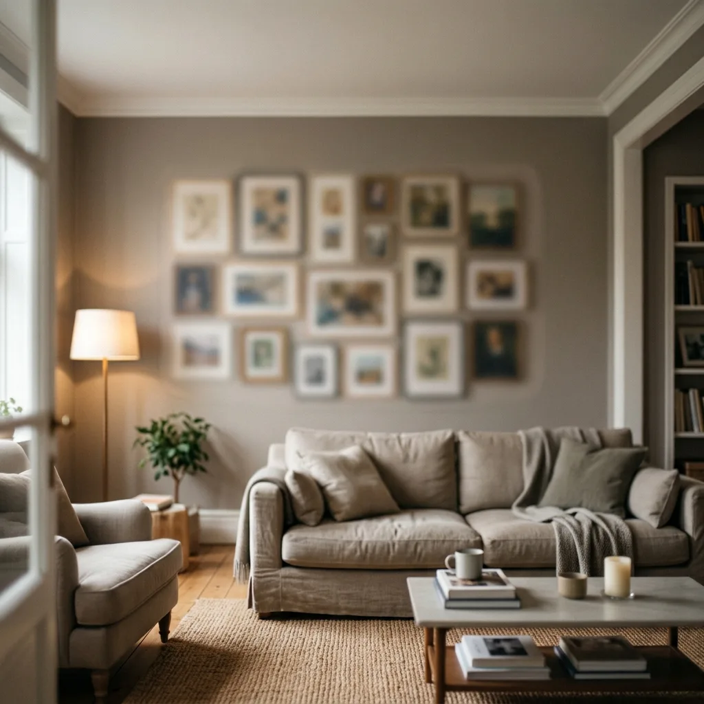
Size the footprint before you choose a shape. Make the arrangement roughly two-thirds to three-quarters the width of the furniture below it, start it 7 to 10 inches above that furniture, keep gaps at a consistent 2 to 3 inches, then pick from five shapes — tight grid, salon cluster, linear row, staircase diagonal, or vertical column — based on what the wall can hold.
Why Do Downloaded Grid Templates Stop Working on a Real Wall?
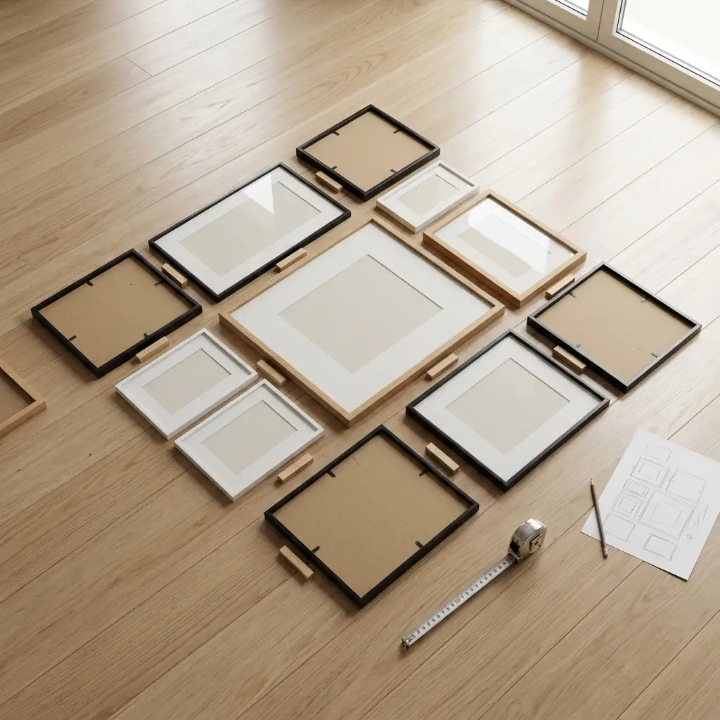
The standard advice — lay your frames on the floor, shuffle them until it looks right, then copy it onto the wall — is only half a method, and the missing half is why so many walls come out wrong. A floor has no edges. A wall has furniture under it, a light switch to one side, and a ceiling that stops it.
Part of our guide to wall decor, this post covers the arrangement itself.
Here is the direct answer. A downloadable gallery wall layout template gives you a shape but no size, and size is the part that has to come from your room. The same nine-frame diamond that looks balanced above a 90-inch sofa looks cramped above a 40-inch console. The shape was never the problem.
So the order of operations is inverted from how most people work. Measure the space the arrangement may occupy, turn that into a rectangle, and only then choose a shape to fill it. The same logic drives our living room wall decor ideas, where the sofa sets the terms for everything above it.
Start With the Rectangle, Not the Template
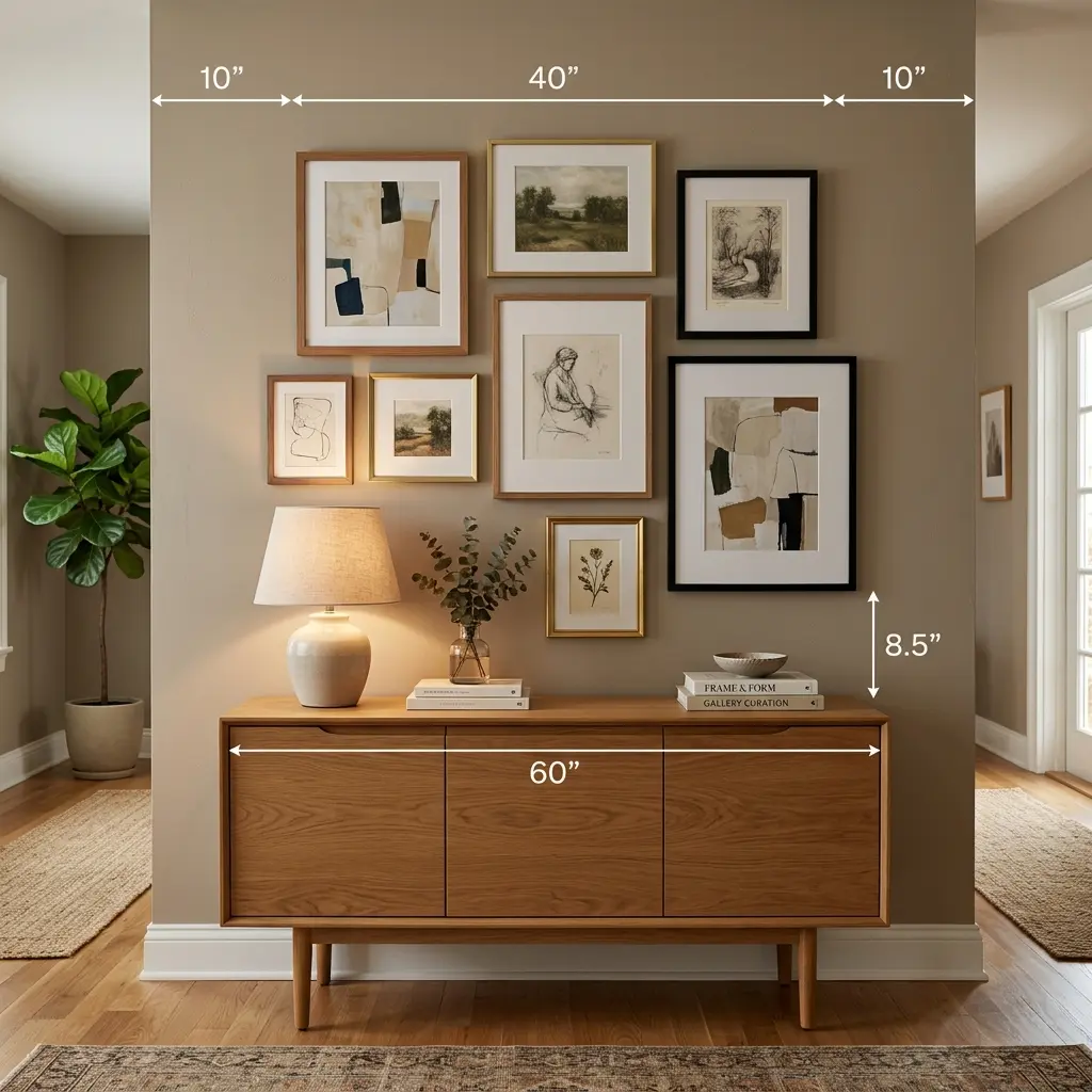
Before any shape is chosen, define the outer rectangle the whole arrangement has to live inside. Every good layout is a shape fitted into a footprint, and the footprint comes from the room rather than from a template.
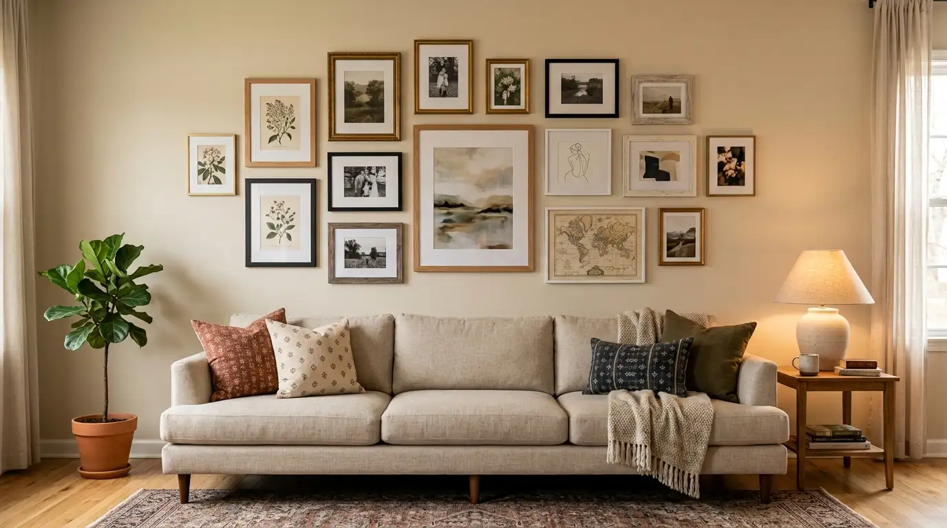
The width comes from the furniture below. Aim for the arrangement to span roughly two-thirds to three-quarters of the width of the sofa, console, sideboard or bed underneath it. Narrower than two-thirds and the wall looks under-filled; wider than the furniture itself and the group stops belonging to the piece it sits above. Above a bed the same proportion holds, and our guide to wall decor above the bed covers that wall in more detail.
The height comes from the gap between the furniture and whatever stops the wall. Custom framer Framebridge recommends planning for the bottom of your lowest frame to hang 7 to 10 inches above the top of your furniture, which sets the rectangle’s lower edge. The upper edge stops below any picture rail, crown moulding or shelf — not at the ceiling.
On a wall with no furniture at all, the rectangle is set by the architecture instead: doorways, window edges, the run of a stair rail. How high the finished group then sits off the floor is a separate question from its shape, and one this guide deliberately leaves alone.
| Quick Takeaways | |
|---|---|
| Footprint width | Two-thirds to three-quarters of the furniture width below. Never wider than the furniture. |
| Footprint base | Lowest frame sits 7–10 inches above the furniture top. |
| Gaps | 2–3 inches, consistent throughout. Widen slightly for oversized frames. |
| Shape | Five options: tight grid, salon cluster, linear row, staircase diagonal, vertical column. |
| Test | Cut kraft paper to each frame and tape it up before a single hole is drilled. |
What Changed About Gallery Wall Layouts?
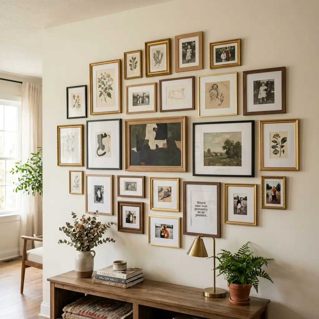
The symmetrical grid was the default for a decade and it is no longer what designers reach for first. What replaced it is looser, and the change is specifically about the outer edge of the arrangement rather than about the frames inside it.
Signs This Is Catching On:
- The organic cluster — varied frame sizes in a loose grouping, some pieces sitting higher than others — has become the default recommendation over the rigid grid.
- Outer edges are deliberately irregular now. The clean rectangular boundary that defined the old grid look reads as dated.
- Fewer and larger is displacing more and smaller: three or four generously sized frames where a dense twelve-frame grid used to go.
- Asymmetry is being used to create movement across a wall rather than treated as a mistake to correct.
This does not retire the rectangle. A loose cluster still occupies a footprint, and the pieces still have to stop somewhere sensible relative to the sofa below. The difference is that the edge is now soft rather than crisp — some frames break the line slightly, and the eye reads the whole thing as one shape anyway. Work out the rectangle, then let a few pieces cross it on purpose.
The fewer-and-larger shift matters most in small rooms, where a dense grid never had the viewing distance to work. Our small bedroom ideas guide covers the same trade-off across a whole room.
The Five Layouts and the Wall Each One Needs
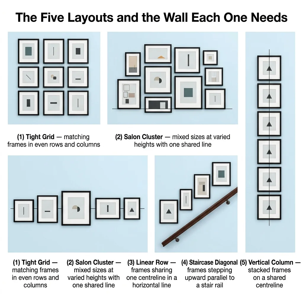
Every gallery wall layout worth using is a variation on five shapes. Each one asks something different of the wall, and picking the wrong one for your space is more damaging than any spacing error.
The Tight Grid
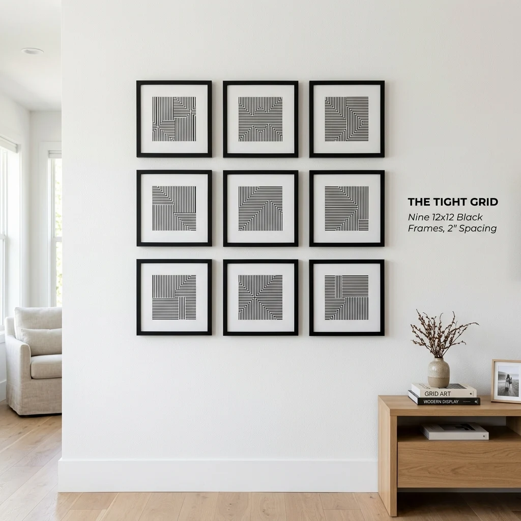
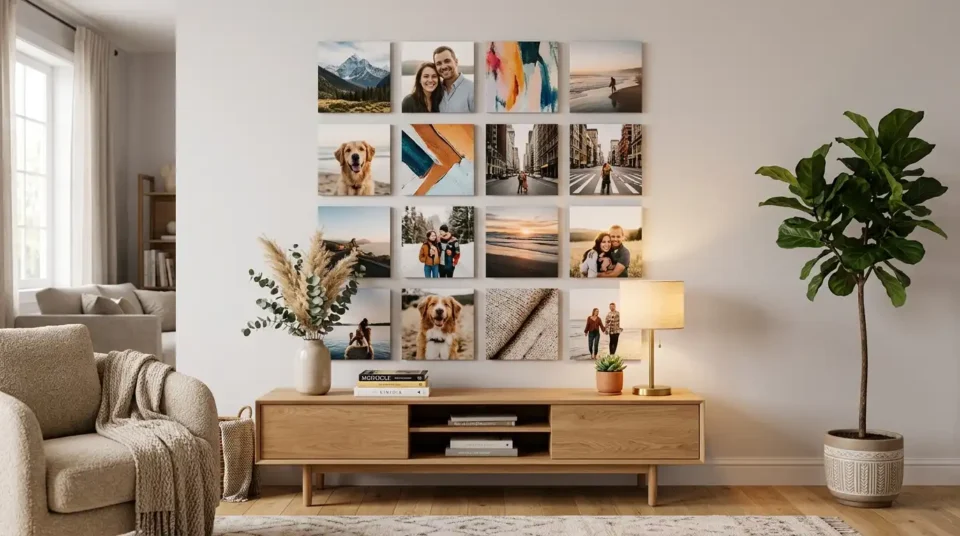
A grid is equal frames in equal rows and columns with identical gaps throughout. It needs matching frames, an even count that divides cleanly, and a rectangular patch of wall with nothing interrupting it.
The grid is the most forgiving layout for weak content and the least forgiving for imperfect execution. Because every edge aligns, a frame hanging a few millimetres out is immediately visible. It suits repeating subjects — botanical plates, nine shots from one trip — where the repetition is the point.
Use it above a sideboard, in a dining room, or anywhere the room is already formal. Avoid it if your frames are mismatched, because a grid makes the mismatch look like a mistake rather than a choice. Seasonal botanical sets are among the easiest repeating subjects to assemble for one — our spring wall art ideas cover that category.
The Salon Cluster
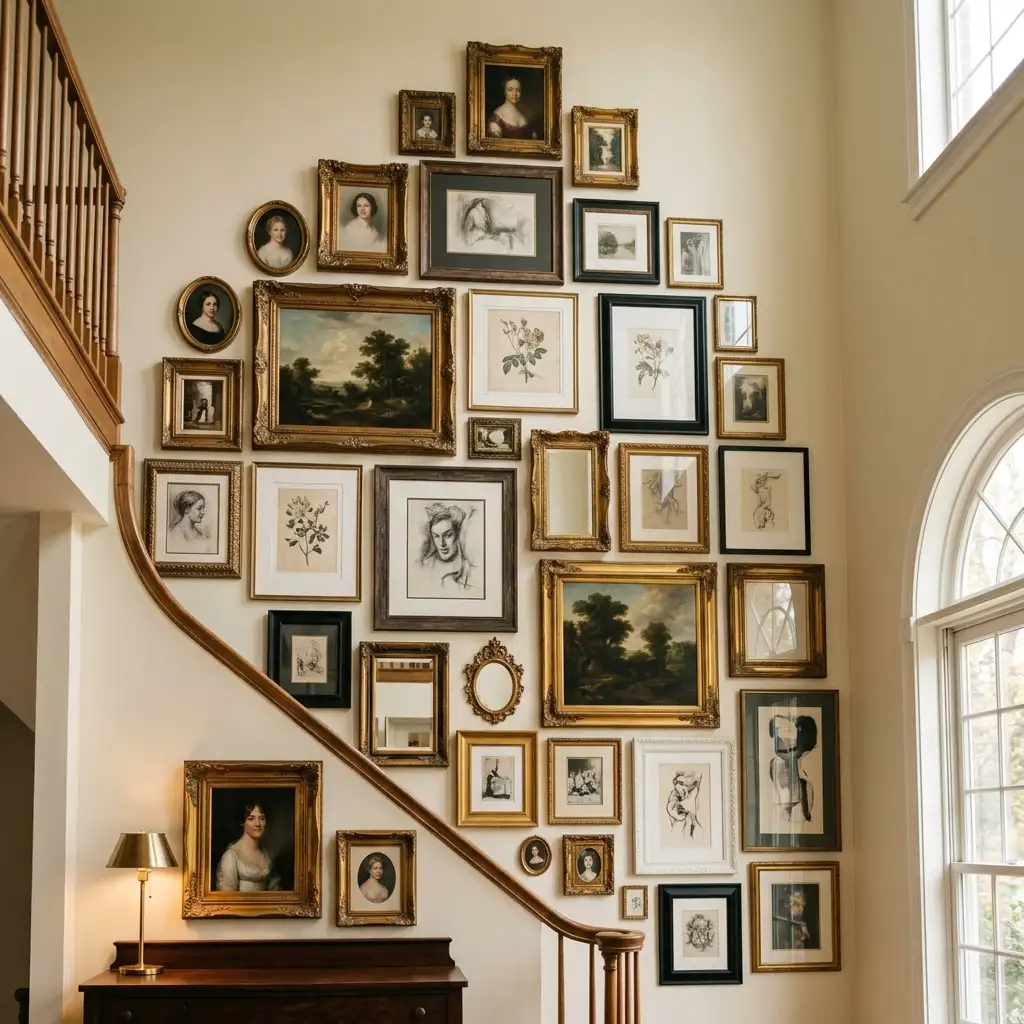
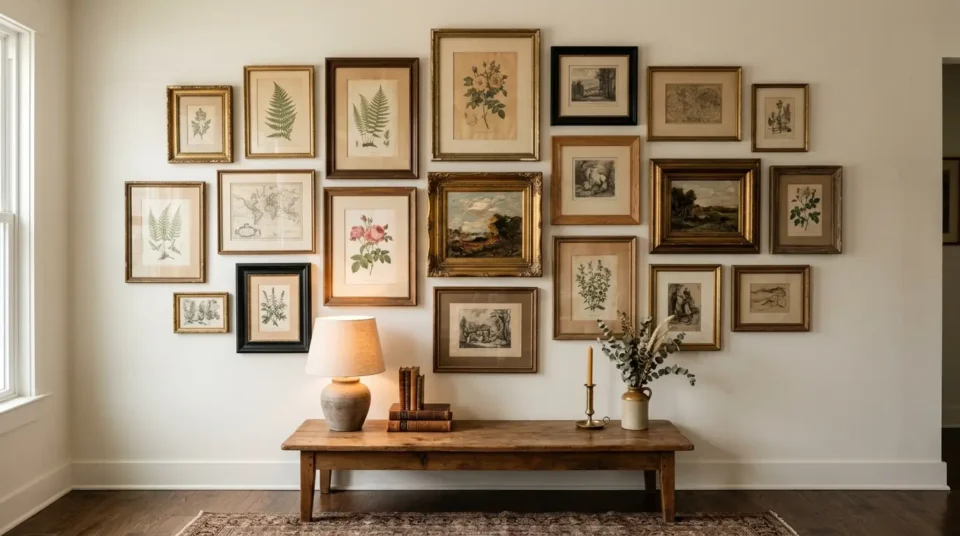
A salon cluster fills a footprint with mixed frame sizes at varied heights, with no rows and no symmetry. It is the loosest of the five and the hardest to get right, because nothing aligns automatically.
One rule saves it: at least one axis has to align across the group. Pick a horizontal line and let three or four frames share a top edge, or a bottom edge, or a common centreline — then let everything else fall freely around that. Without a single shared line the arrangement reads as scattered; with one, the same frames read as composed.
Salon clusters want height. They work up a stairwell, on a tall hallway wall, or over a bed where the wall runs well above the headboard. They struggle in a low horizontal strip, where there is no room for the vertical variation that makes them interesting. The look sits naturally in a dark academia bedroom, where a densely hung wall is part of the period reference rather than a departure from it.
The Linear Row
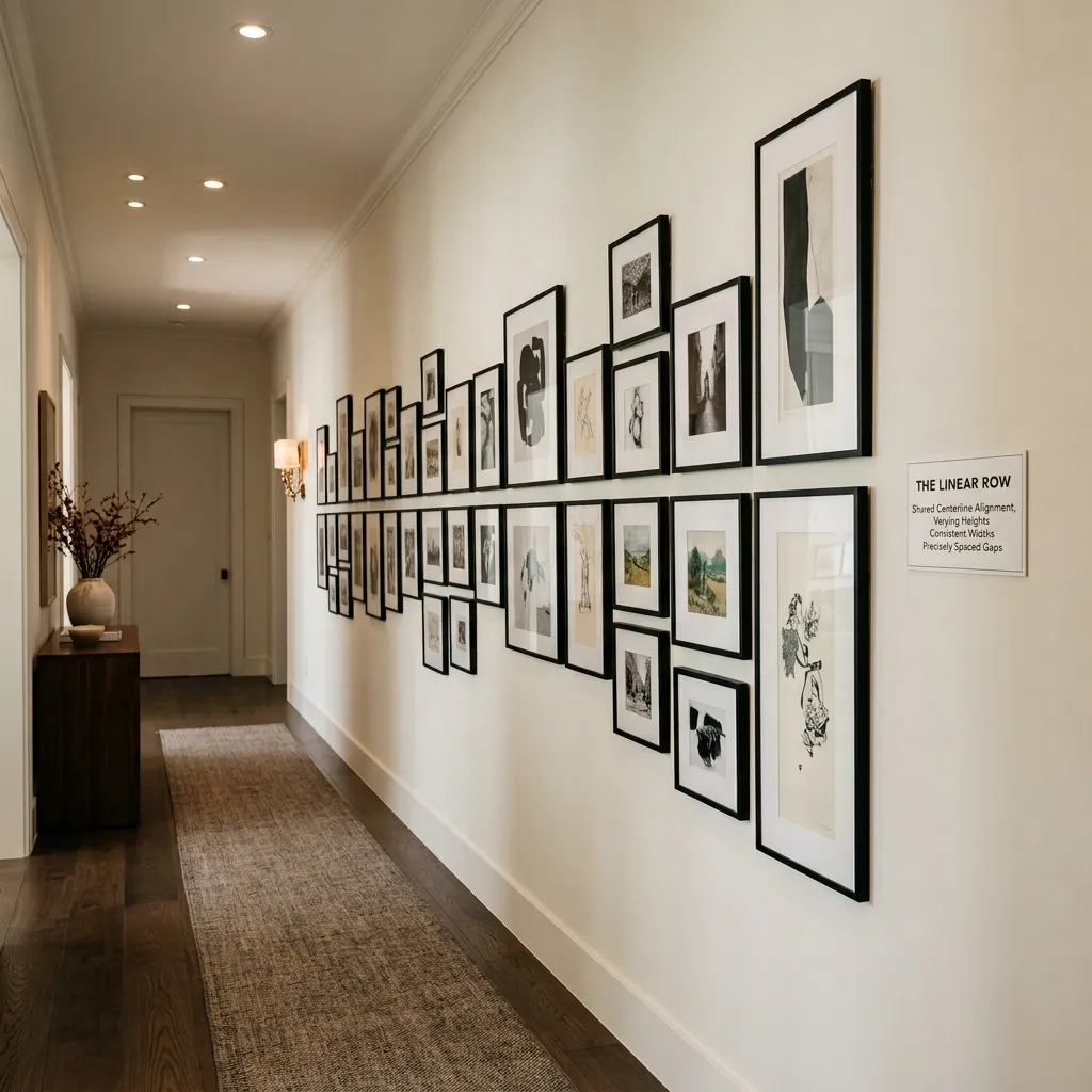
A row is a single horizontal line of frames sharing one centreline, evenly spaced. It is the simplest layout to execute correctly and the one most often skipped for looking too plain on paper.
It is the right answer more often than people expect. A hallway, the strip above a long low sideboard, a landing — anywhere the rectangle is much wider than it is tall — takes a row better than any cluster. Frames can vary in size provided their centres stay on the line.
DESIGNER TIP: In a row, the gap does more work than in any other layout, because the eye reads the rhythm directly. Measure every gap rather than eyeballing it — an inconsistent row looks broken in a way an inconsistent cluster never does.
The Staircase Diagonal
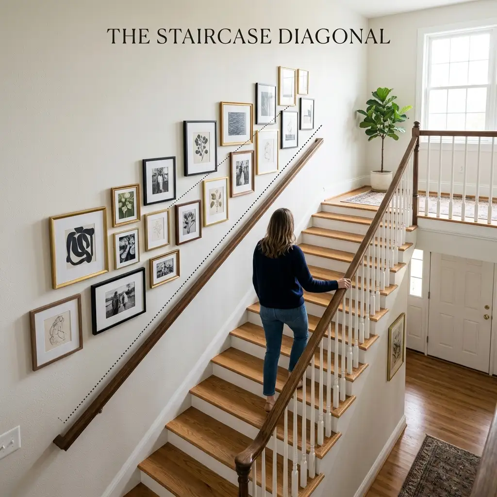
A staircase layout steps frames upward on an invisible diagonal that runs parallel to the stair rail below it. The rail sets the angle, and every frame’s centre sits the same vertical distance above that line.
The most common failure here is following the stairs with the frame bottoms while the tops wander, which produces a ragged upper edge climbing the wall. Track the centres to the rail instead and let the tops and bottoms fall where they will.
Frames can be mixed sizes, and a mix actually helps — a diagonal of identical frames reads as a conveyor belt. Keep the gaps measured along the diagonal rather than horizontally.
The Vertical Column
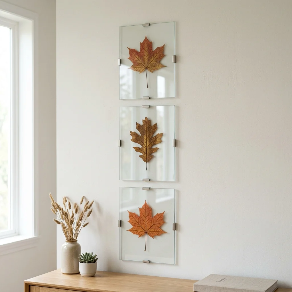
A column is two to four frames stacked on a shared vertical centreline. It exists for walls the other four layouts cannot use: the strip between two doorways, the panel beside a window, a chimney breast return, the narrow wall at the end of a galley kitchen.
Columns make a low ceiling read taller, which is the main reason to choose one where a row would also fit. Keep the frames the same width even when their heights differ — varied widths in a column produce a zigzag edge that undoes the height effect.
Two columns flanking a window or a bed work as a pair, provided both hold the same number of frames at the same heights. Our guide to arranging a bedroom with one window covers the wall space that tends to be left over in those rooms.
How Do You Test a Layout Before Making Holes?
Floor layouts lie. An arrangement that looks balanced flat on the ground looks different vertical, at eye level, against a coloured wall, with a sofa underneath it. The gap between those two views is where most gallery walls go wrong, and the fix costs about four dollars. Judge the mock-up under the lamps you actually use at night as well as in daylight — our cozy bedroom lighting guide covers how much that changes a wall.
The Kraft Paper Method
Trace each frame onto kraft or butcher paper, cut the shapes out, and tape them up with painter’s tape. You now have a full-size mock-up you can stand back from, live with for a day, and move as often as you like.
Two details make it worth the effort. First, mark each paper with the frame’s hanging point before it goes up — measure from the top of the frame down to the taut wire or hook slot, then mark that distance on the paper. Second, hang directly through the paper: drive the nail at the mark, then tear the paper away.
That second step removes the measuring error entirely. You never transfer a measurement from paper to wall, because the paper is already on the wall in the right place.
DESIGNER TIP: Photograph the paper mock-up from the doorway rather than from in front of it. Almost nobody views a gallery wall square-on, and problems with the outer edge show up immediately from an angle.
What Gap Should Sit Between Frames?
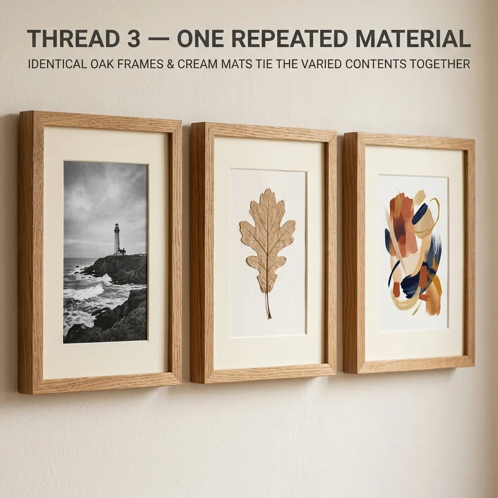
Two to three inches is the working range, and consistency matters more than the exact figure. Framebridge’s guidance is to space frames 2 to 3 inches apart and keep that spacing the same between every frame, which is the part people skip.
Scale the gap to the frames rather than to the wall. Small frames under about 8 by 10 inches sit comfortably at 2 inches; standard sizes suit 2.5; oversized pieces above roughly 24 inches need 3 or more, because a tight gap around a big frame reads as crowding. Whatever you choose, use the same number everywhere in the arrangement.
The one exception is the salon cluster, where slightly uneven gaps are part of the effect. Even there, keep the variation inside a narrow band — 2 to 4 inches, not 1 to 8 — or the group stops reading as one shape.
When the Wall Will Not Cooperate
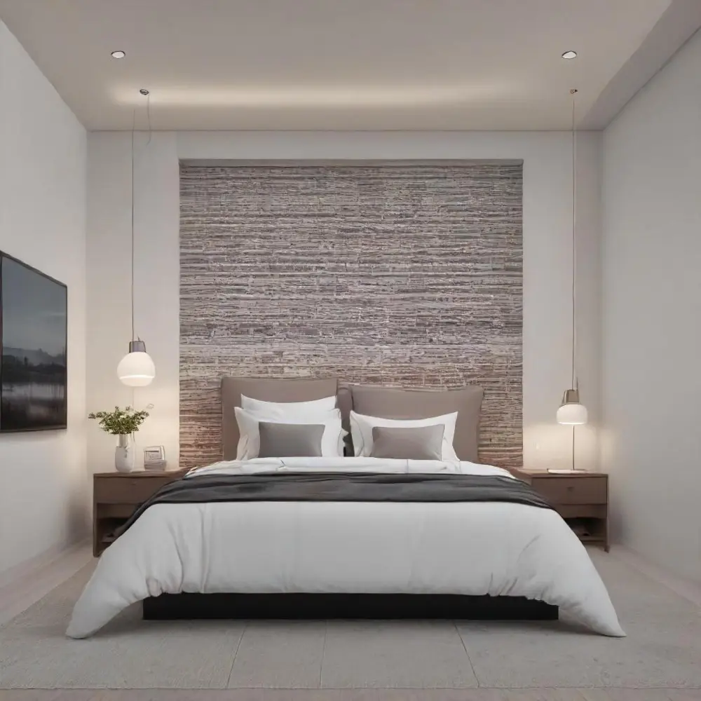
Some walls refuse every one of the five shapes, and forcing one is worse than adapting.
A light switch, thermostat or intercom inside the footprint is the most common obstruction. Shift the whole footprint sideways so the switch falls clearly outside, or build a column on the other side of it. An arrangement slightly off-centre on the wall but correctly centred on its furniture looks right; the reverse never does. Bathrooms are the worst offenders for this, and our bathroom wall decor ideas cover working around fixtures.
Sloped ceilings rule out grids and rows entirely. A staircase diagonal is usually the answer even when there are no stairs, because it is the only shape that reads correctly under an angled line.
Small rooms need fewer, larger pieces rather than more small ones. A dense cluster in a tight space reads as clutter from the only viewing distance available.
Where the wall is genuinely unusable — damp, textured, or off-limits under a lease — a picture ledge sidesteps the layout question, and built-in style shelving does the same thing permanently. Frames lean, overlap and move without any of this planning.
Rental Note: Kraft paper templates are worth more to renters than anyone, because every avoided hole is a deposit you keep.
The Bottom Line
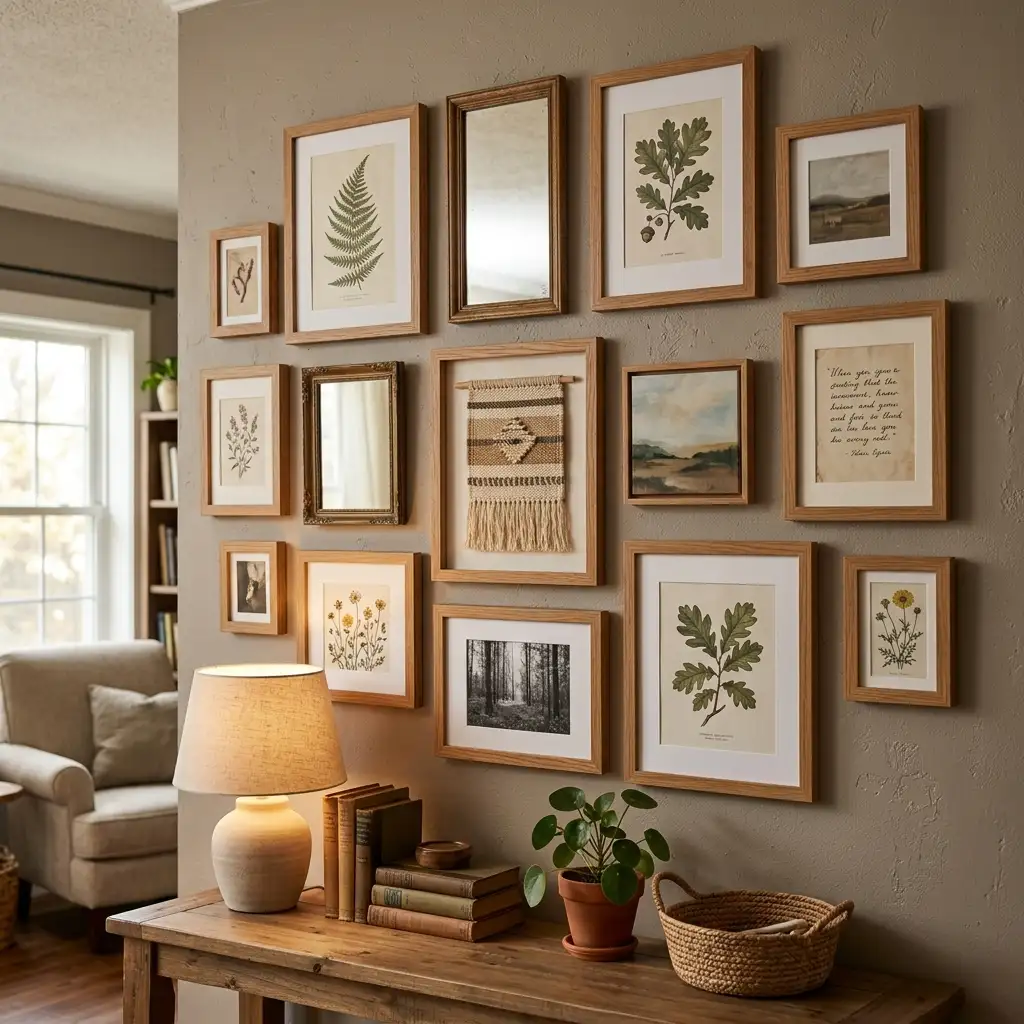
Designer’s Verdict: The organic cluster deserves its popularity, but the reason it works is the opposite of how it is usually explained. It is not that rules stopped applying — the rules moved from the frames to the footprint. A loose cluster inside a correctly sized rectangle looks effortless; the same frames scattered across an unmeasured wall look careless, and from the doorway you can tell instantly which one you are looking at.
The grid is not finished either, despite being called dated. It remains the strongest layout for repeating subjects and formal rooms, and the only shape that makes identical frames look deliberate. What has ended is the grid as a default.
More ways to handle a blank wall sit across our decor and styling ideas, including the treatments that replace a gallery wall entirely.
Where Layouts Go Wrong
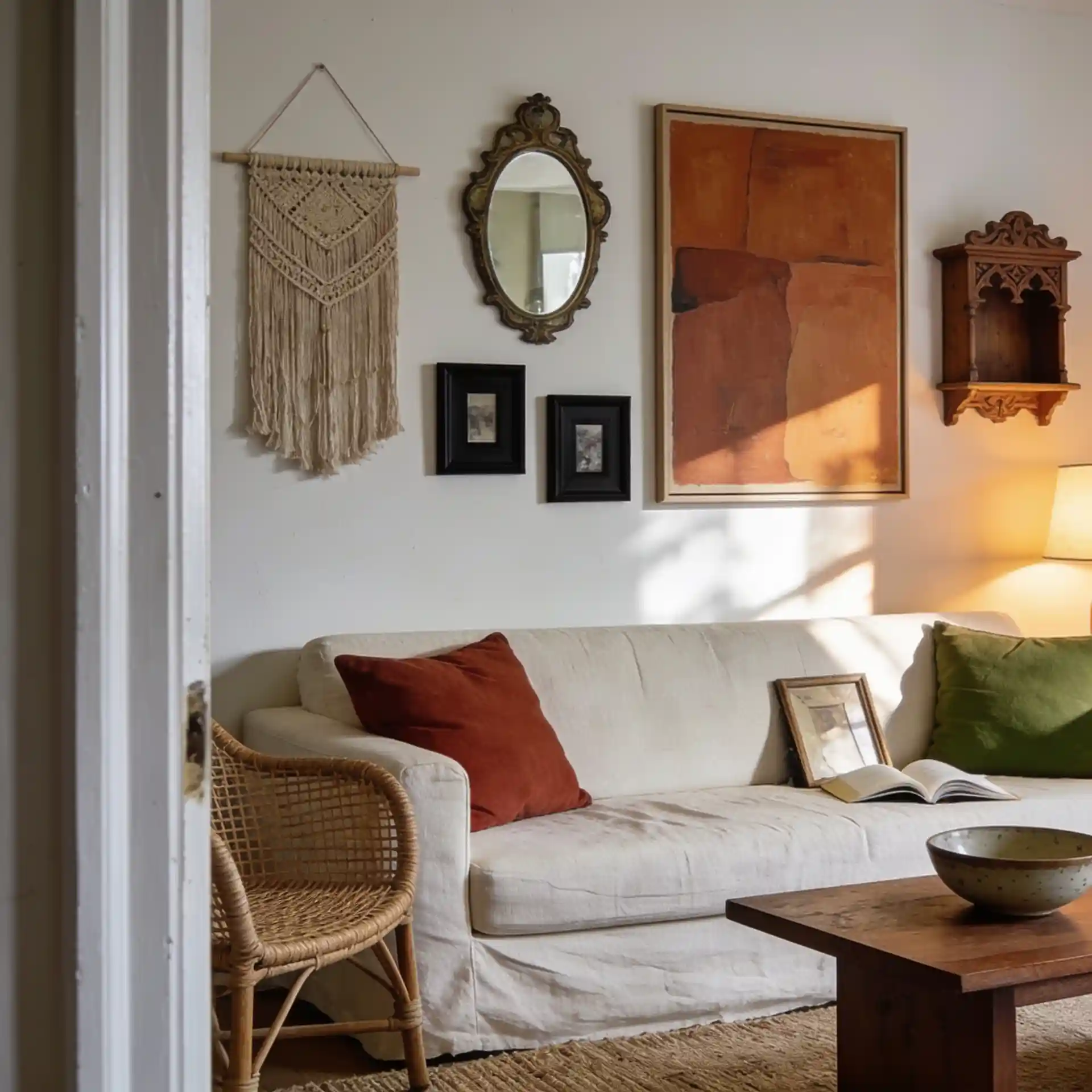
- Sizing the arrangement to the wall instead of to the furniture. A gallery wall belongs to the piece below it, not to the plasterboard. Span two-thirds to three-quarters of the sofa or console and ignore the bare wall left either side. If you want the whole wall to carry the weight instead, that is a bedroom accent wall and a different job.
- Copying a template built for frames you do not own. Printable layouts assume specific sizes in specific quantities. If you have seven frames and the template needs nine, you are already redesigning it.
- Letting the gaps drift. Measuring the first three gaps and eyeballing the rest is the most common execution error, and it shows most in rows and grids where every edge is a reference line.
- Hanging the whole group too high. A gallery wall sitting well above the furniture stops belonging to it and starts floating. Seven to ten inches above the furniture top keeps the two connected.
- Building a cluster with nothing aligned. A salon arrangement needs one shared line — a common top edge, bottom edge, or centreline across several frames. Without it, varied becomes random.
What It Costs to Plan a Layout
Planning is the cheapest stage of a gallery wall and the one people skip to save time rather than money.
| Project | Estimated Cost | Impact Level |
|---|---|---|
| Kraft paper roll plus painter’s tape | $8–$20 | Very High |
| Tape measure, pencil and a small spirit level | $12–$30 | High |
| Laser level for rows and grids | $25–$70 | Medium |
| Picture-hanging kit with hooks and wall anchors | $10–$35 | High |
| Professional hanging service for a large wall | $150–$450 | Medium |
At the budget end, kraft paper and painter’s tape are all a careful person needs. In the middle, a laser level pays for itself the first time you hang a row of five. At the top, a professional hang is worth it only for heavy pieces or a full stairwell, where the ladder work is the real cost.
Best First Upgrade: The paper. Nothing else on this list changes the outcome as much per dollar spent.
Skip for Now: Adhesive hanging strips as a planning shortcut. They are a legitimate fixing method, but repositioning them repeatedly during layout tests wastes strips and pulls paint.
Gallery Wall Layout Checklist
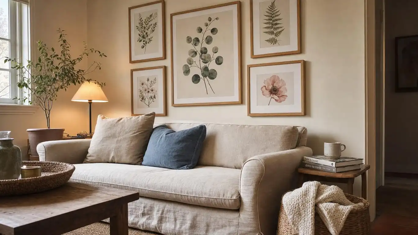
Work through this before the first nail:
- Measure the furniture width below and multiply by two-thirds and three-quarters to get your footprint’s width range.
- Mark the footprint’s lower edge 7 to 10 inches above the furniture top, and its upper edge below any moulding or shelf.
- Count your frames and note their sizes — the shape you can use depends on what you actually own.
- Pick one of the five shapes based on the footprint’s proportions, not on a picture you liked.
- Choose a single gap figure between 2 and 3 inches and write it down so you stop re-deciding mid-hang.
- Cut kraft paper templates and mark each one’s hanging point before taping it up.
- Look at the taped mock-up from the doorway and from a seated position before drilling anything.
Frequently Asked Questions
Conclusion
A year from now you will not remember which of the five shapes you chose, but you will still notice if the arrangement is the wrong size for the sofa underneath it — that is the error that never stops being visible, and it is the one a gallery wall layout template cannot protect you from. Measure the footprint, pick a shape that fits it, and test the whole thing in paper first. There is more on finishing the rest of the room across our home decor inspiration.