What Happens When You Take the Screen Into the Room
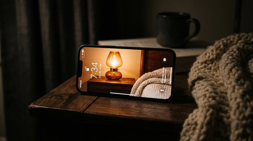
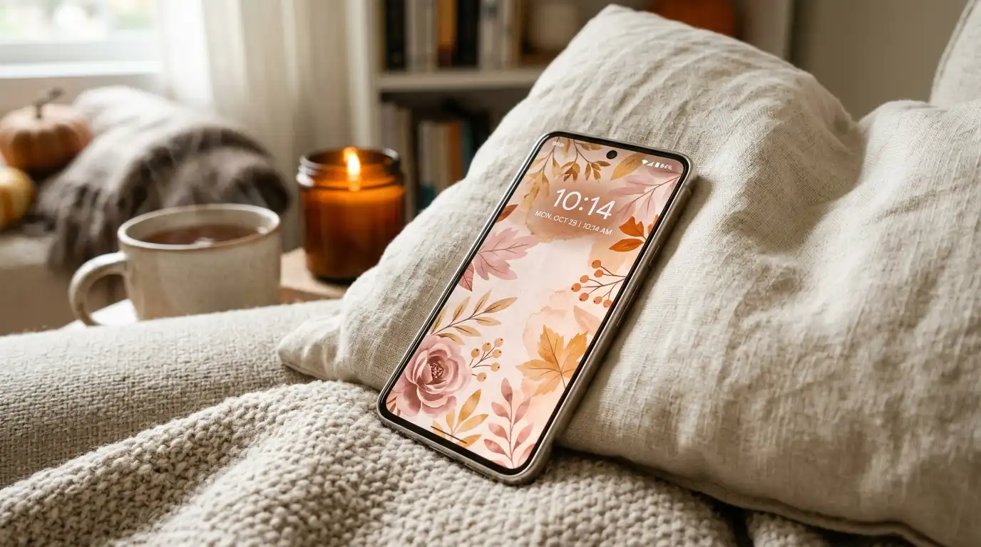
A current phone display runs at roughly 1,000 nits. A painted wall runs at zero. It has no light of its own and can only hand back a share of whatever the room already gives it. That one gap is why the pink fall wallpaper you saved on Sunday never turns up in your living room on Saturday.
This is not a taste problem and it is not a bad screen. Emitted light and reflected light are two different systems, and pink sits exactly where the difference shows most.

Looking for more ideas? Explore our full guide to Fall Wallpaper.
Roughly two-thirds of pink autumn backgrounds can become a real room. The ones that convert are photographs of physical objects, because the camera already recorded reflected light. The ones that cannot are rendered gradients, where the pink exists only because glass is lit from behind. One thirty-second test sorts them before you spend anything.
Editorial field note: A dusty rose cushion that looks warm and lit on a phone can look grey and flat on a north-facing sofa in mid-November. Nothing was mis-ordered. The screen was making its own light and the sofa was not.
Start with the broader fall and autumn decor ideas for a seasonal refresh if you want the whole-house view first, or keep reading for the color half.
The Half-Brightness Test
Run this before you buy anything. It takes half a minute and it kills the wrong pinks early.
Open the image full-screen, standing in the room you want to decorate, at the hour you actually use that room. Turn off True Tone and Night Shift first. Both retint the display toward warm, and warm tinting flatters every pink on earth. Then drag the brightness slider down to roughly half.
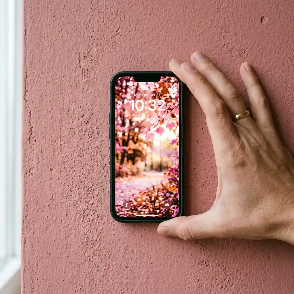
Now hold the phone flat against the wall you would paint, or lay it on the sofa you would pillow. Watch for three failures. The pink goes grey. The pink goes muddy brown. Or the pink jumps forward and looks bubblegum-bright against everything around it. Any of those three means you were looking at a backlight, not a color.
Whatever pink still looks like itself at half brightness exists in paint, cotton and glazed stoneware. That is the one worth chasing.
DESIGNER TIP: Lay a sheet of white printer paper next to the phone during the test. The paper shows you the room’s real light level. If the screen still looks like a small lamp sitting on white paper, drop the brightness further before you judge anything.
Why Does Pink Look Better on a Screen Than on a Wall?
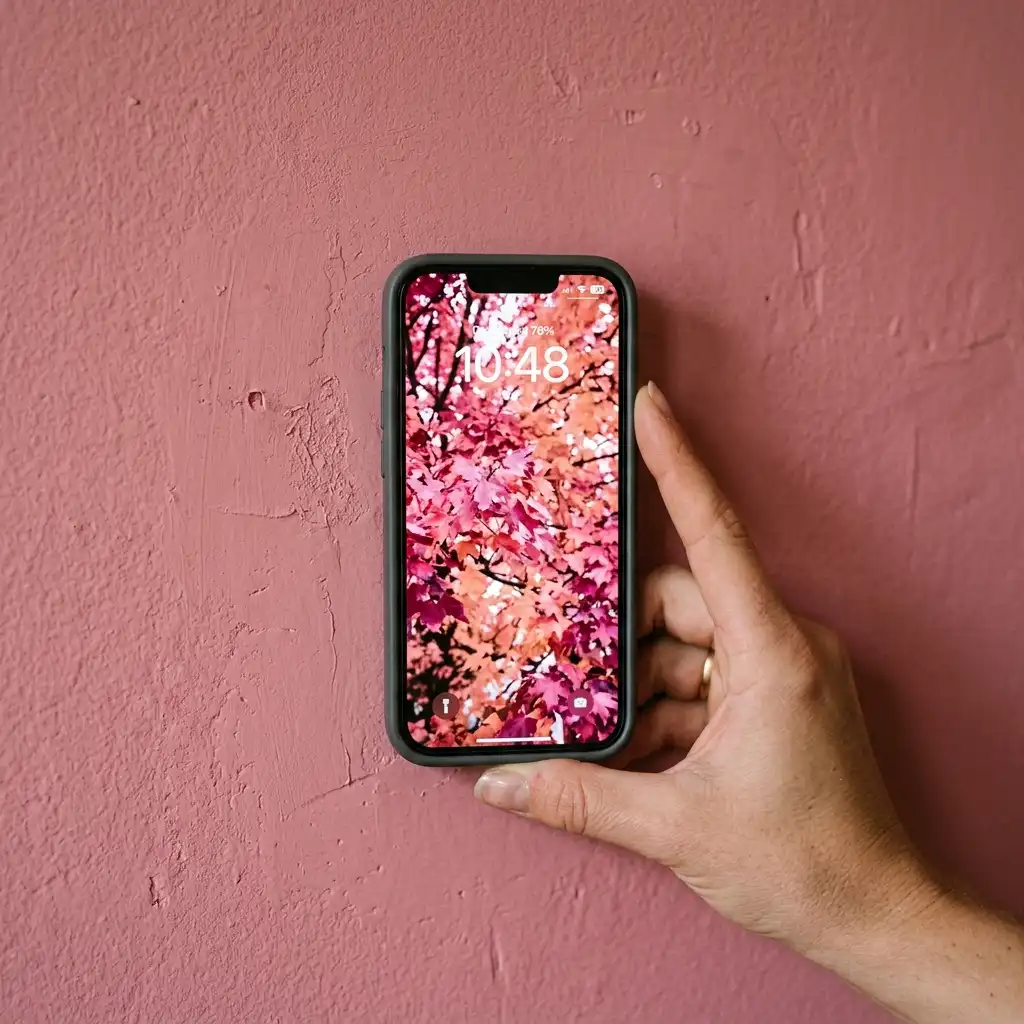
A screen makes light. A wall borrows it. That is the whole mechanism, and pink shows the difference more than almost any other color, because pink lives in the range where a little extra brightness changes the name of the shade.
Apple lists the iPhone 17 Pro display at 1000 nits max brightness (typical) and 3000 nits peak brightness (outdoor), with wide color (P3) and a 1-nit minimum. Your saved background generates that light from behind the glass. Paint does the opposite. Light Reflectance Value, or LRV, measures the percentage of light a paint color reflects on a scale from zero to 100. A mid-tone dusty rose sits somewhere around 40 to 50, so it sends back well under half of whatever lands on it.
Pigment gets there by absorbing. The University of Wisconsin’s physics museum puts it plainly: when white light hits a colored pigment, the diffused light that is reflected has one of the additive primaries missing. Your wall subtracts light. Your phone adds it. They are not doing the same job.
Source Note: Light Reflectance Value, as Diamond Vogel defines it, is a percentage of reflected light — so a painted surface can never be brighter than the room it sits in.
Why Is Pink Showing Up in Fall Backgrounds Now?

Signs This Is Catching On:
- Fall background searches have split by color. Pink now behaves as its own branch rather than a subset of the general autumn aesthetic, sitting alongside the rust and espresso versions instead of under them.
- Phone displays got brighter and wider. The 3,000-nit outdoor peak and P3 color Apple publishes today are well past what the same files were shown on three or four years ago, so identical images look more saturated than they used to.
- Paint ranges keep their pinks quiet. The words printed on the chips have stayed muted and historic rather than bright, and the naming follows what people are actually putting on walls.
- Wallpaper sets now ship as matched packs, one size for the phone and one for the desktop. Repetition across every screen you own is what turns a saved picture into a palette you start buying against.
None of that is a forecast. It is simply what is observable, and it lines up with the warm-neutral direction the rest of the color ideas archive has been moving in for two seasons.
The Three Kinds of Pink Fall Wallpaper — and Which Two Convert
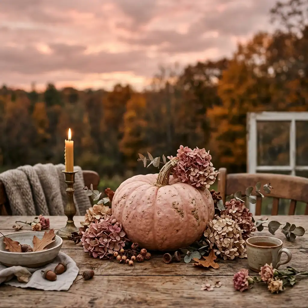
Almost every pink autumn background falls into one of three families. Sort them by one question only: did a camera record this off a real surface, or did software build it? That answer decides whether a paint counter can follow you.
Sunset Gradient Skies
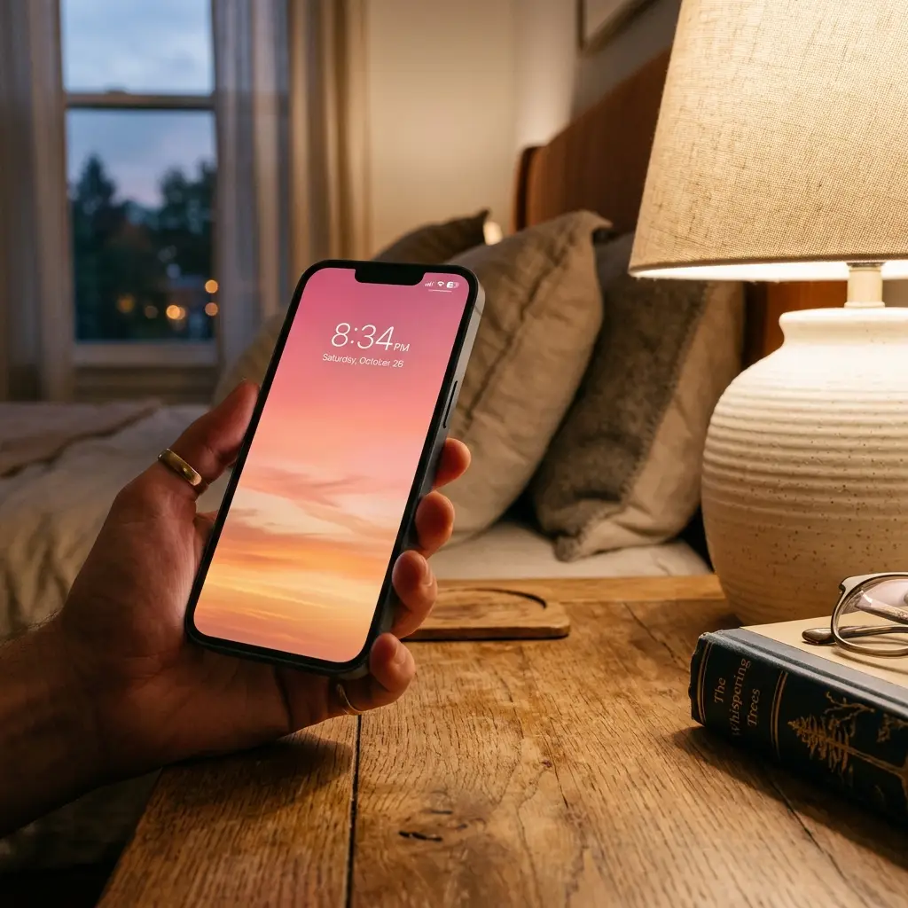
This is the one you save most and can use least. A pink-to-amber sky is pure emitted light, blended across hundreds of steps, with no single flat color anywhere in it. Sample a point near the top and you get a lilac. Sample near the horizon and you get apricot. Neither shade ever appeared as an object in the image. A gradient is a lighting event, not a palette, and it fails the half-brightness test almost every time — the whole thing collapses to grey-mauve. Enjoy it on the lock screen and take nothing from it but the mood.
Dusty-Rose Botanicals and Pressed Flowers
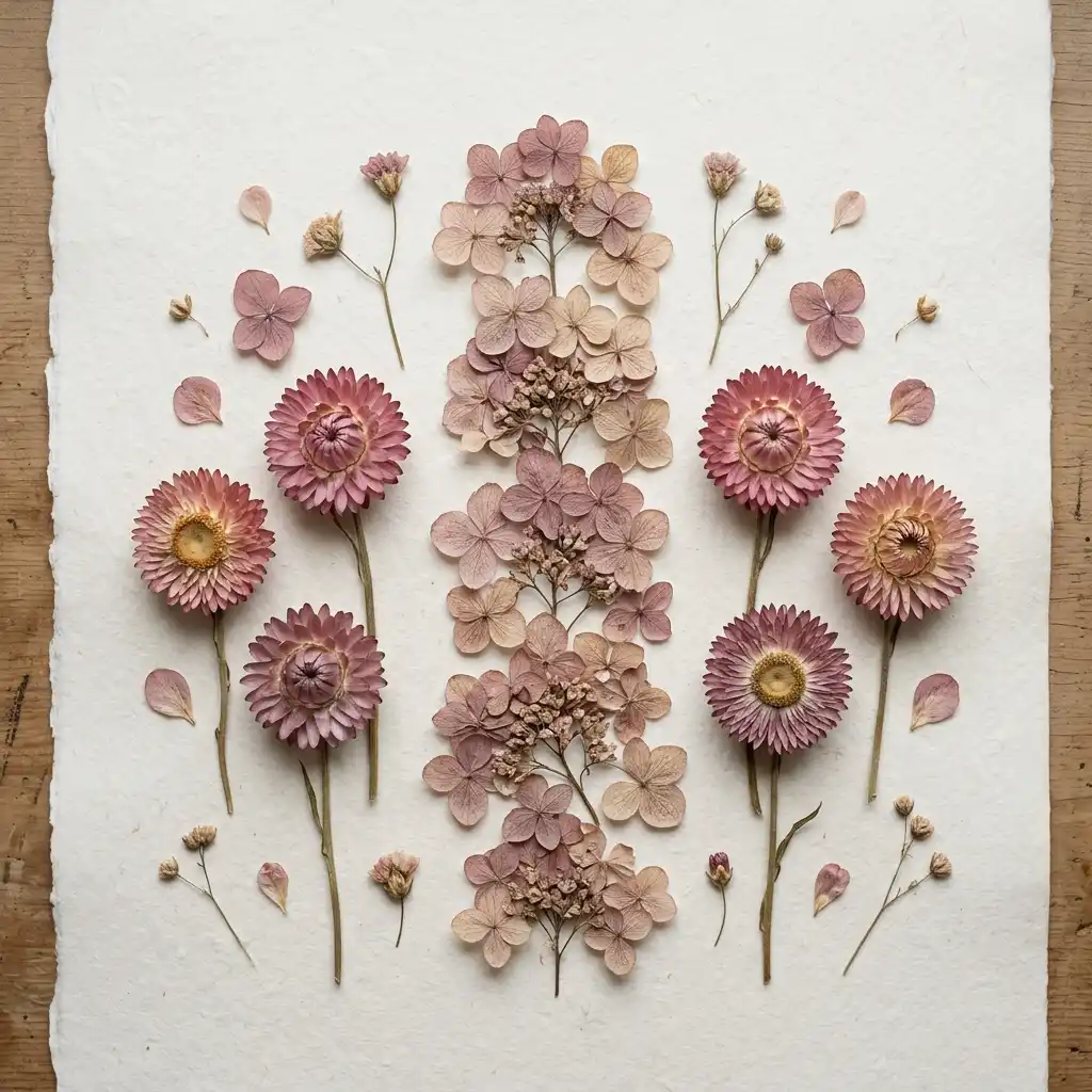
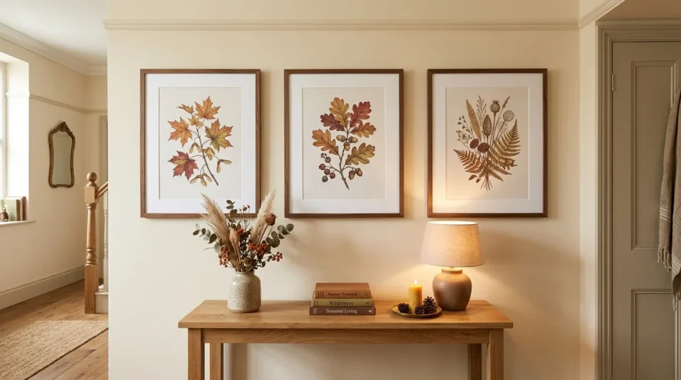
These convert best, and the reason is technical rather than aesthetic. A photographed hydrangea head, a pressed cosmos, a sprig of dried strawflower — you are already looking at reflected light that a camera recorded off a real surface. The pinks are low in saturation, flat across large areas, and sit against cream or bark brown. Sample one of those flat areas and the code you get corresponds to something a paint counter can actually mix. Rooms built from this family land closest to what the screen promised.
Pink Pumpkin and Harvest Still-Life

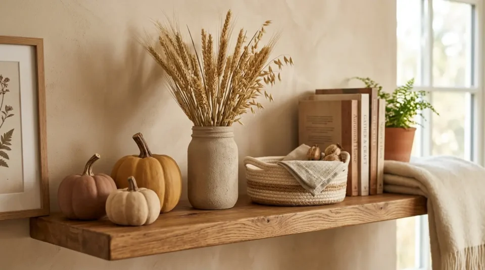
Mid-saturation, mid-risk, and useful for a reason people miss. Look at how little of the frame is actually pink. Two or three pumpkins sit in a field of oat linen, oak, dried grass and shadow. The image works because it is mostly not pink. That ratio is more useful to copy than the hue is, and it is the fastest correction for a room that came out too sweet. Warm terracotta and clay shades borrow well here, which is the same logic behind these terracotta bedroom ideas for a warm, earthy retreat.
How Do You Pull a Palette Off a Background Without Guessing?
Sample three points, not one. Use the phone’s own markup eyedropper or any free color picker and take the lightest area, the pink itself, and the darkest point in the image. Write the three hex codes into a note. Those three are your brief.
Then ignore the pink for a moment. The lightest and darkest codes decide the room, because they cover the walls, the floor and the large soft pieces. The pink is the small one. Take the light and dark codes to a paint counter and ask for the strips they sit on.
When you get to the pink, step it down. A sampled pink is nearly always one or two rows too saturated as paint or dye. Take the chip one row lighter or one row greyer than the match and compare both at home. Paint a 12 by 12 inch sample board, prop it against the wall, and look at it at 8 a.m. and again at 8 p.m.
Material Note: Never color-match a printed screenshot at a paint scanner — the print is already a second translation of an emitted color, and the error compounds.
Five Ways to Move a Pink Fall Wallpaper Off the Screen
- Buy the ground color first. The oat, cream or warm greige that fills most of the image is what your walls, curtains and rug should be. It is the biggest surface and the cheapest mistake to avoid.
- Put the pink on something swappable. Two washed cotton cushion covers or a table runner cost little and come off in October if the shade turns out wrong. Soft goods are where a screen palette should be tested, not on a wall.
- Add one glazed object. A stoneware vase, a ceramic lamp base, a glossy bowl. A glaze bounces a little light back at you, which is the closest a physical surface gets to the glow you liked on the phone.
- Retire the image while you shop. Save the three hex codes, then switch your lock screen to something neutral. Left up, the phone keeps showing you a version the room cannot match, and you will keep rejecting good samples against it.
- Look again in mid-November. These pictures are taken in October light. When daylight drops, check whether the pink has gone grey. If it has, something warmer needs to sit underneath it, usually in the rug rather than in more pink.
What If You Rent or Only Want One Piece?
The whole palette fits on soft goods. A duvet cover in the ground color, two pink cushion covers and one lamp shade will carry the look without a drop of paint, which is how most of these blush pink bedroom ideas for a sophisticated adult space are built.
In a small or dark room, take the pink one step lighter than your sample. Less daylight means less to reflect, so the shade that looked soft in a bright shop will feel heavy in a north-facing bedroom. That adjustment is why pink small bedroom ideas tend to run paler than their full-size versions.
Rental Note: For the peel-and-stick route, use it on the neutral ground rather than the pink — a removable warm cream is far easier to live with than a removable rose.
The one-object version is legitimate too. A single glazed pink vessel on a shelf, with the picture still on your phone, is a complete answer for anyone who is not sure yet.
The Short Version, for the Paint Aisle
- Run the half-brightness test in the room itself, with True Tone and Night Shift switched off.
- Sample three hex codes — lightest, pink, darkest — and treat the two neutrals as the real decision.
- Confirm the image is a photograph of objects rather than a rendered gradient before sampling any pink.
- Step the pink one row lighter or greyer than the direct match before ordering paint or fabric.
- Check the sample board in morning daylight, then again under lamps that night.
KEY TAKEAWAY: The neutrals in the image decide whether the room works; the pink only decides whether it feels like autumn.
What Does the Physical Version Cost?
Moving a screen palette into a room is cheaper than most color projects, because the pink stays small. Under $50 buys the test. Around $120 buys a corner that looks finished. Past $150 you are painting, and painting is the part worth being sure about.
| Project | Estimated Cost | Impact Level |
|---|---|---|
| Two 18-inch cushion covers in washed cotton or linen | $18-$45 | Medium |
| One glazed stoneware vase or ceramic lamp base | $30-$85 | High |
| Sample pots plus one gallon of matte paint in the neutral | $55-$150 | Very High |
Best First Upgrade: The two cushion covers — they are the cheapest honest test of whether your sampled pink survives real daylight.
Skip for Now: A full gallon of pink paint. Nobody should buy that before living with a sample board for a week.
What Goes Wrong Between the Screenshot and the Sofa
These are ordering errors rather than taste errors, which is why they are easy to undo.
- Printing the saved image and handing it to a paint counter is the most expensive one. The print already turned an emitted color into ink, so the mix comes back a shade nobody recognizes. Sample the hex code on the phone instead, then step it down a row by eye.
- Choosing the pink before the neutral it will sit on leaves you decorating around a small accent. The oat or greige ground covers far more of the room, and it is much easier to find a pink that suits a cream you already own than the reverse.
- Putting the pink on the largest surface you own is the fastest route to a room that feels younger than you wanted. The picture you liked is mostly not pink. Keep it on cushions, ceramics and one small textile, and let the neutrals carry the volume.
Does Pink Have Staying Power in Fall Decor?
Designer’s Verdict: The botanical and harvest families are worth building a room from and will still look right in three autumns — the sunset gradients are worth keeping on your phone and nowhere else. Warm pink lasts in autumn decor because it belongs to the same family as clay and rust. Screen-bright pink does not, because it was never a surface color to begin with.
Related Autumn Color Ideas:
- 12 Fall Bedroom Refresh Ideas for a Cozy, Layered Seasonal Look
- 14 Brown & Tan Bedroom Ideas That Feel Warm, Rich and Designer-Made
- 12 Sophisticated Pink Bathroom Designs for a Modern Adult Space
- Cozy Bedroom Lighting Ideas for a Warm, Layered Glow
- Browse the cozy decor collection
- 15 Cozy Winter Decor Ideas to Keep Your Home Warm and Stylish
- See every seasonal decorating guide
Frequently Asked Questions
Conclusion
Run the half-brightness test before you spend anything else — thirty seconds settles which pinks in a pink fall wallpaper are real and which are only backlight. Buy the neutral ground first, keep the pink on things you can swap out, and the room will finally look like the picture, with more warm-toned inspiration waiting across the rest of our home decor ideas.