Why Does Dusty Blue Feel So Soft and Calm in a Bedroom?
Dusty blue is one of the few bedroom colours that looks different depending on the direction your window faces — and knowing which undertone to choose for each condition is what separates a serene room from one that feels flat and cold. That is the detail most paint guides leave out.
Editorial field note: A bedroom painted in bright sky blue felt alert rather than calm — the saturation was too high and the hue too electric. Switching to the same hue at lower saturation and cooler grey depth, with warm cream linen and an oak nightstand, changed the room completely. The colour stopped competing and started holding the light.
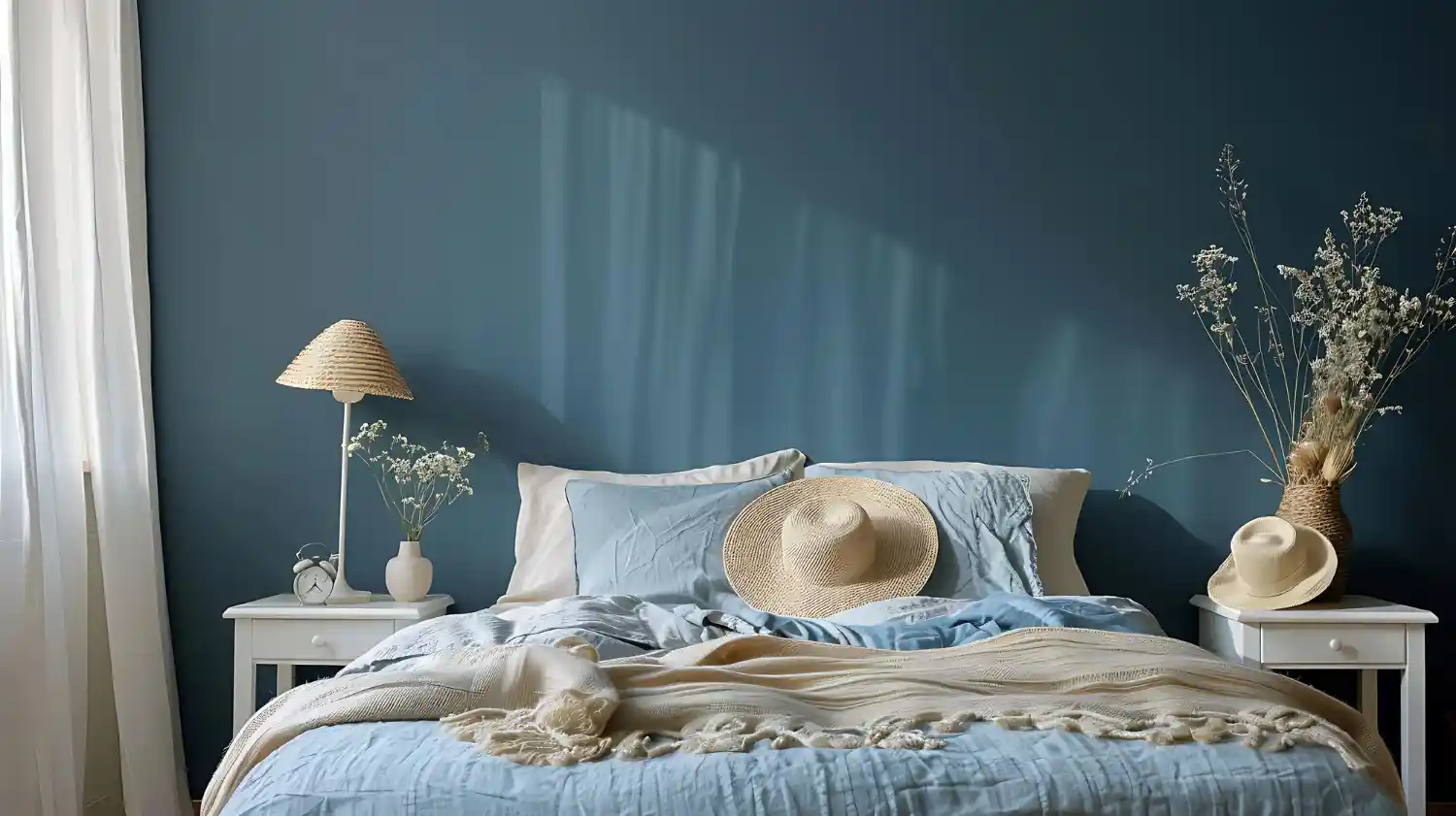
Dusty blue bedroom ideas work because the colour sits in the grey-blue range — muted, low-saturation, somewhere between slate and powder blue. That grey quality softens the natural coolness of blue, making it feel restful rather than cold. Paired with warm cream, natural linen, and oak or walnut wood, dusty blue creates one of the most serene bedroom palettes available without reading sterile or clinical.
Bookmark this guide for quick reference.
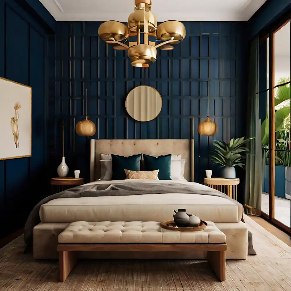
For a full overview of bedroom colour directions, start with our bedroom color ideas guide. If you are planning a broader bedroom refresh, Bedroom Decorating Ideas: The Complete Guide covers layout, lighting, and layer-by-layer decisions. And 101homedecor.com has inspiration across every room.
KEY TAKEAWAY: Dusty blue works in any room size or light direction — the key is choosing the right undertone and pairing it with warm cream and natural wood rather than bright white and cool metal.
Your Dusty Blue Bedroom Ideas Checklist
- Choose a paint sample with a grey or greige undertone — not a bright or electric blue.
- Test the sample on two walls at different times of day; dusty blue shifts significantly in low and evening light.
- Pick warm cream at LRV 75+ as your dominant neutral for bedding, curtains, and trim.
- Bring in one warm wood tone — oak, walnut, or rattan — before committing to the full paint.
- Replace bedside bulbs with 2700K warm-white options before painting to see how the light temperature changes the room.
- Choose brushed nickel, pewter, or soft brass hardware and fixtures rather than polished chrome.
- Add at least two natural textures: linen, jute, boucle, or woven cotton.
KEY TAKEAWAY: Test paint samples in both natural and evening light before committing — dusty blue shifts more than almost any other colour depending on the time of day.
The Foundation: Bringing Dusty Blue Into Your Bedroom
Dusty blue is a calm, versatile base for a bedroom. These foundational moves — an accent wall, a full drench, or starting with bedding — show the easiest ways to bring the shade in.
1. Start With a Dusty Blue Accent Wall
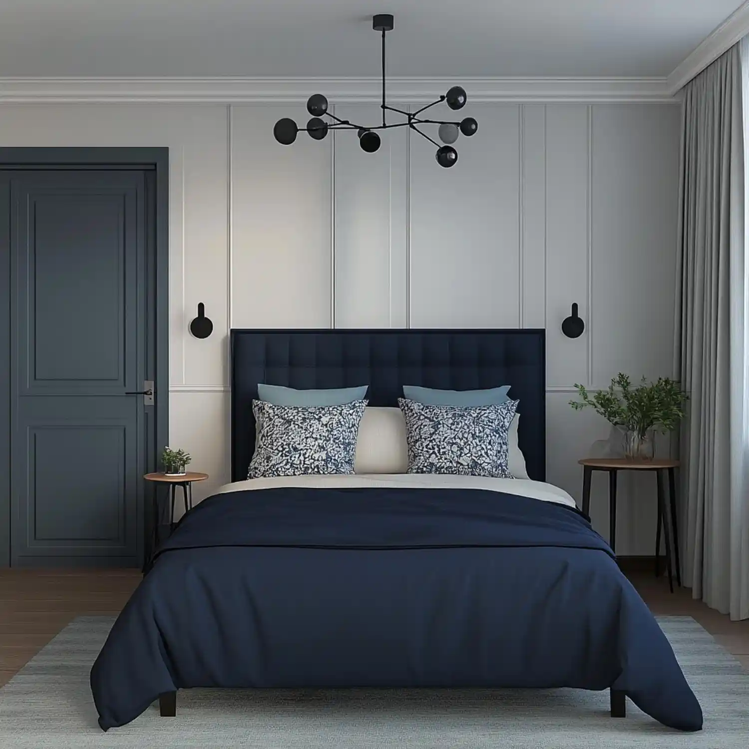
The headboard wall is the natural starting point for dusty blue. Paint it in a muted grey-blue — Sherwin-Williams Copen Blue SW 6519 (LRV ~42) is a medium-depth slate blue that holds warmth without darkening the room — and keep the other three walls in warm cream. The contrast is enough to define the bed as the room’s focal point without the space feeling colour-heavy.
A single accent wall lets you test the undertone before committing to a full drench. If the wall looks too cool after a week, the adjustment starts at the bedding and lamp level — not another paint job.
KEY TAKEAWAY: A dusty blue headboard wall with warm cream on three sides is often the most polished outcome — more refined than a full drench in many rooms.
2. Try a Full Dusty Blue Color Drench
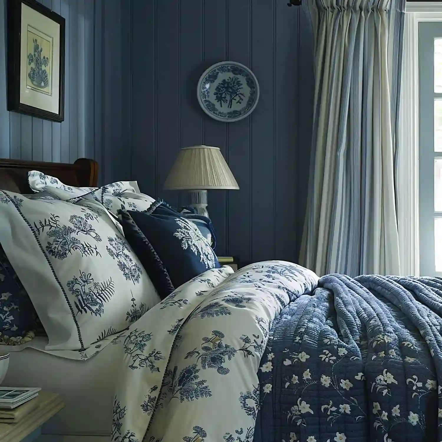
Colour drenching — painting walls, ceiling, and trim in the same dusty blue — creates a cocooning effect that suits a bedroom more than almost any other room. Use a lighter tone for this approach: Benjamin Moore Quiet Moments 1563 (LRV ~61) is soft enough to drench without the room closing in.
The key with a full drench is to add significant warmth through every other element: an oak or walnut bed frame, cream linen bedding, and at least two 2700K warm-white lamps at bedside level. The drench feels calm, not cold, when the warm anchors are solid.
*Designer Tip: For a colour drench, use flat finish on the ceiling rather than eggshell or satin. The matte ceiling absorbs rather than bounces light, and the colour feels softer and more enveloping rather than reflective.*
KEY TAKEAWAY: A full dusty blue drench needs warm anchors — cream linen, oak or walnut wood, and warm-white bulbs — to stop the room feeling clinical rather than cocooned.
3. Layer Dusty Blue Bedding as Your Starting Point
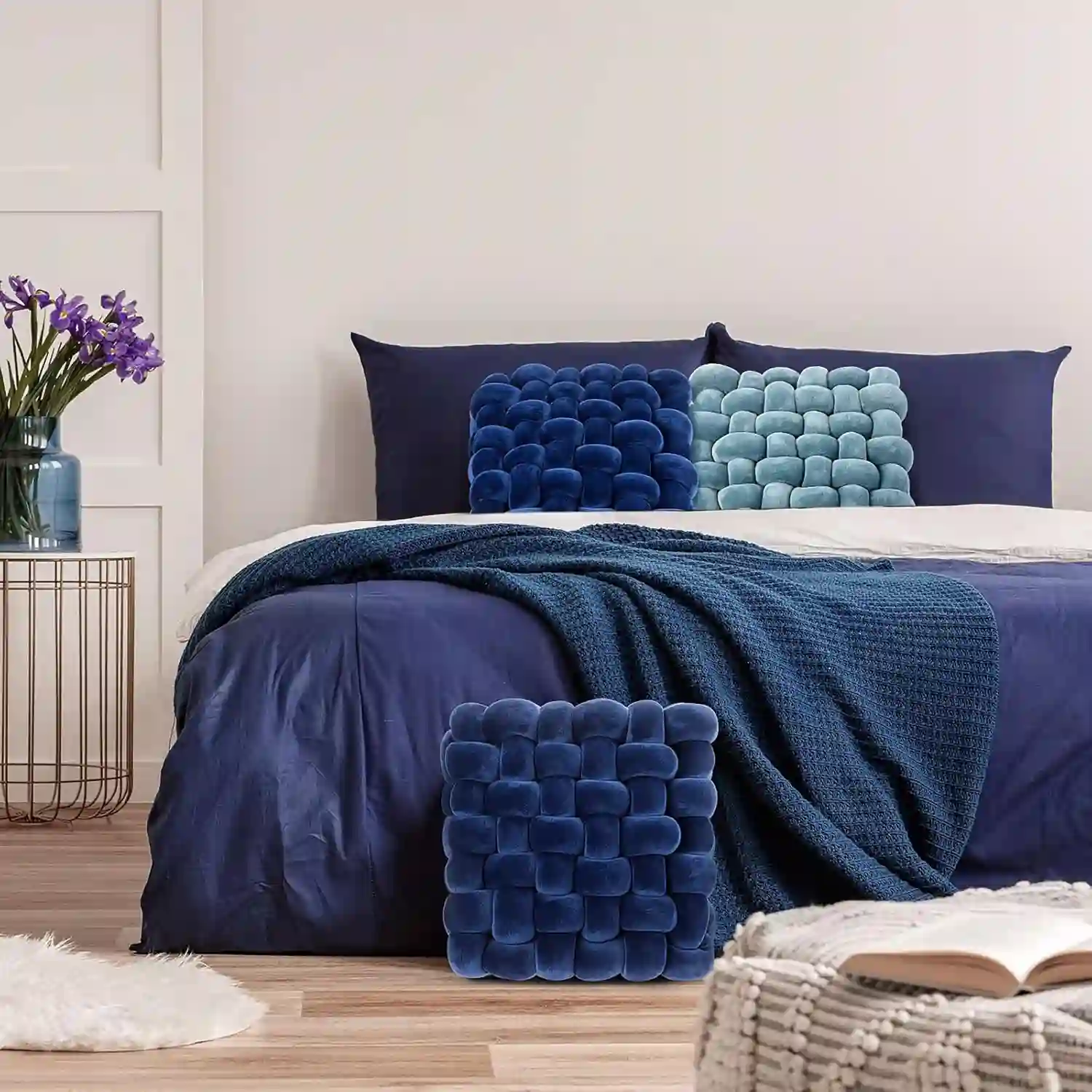
If painting feels like too much of a commitment, the bedding layer is where dusty blue is easiest to introduce. A dusty blue linen duvet cover with cream or oat Euro shams creates the palette without touching the walls. The grey-blue linen against cream walls and warm oak nightstands sets the whole room’s direction.
From here you can add a dusty blue throw, a jute rug, and 2700K lamps — and test whether you want to extend the colour to an accent wall or keep it entirely in the soft furnishings.
Material Note: Washed linen in dusty blue softens slightly after washing — the colour becomes a little more faded and natural, which works in the palette’s favour. That soft, lived-in tone adds the variation that stops muted colours looking flat.
KEY TAKEAWAY: Dusty blue linen bedding is the lowest-commitment way to preview the palette, and often looks better than paint in rooms with limited natural light.
4. Which Paint Shade of Dusty Blue Works Best?
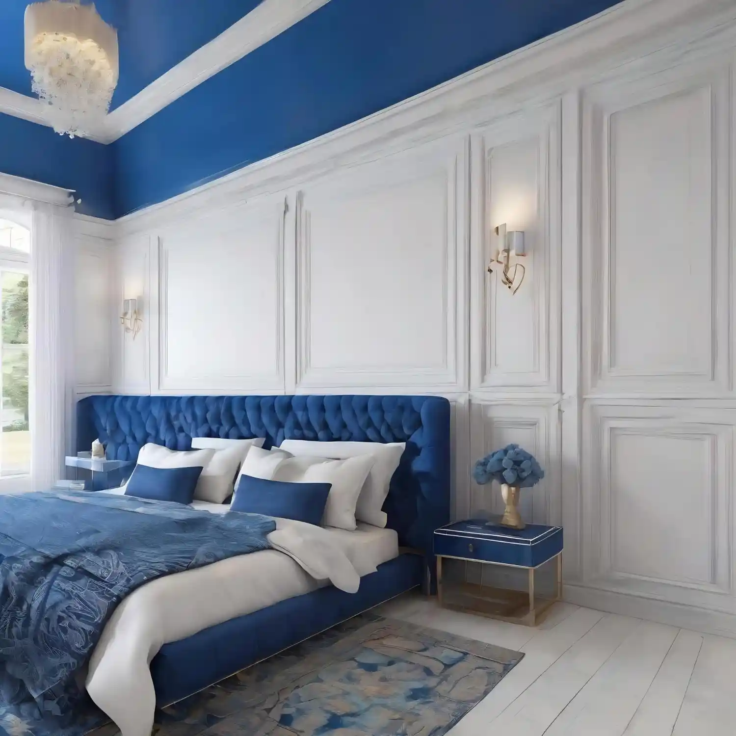
Dusty blue spans a wide range of undertones — grey-blue, blue-green, and blue-violet — and the undertone that works depends on your room’s light direction.
- Grey-blue (Sherwin-Williams Copen Blue SW 6519, LRV ~42): the most versatile. Works in any orientation and is the safest starting point.
- Lighter grey-blue (Benjamin Moore Quiet Moments 1563, LRV ~61): ideal for north-facing or low-light rooms where the higher LRV prevents the space from darkening.
- Blue-green (Farrow & Ball Parma Gray No. 27, LRV ~52): suits east and south-facing rooms where warm natural light balances the greenish cast.
- Blue-violet (Benjamin Moore Van Cortlandt Blue HC-145, LRV ~37): creates more depth and contrast — best used as an accent wall rather than a full drench.
Test two samples — one lighter, one deeper — and live with them for 48 hours in both morning and evening light before choosing.
KEY TAKEAWAY: Grey-blue undertone is the most forgiving across light conditions. Save blue-green undertones for rooms with warm direct light for most of the day.
The Pairings: How Dusty Blue Works With Other Colors
Dusty blue really comes alive alongside the right partners. These pairings — warm cream, soft blush, and quiet sage — show how to combine it for a calm, balanced palette.
5. Pair Dusty Blue With Warm Cream and Natural Linen
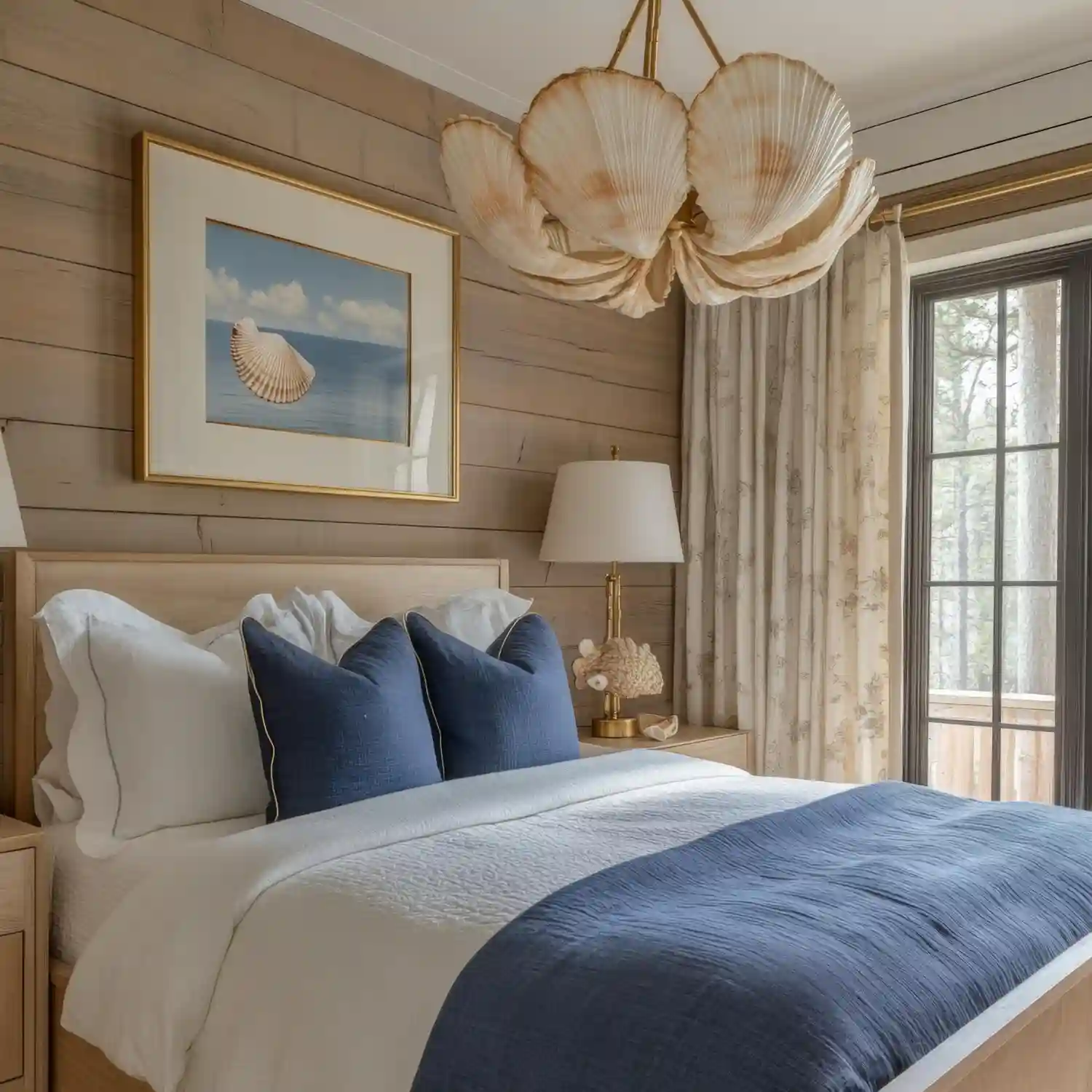
Warm cream is the best pairing for dusty blue because it adds warmth without competing. The 60-30-10 split works naturally here: 60% cream across walls, bedding base, and trim; 30% dusty blue in the duvet, one painted wall, or curtains; 10% accent in warm oak, brushed nickel, or sage green. Use cream at LRV 75 or above to keep the lightness that dusty blue needs as its counterbalance.
Linen textures matter at this colour scale. A cream linen duvet, linen curtains, and a jute rug give the palette enough texture that the soft colours feel layered rather than thin. Natural materials also warm the palette in a way that synthetic textiles cannot.
KEY TAKEAWAY: The 60-30-10 split with warm cream dominant and dusty blue as the secondary colour creates a bedroom that feels effortlessly calm rather than deliberately arranged.
6. Combine Dusty Blue With Blush or Dusty Rose
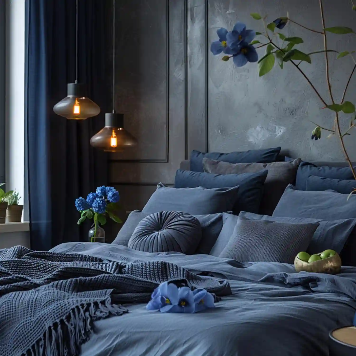
Dusty blue and blush or dusty rose sit on opposite sides of the warm-cool spectrum, and the pairing works because both colours share the same muted, grey-toned quality. The contrast is gentle — there are no clashing hues, only a quiet temperature dialogue between a cool-toned blue and a warm-toned rose.
Use dusty blue as the wall or bedding anchor and blush as the accent: a dusty rose velvet throw, two blush Euro shams, or a rose-toned botanical print above the headboard. Keep the ratio at roughly 2:1 blue to blush so neither colour dominates.
For layered blush-and-blue rooms styled in a softer boho direction, boho coastal bedroom ideas shows how this temperature pairing plays out across a fuller space.
KEY TAKEAWAY: Both colours need the same muted, grey-toned quality — avoid bright rose or coral, which clashes; dusty rose or mauve holds the palette’s calm register.
7. Add Sage Green as a Quiet Companion Color
Dusty blue and sage green are both muted, grey-toned, nature-adjacent colours that sit in the same tonal family without looking like a matched set. Sage green works as the third accent: a sage cotton throw, a ceramic pot or vase, a botanical print above the bed, or a sage linen cushion against cream shams.
Keep the ratio clear — dusty blue is the dominant colour, sage is the accent, cream is the neutral ground. Over-balancing the two muted hues into equal parts makes the room look indecisive rather than layered. For more on pairing muted greens in a bedroom, olive green bedroom ideas explores the adjacent green family in depth.
KEY TAKEAWAY: A little sage green on two or three accents is enough — dusty blue and sage green share the same calm tonal family, so they need separation to read as distinct.
8. How Do You Use Dusty Blue in a Small Bedroom?
Dusty blue in a small bedroom can expand the sense of space rather than close it in, because its muted, low-saturation quality doesn’t overwhelm the way bright or highly saturated colours do. Two approaches work well.
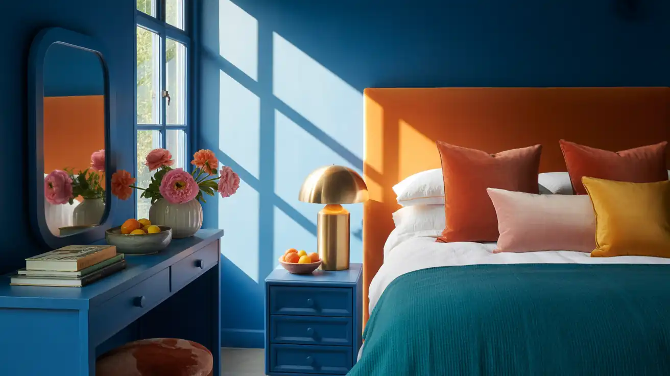
Option 1 — Light dusty blue on all four walls: Use a high-LRV shade (LRV 55–65) like Benjamin Moore Quiet Moments 1563. The wall colour recedes and the room feels airier than white because the soft hue creates depth without hard contrast.
Option 2 — Accent wall only: Paint the headboard wall in a deeper dusty blue like Copen Blue SW 6519. Keep the other three walls in warm cream to maintain brightness.
In both cases, a jute or wool rug in cream or oat grounds the room without shrinking it. A large mirror opposite the window doubles the daylight. Browse small bedroom ideas for layout guidance and all bedroom design ideas for further direction.
KEY TAKEAWAY: High-LRV dusty blue on all four walls often makes a small room feel more spacious than white — because the soft colour adds visual depth without the contrast that makes rooms feel smaller.
The Finishing Layer: Details That Make Dusty Blue Look Expensive
The finishing details are what make dusty blue read as expensive rather than flat. These touches — natural texture, warm wood, and the right metal finish — add depth and warmth.
9. Layer In Natural Textures — Linen, Jute, and Rattan
Dusty blue in a single-material room — cotton duvet, polyester curtains, smooth wall — looks flat. Add three or four natural textures and the palette comes alive. Linen curtains soften the window light. A jute rug adds grain at floor level. A boucle throw or rattan headboard provides the mid-layer variation the eye needs.
Natural textures in neutral tones — cream, oat, natural — let the dusty blue stay as the colour story while the materials add depth. This material-first approach works particularly well in rooms styled around earthy modern bedroom ideas.
Material Note: Washed linen curtains in cream or oat filter daylight without blocking it. The soft, diffused light keeps dusty blue looking warmer than it would against a bare window.
KEY TAKEAWAY: Three natural material layers — linen, jute, and one woven or boucle element — take dusty blue from a flat paint choice to a complete and layered palette.
10. Bring in Warm Wood Tones to Prevent It Looking Cold
Oak and walnut are the two warmest wood choices alongside dusty blue. Oak has a honey warmth that stops dusty blue tipping toward clinical grey. Walnut’s rich, dark tone adds contrast and grounds the light palette. Use oak for a light airy direction — rattan headboards, cane nightstands, light oak bed frames. Use walnut for a more dramatic, hotel-toned direction.
Avoid cold-toned woods: ash, white-washed pine, or grey-stained oak all pull the palette cool and flatten the dusty blue. The wood element needs to add warmth, not compound the colour’s cooler tendency.
*Designer Tip: Place your warm wood element at eye level or bed height — an oak headboard or a pair of walnut nightstands matters more than a floor-level wood accent like a baseboard or bench leg. The eye meets the warm tone at the same height as the colour, and the two balance directly.*
KEY TAKEAWAY: Oak for a light airy feel, walnut for depth and contrast — both work alongside dusty blue; grey-toned or white-washed woods do not.
11. Which Metal Finish Works Best With Dusty Blue?
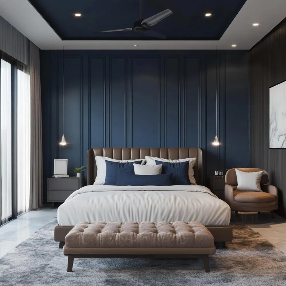
Brushed nickel and soft pewter are the two best metal pairings for dusty blue. Both add a cool-warm metallic note that bridges the gap between the blue walls and warm wood tones. Brushed nickel looks clean and refined without the hardness of polished chrome. Soft pewter goes darker and more matte, suiting a deeper or moodier dusty blue direction.
Brushed brass can work, but it reads warmer and may pull the room toward a different colour territory. Use it carefully if the rest of the palette stays neutral. Avoid cool chrome and polished silver: both emphasise the colour’s cooler properties, which is precisely what the warm elements in the room are working against.
KEY TAKEAWAY: Brushed nickel is the safest metal choice for dusty blue — cool enough to feel coherent with the colour, warm enough not to pull the room cold.
12. What Happens When You Pair Dusty Blue With Warm Charcoal?
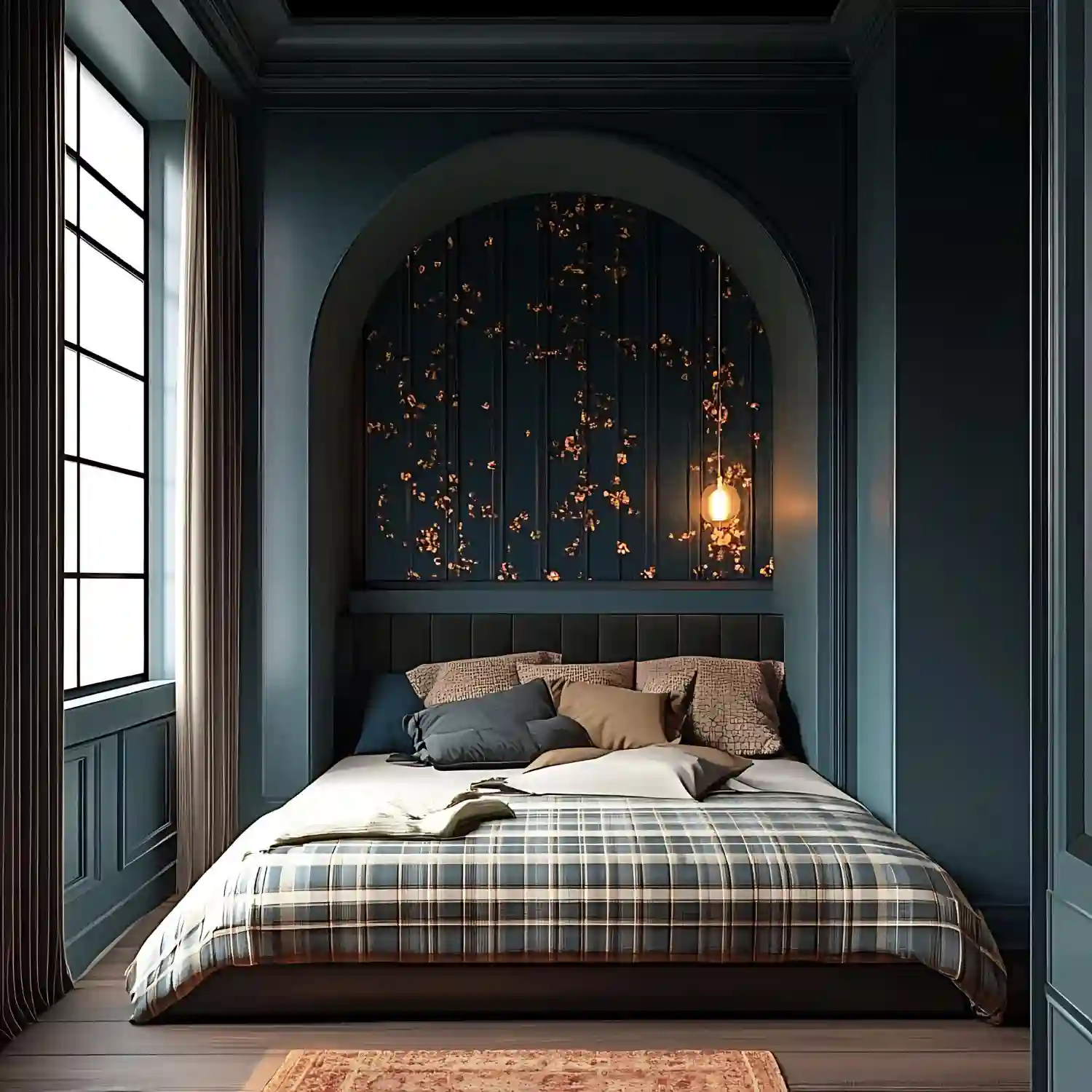
Dusty blue and warm charcoal is one of the most understated bedroom pairings — the soft muted blue against deep grey-charcoal creates a layered, grown-up palette that feels sophisticated without going stark or cold.
The approach works best as: dusty blue headboard wall, warm charcoal in the bed frame or a pair of deep-grey shams, cream linen bedding as the light anchor, and oak or walnut nightstands for warmth. The charcoal doesn’t need its own wall — a charcoal linen throw, upholstered headboard panel, or pair of deep-grey pillows is enough to bring in the contrast.
For more on how charcoal and blue interact in a bedroom, navy blue bedroom ideas and 15 grey bedroom design ideas explore the deeper end of this colour family.
KEY TAKEAWAY: Use charcoal in bedding and a frame rather than as a second painted wall — that keeps the palette grounded and sophisticated without the room going too dark.
How Do You Make a Dusty Blue Bedroom Feel Warm, Not Cold?
The most common concern with dusty blue is that it looks cold at night or in low-light rooms. The fix happens at three levels.
Light temperature first: Replace any cool-white bulbs with 2700K warm-white lamps at bedside level. According to Feit Electric’s color temperature guide, 2700K produces a warm amber-white glow that softens the cool properties of blue-grey walls. Overhead lighting at 4000K–6500K is the most common mistake — it makes any cool-toned wall look clinical.
Warm anchors second: At least one warm wood element, one cream neutral layer, and one warm metal finish are essential in a dusty blue room. These don’t neutralise the colour — they give it the warmth contrast it needs to feel calm rather than cool.
Proportion third: The best dusty blue bedroom ideas balance the room so the blue is not dominant by area. When the room is 60% cream or warm neutral, 30% dusty blue, and 10% warm accent (wood, metal, or blush), the blue feels comfortable rather than overwhelming. A broader guide to balancing bedroom palettes sits in our bedroom decor ideas library and the full Rooms archive.
What a Dusty Blue Bedroom Costs
Dusty blue works at every budget level. The biggest cost difference is whether you are repainting, re-bedding, or only swapping textiles.
| Project | Estimated Cost | Impact Level |
|---|---|---|
| Dusty blue linen duvet cover and Euro shams | $80–$250 | High |
| Accent wall in dusty blue (paint + supplies) | $60–$120 DIY / $250–$450 pro | Very High |
| Warm cream linen curtain panels (pair) | $60–$200 | High |
| Full colour drench — four walls and ceiling | $180–$380 DIY / $600–$1,100 pro | Very High |
Best First Upgrade: A dusty blue linen duvet cover with cream Euro shams — it introduces the palette at the lowest cost and lets you test the colour balance before committing to paint.
Skip for Now: A full colour drench until you have lived with an accent wall version for at least four weeks — the undertone needs to feel right in every light before you paint the ceiling.
Frequently Asked Questions
Conclusion
A dusty blue bedroom works because the colour sits in the grey-blue range — soft enough to feel restful, specific enough to feel intentional. The two decisions that matter most before you commit to paint: replace your bedside bulbs with 2700K warm-white options, and swap your bedding to warm cream linen. Both take less than an hour and both reveal how the palette will actually perform before you open a paint tin.
Editorial field note: A north-facing bedroom with a bright white duvet and overhead lighting looked cold and unfinished regardless of what was added to the walls. Switching to 2700K bedside lamps and cream linen took the room from cold to calm in a single afternoon. The dusty blue accent wall followed two weeks later and the room finally felt settled.
For style directions beyond colour, bedroom style ideas covers everything from japandi to coastal and boho. If you are ready to rethink the full room, 101homedecor.com has inspiration across every corner of the home.
More Bedroom Color Ideas
- 12 Beige and Cream Bedroom Ideas for a Warm, Layered Look
- 12 Black Bedroom Ideas for a Bold, Sophisticated Look
- 12 Sage Green Bedroom Ideas for a Calm, Restful Retreat
- 12 Terracotta Bedroom Ideas for a Warm, Earthy, and Grounded Retreat
- 12 Two-Color Bedroom Combinations for a Pulled-Together Look
- 12 White Bedroom Ideas for a Bright, Airy, and Cozy Space
- 14 Brown & Tan Bedroom Ideas That Feel Warm, Rich and Designer-Made
- 15 Grey Bedroom Design Ideas to Transform Your Sleeping Space
- Black and White Bedroom Ideas: Why Does Yours Feel Cold?
- Blush Pink Bedroom Ideas for a Sophisticated Adult Space