TL;DR
- These 12 two-color bedroom combinations are tested pairings that always look planned, not mismatched.
- Each pairing names two colors, explains why they work, and gives the dominant (about 60%) and accent (about 10-30%) split.
- Cool and calming pairs like navy and cream feel restful. Warm and earthy pairs like terracotta and cream feel cozy.
- High-contrast pairs like black and white feel crisp and timeless.
- Put the dominant color on walls and bedding. Add the accent on pillows, a throw, art, or one piece of furniture.
- Pick one pairing, follow the balance, and your bedroom looks finished.
How Two Colors Make a Bedroom Look Finished
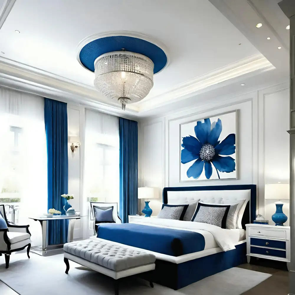
Most bedrooms feel off for one reason: too many colors fighting for attention. If you have ever stood in a paint aisle unsure which two shades go together, you are not alone. The fix is simple. Pick two colors and give one the lead.
Two-color bedroom combinations work because they give the eye a clear path. One color does most of the work. The other adds contrast and personality. The trick is the split, not the colors themselves.
The reliable balance is the 60-30-10 rule. The dominant color covers about 60% of the room, usually walls and large bedding. The secondary covers about 30%, like a headboard, curtains, or a rug. The accent is the last 10%, used on pillows, a throw, lamps, or art. The BEHR color team explains the 60-30-10 framework here, and it keeps any pairing from feeling lopsided.
Editorial field note: A bedroom painted one flat color often feels unfinished, even with nice furniture. Adding a single accent color on the pillows, a throw, and one lamp gives the room a clear focal point. The space looks settled before any furniture changes.
If you want the bigger picture first, start with these bedroom color ideas, palettes, and inspiration for an overview, then come back here to choose a pairing. For full-room planning, our complete guide to bedroom decorating ideas covers layout and furniture too. Bookmark this guide for quick reference.
KEY TAKEAWAY: A two-color bedroom looks finished when one color leads at about 60% and the second color appears as a 10-30% accent.
| Quick Takeaways | |
|---|---|
| The Split | Let one color lead at about 60%; keep the second as a 10-30% accent. |
| Dominant | Put the lead color on walls and large bedding. |
| Accent | Repeat the second color on pillows, a throw, and art so it looks chosen. |
| Undertone | Match warm with warm and cool with cool so the two shades agree. |
| Texture | Layer linen, wool, and wood in your colors so the room is not flat. |
Cool and Calming Two-Color Pairings
These pairings lean cool and quiet, which makes them ideal for rest. Most use a warm neutral to soften the cooler shade so the room still feels inviting.
1. Navy Blue and Cream
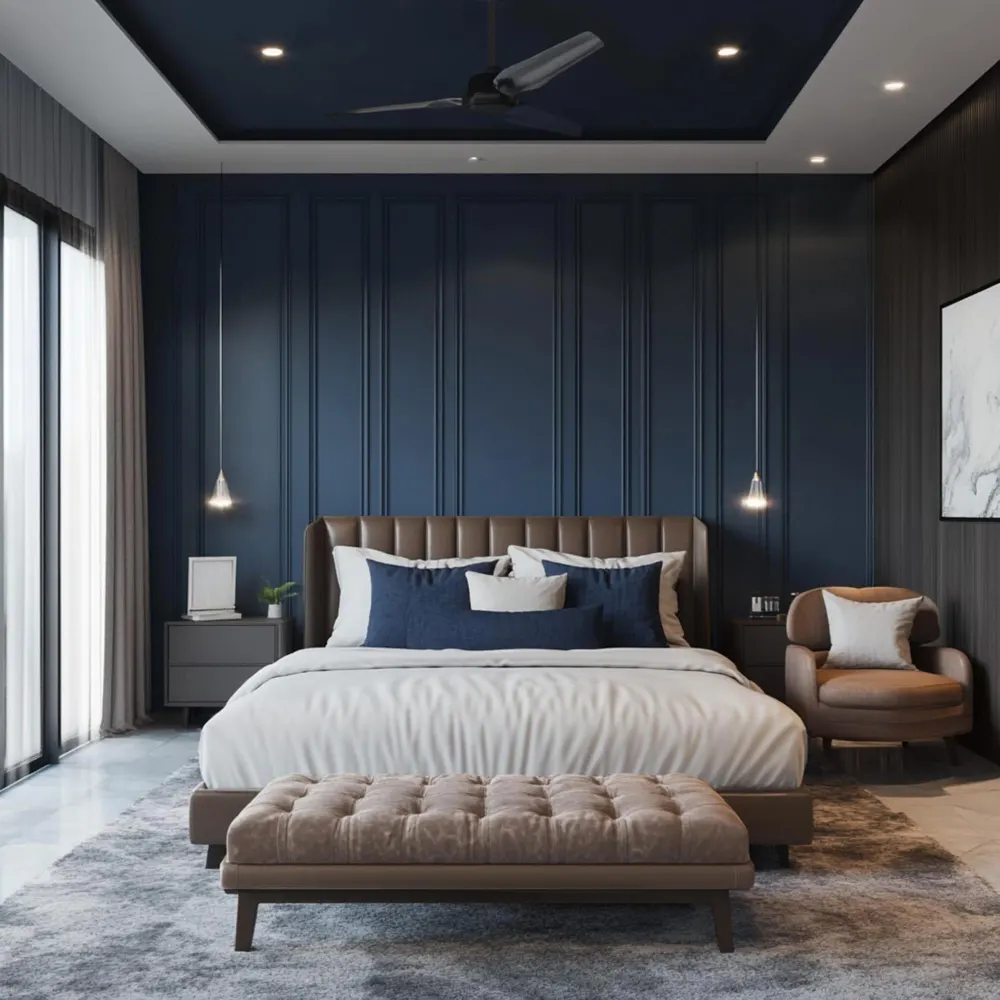
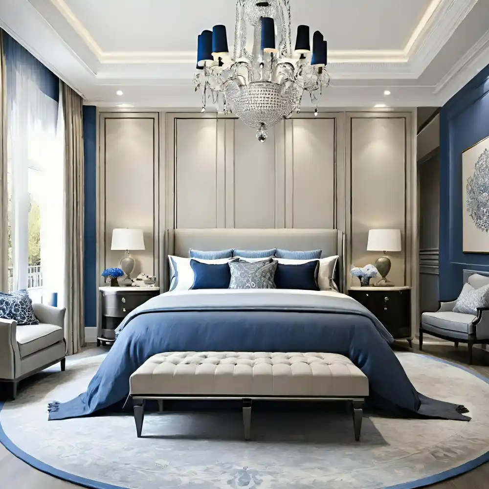
Navy and cream is the classic restful pairing for a reason. Navy blue brings calm depth, while cream adds warmth so the room never feels cold. The two balance each other because cream is warm and navy is cool, a mix that reads serene and inviting at once.
Make cream the dominant color on walls and bedding at about 60%. Bring navy in at 30% on a headboard, the duvet, or curtains. Then add a 10% touch of brass on lamps or hardware for a little glow. For more ways to work this shade, see these navy blue bedroom ideas.
2. Dusty Blue and Cream
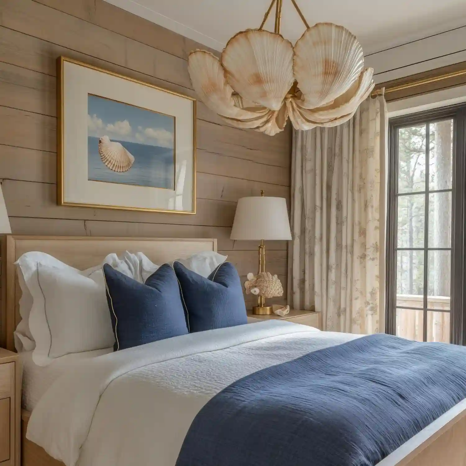
Dusty blue is softer than navy, with a grey-blue, faded quality. Paired with cream, it feels airy and quiet, like a calm spring morning. This pairing suits small or north-facing bedrooms because both colors stay light and open.
Use cream or a warm white as the dominant on walls. Add dusty blue at about 30% on the bedding or a painted headboard wall. Keep the accents soft too, like a pale oak nightstand and natural linen curtains, so nothing breaks the calm.
3. Grey and Blush Pink
Grey and blush is the easiest way to warm up a cool grey room. Grey gives a quiet, modern base. Blush pink adds warmth and a soft, grown-up touch that keeps grey from feeling flat. Choose a warm greige rather than a cold blue-grey so the two shades agree.
Let warm grey lead at 60% on the walls. Add blush at 10-20% on pillows, a velvet throw, or art. A little aged brass ties it together. This pairing works well in a bedroom accent wall too, with grey on three walls and a soft blush behind the bed.
4. Sage Green and Blush
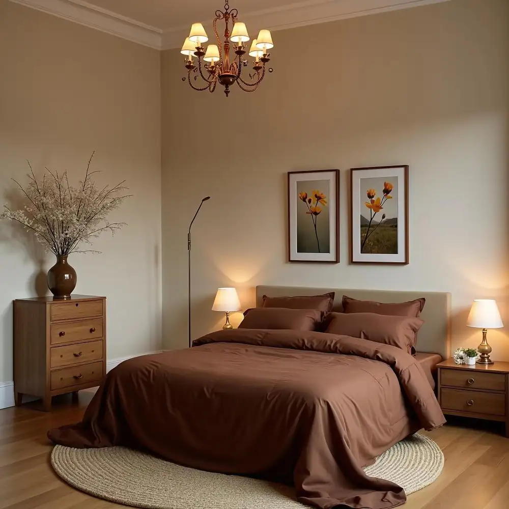
Sage green and blush is a gentle, nature-led pairing. Sage brings a calm, grounded green. Blush adds a warm, rosy lift. Because both are muted, they feel soft together rather than sweet. This is a quick, lovely pairing worth a whole room of its own if you fall for it.
Use sage as the dominant on walls or bedding. Keep blush as a light 10% accent on a few pillows or a throw. Add cream and warm oak to keep it earthy. Designer Tip: Repeat blush in at least two spots, like the pillows and a small framed print, so it looks chosen rather than accidental.
KEY TAKEAWAY: Cool pairings stay restful when a warm neutral like cream or warm grey leads and the cooler color plays the accent.
Warm and Earthy Two-Color Pairings
These pairings feel cozy and grounded. They use earthy tones and natural materials, which make a bedroom feel warm the moment you walk in.
5. Terracotta and Cream
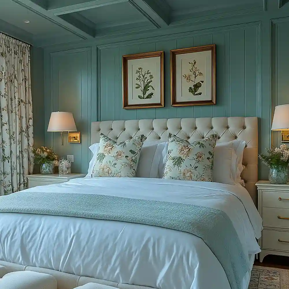
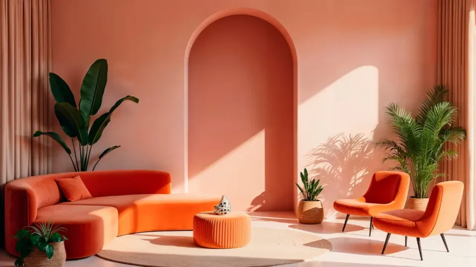
Terracotta and cream is warm, earthy, and full of character. Terracotta brings a clay-orange warmth. Cream keeps the room light so the terracotta does not take over. Cream is warmer than white, so it blends softly with terracotta instead of clashing. Designers often let terracotta be the single warm moment against creamy whites and taupe.
Make cream the dominant at 60% on walls and bedding. Use terracotta at about 30% on a throw, accent pillows, or one painted wall. Add natural materials like jute and linen to enrich the mix. This pairing feels cozy in any season.
6. Olive Green and Tan
Olive green and tan is a relaxed, organic pairing that feels like the outdoors brought inside. Olive is a warm, muted green. Tan is a soft, sandy neutral. They sit near each other in tone, so the room feels smooth and easy rather than busy.
Let tan lead on the walls and large bedding at 60%. Bring olive in at 30% on a duvet, curtains, or a velvet headboard. Warm wood and brass finish it off. For more on this shade, see these grounded olive green bedroom ideas. Designer Tip: Layer linen, wool, and rattan in olive and tan so the pairing reads rich and full, not flat.
7. Warm White and Walnut
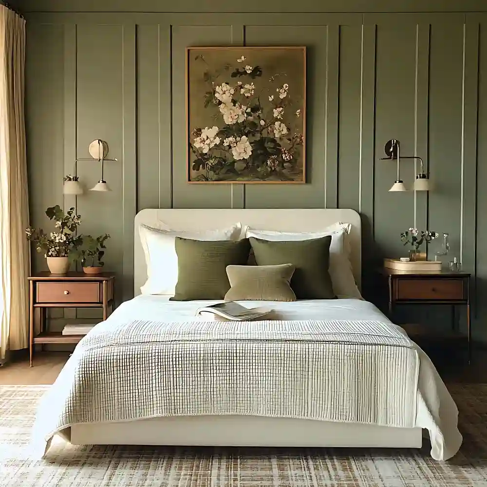
Warm white and walnut is barely a color pairing, and that is the point. Warm white keeps the room bright and airy. Walnut, a deep brown wood tone, adds richness and warmth. The contrast is gentle, so the room feels calm and quietly luxe.
Use warm white as the dominant on walls and bedding. Let walnut be the strong accent through furniture: a walnut bed frame, nightstands, or a dresser. Add cream linen and one black detail for definition. This is the easiest pairing for anyone nervous about color.
8. Forest Green and Gold
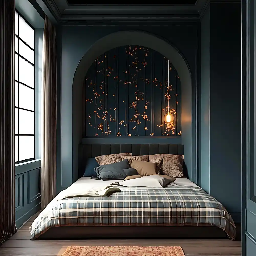
Forest green and gold is the pairing for a rich, jewel-tone bedroom. Deep forest green feels cocooning and dramatic. Gold and brass add warmth and a little glamour. Gold works as a glamorous neutral against green, which is why the two look so luxe together.
Make forest green the dominant on a feature wall or velvet headboard at 60%. Keep gold and brass to about 10% on lamps, frames, or hardware so it glows without going flashy. A velvet headboard in this green deepens the color beautifully. See more headboard ideas that make a bedroom feel luxurious for the right shape.
KEY TAKEAWAY: Warm pairings feel cozy when a soft neutral leads, the earthy color plays the accent, and natural textures fill out the room.
Two-Color Bedroom Combinations: How to Pick Your Pairing Checklist
- Choose your mood first: cool and calming, warm and earthy, or high-contrast and classic.
- Make the lighter or quieter shade your dominant color on walls and main bedding.
- Use the bolder shade as the 10-30% accent on pillows, a throw, art, or one piece of furniture.
- Sample paint on two walls and check it in morning light and at night before you commit.
- Add three textures in your colors, like linen, wool, and oak, so the pairing reads rich, not flat.
- Repeat the accent color at least twice in the room so it looks chosen, not random.
- Keep your metal finish consistent, such as brushed brass or matte black, across the whole room.
KEY TAKEAWAY: Decide the mood, pick the dominant color, then place the accent in two or three spots so the pairing looks planned.
High-Contrast and Classic Two-Color Pairings
These pairings use stronger contrast for a crisp, timeless look. The key is balance, so one color clearly leads and the bolder color stays the accent. The highest-contrast version of this is a dedicated black and white bedroom, where the same lead-and-accent rule keeps the two tones from fighting.
9. Black and White
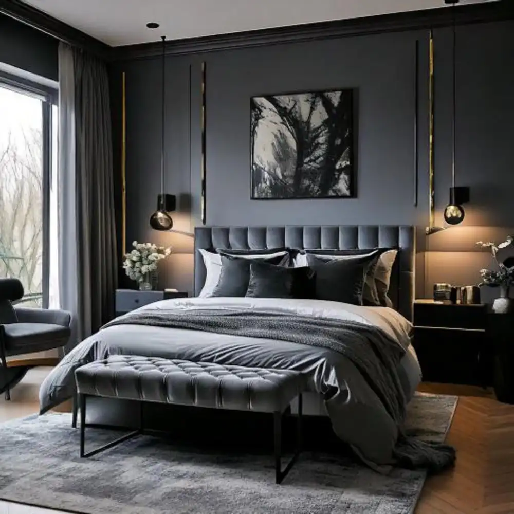
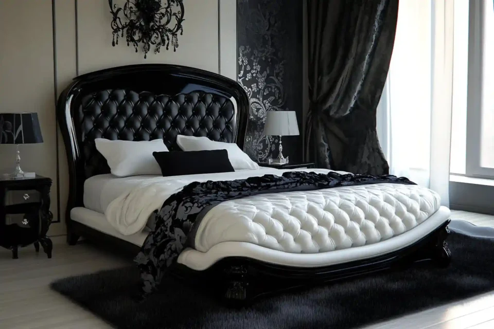
Black and white is the most timeless of all two-color bedroom combinations. White keeps the room light and open. Black adds sharp definition and a modern edge. Black and white sit opposite in value, so the contrast is strong, which makes balance the whole game.
Keep white dominant at 60% on walls and bedding so the room never feels heavy. Use black at 10-20% on a frame, a lamp, hardware, or thin window mullions. Add warm wood and linen so the pairing feels cozy rather than stark. To soften it, see how to style a bed like a designer.
10. Charcoal and Blush
Charcoal and blush is moody softness. Charcoal, a deep soft grey, feels grown-up and cozy. Blush adds a warm, rosy lightness that keeps charcoal from feeling cold. The contrast is gentle, so the room feels calm and a little romantic.
Use charcoal as a dominant or strong secondary, on one wall behind the bed or on the bedding. Keep blush as the 10-20% accent on pillows, a throw, and art. Warm metallics like aged brass bridge the two. Layered, low lamplight makes this pairing glow at night. Our cozy bedroom lighting ideas show how to layer that warm glow.
11. Beige and Black
Beige and black is warm contrast done simply. Warm beige gives a soft, inviting base. Black adds a crisp anchor that makes the beige look more elevated. Because beige is so warm, the black reads sharp but never cold.
Make warm beige the clear dominant at 60% on walls and bedding. Use black sparingly at about 10% on a light fixture, picture frames, a mirror, or lamp bases. Add one mid-tone, like camel or oak, so the jump from beige to black feels smooth. This pairing suits both modern and farmhouse rooms.
12. Navy and Mustard
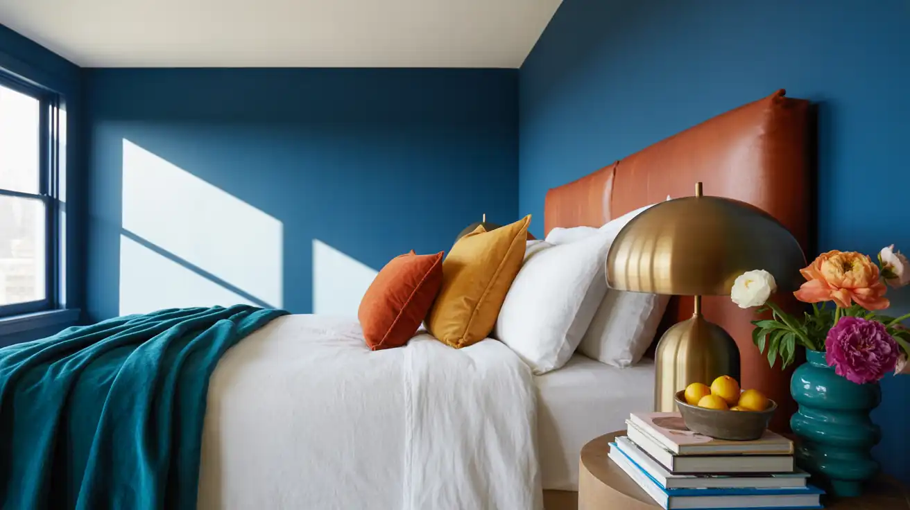
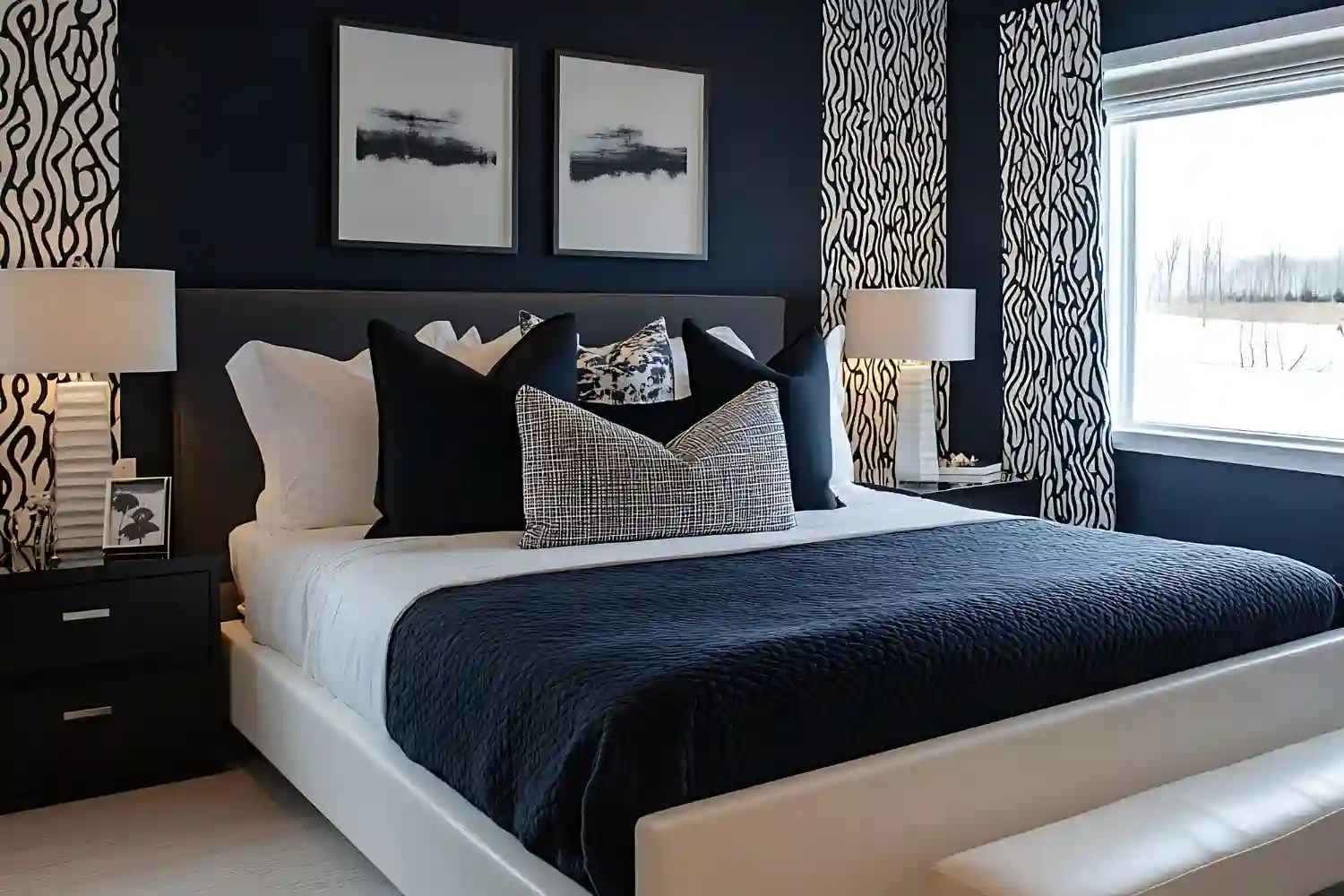
Navy and mustard is the boldest pairing here, and it works because the two are complementary, sitting opposite on the color wheel. Navy is deep and cool. Mustard is warm and golden. Together they feel rich and a little retro, with real energy.
Let navy lead at 60% on walls or bedding. Bring mustard in at 10-20% on a few pillows, a throw, or one chair, so it pops without taking over. With a strong pair like this, let one color clearly lead while the other supports. Designer Tip: Choose a muted, mustard-gold rather than a bright yellow so the pairing feels sophisticated instead of loud.
KEY TAKEAWAY: High-contrast pairings stay elegant when the lighter color leads at 60% and the bold color appears in small, repeated touches.
Making Any Two-Color Bedroom Feel Layered
A two-color room can still fall flat if it stays smooth and one-note. The fix is texture, not more color. Layer at least three textures in your two shades: linen bedding, a wool or boucle throw, and a jute or wool rug. The colors stay simple while the room gains depth.
Repeat each color in more than one place. If your accent is blush, let it show up on pillows, a throw, and a small print. A color that appears once looks like an accident. A color that appears three times looks planned.
A wool area rug grounds the whole pairing. Size it so it extends 18-24 inches past each side of the bed; an 8×10 rug suits most queen beds and a 9×12 suits a king. Rugs Direct confirms this 18-24 inch overhang guideline. The rug pulls both colors down to the floor and ties the room together.
KEY TAKEAWAY: Texture and repetition, not extra colors, are what make a two-color bedroom feel layered and complete.
What Makes a Two-Color Bedroom Look Off
Most two-color rooms miss for small, fixable reasons. Here are the common ones and the quick fix for each.
❌ Splitting the room 50/50 between both colors → ✅ Let one color lead at about 60% and keep the other as the accent.
❌ Pairing a warm color with a clashing cool undertone → ✅ Match undertones, like warm cream with warm terracotta, not cool grey-white.
❌ Using the accent color only once → ✅ Repeat the accent in two or three spots so it looks chosen.
❌ Skipping texture so the room feels flat → ✅ Add linen, wool, and wood in your two colors for depth.
KEY TAKEAWAY: Balance the split, match undertones, repeat the accent, and add texture to keep a two-color bedroom looking planned.
What a Two-Color Refresh Costs
A two-color bedroom is one of the most affordable updates because color does the heavy lifting. You can start small or go all in.
| Project | Estimated Cost | Impact Level |
|---|---|---|
| Accent pillows, throw, and one art print in your second color | $60-$130 | High |
| Two-color bedding set plus warm bulbs | $150-$350 | High |
| Paint one accent wall in the dominant or accent color | $40-$90 | Very High |
| Wool area rug to ground both colors | $200-$600 | Medium |
Best First Upgrade: Add your second color as pillows, a throw, and one print first; it costs under $130 and instantly shows the pairing.
Skip for Now: Do not rush a new bed frame or full furniture set before you have tested the two colors with bedding and accents.
KEY TAKEAWAY: Start with $60-$130 of accent pieces in your second color, then paint or add a rug once the pairing feels right.
Tougher Color Questions for Small or Dark Rooms
Small and dark bedrooms need a lighter touch with two-color schemes. In a small room, keep the lighter color dominant on the walls and use the bolder color only on bedding and accents, so the space stays open. A dark accent wall behind the bed still works, since you mostly see it from the doorway.
In a north-facing or low-light room, lean warm. Choose warm cream, warm beige, or a soft sage as the dominant, and pick a warm accent like blush, terracotta, or mustard. Cool pairings like grey and navy can feel chilly in poor light, so warm them with brass, oak, and 2700K bulbs.
Renting? You can still do a two-color room without paint. Bring both colors in through bedding, curtains, a rug, and removable peel-and-stick wallpaper on one wall. Rental Note: Use peel-and-stick wallpaper or fabric, not paint, to add your accent color on a wall without risking your deposit.
KEY TAKEAWAY: In small or dark rooms, keep the light color dominant, lean warm, and add the bold color through bedding and accents.
Frequently Asked Questions
Conclusion
The right two-color bedroom combinations turn a guessing game into a plan. Pick a mood, choose two colors, and let one lead while the other adds personality. Whether you go restful with navy and cream, cozy with terracotta and cream, or crisp with black and white, the 60-30-10 split keeps the room balanced and finished.
Editorial field note: A bedroom built around two well-chosen colors almost always looks more pulled together than one with five competing shades. Strip a busy room back to one dominant color and one repeated accent, and it settles immediately, even before new furniture arrives. Browse more of our home decor inspiration when you are ready for the next room.
More Bedroom Color Ideas
- 11 Navy Blue Bedroom Ideas for a Rich, Moody, and Calming Retreat
- 11 Olive Green Bedroom Ideas That Create a Grounded, Calm Space
- 12 Dusty Blue Bedroom Ideas for a Calm, Soft, and Airy Retreat
- 12 Sage Green Bedroom Ideas for a Calm, Restful Retreat
- 12 Terracotta Bedroom Ideas for a Warm, Earthy, and Grounded Retreat
- 12 White Bedroom Ideas for a Bright, Airy, and Cozy Space
- 14 Brown & Tan Bedroom Ideas That Feel Warm, Rich and Designer-Made
- 15 Grey Bedroom Design Ideas to Transform Your Sleeping Space
- Black and White Bedroom Ideas: Why Does Yours Feel Cold?
- Blush Pink Bedroom Ideas for a Sophisticated Adult Space