TL;DR
The best bedroom color ideas start with the mood you want, then get matched to your room’s natural light. Cool tones like navy, sage green, and dusty blue feel calm and rest-friendly. Warm earthy shades like terracotta, tan, and blush feel cozy and grounded. Neutrals like white, cream, greige, and grey keep things quiet and flexible. Build any of them into a full scheme with the 60-30-10 rule: 60% main color, 30% secondary, 10% accent. Test every shade in your own light before you commit.
Looking for more ideas? Explore our full guide to Bedroom Decorating Ideas.
How to Use This Bedroom Color Guide
Most bedroom advice hands you a list of trendy shades and walks away. That’s how people end up with a “perfect” gray that turns blue at night, or a warm beige that looks dull by a north window. The color was never the problem. The match between the color, the room’s light, and the mood you wanted was.
If you’ve ever painted a wall, hated it by evening, and repainted within a month — you’re not alone. It is one of the most common decorating regrets.
Editorial field note: A bedroom painted in a cool, trendy grey often feels flat and slightly cold once the overhead light goes off. Swapping that grey for a warm greige, then adding one deep accent like navy or olive, makes the same room feel settled and calm. The shift costs one weekend and a single gallon of paint.
Good bedroom color ideas come from working in this order: mood first, light second, palette third. This guide is the browse-by-color umbrella for the whole bedroom color collection. It groups colors by the feeling they create, gives a light-and-orientation note for each, and points you to a deeper page when you want one specific shade. For more rooms and palettes, our home decor inspiration library covers the rest of the house. Bookmark this guide for quick reference.
KEY TAKEAWAY: Choose your bedroom color by mood and natural light first, then refine the exact shade.
How Do You Choose the Right Bedroom Color?
Choose a bedroom color by deciding the mood you want, then checking your room’s natural light before you pick a shade. Cool colors like blue and green feel calm and rest-friendly. Warm colors like terracotta and tan feel cozy. North-facing rooms need warmer undertones to avoid a cold cast, while bright south-facing rooms can carry cooler shades. Test two or three samples on the wall for a full day before buying paint.
That short version covers most people. The rest of this section explains the three checks that make a color work.
| Quick Takeaways | |
|---|---|
| Mood | Cool tones rest you; warm tones cozy you up; neutrals stay quiet. |
| Light | North rooms want warm undertones; bright south rooms carry cool shades. |
| Bulbs | A 2700K warm-white bulb softens color at night; 5000K reads crisp. |
| Balance | Use the 60-30-10 rule to split your scheme into three weights. |
What Mood Do You Want the Room to Have?
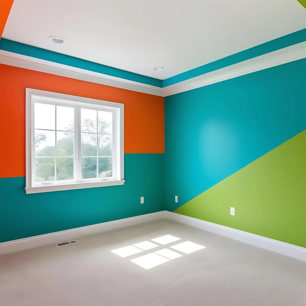
Color sets the mood before any furniture does. Cool colors — blue, green, soft slate — tend to feel calm and restful, which is why they suit bedrooms so well. The Sleep Foundation links blue and green with relaxation, noting that softer, muted versions feel more restful than bright, stimulating ones. Warm colors like terracotta and ochre feel cozy and grounded. Bright, energizing shades like pure red or strong orange are the least sleep-friendly, so keep those to small accents.
How Does Your Room’s Light Change the Color?
Natural light changes a paint color more than most people expect. A north-facing room gets soft, cool light, so warm tones can look muted and grey can turn cold. Sherwin-Williams recommends warm neutrals or warm undertones for north-facing rooms to balance that cool cast. A south-facing room gets steady warm light all day, so cooler shades read more neutral and stay comfortable. East and west rooms shift through the day, warm at one end and cool at the other, so pick the shade for when you use the room most.
DESIGNER TIP: Tape two large painted samples to different walls and check them at morning, midday, and night before you commit.
How Do Your Light Bulbs Affect the Final Color?
Bulb color temperature finishes the job your paint started. A 2700K warm-white bulb adds a soft, creamy glow that flatters warm and neutral colors at night, which is the cozy look most bedrooms want. A 5000K daylight bulb reads crisp and cool, pushing blues and greys to look bluer and more modern. Most bedrooms feel best with 2700K to 3000K bulbs for evening color rendering. Match your bulb choice to the mood, not just the paint chip.
KEY TAKEAWAY: Mood, natural light, and bulb temperature together decide how a bedroom color actually looks.
Bedroom Color Foundation Checklist
Run through this short list before you buy any paint or bedding. It keeps a color choice from going sideways.
- Name the mood first: calm and restful, cozy and warm, or quiet and neutral.
- Note your window direction so you can adjust undertones for north or south light.
- Test two or three samples on the wall and view them across a full day.
- Set your split with the 60-30-10 rule: one main color, one secondary, one accent.
- Choose 2700K to 3000K bulbs if you want a soft, warm evening glow.
- Keep bright, stimulating shades like pure red to small accents only.
- Pull one color cue from a fixed item you keep, like a rug or wood floor.
KEY TAKEAWAY: A seven-point check turns a guess into a color choice you will still like in a year.
Calming Cool Tones for a Restful Bedroom
Cool colors are the natural home base for a bedroom. Blue and green sit at the calm end of the color wheel, and softer versions of both feel restful rather than cold. These bedroom color ideas suit anyone who wants the room to slow them down at the end of the day. Cool tones also pair well with warm wood and brass, so the room never tips into chilly.
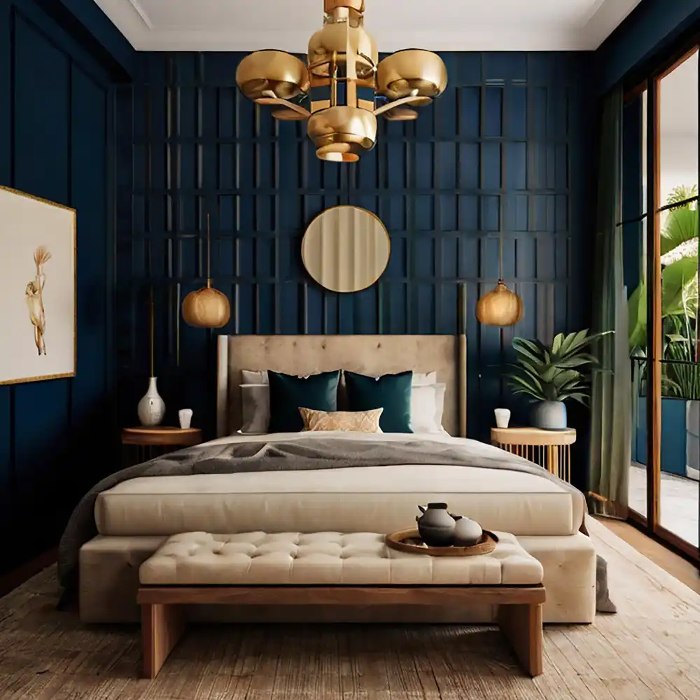
Navy Blue — Deep, Moody, and Calming
Navy blue gives a bedroom richness without going dark or heavy. It works as a full wall color, a headboard wall, or just bedding against soft white walls. Navy pairs beautifully with brass hardware, oak nightstands, and cream linen. It suits north and east rooms because its depth holds up in softer light. For a full breakdown, see these navy blue bedroom ideas for a rich, calming retreat.
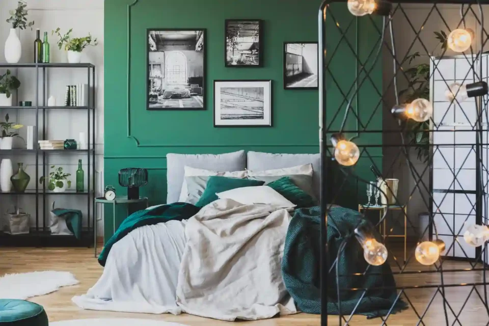
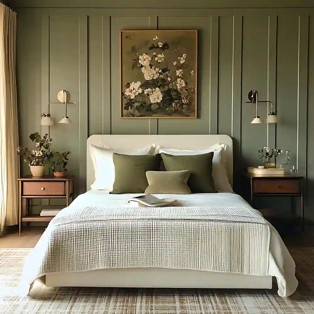
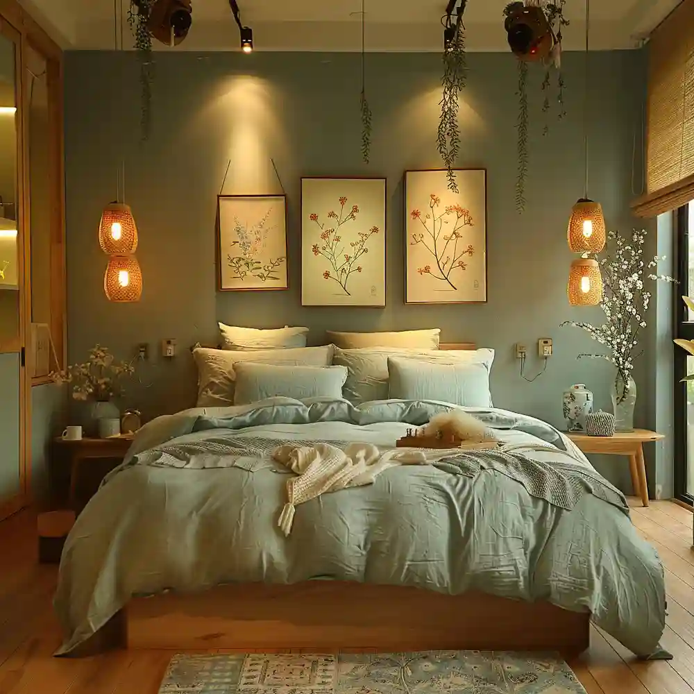
Sage and Olive Green — Grounded and Easy on the Eyes
Green brings the calm of nature indoors and is one of the easiest colors to live with. Sage green feels soft and airy, while olive green feels deeper and more grounded. Both pair well with raw oak, rattan, linen, and warm white trim. Green flatters almost any light because it sits between cool blue and warm yellow. These olive green bedroom ideas show how a grounded green creates a calm, settled space.
Dusty Blue — Soft, Quiet, and Sleep-Friendly
Dusty blue is a muted, greyed-down blue that feels gentle instead of bright. It is one of the most sleep-friendly bedroom colors because it stays calm without feeling cold. Dusty blue works as a wall color, bedding, or curtains, and pairs with warm greige, soft white, and pale wood. It suits bright south or west rooms especially well, where its cool tone reads as a clean, restful neutral.
DESIGNER TIP: If a cool color feels too cold, warm it back up with oak, brass, cream bedding, and a 2700K bulb rather than changing the paint.
KEY TAKEAWAY: Cool tones like navy, sage, and dusty blue create the restful mood most bedrooms are after.
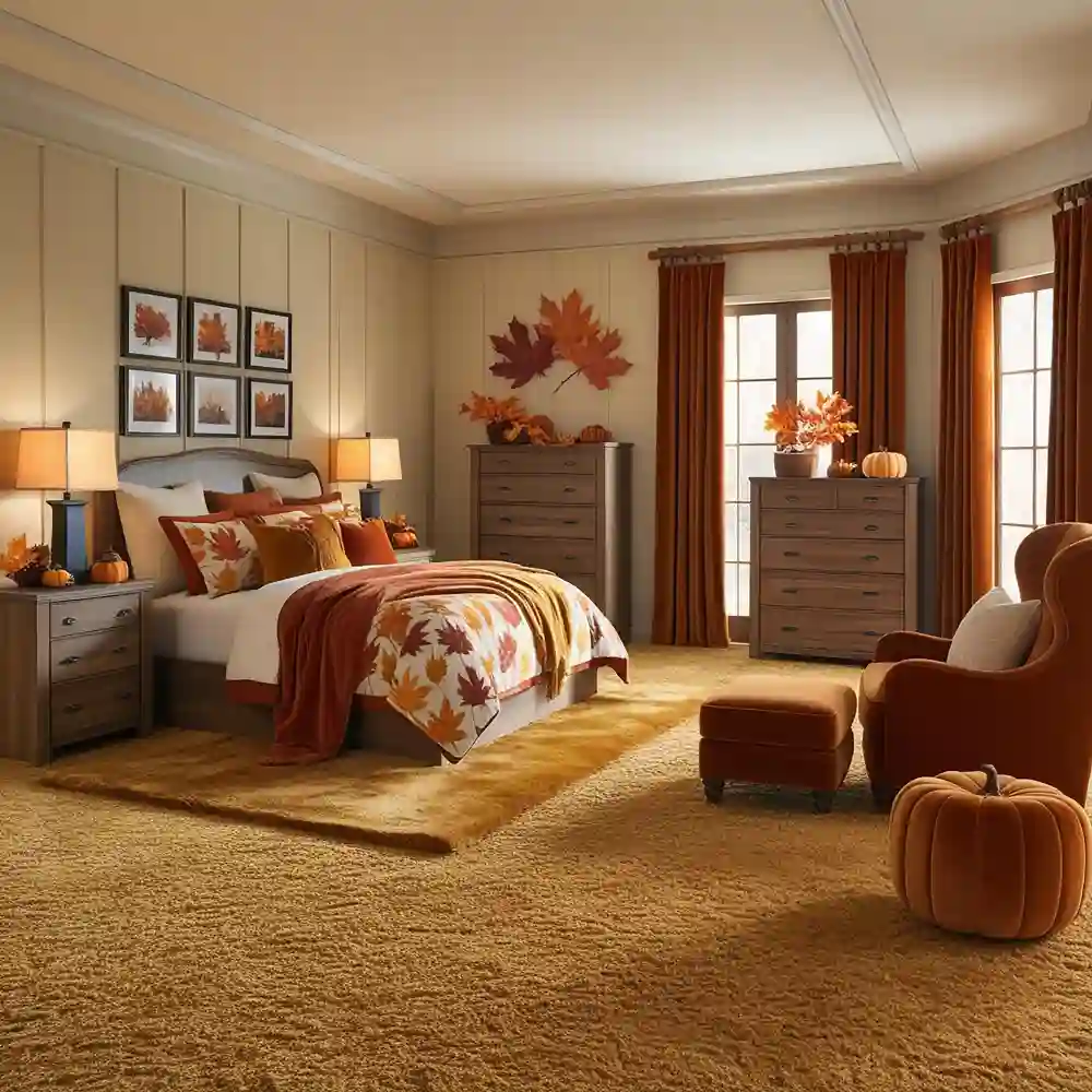
Warm and Earthy Tones for a Cozy Bedroom
Warm colors wrap a bedroom in comfort. Terracotta, tan, brown, and blush all carry the warmth of natural materials and skin tones, which is why they feel so welcoming. These bedroom color ideas suit anyone who wants the room to feel like a soft, grounded retreat. Warm earthy tones especially help north-facing rooms, where they push back against cool, flat light.
Terracotta and Clay — Warm Without Going Loud
Terracotta is a muted orange-brown that feels earthy rather than bright. It brings warmth and a hand-made, natural feeling to a bedroom without overwhelming it. Terracotta pairs with cream, raw oak, jute, and matte black accents. Use it as an accent wall, bedding, or a single clay-toned piece if a full wall feels like too much. It glows under warm 2700K light at night.
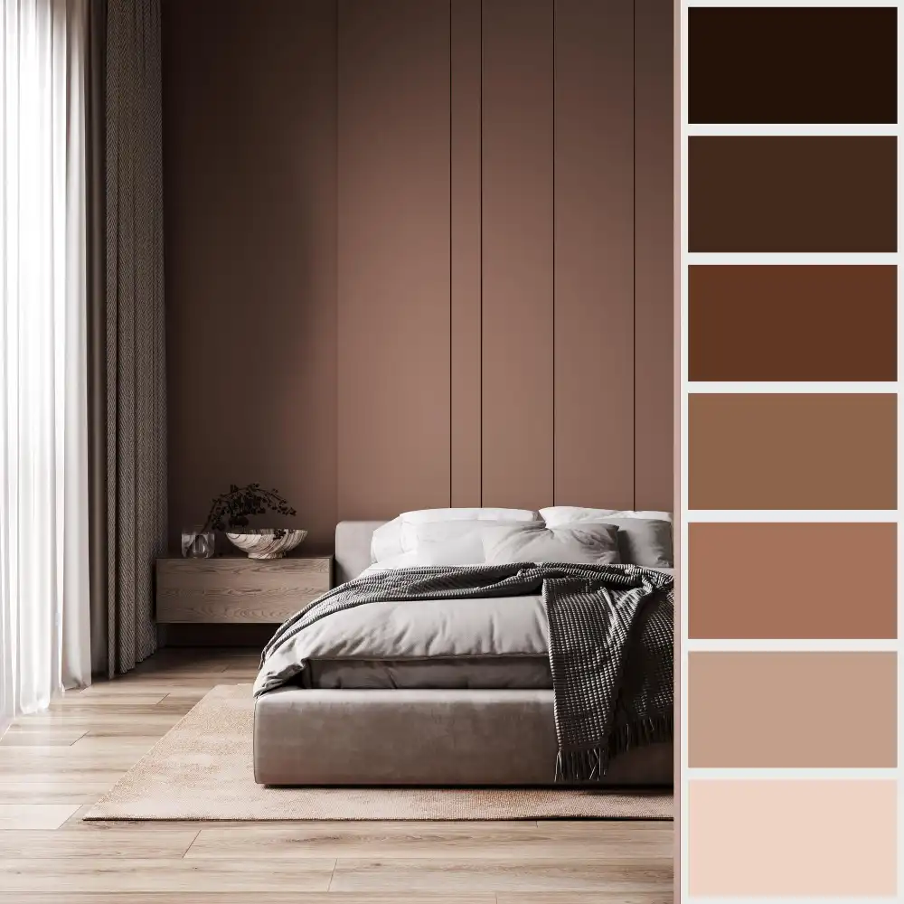
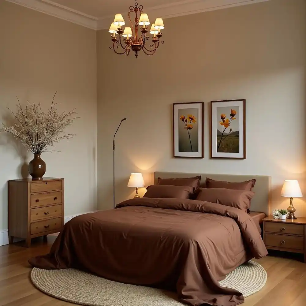
Brown and Tan — The New Warm Neutral
Brown and tan have returned as soft, grounding bedroom colors. Tan acts almost like a neutral, while deeper brown adds richness and a settled, cabin-like calm. Both pair with cream linen, walnut, leather, and brass. Warm browns suit north and east rooms because they add the warmth those rooms lack. Layer two or three tones of brown for depth instead of one flat shade.
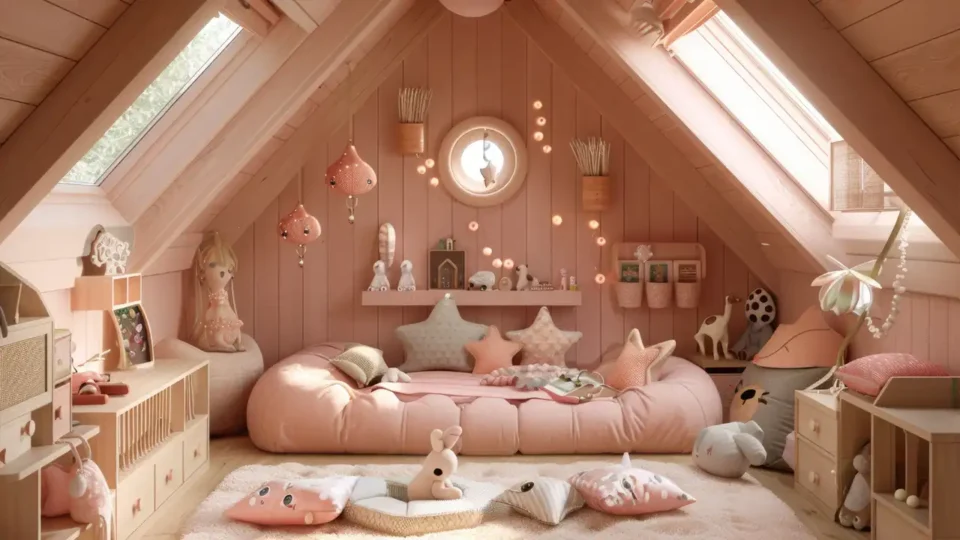
Blush Pink — Soft, Warm, and Surprisingly Versatile
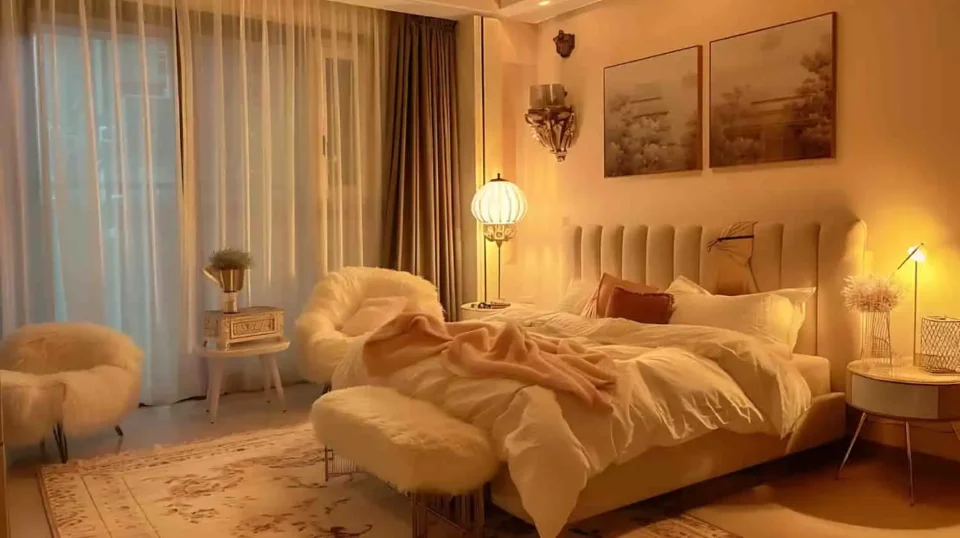
Blush is a warm, dusty pink that reads soft and grown-up, not loud. It adds a gentle, flattering warmth that suits bedrooms of any size. Blush pairs with warm greige, brass, cream, and natural wood for a calm, put-together look. It works especially well in smaller rooms — see these pink small bedroom ideas for ways to use it without the room feeling too sweet.
KEY TAKEAWAY: Warm earthy tones like terracotta, tan, and blush make a bedroom feel cozy and grounded.
Neutral Bedroom Colors That Always Work
Neutrals are the safe, flexible heart of bedroom color. White, cream, beige, greige, and grey let you change bedding and decor without repainting, and they keep a small room feeling open. These bedroom color ideas suit anyone who wants a calm backdrop they can build on slowly. The trick with neutrals is undertone — that is what makes one beige look fresh and another look dingy.
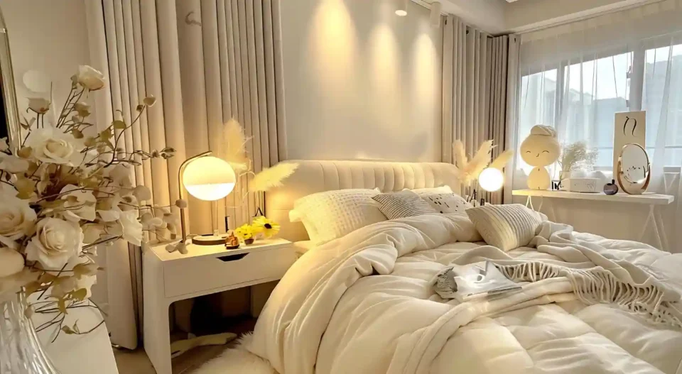
White and Cream — Bright, Clean, and Restful
White and cream keep a bedroom light and quiet. White feels crisp and open, while cream adds a soft, warm glow that feels cozier at night. Both make small rooms feel larger and let textures do the talking. Pure white can feel cold in a north room, so a warm white or cream usually works better there. Layer linen, boucle, and wood so an all-neutral room still feels full.
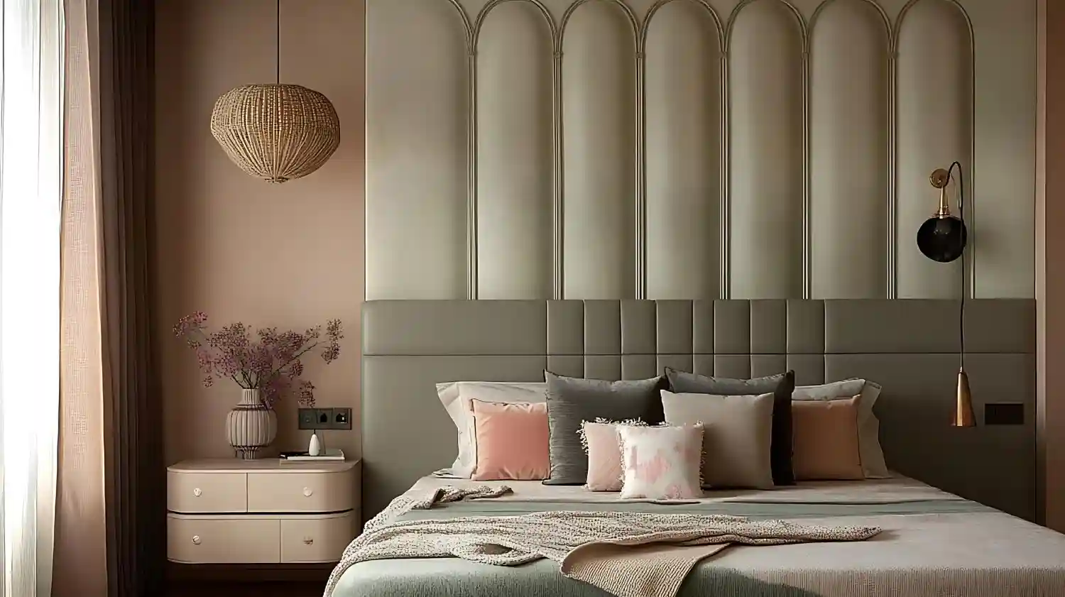
Beige, Cream, and Greige — Warm Neutrals With Depth
Beige and greige are the warm neutrals that feel current rather than dated. Greige — a mix of grey and beige — is the most flexible of all, since it pairs with both cool and warm accents. These tones suit nearly any light and any style. Choose a greige with a warm undertone for north rooms and a cooler one for bright south rooms. They make a calm base for navy, sage, or blush accents.
Grey — Modern, Quiet, and Easy to Style
Grey gives a bedroom a clean, modern calm. The key is warmth: a soft, warm grey stays cozy, while a cool grey can feel chilly, especially in low light. Grey pairs with crisp white trim, walnut, brass, and soft textiles. It suits bright rooms best, where its cool tone reads as fresh rather than flat. For a full walkthrough, these grey bedroom design ideas cover shades, accents, and styling.
DESIGNER TIP: Test any neutral against a sheet of plain white printer paper — it instantly reveals whether the undertone leans pink, green, yellow, or blue.
KEY TAKEAWAY: Neutrals work in any room as long as you match the undertone to your light.
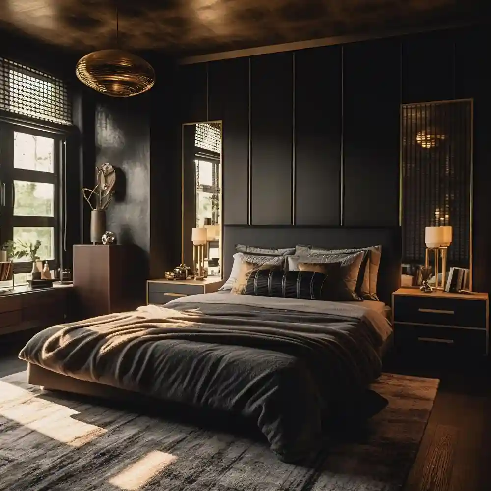
Dark and Moody Bedroom Colors
Dark colors turn a bedroom into a cocoon. Deep charcoal, forest green, dark navy, and near-black wrap the room and hide a low ceiling or awkward corners. This is one color direction, not a full how-to — going dark well is its own skill of light, contrast, and finishes, which our dedicated dark bedroom guide will cover in depth. As a palette choice, a dark bedroom feels intimate and quiet, and it suits people who sleep better in a darker, enclosed room.
A dark room needs warm layered light to feel cozy rather than gloomy. Add warm 2700K bulbs, a bedside lamp, and one or two wall sconces so the room glows in the evening. Break up the dark walls with cream bedding, warm wood, and brass so the space reads rich, not heavy. Matte finishes soften a dark color and hide marks better than a sheen.
KEY TAKEAWAY: Dark colors create an intimate, cocoon-like bedroom when you add warm, layered light.
Two-Color Combinations for a Bedroom
A second color is what makes a scheme feel finished instead of flat. Pairing two colors gives a bedroom depth without clutter. The easiest combinations pair a calm base with one warmer or deeper partner. These are starting points — a dedicated pairings page will go deeper on each.
- Sage green and blush: soft, warm, and gently feminine without being sweet.
- Navy and warm greige: classic, calm, and grown-up, with brass tying them together.
- Terracotta and cream: cozy and earthy, like a sun-warmed clay pot against linen.
- Dusty blue and tan: a quiet, restful mix that feels like sky meets sand.
- Charcoal and warm white: crisp, modern contrast that still feels soft.
Pick one color to lead and let the other support. That balance comes straight from the 60-30-10 rule in the next section.
KEY TAKEAWAY: Two-color pairings add depth by letting one calm color lead and a second one support.
How Do You Build a Full Bedroom Color Scheme?
Build a bedroom color scheme with the 60-30-10 rule: choose one main color for 60% of the room, a secondary color for 30%, and an accent for 10%. The 60% is usually your walls and largest pieces. The 30% covers bedding, curtains, or a rug. The 10% is the smallest touch — a lamp, a cushion, or art. This split keeps any palette balanced and is the simplest way to turn a single color into a finished scheme.
This is the short version of building a palette. A dedicated bedroom color schemes page will give ready-made recipes, but the 60-30-10 rule alone will carry most rooms. Pull your three colors from something you already own and love — a rug, a piece of art, or a wood tone — so the scheme feels personal instead of pulled from a chart.
A simple example shows how it works. Start with warm greige walls as your 60%. Add sage green bedding and curtains as your 30%. Finish with brass lamps and a terracotta cushion as your 10%. The same formula works with navy, blush, or any base you choose. If you want help picking a shade for a tight room, these best paint colors for a small bedroom make a small space feel larger.
KEY TAKEAWAY: The 60-30-10 rule turns any single color into a balanced, finished bedroom scheme.
Where Bedroom Color Goes Wrong
A few common slips cause most color regret. Each one is easy to avoid once you know it.
❌ Skipping samples and trusting the paint chip → ✅ Test two or three samples on the wall for a full day.
❌ Ignoring window direction → ✅ Warm up north rooms; let bright south rooms carry cooler shades.
❌ Forgetting bulb color → ✅ Use 2700K to 3000K bulbs so colors stay warm and calm at night.
❌ Using too many colors at once → ✅ Stick to the 60-30-10 split: one main, one secondary, one accent.
KEY TAKEAWAY: Most color mistakes come from skipping samples, ignoring light, or using too many colors.
What You’ll Spend
Changing a bedroom’s color is one of the cheapest ways to reset a room. A paint refresh costs far less than new furniture and delivers the biggest visible change. Interior paint runs roughly $20 to $70 per gallon, and a single bedroom usually needs one or two gallons.
| Project | Estimated Cost | Impact Level |
|---|---|---|
| DIY accent wall (1 gallon, mid-range paint) | $30-$60 | High |
| DIY full-room repaint (2 gallons plus supplies) | $80-$180 | Very High |
| New bedding and curtains in your scheme | $120-$400 | High |
| Pro repaint of a standard bedroom | $300-$700 | Very High |
Best First Upgrade: Repaint the room or one accent wall yourself — it is the highest-impact change for the lowest cost.
Skip for Now: Don’t replace furniture to match a color until the walls and textiles are settled.
KEY TAKEAWAY: A DIY repaint delivers the biggest color change for the least money, often under $180.
Frequently Asked Questions
Conclusion
The best bedroom color ideas are not about chasing a trend shade. They come from choosing the mood you want, matching it to your room’s light, and balancing the palette with the 60-30-10 rule. Cool tones rest you, warm tones cozy you up, and neutrals give you a calm base to build on. Pick the direction that fits how you want the room to feel.
Editorial field note: A bedroom often feels unfinished when it sits in one flat color with no second tone to support it. Adding a single warm wood piece, cream bedding, and one deep accent like navy or terracotta makes the same room feel layered and settled — no repaint required. Start with one change, live with it, then add the next. For more rooms and palettes, our home decor inspiration library is a good next stop, and you can always browse more bedroom ideas or explore all rooms inspiration for the rest of your home.